
layout: docwithnav assignees:
- ikulikov title: 部件开发指南(3.0以前)
介绍
ThingsBoard 3.0版本之前的ThingsBoard版本的部件开发指南如果使用的是ThingsBoard3.0+版本您可以参考部件开发3.0+版本指南。
ThingsBoard部件属于UI模块可以与任何IoT仪表板集成并提供最终功能给用户例如数据可视化、远程设备控制、警报管理和显示静态自定义html内容。
根据提供的功能每个部件定义代表特定的部件类型。
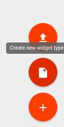
创建部件
为了创建新的部件定义请导航“部件库”然后打开现有的“部件捆绑”或创建一个新的在“部件捆绑”视图中单击屏幕右下角的大“ +”按钮然后单击“创建新的窗口小部件类型”按钮。
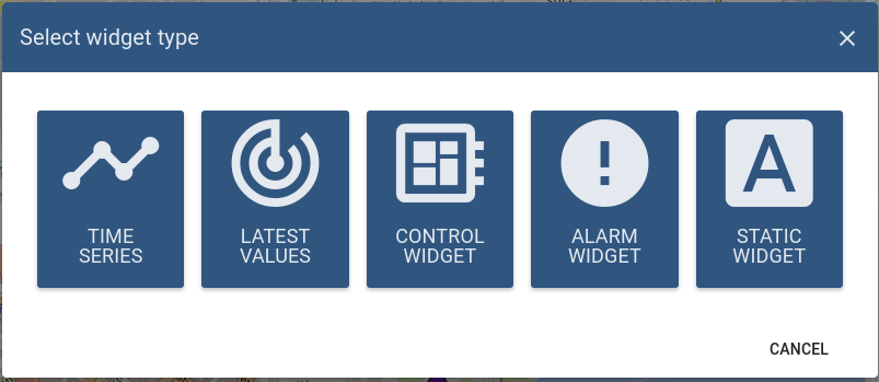
选择窗口部件类型会弹出窗口会提示你选择要开发的相应部件类型。
将根据先前选择的窗口小部件类型打开“窗口部件编辑器”页面该页面预填充了启动器窗口部件模板。
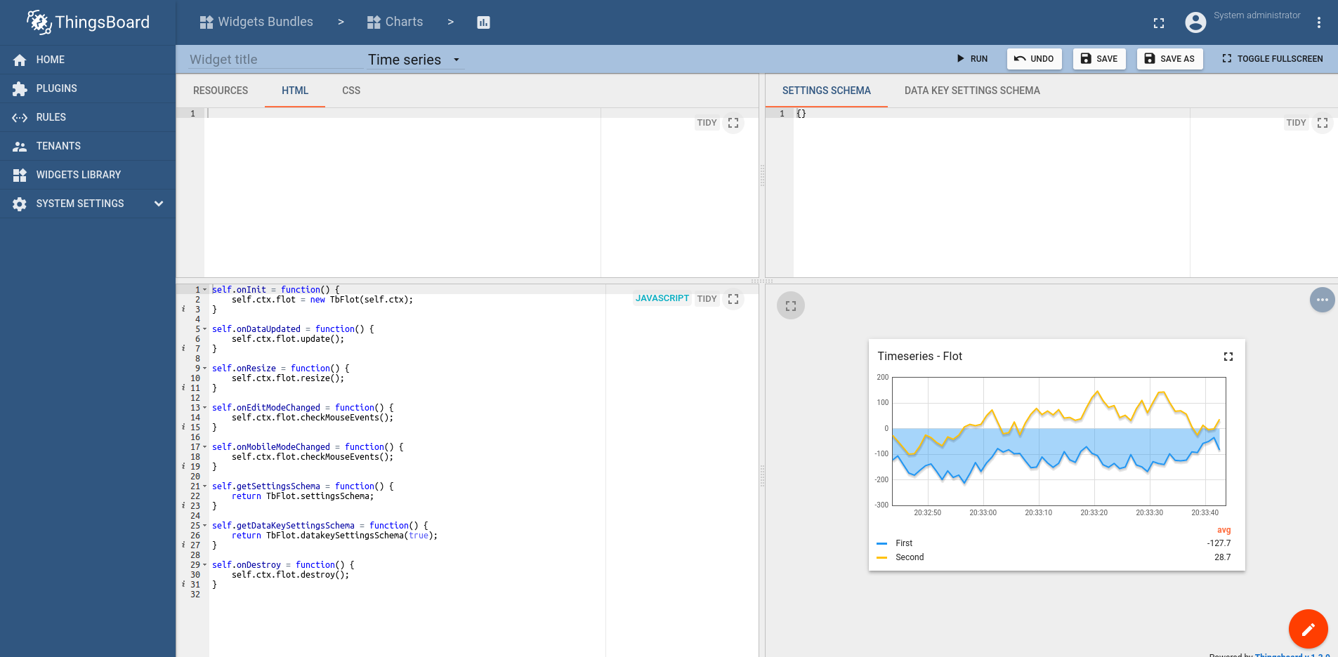
它由工具栏和四个主要部分组成:
工具栏

窗口部件编辑器工具栏包含以下各项:
- 部件标题字段 - 用于指定小部件定义的标题
- 部件类型选择器 - 用于指定部件定义的类型
- 运行按钮 - 用于运行部件代码并在“部件预览”部分中查看结果
- 撤消按钮 - 将所有编辑器部分恢复为最新保存状态
- 保存按钮 - 保存部件定义
- 另存为按钮 - 通过指定新的部件类型名称和目标部件捆绑可以保存新的部件定义副本
HTML和CSS资源部分
第一个resources选项卡用于指定窗口部件使用的外部JavaScript/CSS资源。
第二个HTML选项卡包含部件html代码(注意:此内容可以为空并由代码动态创建)。
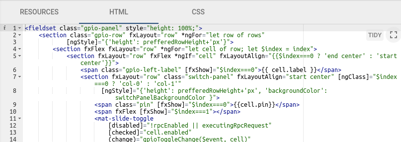
第三个CSS选项卡包含部件的CSS样式定义。
JavaScript
本节包含根据部件API的所有与窗口部件相关的JavaScript代码。
设置
第一个设置模式标签用于指定部件设置的json模式并使用react-schema-formbuilder。
在生成的UI表单上显示部件设置的高级选项卡,设置序列化对象存储部件然后从部件Javascript代码访问。
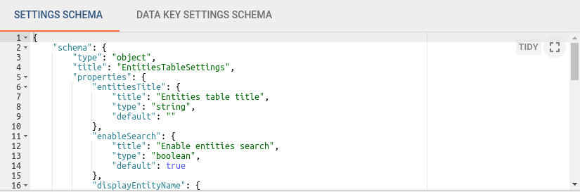
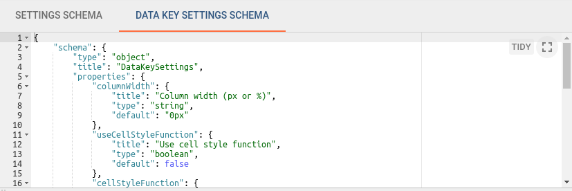
第二个数据键设置选项卡用于指定数据键为json模式并使用react-schema-formbuilder。
在生成的UI表单上显示部件设置的数据键配置选项卡,设置序列化对象存储部件数据源的特定数据键,这些设置可以通过部件JavaScript代码访问。
预览
本部分用于预览和测试窗口中部件定义,以迷你仪表板的形式通过当前窗口显示部件具有通常的ThingsBoard仪表板提供的几乎所有功能但有一些限制。
例如:出于调试目的在窗口中部件数据源部分中只能选择“功能”作为数据源类型。
基础小部件API
所有与部件相关的代码都位于JavaScript部分并提供了对部件实例的引用的内置变量self部件函数都必须定义主self变量的属性。
self变量有ctx属性引用部件实例使用的所有API和数据的WidgetContext上下文对象。
以下是窗口部件上下文属性的简要说明:
| 属性 | 类型 | 描述 |
|---|---|---|
| $container | jQuery Object | Container element of the widget. Can be used to dynamically access or modify widget DOM using jQuery API. |
| $scope | Object | Angular scope object of the current widget element. Can be used to access/modify scope properties when widget is built using Angular approach. |
| width | Number | Current width of widget container in pixels. |
| height | Number | Current height of widget container in pixels. |
| isEdit | Boolean | Indicates whether the dashboard is in in the view or editing state. |
| isMobile | Boolean | Indicates whether the dashboard view is less then 960px width (default mobile breakpoint). |
| widgetConfig | Object | Common widget configuration containing properties such as color (text color), backgroundColor (widget background color), etc. |
| settings | Object | Widget settings containing widget specific properties according to the defined settings json schema |
| units | String | Optional property defining units text of values displayed by widget. Useful for simple widgets like cards or gauges. |
| decimals | Number | Optional property defining how many positions should be used to display decimal part of the value number. |
| hideTitlePanel | Boolean | Manages visibility of widget title panel. Useful for widget with custom title panels or different states. |
| defaultSubscription | Object | See Subscription object |
| timewindowFunctions | Object | See Timewindow functions |
| controlApi | Object | See Control API |
| actionsApi | Object | See Actions API |
| stateController | Object | See State Controller |
部件相关的JavaScript函数(注意:每个函数都是可选的):
| 函数 | 描述 | |
|---|---|---|
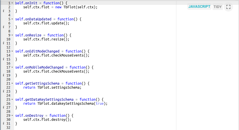
onInit() |
The first function which is called when widget is ready for initialization. Should be used to prepare widget DOM, process widget settings and initial subscription information. | |
onDataUpdated() |
Called when the new data is available from the widget subscription. Latest data can be accessed from the defaultSubscription object of widget context (ctx). | |
onResize() |
Called when widget container is resized. Latest width and height can be obtained from widget context (ctx). | |
onEditModeChanged() |
Called when dashboard editing mode is changed. Latest mode is handled by isEdit property of ctx. | |
onMobileModeChanged() |
Called when dashboard view width crosses mobile breakpoint. Latest state is handled by isMobile property of ctx. | |
onDestroy() |
Called when widget element is destroyed. Should be used to cleanup all resources if necessary. | |
getSettingsSchema() |
Optional function returning widget settings schema json as alternative to Settings tab of Settings schema section. | |
getDataKeySettingsSchema() |
Optional function returning particular data key settings schema json as alternative to Data key settings schema tab of Settings schema section. | |
typeParameters() |
Retruns object describing widget datasource parameters. See Type parameters object. | |
actionSources() |
Retruns object describing available widget action sources used to define user actions. See Action sources object. |
订阅对象
窗口小部件订阅对象包含所有订阅信息包括widget type包括当前数据。 取决于部件类型订阅对象提供不同的数据结构。 对于Latest values和Time-series部件类型它提供了以下属性:
- datasources -此订阅使用的数据量数组并具有以下结构:
1
2
3
4
5
6
7
8
9
10
11
12
13
14
15
16
17
18
19
20
21
22
    datasources = [
        {  // datasource
           type: 'entity',// type of the datasource. Can be "function" or "entity"
           name: 'name', // name of the datasource (in case of "entity" usually Entity name)
           aliasName: 'aliasName', // name of the alias used to resolve this particular datasource Entity
           entityName: 'entityName', // name of the Entity used as datasource
           entityType: 'DEVICE', // datasource Entity type (for ex. "DEVICE", "ASSET", "TENANT", etc.)
           entityId: '943b8cd0-576a-11e7-824c-0b1cb331ec92', // entity identificator presented as string uuid.
           dataKeys: [ // array of keys (attributes or timeseries) of the entity used to fetch data
               { // dataKey
                    name: 'name', // the name of the particular entity attribute/timeseries
                    type: 'timeseries', // type of the dataKey. Can be "timeseries", "attribute" or "function"
                    label: 'Sin', // label of the dataKey. Used as display value (for ex. in the widget legend section)
                    color: '#ffffff', // color of the key. Can be used by widget to set color of the key data (for ex. lines in line chart or segments in the pie chart).
                    funcBody: "", // only applicable for datasource with type "function" and "function" key type. Defines body of the function to generate simulated data.
                    settings: {} // dataKey specific settings with structure according to the defined Data key settings json schema. See "Settings schema section".
               },
               //...
           ]
        },
        //...
    ]
- data - 在此订阅范围内收到的一系列最新数据并具有以下结构:
1
2
3
4
5
6
7
8
9
10
11
12
13
14
    data = [
        {
            datasource: {}, // datasource object of this data. See datasource structure above.
            dataKey: {}, // dataKey for which the data is held. See dataKey structure above.
            data: [ // array of data points
                [   // data point
                    1498150092317, // unix timestamp of datapoint in milliseconds
                    1, // value, can be either string, numeric or boolean
                ],
                //...
            ]
        },
        //...
    ]
对于Alarm widget类型它提供以下属性:
- alarmSource - 有关获取警报的实体的信息并具有以下结构:
1
2
3
4
5
6
7
8
9
10
11
12
13
14
15
16
17
18
    alarmSource = {
         type: 'entity',// type of the alarm source. Can be "function" or "entity"
         name: 'name', // name of the alarm source (in case of "entity" usually Entity name)
         aliasName: 'aliasName', // name of the alias used to resolve this particular alarm source Entity
         entityName: 'entityName', // name of the Entity used as alarm source
         entityType: 'DEVICE', // alarm source Entity type (for ex. "DEVICE", "ASSET", "TENANT", etc.)
         entityId: '943b8cd0-576a-11e7-824c-0b1cb331ec92', // entity identificator presented as string uuid.
         dataKeys: [ // array of keys indicating alarm fields used to display alarms data
            { // dataKey
                 name: 'name', // the name of the particular alarm field
                 type: 'alarm', // type of the dataKey. Only "alarm" in this case.
                 label: 'Severity', // label of the dataKey. Used as display value (for ex. as a column title in the Alarms table)
                 color: '#ffffff', // color of the key. Can be used by widget to set color of the key data.
                 settings: {} // dataKey specific settings with structure according to the defined Data key settings json schema. See "Settings schema section".
            },
            //...
          ]
    }
- alarms - 有关获取警报的实体的信息并具有以下结构:
1
2
3
4
5
6
7
8
9
10
11
12
13
14
15
16
17
18
19
20
21
22
23
24
25
26
    alarms = [
        { // alarm
            id: { // alarm id
                entityType: "ALARM",
                id: "943b8cd0-576a-11e7-824c-0b1cb331ec92"
            },
            createdTime: 1498150092317, // Alarm created time (unix timestamp)
            startTs: 1498150092316, // Alarm started time (unix timestamp)
            endTs: 1498563899065, // Alarm end time (unix timestamp)
            ackTs: 0, // Time of alarm aknowledgment (unix timestamp)
            clearTs: 0, // Time of alarm clear (unix timestamp)
            originator: { // Originator - id of entity produced this alarm
                entityType: "ASSET",
                id: "ceb16a30-4142-11e7-8b30-d5d66714ea5a"
            },
            originatorName: "Originator Name", // Name of originator entity
            type: "Temperature", // Type of the alarm
            severity: "CRITICAL", // Severity of the alarm ("CRITICAL", "MAJOR", "MINOR", "WARNING", "INDETERMINATE")
            status: "ACTIVE_UNACK", // Status of the alarm
                                    // ("ACTIVE_UNACK" - active unacknowledged,
                                    // "ACTIVE_ACK" - active acknowledged,
                                    // "CLEARED_UNACK" - cleared unacknowledged,
                                    // "CLEARED_ACK" - cleared acknowledged)
            details: {} // Alarm details object derived from alarm details json.
        }
    ]
对于其他部件类型例如RPC或Static订阅对象是可选的不包含必要的信息。
Timewindow函数
带有时间窗口功能的对象用于管理小部件数据时间范围可以通过[时间序列]使用Time-series或Alarm部件。
| 函数 | 描述 |
|---|---|
onUpdateTimewindow(startTimeMs, endTimeMs) |
This function can be used to update current subscription time frame to historical one identified by startTimeMs and endTimeMs arguments. |
onResetTimewindow() |
Resets subscription time frame to default defined by widget timewindow component or dashboard timewindow depending on widget settings. |
Control API
Object that provides API functions for RPC (Control) widgets.
| 函数 | 描述 |
|---|---|
sendOneWayCommand(method, params, timeout) |
Sends one way (without response) RPC command to the device. Returns command execution promise. method - RPC method name, string, params - RPC method params, custom json object, timeout - maximum delay in milliseconds to wait until response/acknowledgement is received. |
sendTwoWayCommand(method, params, timeout) |
Sends two way (with response) RPC command to the device. Returns command execution promise with response body in success callback. |
Actions API
与用户定义的操作一起使用的API功能集。
| 函数 | 描述 |
|---|---|
getActionDescriptors(actionSourceId) |
Returns the list of action descriptors for provided actionSourceId |
handleWidgetAction($event, descriptor, entityId, entityName) |
Handles action produced by particular action source. $event - event object associated with action, descriptor - action descriptor, entityId and entityName - current entity id and name provided by action source if available. |
State Controller
引用仪表板状态控制器提供API来管理当前仪表板状态。
| Function | 描述 |
|---|---|
openState(id, params, openRightLayout) |
Navigates to new dashboard state. id - id of the target dashboard state, params - object with state parameters to use by the new state, openRightLayout - optional boolean argument to force open right dashboard layout if present in mobile view mode. |
updateState(id, params, openRightLayout) |
Updates current dashboard state. id - optional id of the target dashboard state to replace current state id, params - object with state parameters to update current state parameters, openRightLayout - optional boolean argument to force open right dashboard layout if present in mobile view mode. |
getStateId() |
Returns current dashboard state id. |
getStateParams() |
Returns current dashboard state parameters. |
getStateParamsByStateId(id) |
Returns state parameters for particular dashboard state identified by id. |
Type parameters object
描述小部件数据源参数的对象它具有以下属性:
1
2
3
4
    return {
        maxDatasources: -1, // Maximum allowed datasources for this widget, -1 - unlimited
        maxDataKeys: -1 //Maximum allowed data keys for this widget, -1 - unlimited
    }
Action sources object
映射描述可以分配用户操作的可用小部件动作源它具有以下结构:
1
2
3
4
5
6
   return {
        'headerButton': { // Action source Id (unique action source identificator)
           name: 'Header button', // Display name of action source, used in widget settings ('Actions' tab).
           multiple: true // Boolean property indicating if this action source supports multiple action definitions (for ex. multiple buttons in one cell, or only one action can by assigned on table row click.)
        }
    };
Creating simple widgets
以下是如何创建每种类型的最小的部件的简单教程集。 为了最大程度地减少代码的数量将使用角框架实际上是在哪个物体上基于的东西。 顺便说一句您始终可以在小部件代码中使用纯JavaScript或jQuery API。
Latest Values widget
在窗口部件捆绑包中视图单击屏幕右侧部分中的大“+”按钮,然后单击“创建新的小部件类型”按钮。 单击选择窗口小部件类型弹出的最新值按钮。 窗口部件编辑器将通过默认最新值模板小部件的内容预先打开。
- “资源”部分CSS选项卡的清晰内容。
- 将以下HTML代码放入“资源”部分的HTML选项卡中:
1
2
3
4
5
6
7
8
  <div flex layout="column" style="height: 100%;" layout-align="center stretch">
      <div>My first latest values widget.</div>
      <div flex layout="row" ng-repeat="dataKeyData in data" layout-align="space-around center">
          <div>{{dataKeyData.dataKey.label}}:</div>
          <div>{{dataKeyData.data[0][0] | date : 'yyyy-MM-dd HH:mm:ss'}}</div>
          <div>{{dataKeyData.data[0][1]}}</div>
      </div>
  </div>
- 将以下JavaScript代码放入“JavaScript”部分:
1
2
3
4
5
    self.onInit = function() {

        self.ctx.$scope.data = self.ctx.defaultSubscription.data;

    }
- 单击窗口部件编辑器工具栏中的运行按钮以查看widget Preview部分中的结果。
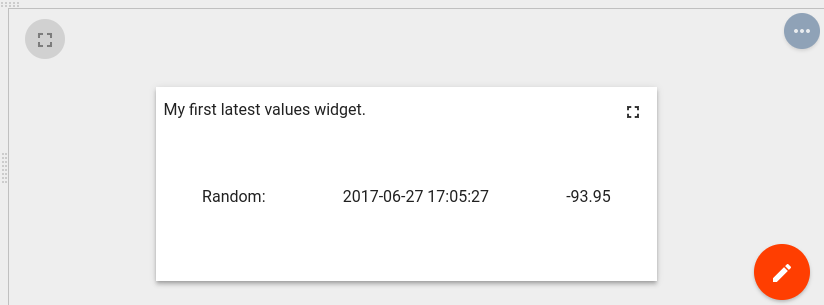
在此示例中订阅的数据属性分配给$scope并在HTML模板中访问。 在HTML内部使用特殊的ng-repeatAngular指令用于迭代可用的Datakeys数据点并使用其时间戳渲染相应的最新值。
Time-Series widget
在窗口部件捆绑包中视图单击屏幕右侧部分中的大“+”按钮然后单击“创建新的小部件类型”按钮。 Click on the Time-Series button in the Select widget type popup. 单击选择小部件类型弹出窗口中的时间序列按钮。 窗口部件编辑器将以默认的时间序列模板窗口小部件的内容预先打开。
- “资源”部分CSS选项卡的清晰内容。
- 将以下HTML代码放入“资源”部分的HTML选项卡中:
1
2
3
4
5
6
7
8
9
10
11
12
13
14
15
16
17
18
19
20
21
  <div flex layout="column" style="height: 100%;">
      <div>My first Time-Series widget.</div>
      <md-tabs md-border-bottom>
          <md-tab ng-repeat="datasource in datasources track by $index" label="{{datasource.name}}">
              <table style="width: 100%;">
                  <thead>
                      <tr>
                          <th>Timestamp</th>
                          <th ng-repeat="dataKeyData in datasourceData[$index]">{{dataKeyData.dataKey.label}}</th>
                      <tr>
                  </thead>
                  <tbody>
                      <tr ng-repeat="data in datasourceData[$index][0].data track by $index">
                          <td>{{data[0] | date : 'yyyy-MM-dd HH:mm:ss'}}</td>
                          <td ng-repeat="dataKeyData in datasourceData[$parent.$index]">{{dataKeyData.data[$parent.$index][1]}}</td>
                      </tr>
                  </tbody>
              </table>
          </md-tab>
      </md-tabs>
  </div>
- 将以下JavaScript代码放入“JavaScript”部分:
1
2
3
4
5
6
7
8
9
10
11
12
13
14
15
16
17
18
19
20
21
22
23
24
25
self.onInit = function() {
    self.ctx.$scope.datasources = self.ctx.defaultSubscription.datasources;
    self.ctx.$scope.data = self.ctx.defaultSubscription.data;

    self.ctx.$scope.datasourceData = [];

    var currentDatasource = null;
    var currentDatasourceIndex = -1;

    for (var i=0;i<self.ctx.$scope.data.length;i++) {
        var dataKeyData = self.ctx.$scope.data[i];
        if (dataKeyData.datasource != currentDatasource) {
            currentDatasource = dataKeyData.datasource
            currentDatasourceIndex++;
            self.ctx.$scope.datasourceData[currentDatasourceIndex] = [];

        }
        self.ctx.$scope.datasourceData[currentDatasourceIndex].push(dataKeyData);
    }

}

self.onDataUpdated = function() {
    self.ctx.$scope.$digest();
}
- 单击窗口小部件编辑器工具栏中的运行按钮以查看widget Preview部分中的结果。
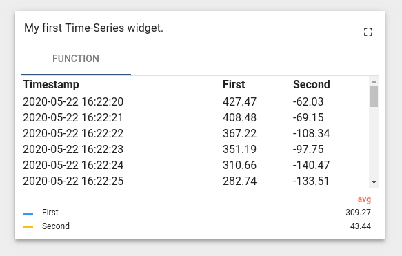
在此示例中dataSources和数据subscription的属性分配给$scope并在HTML模板中访问。 datasourcedata范围属性被引入dataSource索引映射数据源数据以在HTML模板中灵活访问。 在HTML内部使用特殊ng-repeatAngular指令以迭代可用的数据源并渲染相应的选项卡。 在每个选项卡中使用DataSourceData范围属性获得的Datakeys数据呈现表。 每个表通过在所有datakeydata对象上迭代并通过迭代每个data 遍历datakeydata的数组来渲染所有可用的数据点来呈现列。 请注意在此代码中ondataupdated函数通过调用Angular$Digest在收到新数据时执行新的渲染周期所需的函数。
RPC (Control) widget
在选择部件类型弹出窗口中单击控制部件按钮。 将打开部件编辑器并预先填充默认的控制模板小部件的内容。
- 清除“资源”部分CSS标签的内容。
- 将以下HTML代码放入“资源”部分的HTML标签中:
1
2
3
4
5
6
7
8
9
10
11
12
13
14
15
16
17
18
19
20
21
22
23
24
25
26
27
  <form name="rpcForm" ng-submit="sendCommand()">
    <md-content class="md-padding" layout="column">
        <md-input-container>
          <label>RPC method</label>
          <input required name="rpcMethod" ng-model="rpcMethod"/>
          <div ng-messages="rpcForm.rpcMethod.$error">
            <div ng-message="required">RPC method name is required.</div>
          </div>
        </md-input-container>
        <md-input-container>
          <label>RPC params</label>
          <input required name="rpcParams" ng-model="rpcParams"/>
          <div ng-messages="rpcForm.rpcParams.$error">
            <div ng-message="required">RPC params is required.</div>
          </div>
        </md-input-container>
        <md-button ng-disabled="rpcForm.$invalid || !rpcForm.$dirty" type="submit"
                   class="md-raised md-primary">
            Send RPC command
        </md-button>
        <div>
           <label>RPC command response</label>
           <div style="width: 100%; height: 100px; border: solid 2px gray" ng-bind-html="rpcCommandResponse">
           </div>
        </div>
    </md-content>
  </form>
- 将以下JSON内容放入设置架构标签中:
1
2
3
4
5
6
7
8
9
10
11
12
13
14
15
16
17
18
19
20
21
22
23
{
    "schema": {
        "type": "object",
        "title": "Settings",
        "properties": {
            "oneWayElseTwoWay": {
                "title": "Is One Way Command",
                "type": "boolean",
                "default": true
            },
            "requestTimeout": {
                "title": "RPC request timeout",
                "type": "number",
                "default": 500
            }
        },
        "required": []
    },
    "form": [
        "oneWayElseTwoWay",
        "requestTimeout"
    ]
}
- 将以下JavaScript代码放入“JavaScript”部分中:
1
2
3
4
5
6
7
8
9
10
11
12
13
14
15
16
17
18
19
20
21
22
23
24
25
26
27
28
29
30
31
32
33
self.onInit = function() {

    self.ctx.$scope.sendCommand = function() {
        var rpcMethod = self.ctx.$scope.rpcMethod;
        var rpcParams = self.ctx.$scope.rpcParams;
        var timeout = self.ctx.settings.requestTimeout;
        var oneWayElseTwoWay = self.ctx.settings.oneWayElseTwoWay ? true : false;

        var commandPromise;
        if (oneWayElseTwoWay) {
            commandPromise = self.ctx.controlApi.sendOneWayCommand(rpcMethod, rpcParams, timeout);
        } else {
            commandPromise = self.ctx.controlApi.sendTwoWayCommand(rpcMethod, rpcParams, timeout);
        }
        commandPromise.then(
            function success(response) {
                if (oneWayElseTwoWay) {
                    self.ctx.$scope.rpcCommandResponse = "Command was successfully received by device.<br/> No response body because of one way command mode.";
                } else {
                    self.ctx.$scope.rpcCommandResponse = "Response from device:<br/>";
                    self.ctx.$scope.rpcCommandResponse += angular.toJson(response);
                }
            },
            function fail(rejection) {
                self.ctx.$scope.rpcCommandResponse = "Failed to send command to the device:<br/>"
                self.ctx.$scope.rpcCommandResponse += "Status: " + rejection.status + "<br/>";
                self.ctx.$scope.rpcCommandResponse += "Status text: '" + rejection.statusText + "'";
            }

        );
    }

}
- 用小部件类型名称填充部件标题字段例如“我的第一个控件”。
- 单击部件编辑器工具栏中的运行按钮以便在部件预览部分中查看结果。
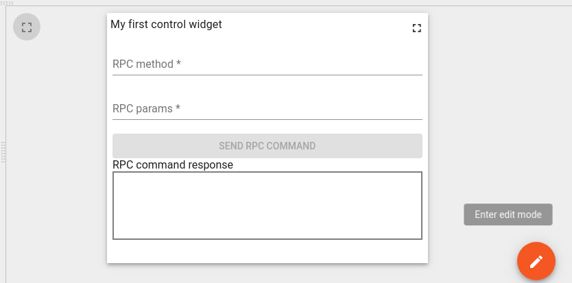
- 现在点击预览部分中的信息中心编辑按钮然后更改生成的小部件的大小然后单击仪表板应用按钮最终的小部件应如下图所示。
-
- 单击部件编辑器工具栏中的保存按钮以保存小部件类型。
为了测试此窗口小部件如何执行RPC命令我们需要将该窗口小部件放置在某些仪表板上并绑定到使用RPC命令的某些设备为此请执行以下步骤:
- 以租户管理员身份登录。
- 导航至设备,并使用某些名称创建新设备例如 “我的RPC设备”。
- 打开设备详细信息,然后单击“复制访问令牌”按钮,以将设备访问令牌复制到剪贴板。
- 下载mqtt-js-rpc-from-server.sh和mqtt-js-rpc-from-server.js将这些文件放在某个文件夹中。
- 编辑mqtt-js-rpc-from-server.sh-用剪贴板中的设备访问令牌替换 $ACCESS_TOKEN。
- 运行mqtt-js-rpc-from-server.sh脚本。如果一切正常,你应该在控制台中看到“已连接”消息。
- 导航至仪表板并创建一个具有某些名称的新仪表板,例如。 “我的第一个控制仪表板”。打开此仪表板。
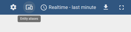
- 点击信息中心的修改按钮。在仪表板编辑模式下,单击位于仪表板工具栏上的“实体别名”按钮。
- 在实体别名弹出窗口中单击“添加别名”。
- 填写“别名”字段例如“我的RPC设备别名”。
- 在“过滤器类型”字段中选择“实体列表”。
- 在“类型”字段中选择“设备”。
- 在“实体列表”字段中选择你的设备在此示例中“我的RPC设备”。
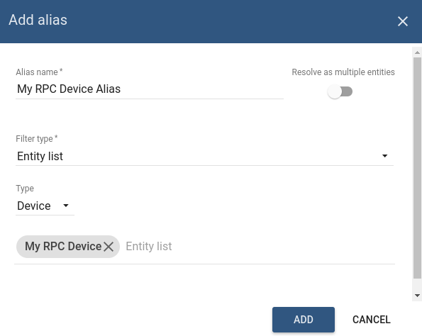
- 在实体别名中单击“添加”然后单击“保存”。
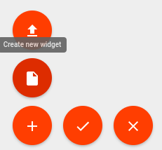
- 点击信息中心的“+”按钮然后点击“创建部件”按钮。
- 然后选择部件捆绑包 RPC小部件的保存位置选择“控件小部件”选项卡。
- 点击小部件在此示例中“我的第一个控件”。
- 在添加小部件弹出窗口中在目标设备部分中选择你的设备别名在此示例中“我的RPC设备别名”。
- 点击添加你的控件小部件将出现在仪表板中单击仪表板“应用更改”按钮以保存仪表板并退出编辑模式。
- 在RPC方法名称字段中填充RPC方法名称对于前“测试方法”。
- 用RPC参数字段“{param1:’value1’}”。
- 点击发送RPC命令按钮。你应该在小部件中看到以下响应。
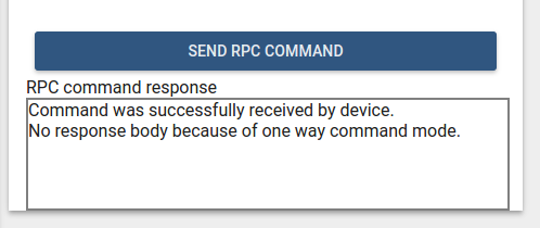
以下输出应在设备控制台中打印:
1
2
  request.topic: v1/devices/me/rpc/request/0
  request.body: {"method":"TestMethod","params":"{ param1: \"value1\" }"}
为了测试“Two way””RPC命令模式,我们需要更改相应的窗口小部件设置属性为此请执行以下步骤:
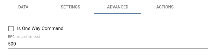
- 点击信息中心的修改按钮.在仪表板编辑模式下,单击“控制”小部件标题中的“编辑小部件”按钮。
- 在小部件详细信息视图中,选择“高级”标签,然后取消选中“Is One Way Command”复选框。
- 点击部件详细信息标题中的应用更改按钮关闭详细信息然后点击信息中心应用更改按钮。
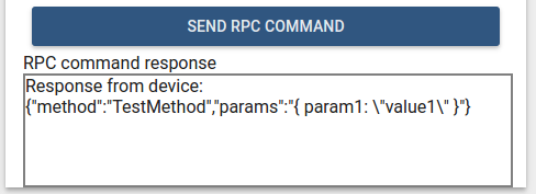
- 与前面的步骤一样,用RPC方法名称和参数填充部件字段。 点击发送RPC命令按钮你应该在小部件中看到以下响应。
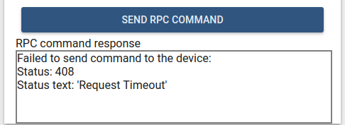
- 停止mqtt-js-rpc-from-server.sh脚本。 点击发送RPC命令按钮。你应该在小部件中看到以下响应。
在此示例中controlApi用于发送RPC命令此外引入了自定义窗口小部件设置以配置RPC命令模式和RPC请求超时。
设备的响应由具有成功和失败回调的commandPromise进行处理并带有包含有关请求执行结果信息的相应响应或拒绝对象。
Alarm widget
在部件捆绑视图中单击屏幕右下角的“+”按钮然后单击创建部件类型按钮。
在选择部件类型弹出窗口中单击警报部件按钮。
使用默认的Alarm模板小部件的内容预填充打开部件编辑器。
- 将以下HTML代码放入“资源”部分的HTML标签中:
1
2
3
4
5
6
7
8
9
10
11
12
13
14
15
16
17
18
  <div flex layout="column" style="height: 100%;">
      <div>My first Alarm widget.</div>
      <table style="width: 100%;">
          <thead>
              <tr>
                  <th ng-repeat="dataKey in alarmSource.dataKeys">{{dataKey.label}}</th>
              <tr>
          </thead>
          <tbody>
              <tr ng-repeat="alarm in alarms">
                  <td ng-repeat="dataKey in alarmSource.dataKeys"
                      ng-style="getAlarmCellStyle(alarm, dataKey)">
                      {{getAlarmValue(alarm, dataKey)}}
                  </td>
              </tr>
          </tbody>
      </table>
  </div>
- 将以下JSON内容放入“设置”部分的设置架构标签中:
1
2
3
4
5
6
7
8
9
10
11
12
13
14
15
16
17
18
19
20
{
    "schema": {
        "type": "object",
        "title": "AlarmTableSettings",
        "properties": {
            "alarmSeverityColorFunction": {
                "title": "Alarm severity color function: f(severity)",
                "type": "string",
                "default": "if(severity == 'CRITICAL') {return 'red';} else if (severity == 'MAJOR') {return 'orange';} else return 'green'; "
            }
        },
        "required": []
    },
    "form": [
        {
            "key": "alarmSeverityColorFunction",
            "type": "javascript"
        }
    ]
}
- 将以下JavaScript代码放入”JavaScript”部分中:
1
2
3
4
5
6
7
8
9
10
11
12
13
14
15
16
17
18
19
20
21
22
23
24
25
26
27
28
29
30
31
32
33
34
35
36
37
38
39
40
41
42
43
44
45
46
47
48
self.onInit = function() {
    self.ctx.$scope.alarmSource = self.ctx.defaultSubscription.alarmSource;

    var alarmFields = self.ctx.$scope.$injector.get('types').alarmFields;
    var $filter = self.ctx.$scope.$injector.get('$filter');

    var alarmSeverityColorFunctionBody = self.ctx.settings.alarmSeverityColorFunction;
    if (angular.isUndefined(alarmSeverityColorFunctionBody) || !alarmSeverityColorFunctionBody.length) {
        alarmSeverityColorFunctionBody = "if(severity == 'CRITICAL') {return 'red';} else if (severity == 'MAJOR') {return 'orange';} else return 'green';";
    }

    var alarmSeverityColorFunction = null;
    try {
        alarmSeverityColorFunction = new Function('severity', alarmSeverityColorFunctionBody);
    } catch (e) {
        alarmSeverityColorFunction = null;
    }

    self.ctx.$scope.getAlarmValue = function(alarm, dataKey) {
        var alarmField = alarmFields[dataKey.name];
        if (alarmField) {
            var value = alarm[alarmField.value];
            if (alarmField.time) {
                return $filter('date')(value, 'yyyy-MM-dd HH:mm:ss');
            } else {
                return value;
            }
        } else {
            return alarm[dataKey.name];
        }
    }

    self.ctx.$scope.getAlarmCellStyle = function(alarm, dataKey) {
        var alarmField = alarmFields[dataKey.name];
        if (alarmField && alarmField == alarmFields.severity && alarmSeverityColorFunction) {
            var severity = alarm[alarmField.value];
            var color = alarmSeverityColorFunction(severity);
            return {
                color: color
            };
        }
        return {};
    }
}

self.onDataUpdated = function() {
    self.ctx.$scope.alarms = self.ctx.defaultSubscription.alarms;
}
- 单击“部件编辑器工具栏”中的“运行”按钮,以便在“部件预览”部分中查看结果。

在此示例中subscription的alarmSource和alarms属性被分配给$scope并且可以在HTML模板中访问。 在HTML内部使用angular的ng-repeat指令进行遍历alarmSource可用警报的dataKeys并呈现相应的列。 在表中通过遍历alarms数组显示对应的单元格dataKeys。 函数getAlarmValue是使用特殊的AlarmFields常量用来获取警报值该常量是从ThingsBoard UI的types中获取的并且可以通过Angular$injector进行访问。 函数getAlarmCellStyle用于为每个警报单元格分配自定义单元格样式。 在getAlarmCellStyle函数中有对应的alarmSeverityColorFunction调用和严重性值以获取警报严重性单元格的颜色。 请注意在此代码中实现了onDataUpdated函数以便使用来自订阅的最新警报更新alarms属性并使用detectChanges()函数调用更改检测。
Static widget
在部件捆绑视图中单击屏幕右下角的“+”按钮然后单击创建部件类型按钮。
在选择部件类型弹出窗口中单击Static部件按钮。
打开部件编辑器并预先填充默认的**Static模板小部件的内容。
- 将以下HTML代码放入“资源”部分的HTML标签中:
1
2
3
4
  <div flex layout="column" style="height: 100%;" layout-align="space-around stretch">
      <h3 style="text-align: center;">My first static widget.</h3>
      <md-button class="md-primary md-raised" ng-click="showAlert()">Click me</md-button>
  </div>
- 将以下JSON内容放入“设置”的设置架构标签中:
1
2
3
4
5
6
7
8
9
10
11
12
13
14
15
16
{
    "schema": {
        "type": "object",
        "title": "Settings",
        "properties": {
            "alertContent": {
                "title": "Alert content",
                "type": "string",
                "default": "Content derived from alertContent property of widget settings."
            }
        }
    },
    "form": [
        "alertContent"
    ]
}
- 将以下JavaScript代码放入“JavaScript”部分中:
1
2
3
4
5
6
7
8
9
10
11
self.onInit = function() {

    self.ctx.$scope.showAlert = function() {
        var alertContent = self.ctx.settings.alertContent;
        if (!alertContent) {
            alertContent = "Content derived from alertContent property of widget settings.";
        }
        window.alert(alertContent);
    };

}
- 单击部件编辑器工具栏中的运行按钮,以便在部件预览部分中查看结果。
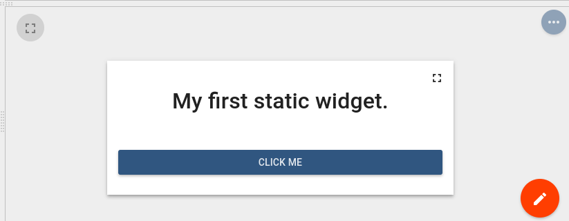
这只是一个静态HTML小部件因此没有订阅数据或使用了特殊的小部件API。
仅实现了自定义showAlert函数该函数显示具有小部件设置的alertContent属性内容的警报。
你可以在部件预览部分切换到仪表盘编辑模式并通过在小部件详细信息的“高级”选项卡中更改小部件设置来更改alertContent的值。
然后你可以看到显示了新的警报内容。
集成现有代码创建部件定义
以下是一些示例,这些示例演示如何重用/集成外部JavaScript库或现有代码以创建新的小部件。
使用外部JavaScript库
在此示例中,将使用外部gauge.js库创建Latest Values仪表小部件。
在部件捆绑视图中单击屏幕右下角的“+”大按钮然后单击创建部件类型按钮。
Latest Values实例
在此示例中Latest Values仪表小部件将使用外部gauge.js库创建。
在选择部件类型弹出窗口中单击Latest Values按钮。
将打开部件编辑器并预先填充默认的Latest Values模板小部件的内容。
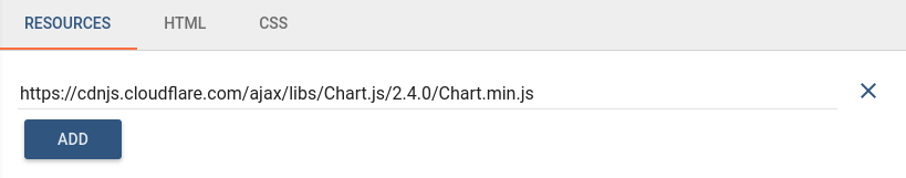
- 打开资源标签然后单击“添加”然后插入以下链接:
1
https://bernii.github.io/gauge.js/dist/gauge.min.js
- 清除“资源”部分CSS标签的内容。
- 将以下HTML代码放入“资源”部分的HTML标签中:
1
  <canvas id="my-gauge"></canvas>
- Put the following JavaScript code inside the “JavaScript” section:
1
2
3
4
5
6
7
8
9
10
11
12
13
14
15
16
17
18
19
20
21
22
23
var canvasElement;
var gauge;

self.onInit = function() {
    canvasElement = $('#my-gauge', self.ctx.$container)[0];
    gauge = new Gauge(canvasElement);
    gauge.minValue = -1000;
    gauge.maxValue = 1000;
    gauge.animationSpeed = 16;
    self.onResize();
}

self.onResize = function() {
    canvasElement.width = self.ctx.width;
    canvasElement.height = self.ctx.height;
    gauge.update(true);
    gauge.render();
}

self.onDataUpdated = function() {
    var value = self.ctx.defaultSubscription.data[0].data[0][1];
    gauge.set(value);
}
- 单击部件编辑器工具栏中的运行按钮以便在部件预览部分中查看结果。
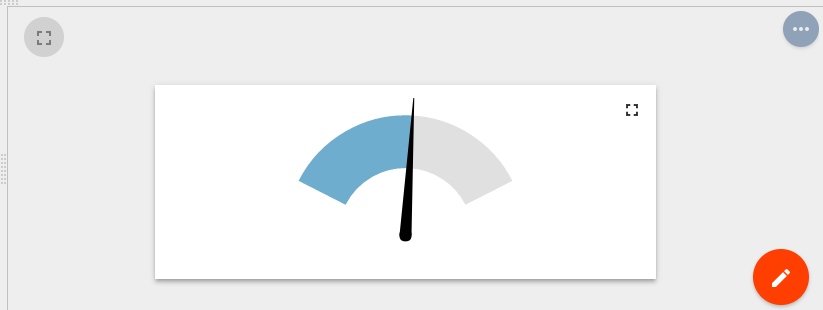
在此示例中,使用了外部JS库的API该API在Resources部分中注入相应的URL后才可用。 显示的值是从第一个dataKey的subscriptiondata属性获得的。
Using existing JavaScript code
创建窗口部件的另一种方法是使用现有的捆绑JavaScript代码。
在这种情况下你可以创建自己的JavaScript类或Angular指令并将其捆绑到ThingsBoard UI代码中。
为了使此代码可在窗口部件中访问你需要注册相应的Angular模块或将JavaScript类注入到全局变量(例如,对于window对象)。
一些ThingsBoard小部件已经使用这种方法。看看widget.service.js。
在这里,你可以找到如何注册一些捆绑的类或模块以供以后在ThingsBoard小部件中使用。
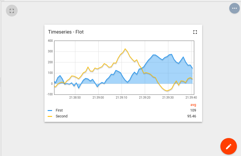
例如Timeseries-Flot小部件(来自Charts部件捆绑包)使用TbFlotJavaScript类,将其作为窗口属性注入widget.service.js中:
1
2
3
4
5
6
7
8
...

import TbFlot from '../widget/lib/flot-widget';
...

    $window.TbFlot = TbFlot;
...
另一个示例是使用Angular指令tb-timeseries-table-widget被注册为treseboard.api.api.widget’angular模块的依赖关系widget.service.service.js。 因此该指令可在窗口小部件模板HTML内使用。
1
2
3
4
5
6
7
8
9
10
...

import thingsboardTimeseriesTableWidget from '../widget/lib/timeseries-table-widget';

...

export default angular.module('thingsboard.api.widget', ['oc.lazyLoad', thingsboardLedLight, thingsboardTimeseriesTableWidget,

...
小部件代码调试技巧
调试的最简单方法是Web控制台输出。
只需将console.log(…)函数放在部件JavaScript代码的任何部分内即可。
然后单击运行按钮以重新启动小部件代码,并在Web控制台中观察调试信息。
另一种最有效的调试方法是调用浏览器调试器。
将debugger;语句放入你感兴趣的部件代码的位置然后单击运行按钮重新启动小部件代码。
浏览器调试器(如果启用)将自动在调试器语句处暂停代码执行,你将能够使用浏览器调试工具来分析脚本执行。
下一步
-
入门指南 - 快速学习ThingsBoard相关功能。
-
安装指南 - 学习如何在各种操作系统上安装ThingsBoard。
-
连接设备 - 学习如何根据你的连接方式或解决方案连接设备。
-
可 视 化 - 学习如何配置复杂的ThingsBoard仪表板说明。
-
数据处理 - 学习如何使用ThingsBoard规则引擎。
-
数据分析 - 学习如何使用规则引擎执行基本的分析任务。
-
硬件样品 - 学习如何将各种硬件平台连接到ThingsBoard。
-
高级功能 - 学习高级ThingsBoard功能。
