
前言
ThingsBoard 是目前 Github 上最流行的开源物联网平台(14.4k Star),可以实现物联网项目的快速开发、管理和扩展, 是中小微企业物联网平台的不二之选。

本文介绍如何在 ThingsBoard 前端项目中开发背景图片部件。
产品需求
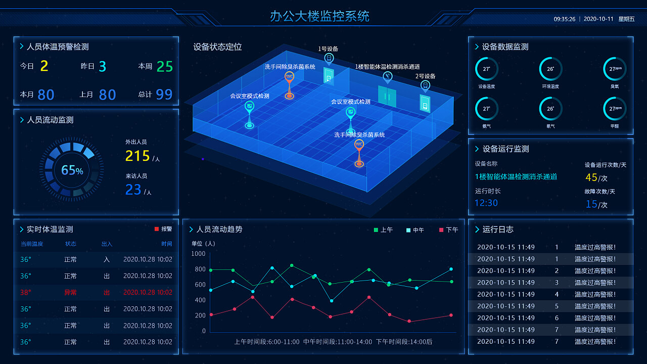
最近接到产品经理一个需求,在 TB 仪表板中部件的下面可以添加背景图片,实现类似如下的效果:
TB 仪表板整个界面是支持背景图设置的,单个部件只支持背景颜色设置,还不支持背景图片设置,原本想着加个背景图片设置功能就可以解决,结果被告知可能会存在两个部件共用一个背景图片的需求,这就有些麻烦了…
解决方案
经过我一番推敲,终于找到了一个合理的解决方案,那就是开发一个可拖拽到其他部件底部的图片部件,将上方的部件背景设置为透明,即可实现预期效果。
开发一个新的部件这个我有经验,难点在于实现拖拽的其他部件下方的部件,这个目前 TB 是不支持的。
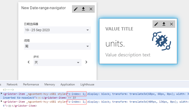
在开发者工具中可以查看到,两个部件元素样式 z-index: 1 一致,均在一个层级上,所以无法重叠。
查看项目代码发现,该功能用到了网格布局插件:angular-gridster2,那么就查查看它的官网支不支持重叠功能了。
- github:
https://github.com/tiberiuzuld/angular-gridster2(1.2k)哎呦,star还不低的样子。 - 官方文档:
https://tiberiuzuld.github.io/angular-gridster2
官方文档是英文的,在我蹩脚的英文阅读水平下,终于找到了该功能:https://tiberiuzuld.github.io/angular-gridster2/multiLayer,感谢官方文档贴心的带 demo 演示功能。
允许项目分层显示关键参数:allowMultiLayer:allow items show in layers。
确定方案可行,那就开干!
背景图片部件
部件高级设置
首先我将背景图片部件定义为 Cards 部件库的一种,所以我在 ui-ngx\src\app\modules\home\components\widget\lib\settings\cards 目录下创建部件设置文件 image-widget-settings.component.html 和 image-widget-settings.component.ts。
其中 image-widget-settings.component.html 代码:
1
2
3
4
5
6
7
8
9
10
11
12
13
14
15
16
17
18
<section class="tb-widget-settings" [formGroup]="imageWidgetSettingsForm">

  <fieldset class="fields-group">
    <legend class="group-title" translate>widgets.image.settings</legend>
    <div fxLayout.xs="column" fxLayout="column" fxLayoutGap="8px">
      <!--上传图片-->
      <tb-image-input label="widgets.image.imageUrl"
                      formControlName="imageUrl">
      </tb-image-input>
      <!--是否为背景图片-->
      <mat-slide-toggle formControlName="isUnderLayer" class="slide-block">
        widgets.image.isUnderLayer
      </mat-slide-toggle>
    </div>
  </fieldset>

</section>
用 FormGroup 表单控件 imageWidgetSettingsForm 存储数据,数据字段 imageUrl 用存储背景图,使用 TB 的 tb-image-input 上传图片组件。另一个数据字段 isUnderLayer 用来存储是否设定为背景图片,即是否可拖拽到其他部件下方,使用 UI 插件 Material 的滑块开关组件 mat-slide-toggle 来实现。
image-widget-settings.component.ts 代码如下:
1
2
3
4
5
6
7
8
9
10
11
12
13
14
15
16
17
18
19
20
21
22
23
24
25
26
27
28
29
30
31
32
33
34
35
36
37
38
39
40
41
42
43
44
45
46
47
import { Component } from '@angular/core';
import { WidgetSettings, WidgetSettingsComponent } from '@shared/models/widget.models';
import { FormBuilder, FormGroup } from '@angular/forms';
import { Store } from '@ngrx/store';
import { AppState } from '@core/core.state';

@Component({
  selector: 'tb-image-widget-settings',
  templateUrl: './image-widget-settings.component.html',
  styleUrls: ['./../widget-settings.scss']
})
export class ImageWidgetSettingsComponent extends WidgetSettingsComponent {

  /*FormGroup表单*/
  imageWidgetSettingsForm: FormGroup;

  constructor(protected store: Store<AppState>,
              private fb: FormBuilder) {
    super(store);
  }

  protected settingsForm(): FormGroup {
    return this.imageWidgetSettingsForm;
  }

  /*初始化数据字段*/
  protected defaultSettings(): WidgetSettings {
    return {
      imageUrl: '',
      isUnderLayer: true,
    };
  }

  /*数据字段设置*/
  protected onSettingsSet(settings: WidgetSettings) {
    this.imageWidgetSettingsForm = this.fb.group({
      imageUrl: [settings.imageUrl, []],
      isUnderLayer: [settings.isUnderLayer, []]
    });
  }

  /*数据字段验证*/
  protected updateValidators(emitEvent: boolean) {
    this.imageWidgetSettingsForm.get('imageUrl').updateValueAndValidity({emitEvent});
    this.imageWidgetSettingsForm.get('isUnderLayer').updateValueAndValidity({emitEvent});
  }
}
代码并不多,我就都贴上了,定义组件选择器 tb-image-widget-settings,定义 FormGroup 表单 imageWidgetSettingsForm, 初始化数据字段 imageUrl 和 isUnderLayer,剩下的数据设置和验证功能和其他的部件设置写法是一致的。
最后记得将 Class ImageWidgetSettingsComponent 在部件设置模块文件 widget-settings.module.ts 中引入声明和导出。
1
2
3
4
5
6
7
8
9
10
11
12
13
14
15
16
17
18
19
20
21
import {
  ImageWidgetSettingsComponent
} from '@home/components/widget/lib/settings/cards/image-widget-settings.component';

@NgModule({
  declarations: [
  ...
  ImageWidgetSettingsComponent
  ],
  exports: [
  ...
  ImageWidgetSettingsComponent
  ]

export class WidgetSettingsModule {
}

export const widgetSettingsComponentsMap: {[key: string]: Type<IWidgetSettingsComponent>} = {
  ...
  'tb-image-widget-settings': ImageWidgetSettingsComponent
};
部件功能展示
创建好部件的高级设置功能,我们来将部件效果展示出来。
在 ui-ngx\src\app\modules\home\components\widget\lib 目录下创建三个文件 image-widget.component.html、image-widget.component.ts 和 image-widget.component.css。
其中 image-widget.component.html 代码如下:
1
2
<div class="bg-img" style="background-image: url('')">
</div>
超级简单有木有,因为就是一个背景图效果展示而已,背景图片的路径就是 imageUrl。
image-widget.component.css 代码如下:
1
2
3
4
5
6
7
8
9
10
11
:host {
  display: flex;
  width: 100%;
  height: 100%;
  .bg-img{
    width: 100%;
    height: 100%;
    background-repeat: no-repeat;
    background-size: 100% 100%;
  }
}
Css 用来设置部件的宽高和背景图片的样式,background-size: 100% 100%; 实现背景图片可随着容器拉伸,达到图片全部展示的效果。
image-widget.component.ts 代码如下:
1
2
3
4
5
6
7
8
9
10
11
12
13
14
15
16
17
18
19
20
21
22
23
24
25
26
27
28
29
30
31
32
33
import { ChangeDetectorRef, Component, Input, OnInit } from '@angular/core';
import { PageComponent } from '@shared/components/page.component';
import { WidgetContext } from '@home/models/widget-component.models';
import { Store } from '@ngrx/store';
import { AppState } from '@core/core.state';

interface ImageWidgetSettings {
  imageUrl: string;
  isUnderLayer: boolean;
}

@Component({
  selector: 'tb-image-widget',
  templateUrl: './image-widget.component.html',
  styleUrls: ['./image-widget.component.css']
})
export class ImageWidgetComponent extends PageComponent implements OnInit {

  settings: ImageWidgetSettings;

  @Input()
  ctx: WidgetContext;

  constructor(protected store: Store<AppState>,
              protected cd: ChangeDetectorRef) {
    super(store);
  }

  ngOnInit(): void {
    this.ctx.$scope.imageWidget = this;
    this.settings = this.ctx.settings;
  }
}
其中的 settings 字段存储部件设置的 imageUrl 和 isUnderLayer。
和高级设置文件一样,Class ImageWidgetComponent 需要在部件模块文件 widget-components.module.ts 中引入声明和导出。
1
2
3
4
5
6
7
8
9
10
11
12
13
14
import { ImageWidgetComponent } from '@home/components/widget/lib/image-widget.component';

@NgModule({
  declarations: [
  ...
  ImageWidgetComponent
  ],
  exports: [
  ...
  ImageWidgetComponent
  ]

export class WidgetComponentsModule {
}
设置部件层级
咳咳,敲黑板,接下来是最核心的部分,怎么设置背景图片部件的层级,实现可拖拽到其他部件的底层。
首先找到 angular-gridster2 选项设置的代码,在 dashboard.component.ts 文件中,添加分层选项 allowMultiLayer:
1
2
3
4
5
6
7
8
9
10
11
12
13
14
15
16
17
18
19
20
21
22
23
24
25
26
27
28
29
30
31
32
33
34
35
36
37
38
39
ngOnInit(): void {
    this.dashboardWidgets.parentDashboard = this.parentDashboard;
    if (!this.dashboardTimewindow) {
      this.dashboardTimewindow = this.timeService.defaultTimewindow();
    }
    this.gridsterOpts = {
      gridType: GridType.ScrollVertical,
      keepFixedHeightInMobile: true,
      disableWarnings: false,
      disableAutoPositionOnConflict: false,
      pushItems: false,
      swap: false,
      maxRows: 100,
      minCols: this.columns ? this.columns : 24,
      maxCols: 3000,
      maxItemCols: 1000,
      maxItemRows: 1000,
      maxItemArea: 1000000,
      outerMargin: true,
      margin: isDefined(this.margin) ? this.margin : 10,
      minItemCols: 1,
      minItemRows: 1,
      defaultItemCols: 8,
      defaultItemRows: 6,

      <!--新增参数-->
      allowMultiLayer: true,
      baseLayerIndex: 1,
      defaultLayerIndex: 2,
      maxLayerIndex: 10,

      resizable: {enabled: this.isEdit},
      draggable: {enabled: this.isEdit},
      itemChangeCallback: item => this.dashboardWidgets.sortWidgets(),
      itemInitCallback: (item, itemComponent) => {
        (itemComponent.item as DashboardWidget).gridsterItemComponent = itemComponent;
      }
    };
  }
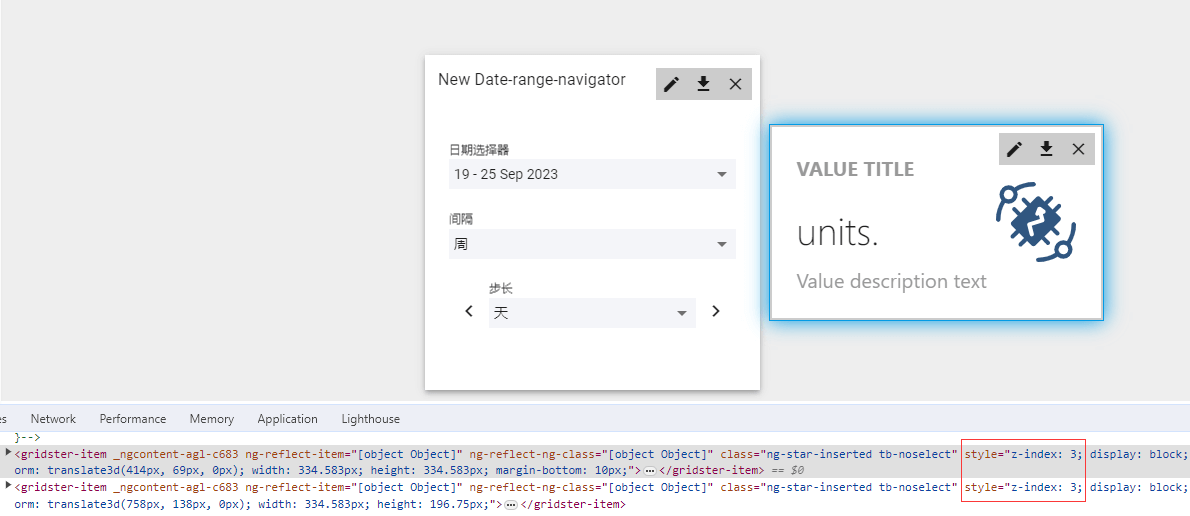
allowMultiLayer: true 设置为允许分层重叠,因为其他部件要在背景图片部件的上方,所以将默认层 defaultLayerIndex 设置 2,按照官方文档的说法,final z-index should be baseLayerIndex + layerIndex,所以最终部件的层级为 baseLayerIndex + defaultLayerIndex,也就是层级为 3,打开控制工具查看,正好为 3。
那么问题来了,这是设置整个网格布局的参数,单个部件的层级怎么设置,官方文档 API 并没有给出。
于是,我想到了面向 ChatGPT 编程:
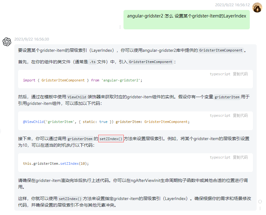
哦?setZIndex(),原来如此!还好我有 ChatGPT,真是… 真是胡说八道啊,试了压根不生效好叭!亏我这么相信你… 压根没这个方法,真是一本正经胡编乱造啊… 算了,看你之前帮了我那么多次,这次我就不跟你计较了…
靠人不如靠己,继续研究官方文档我发现右上角有查看源码按钮… 点开阅读源码终于找到如何设置 layerIndex。
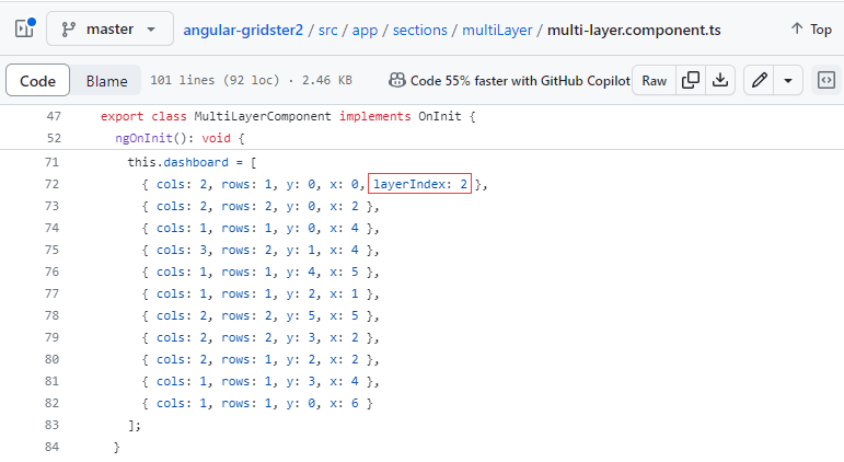
原来将数据设置一个 layerIndex 就可以了,找到循环体数据源打印出来:
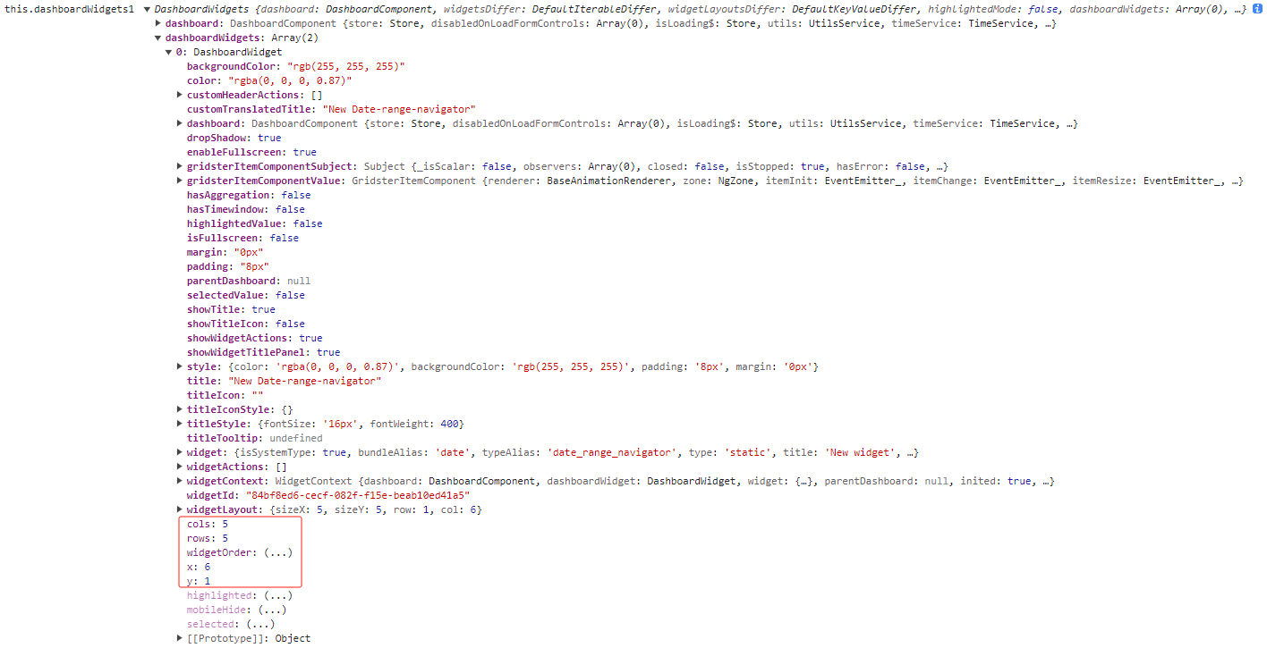
果然找到了栅格单元参数 cols, rows, y, x,我们只需要找到对应的背景图片部件,设置上 layerIndex 属性即可,那怎么找到呢?对了,就是通过高级设置的字段 isUnderLayer,在 dashboard.component.ts 文件中 updateWidgets() 方法体中加入判断。
1
2
3
4
5
6
7
8
9
10
11
private updateWidgets() {
    this.dashboardWidgets.setWidgets(this.widgets, this.widgetLayouts);
    this.dashboardWidgets.doCheck();

    <!--背景图片部件层级设置-->
    this.dashboardWidgets.dashboardWidgets.forEach((widget) => {
      if (widget.widgetContext.widget.config.settings?.isUnderLayer) {
        widget.layerIndex = 1;
      }
    });
  }
因为其他的部件我设置了默认 layerIndex 为 2,背景图片部件在其他部件的下层,所以设置更小的值 1。
最终效果演示
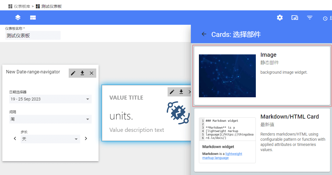
首先我们需要先将背景图片部件添加到部件库中,登录系统管理员账号 sysadmin@thingsboard.org / sysadmin,登录系统管理员账号操作是因为添加后会默认显示为系统部件包。
打开部件库菜单,打开 Cards 部件包,右下角点击添加新的部件类型->创建新的部件类型->静态部件,进行背景图片部件初始化设置:
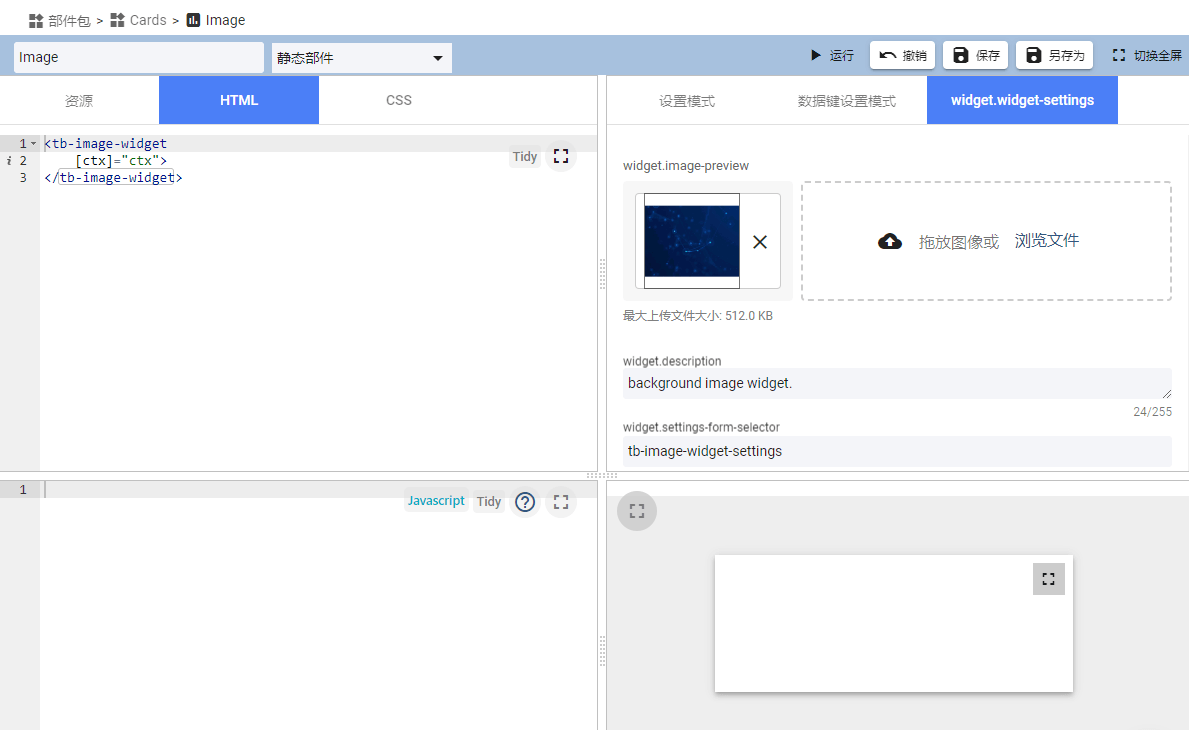
- 设置部件标题,如“Image”
- 设置 HTML :
<tb-image-widget [ctx]="ctx"></tb-image-widget> - 清空 JavaScript 内容
- widget.widget-settings 中 widget.settings-form-selector 设置为
tb-image-widget-settings
其中第 2 项中 [ctx]="ctx" 为组件传值必须项,不能省略;第 4 项的 tb-image-widget-settings 为部件高级设置选择器,不能填错。
添加好部件好,我们在仪表板中添加该部件。
在高级设置中上传一张图片,并将是否为背景图片设置为是,保存后我们来查看下部件元素的 z-index。
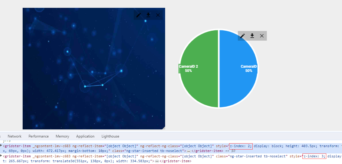
背景图片部件的 z-index 为 2 生效了,接下来就是见证奇迹额时刻!
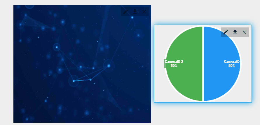
大功告成,Nice~
结语
由于 TB 的受众面很小,所以如果你没研究过 TB 看不懂这篇文章也是很正常的- -,跳过就好,TB 的相关文章更多的是作为本人的一个工作知识记录,如果能对一小部分人有所帮助那就更好啦~
好啦,以上就是 ThingsBoard 前端项目背景图片部件开发的全部内容。
你学“废”了么?
(完)
作者:echeverra
