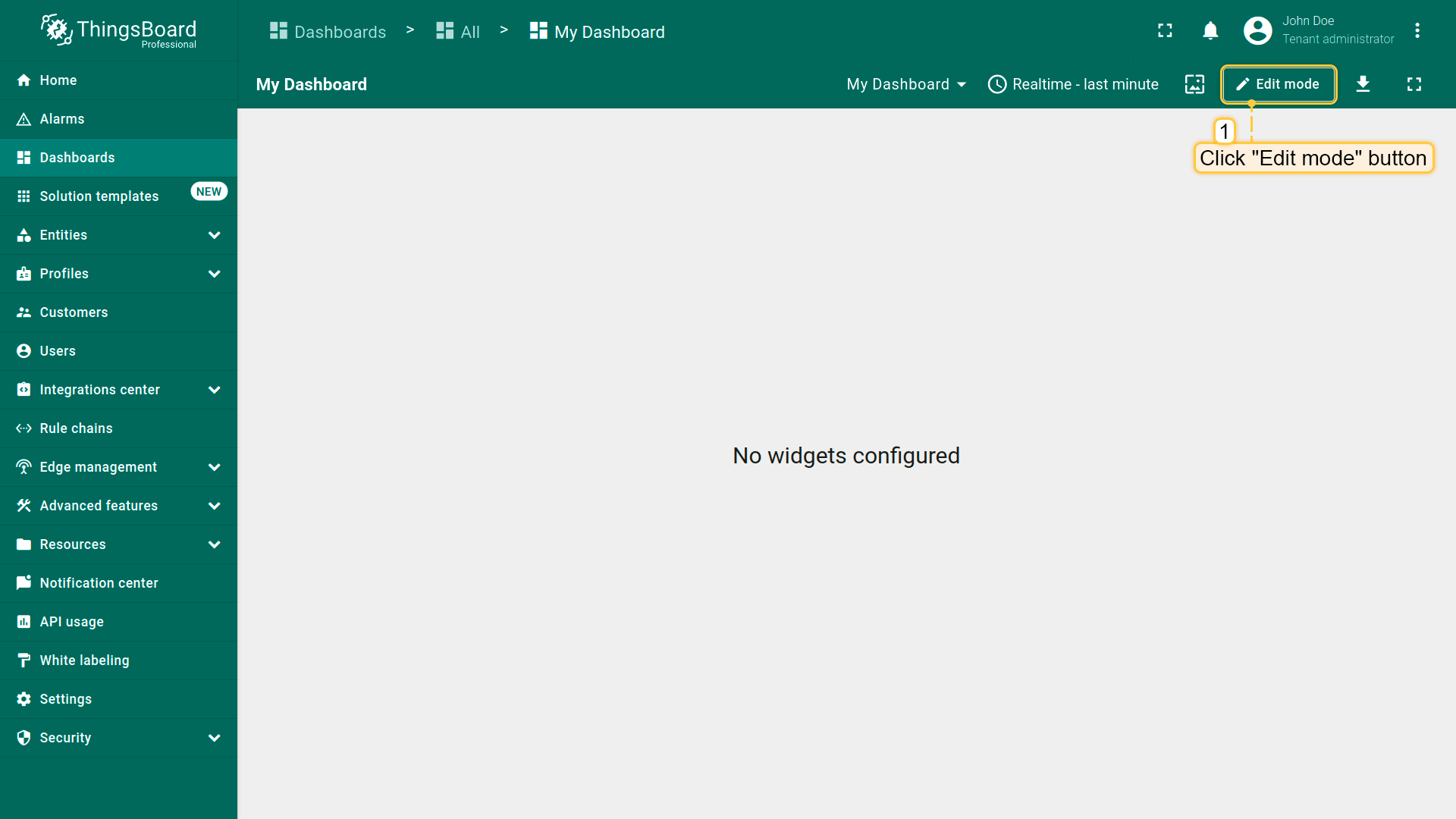
Enter dashboard edit mode by clicking the "Edit mode" button in the upper right corner of the window;
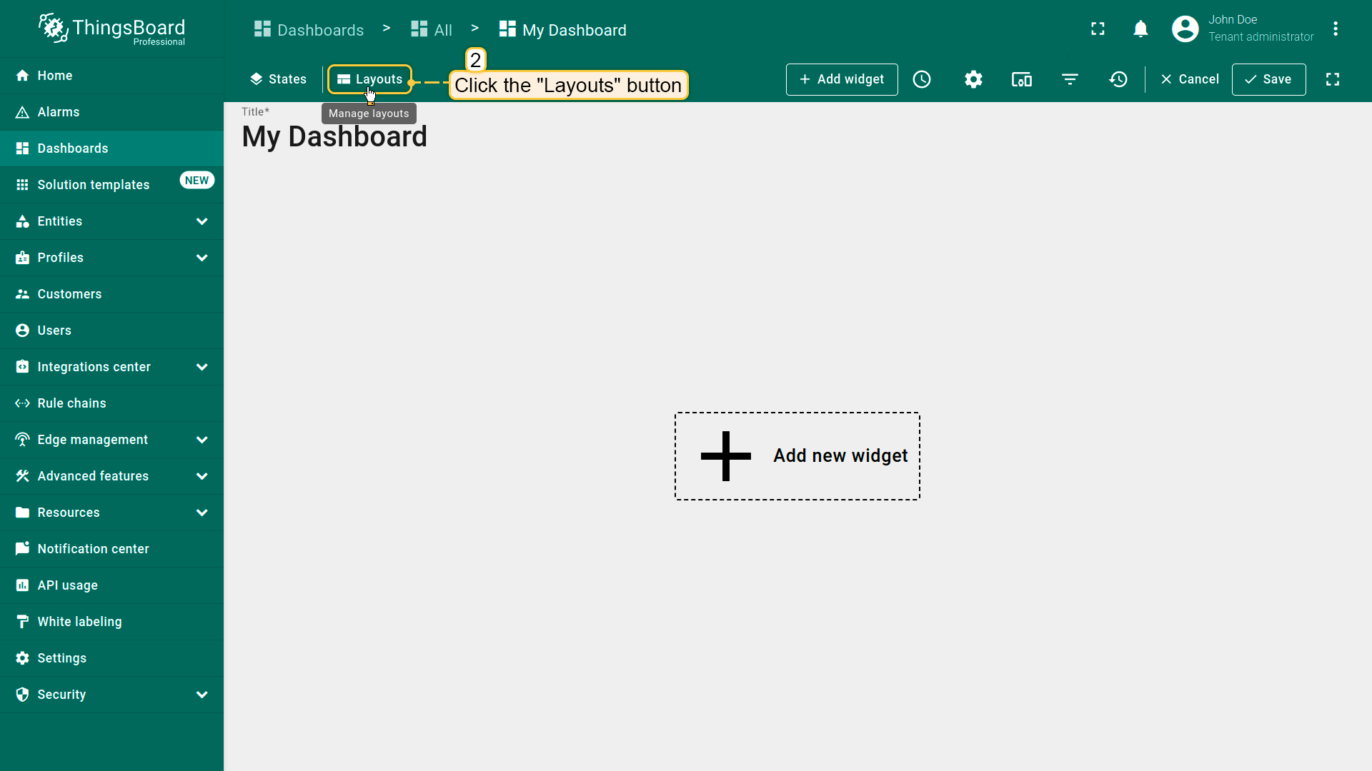
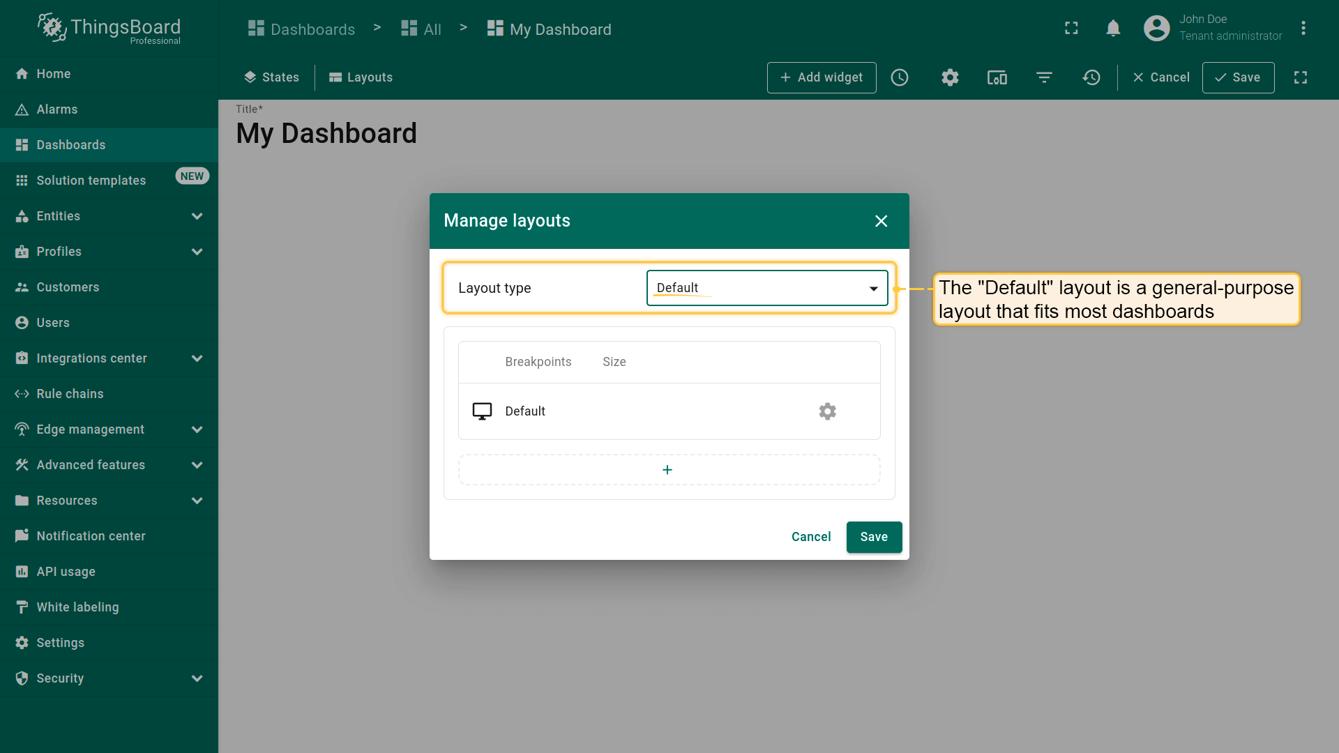
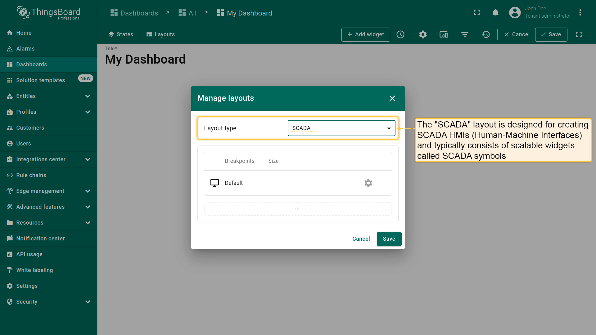
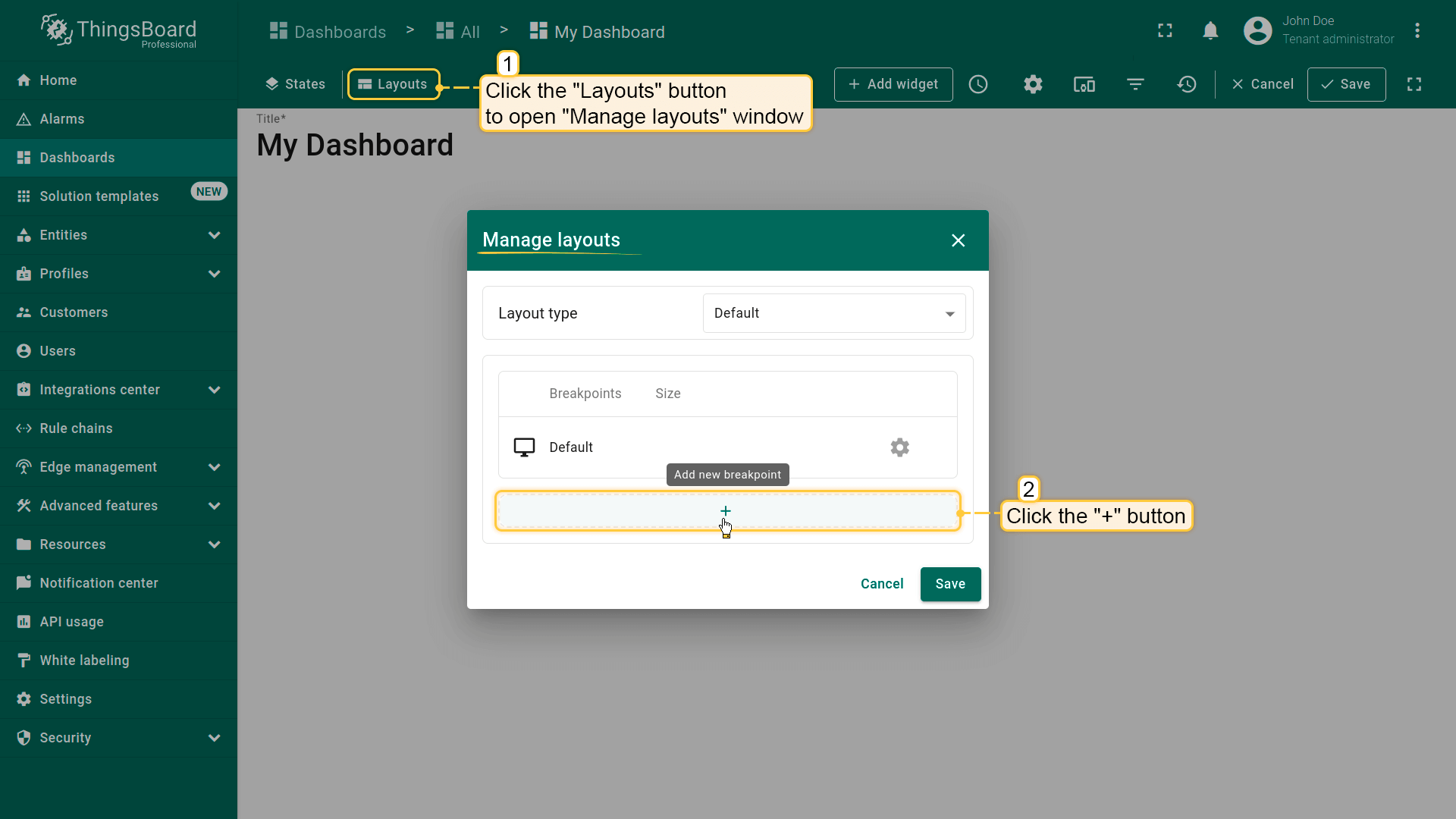
Click the "Layouts" button located in the upper left corner of the dashboard window. This will open the layout management window.
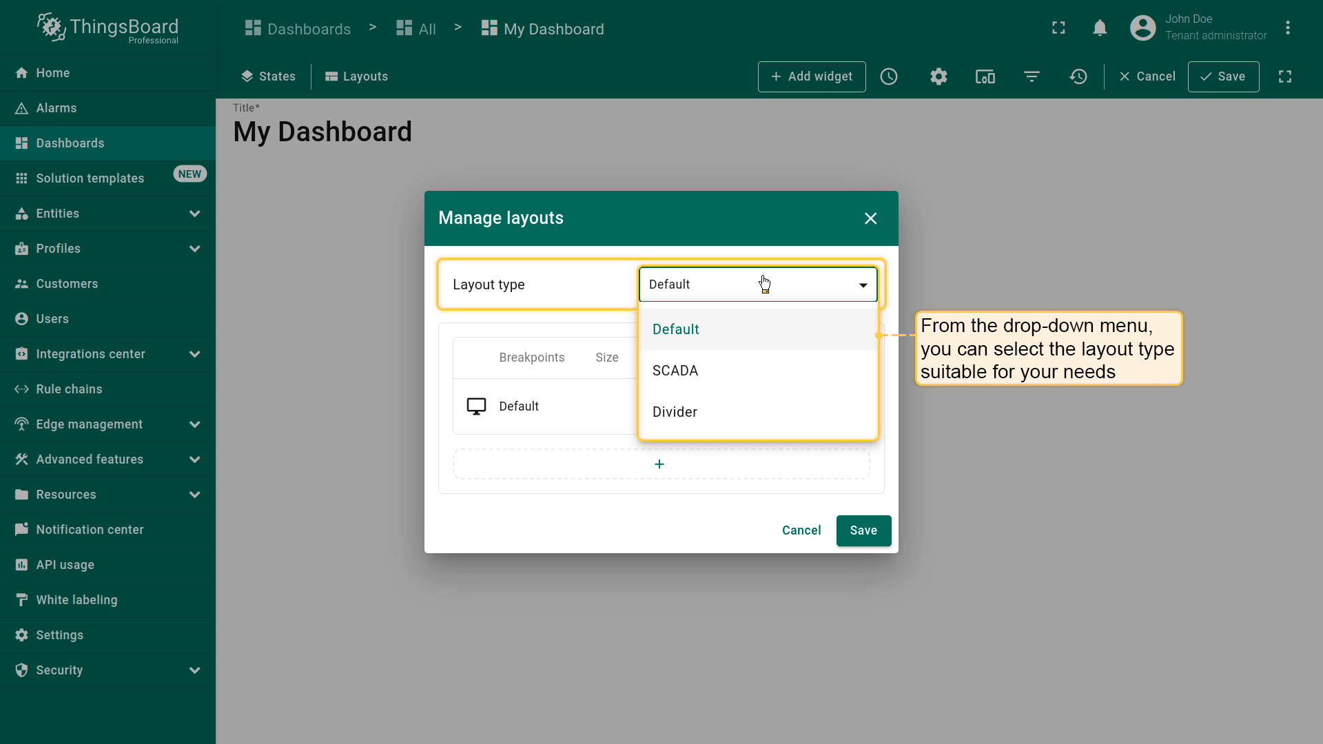
在“Manage layouts”窗口中,可选择适合需求的布局类型:
Default - 灵活的通用布局;
SCADA - 最适合显示SCADA HMI(人机界面);
Divider - 用于视觉分隔区块。
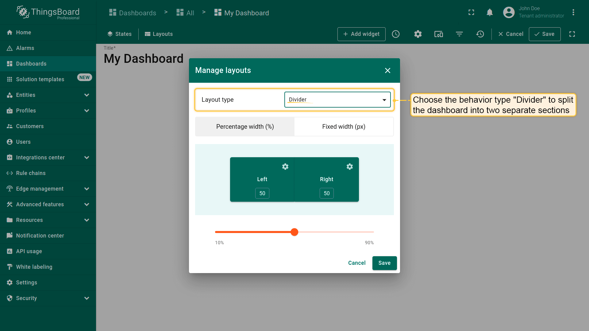
In the "Manage layouts" window, you can select the layout type suitable for your needs: Default, SCADA, or Divider.
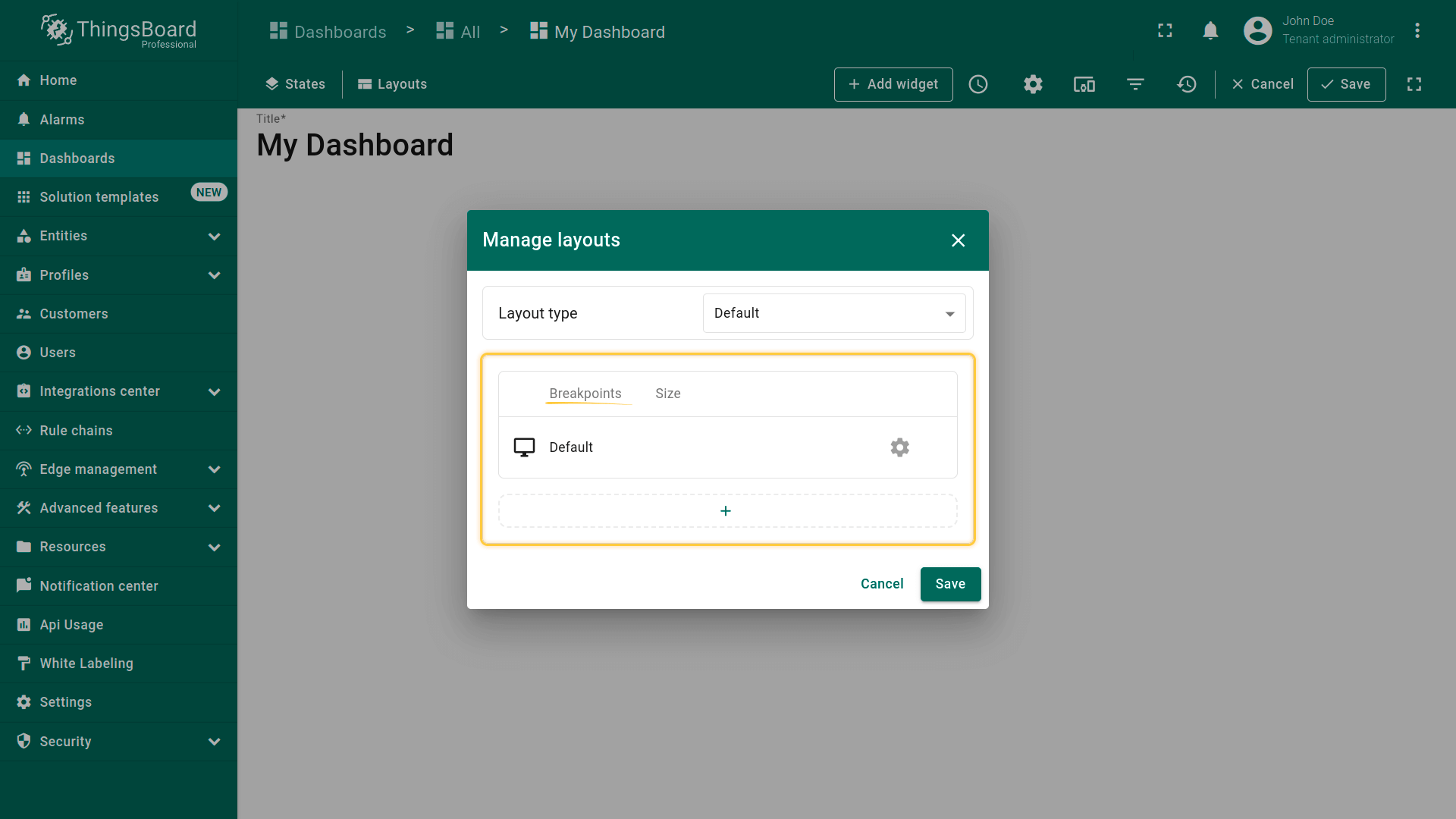
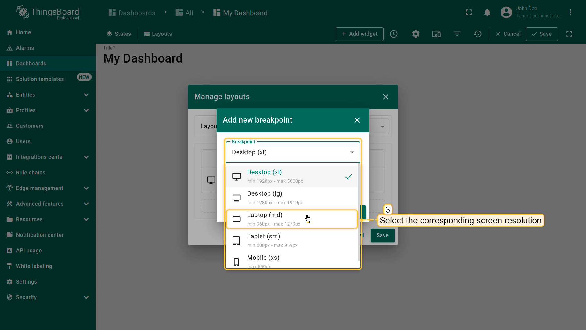
Breakpoints allow you to create responsive layouts that adapt to different screen sizes. You can add and configure breakpoints to ensure your dashboard looks perfect on any device.
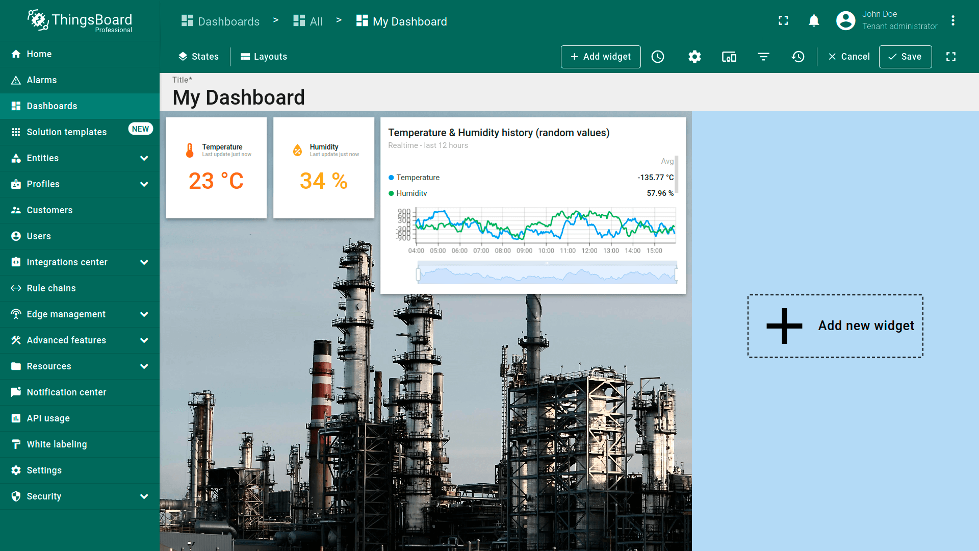
Choose the behavior type "Divider" to split the dashboard into two separate sections: left and right. You can configure the width of these sub-layouts using either a fixed pixel value or a percentage of the screen width.
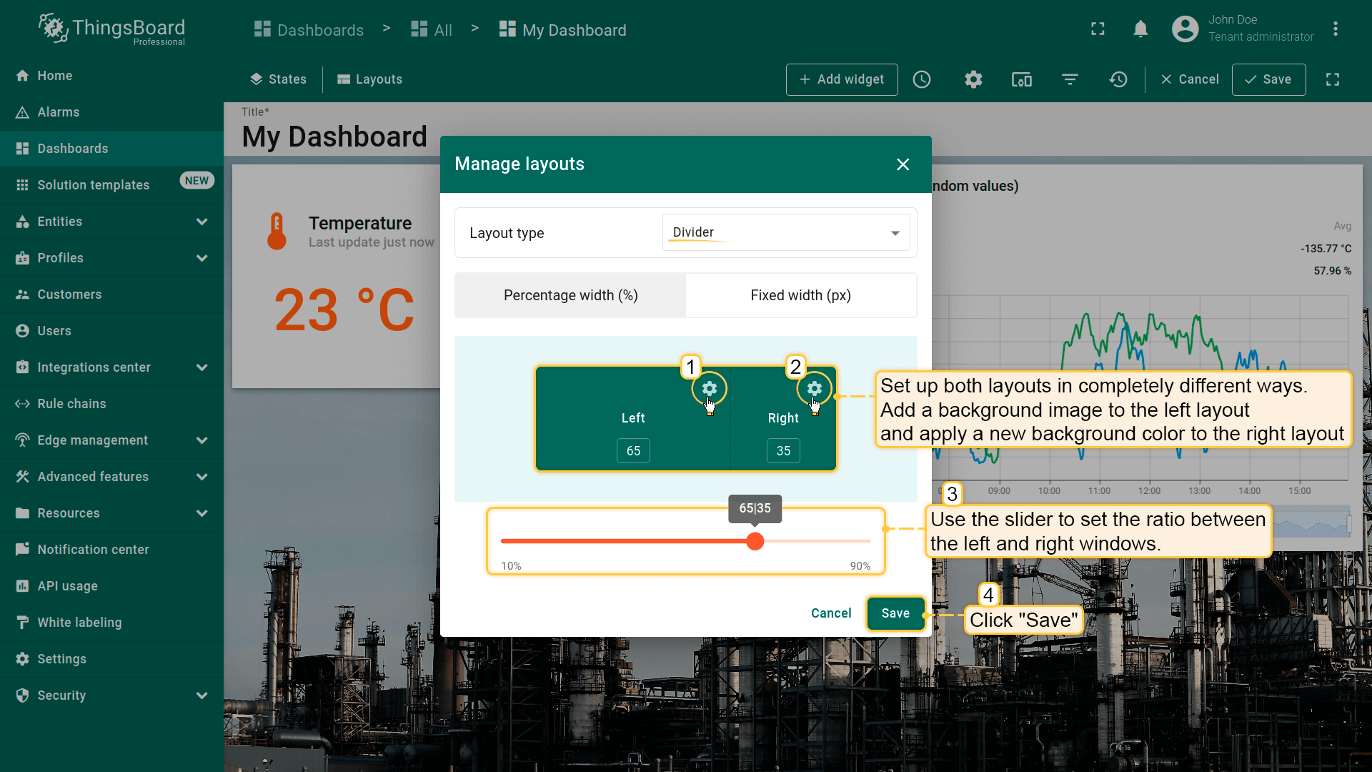
Set up both layouts in completely different ways. Set a different background for each window. And resize the window sizes in a certain percentage ratio to each other. Then save changes.
To add a breakpoint, open the "Manage layouts" window and click the "+" button in the breakpoints table;
Select the breakpoint from the drop-down list;
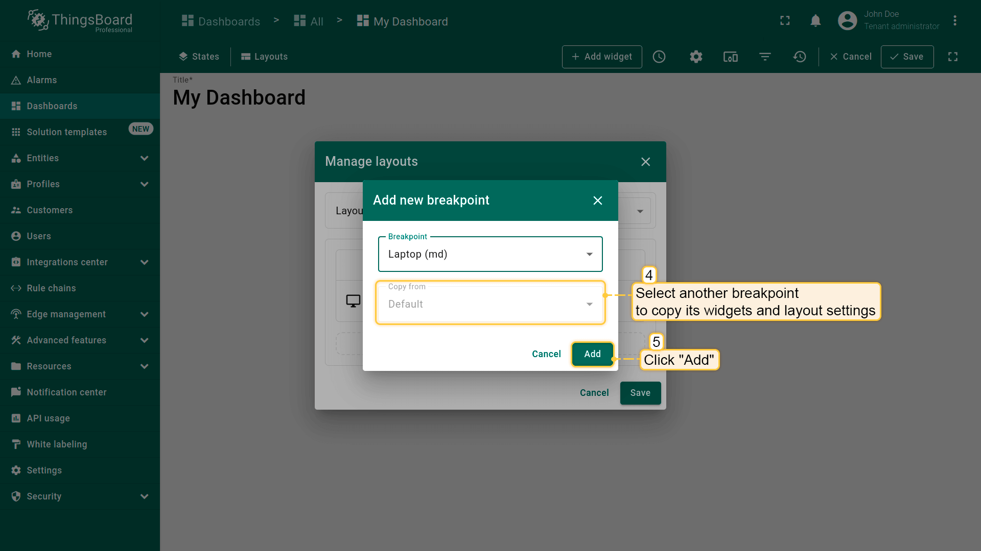
When adding a new breakpoint, you can select the corresponding screen resolution and copy both widgets and layout settings from another breakpoint. Click "Add".
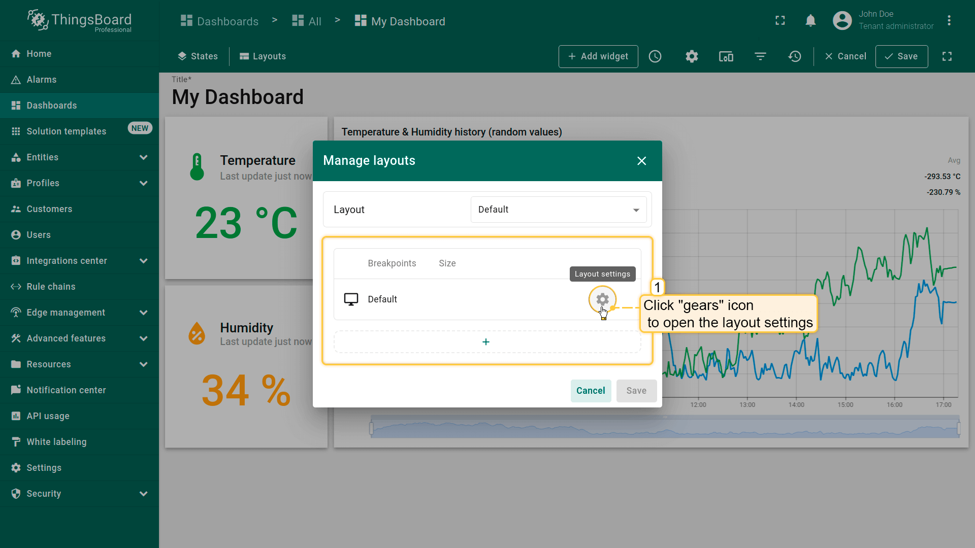
可点击“齿轮”图标打开该断点的布局设置。布局设置决定仪表板的背景配置及部件在仪表板上的排列方式。
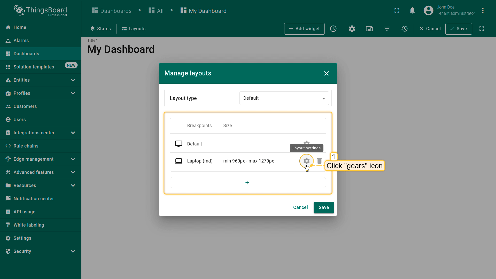
Click the "gears" icon to open the layout settings for that breakpoint;
Layout settings determine the background configurations of the dashboard and how widgets will be arranged on it.
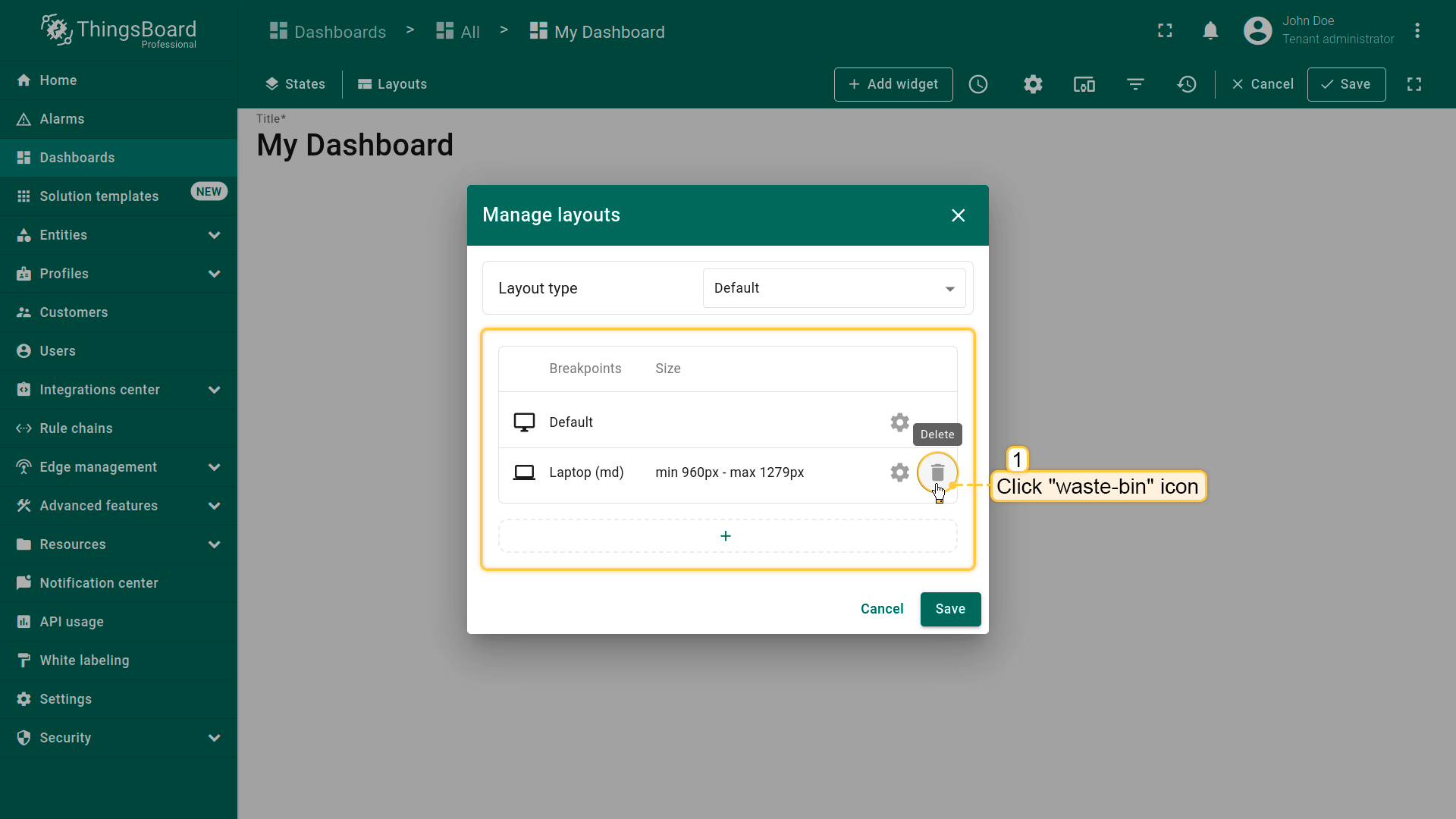
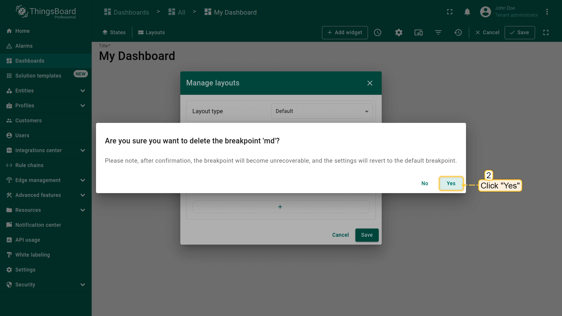
也可点击“垃圾桶”图标删除断点。在对话框中确认删除断点。
Click the "waste-bin" icon to delete a breakpoint;
Confirm deleting the breakpoint in the dialog box.
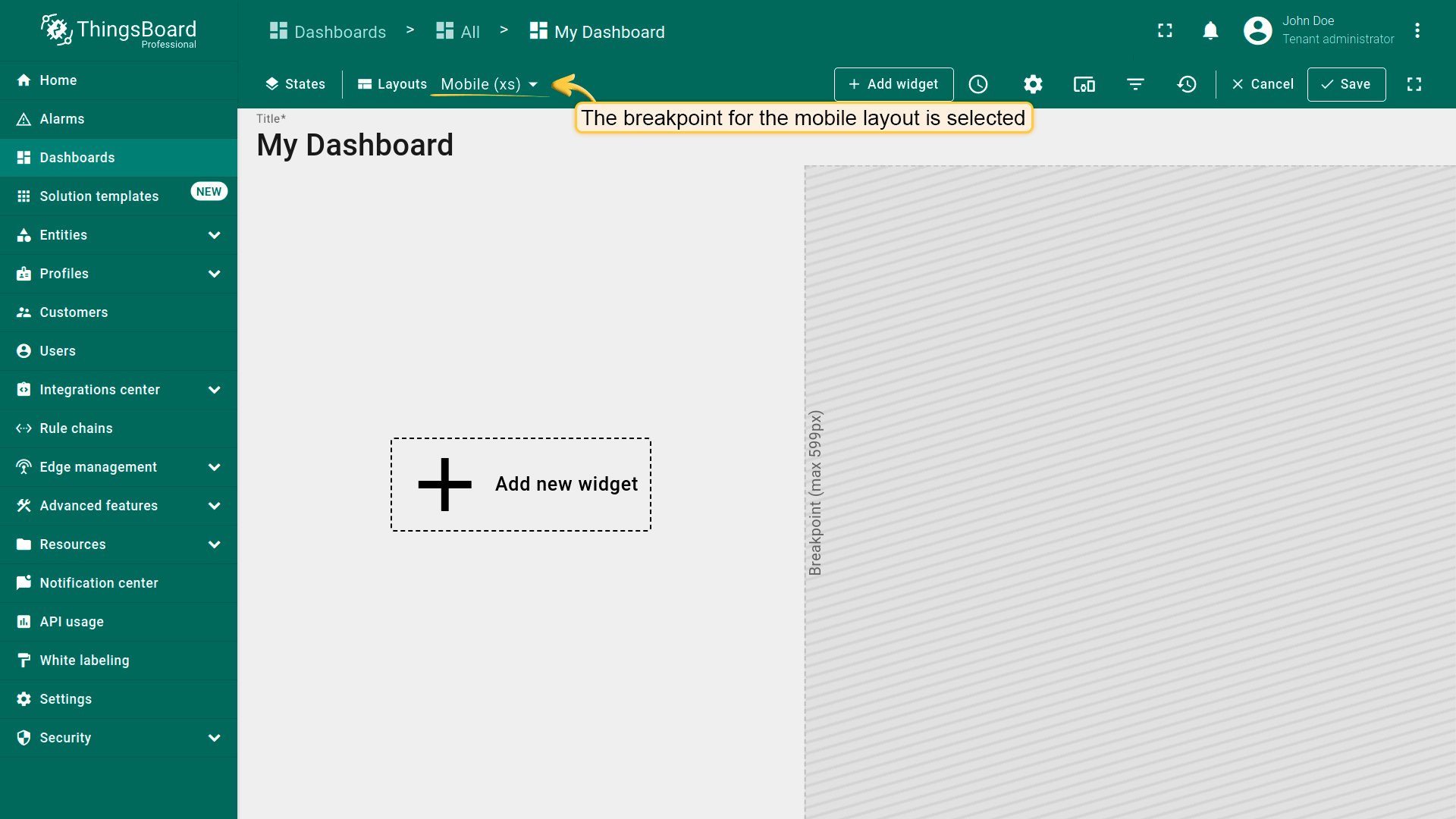
切换断点
用户打开仪表板时,将根据屏幕分辨率自动选择对应的断点布局。
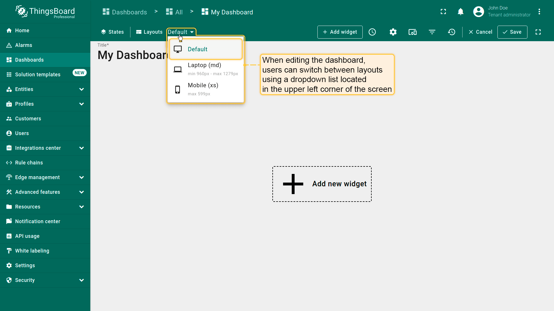
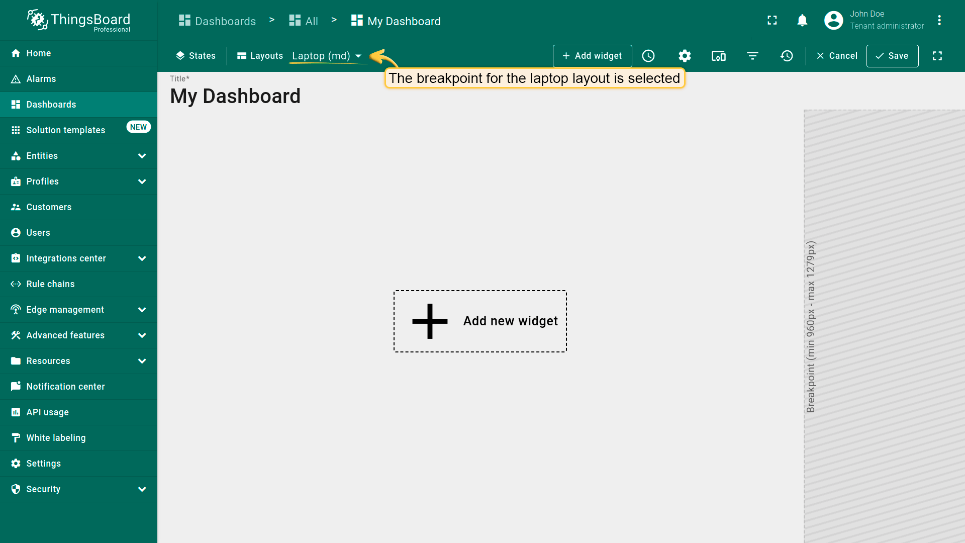
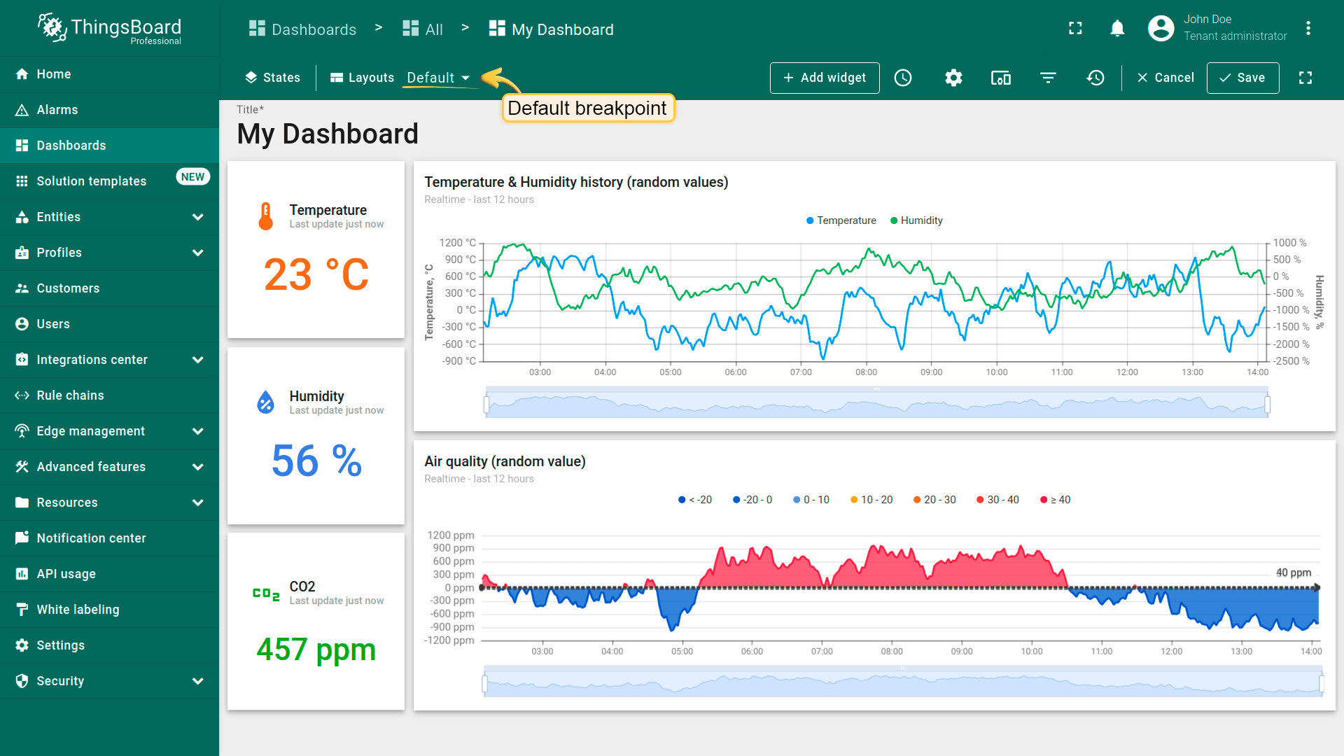
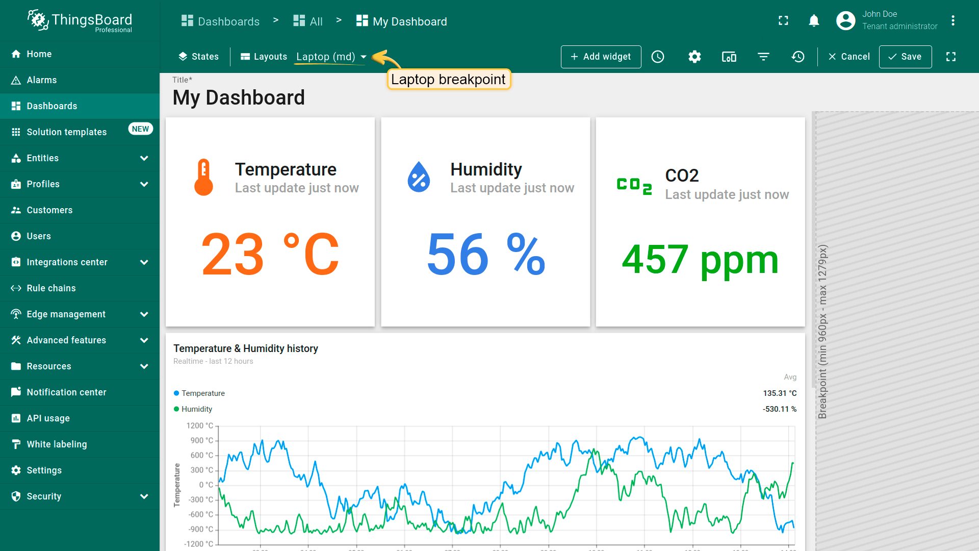
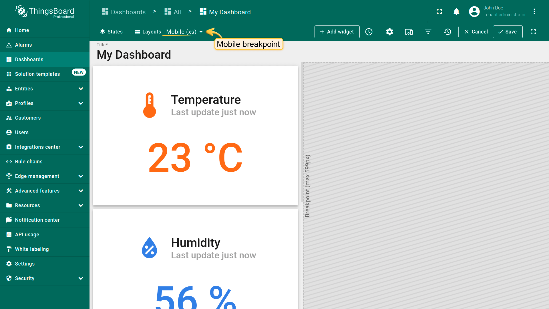
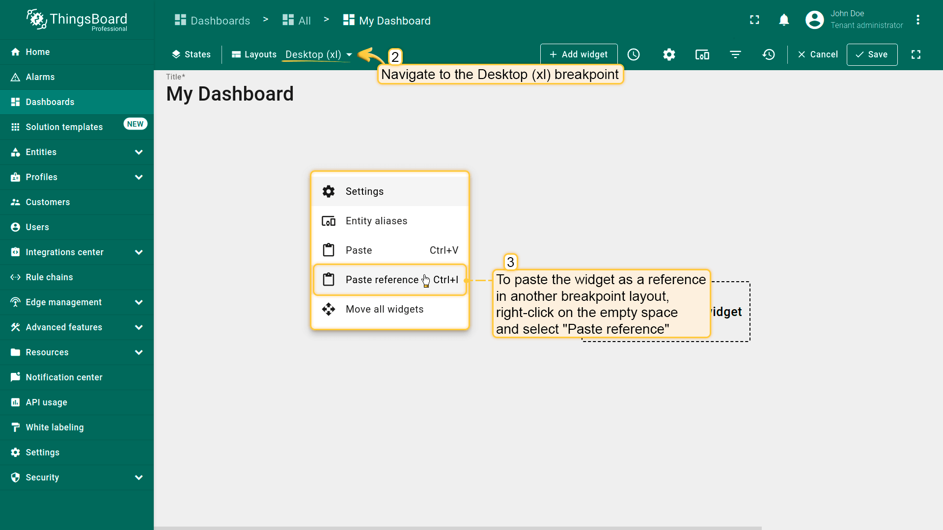
编辑仪表板时,用户可使用屏幕左上角的下拉框在布局间切换。
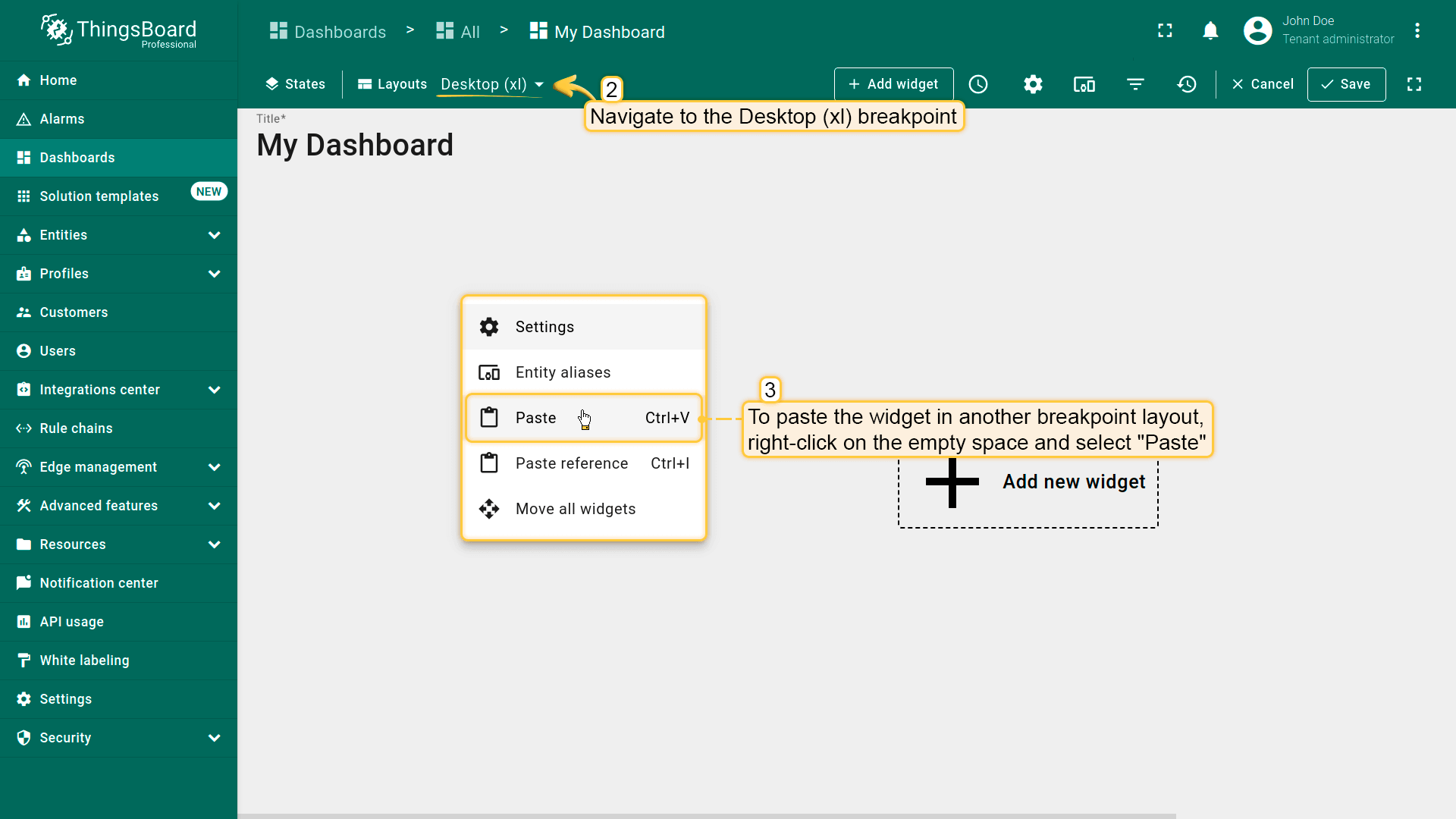
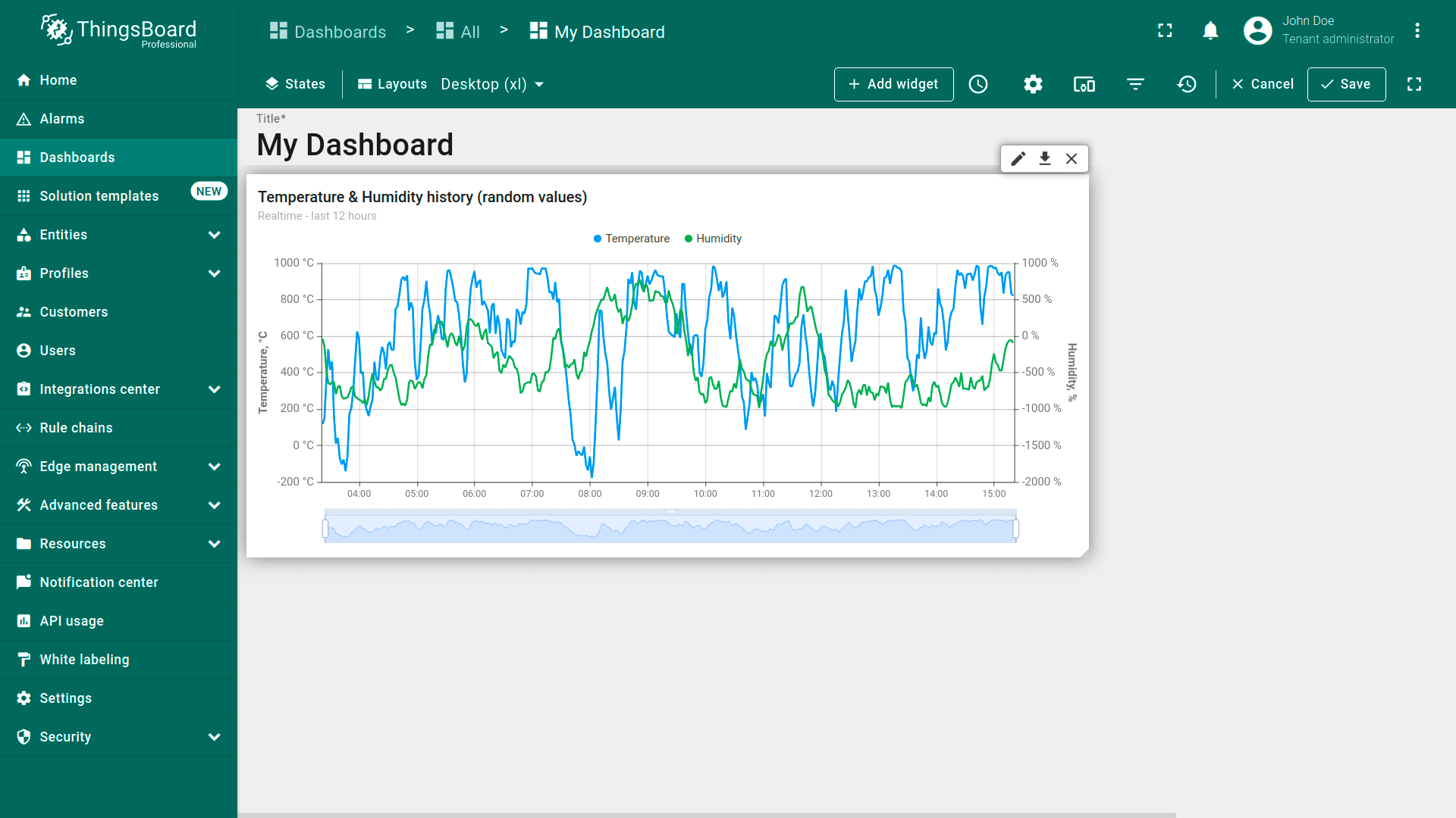
When editing the dashboard, users can switch between layouts using the combobox located in the top-left corner of the screen;
Breakpoint for laptop;
Breakpoint for mobile.
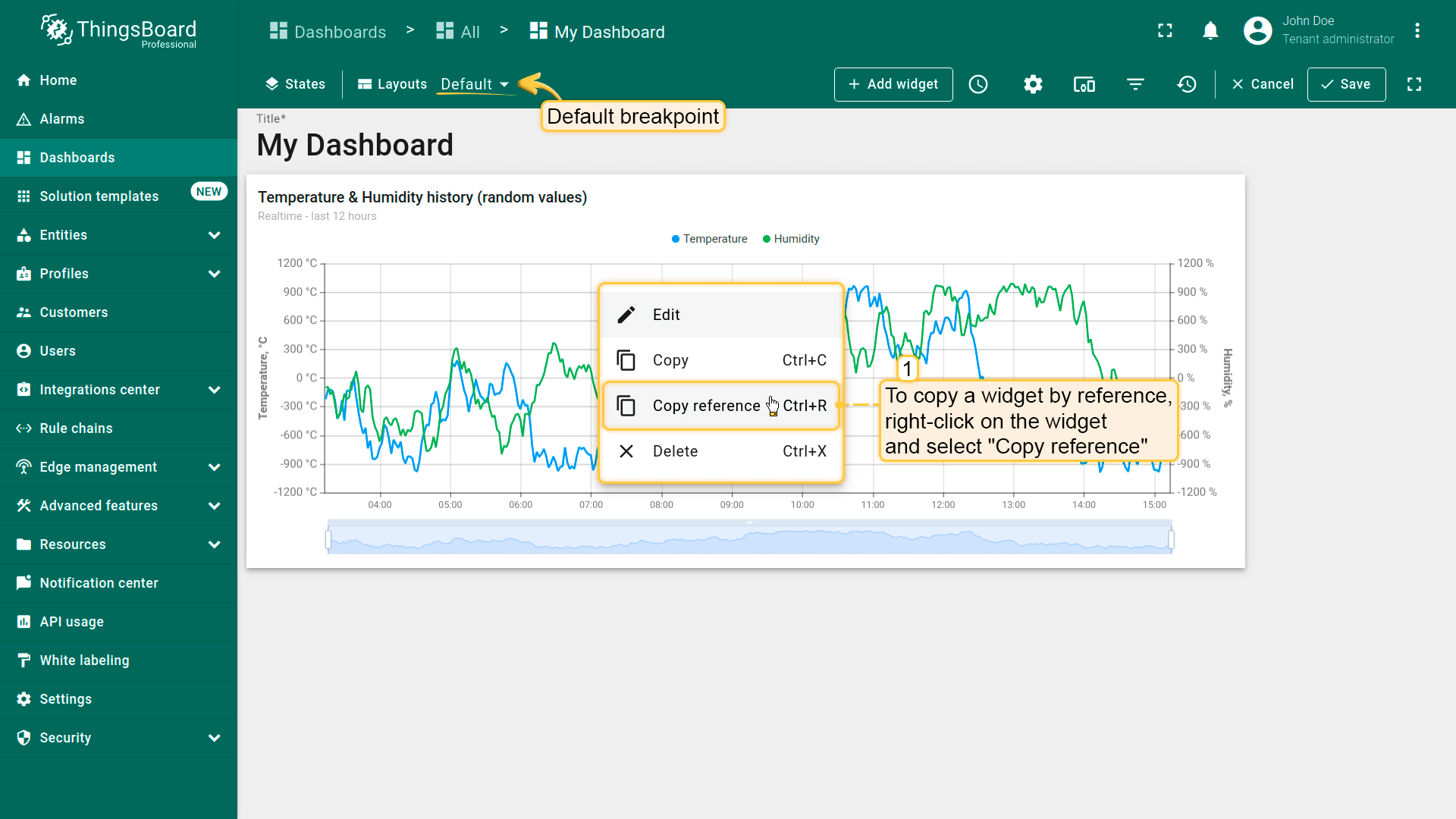
To copy a widget by reference, right-click on the widget and select "Copy reference" (Ctrl+R);
To paste the widget as a reference in another breakpoint layout, right-click on the empty space and select "Paste reference" (Ctrl+I);
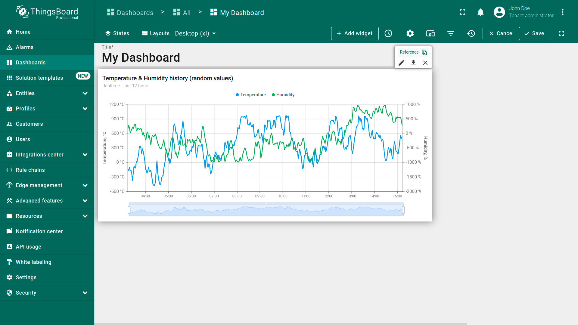
The widget is pasted as a reference.
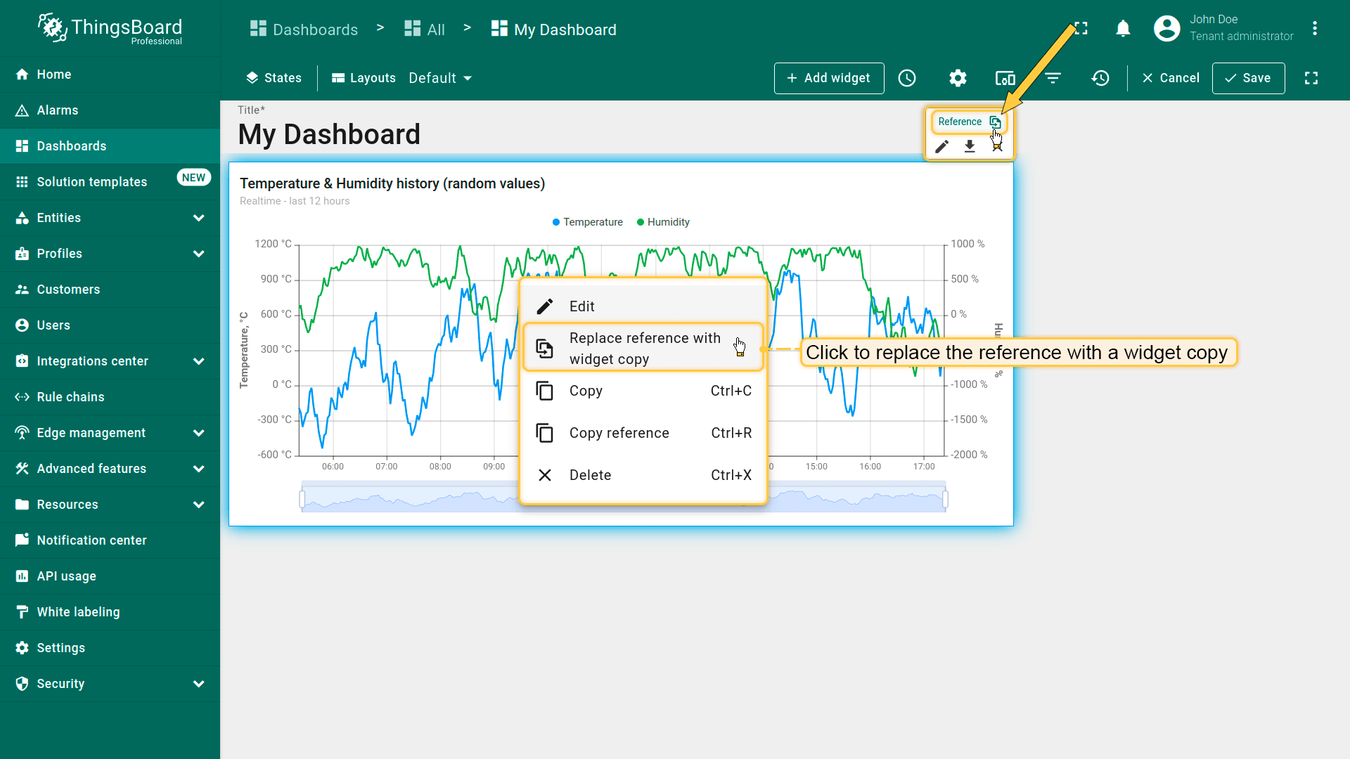
在编辑模式下,可通过部件编辑面板中的“Reference”按钮识别引用部件。
In edit mode, you can identify a referenced widget by the presence of a "Reference" button in the widget's edit panel.
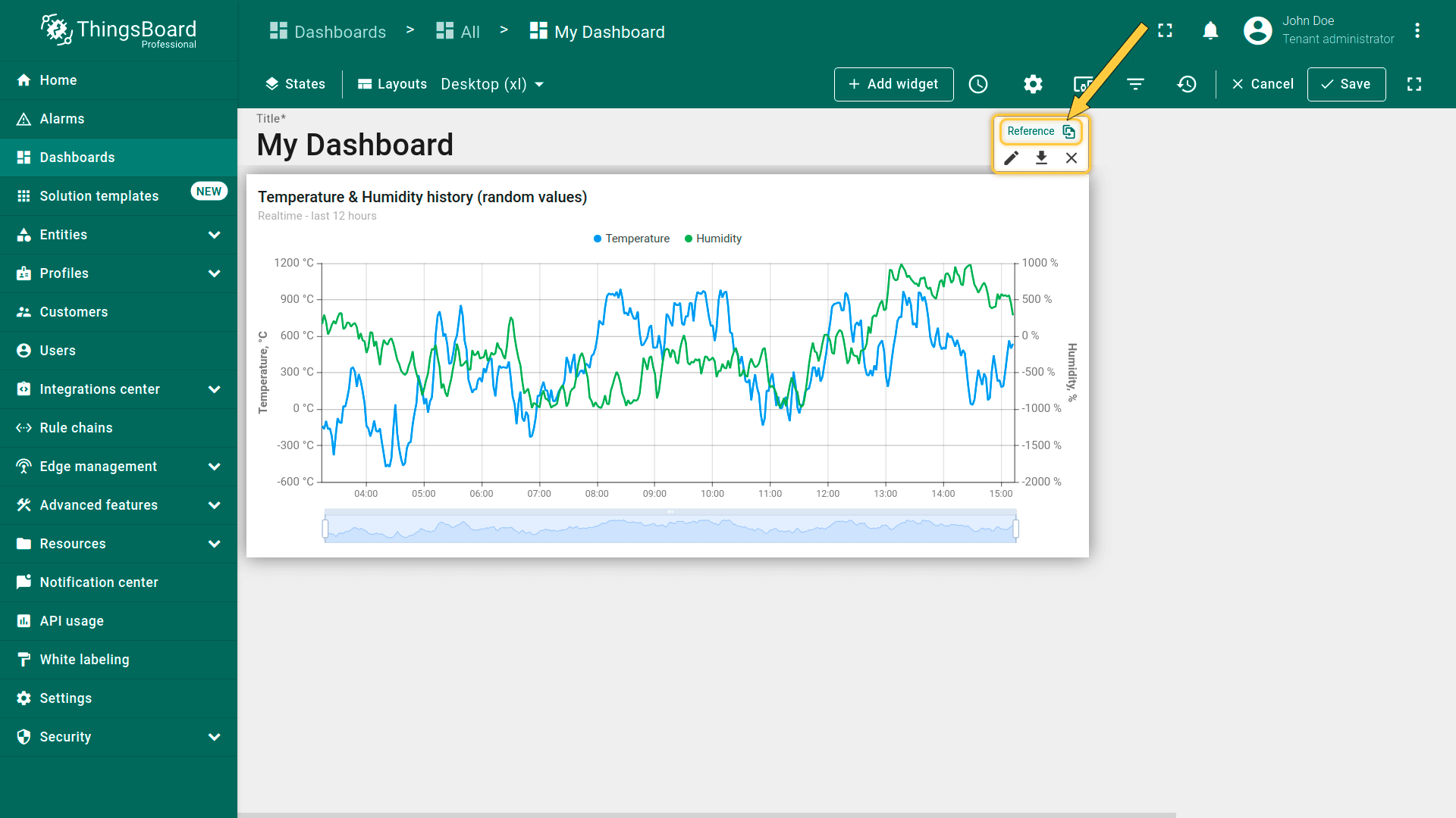
要将引用替换为部件副本,点击部件编辑面板上的“Reference”按钮,或右键点击部件并选择“Replace reference with widget copy”。
To replace the reference with the widget copy, click the "Reference" button on the widget editing panel, or right-click on the widget and select "Replace reference with widget copy".
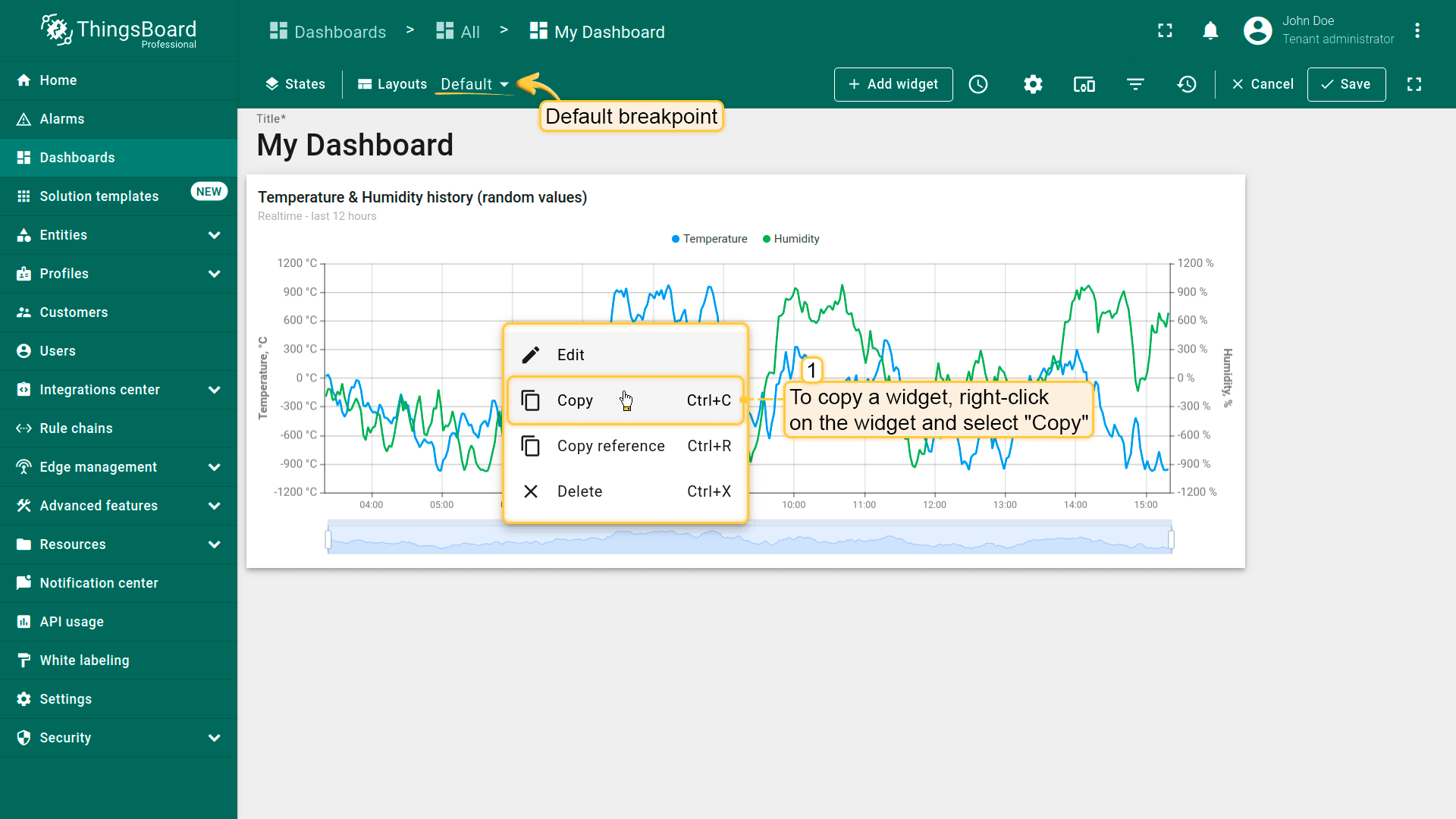
部件副本
部件副本是部件配置的完整独立副本。对副本部件的更改不会影响原始部件。
要复制部件,右键点击部件并选择“Copy”(Ctrl+C);
要将部件粘贴到另一断点布局,右键点击空白处并选择“Paste”(Ctrl+V)。
To copy a widget, right-click on the widget and select "Copy" (Ctrl+C);
To paste the widget in another breakpoint layout, right-click on the empty space and select "Paste" (Ctrl+V);
The widget is pasted. Changes made to the copied widget will not affect the original widget.
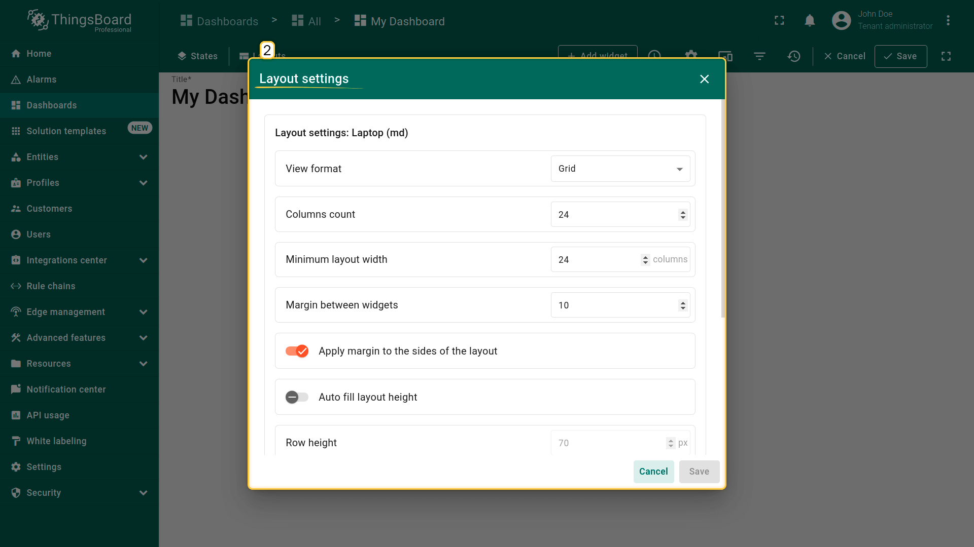
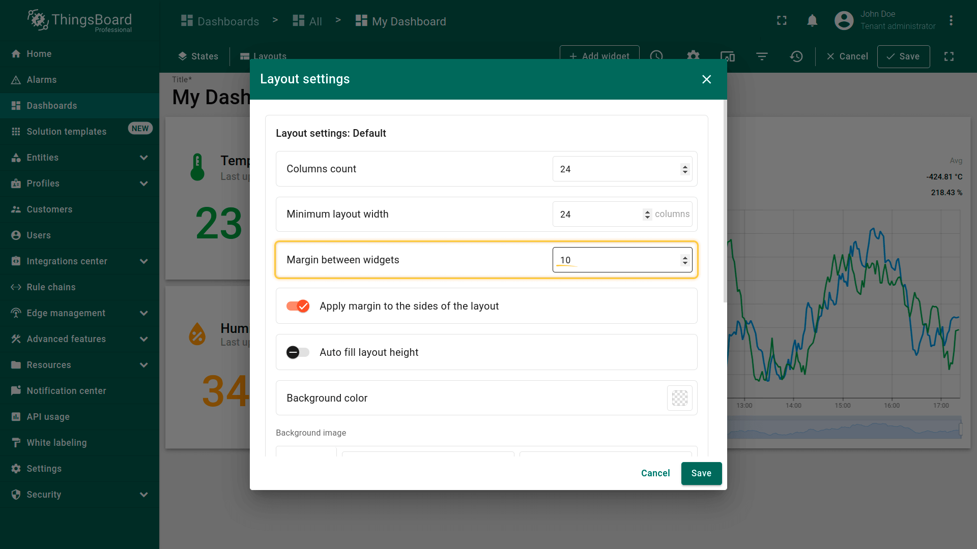
布局设置
点击断点旁的“齿轮”图标打开布局设置。
Click the "gear" icon opposite the breakpoint to open the layout settings.
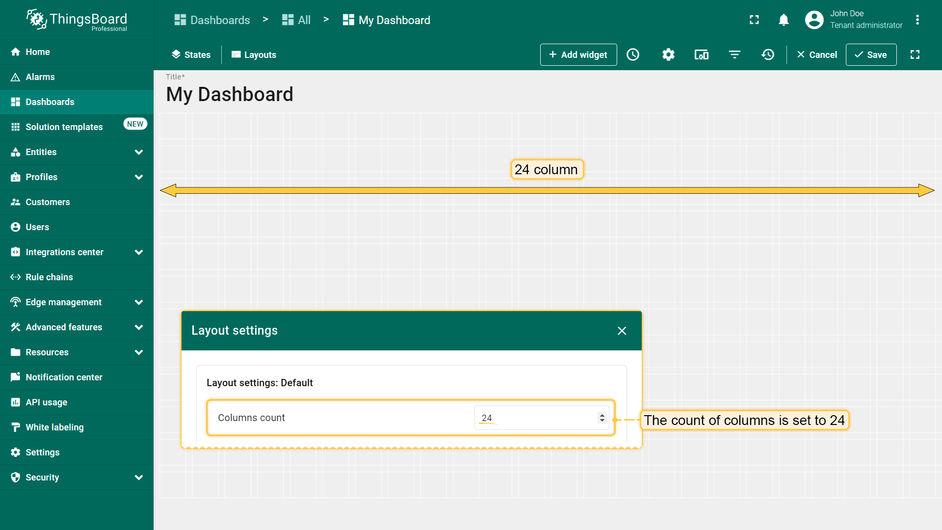
While editing the Dashboard, specifically the size and space of your widgets, you can notice a whitish grid on a gray background. These are columns that determine how many widgets can fit horizontally on the dashboard;
By default, the number of columns is 24. You can increase or decrease their number. The minimum number of columns is 10. The maximum number is 1000 columns.
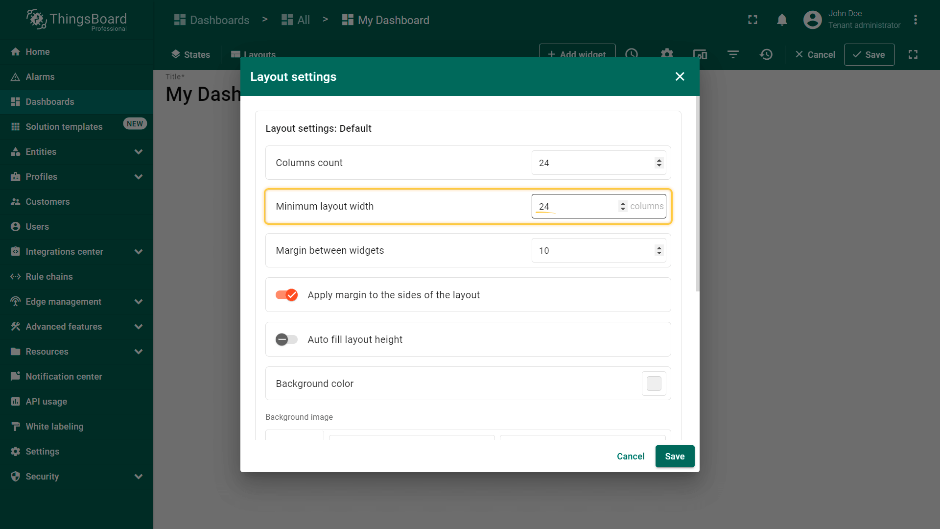
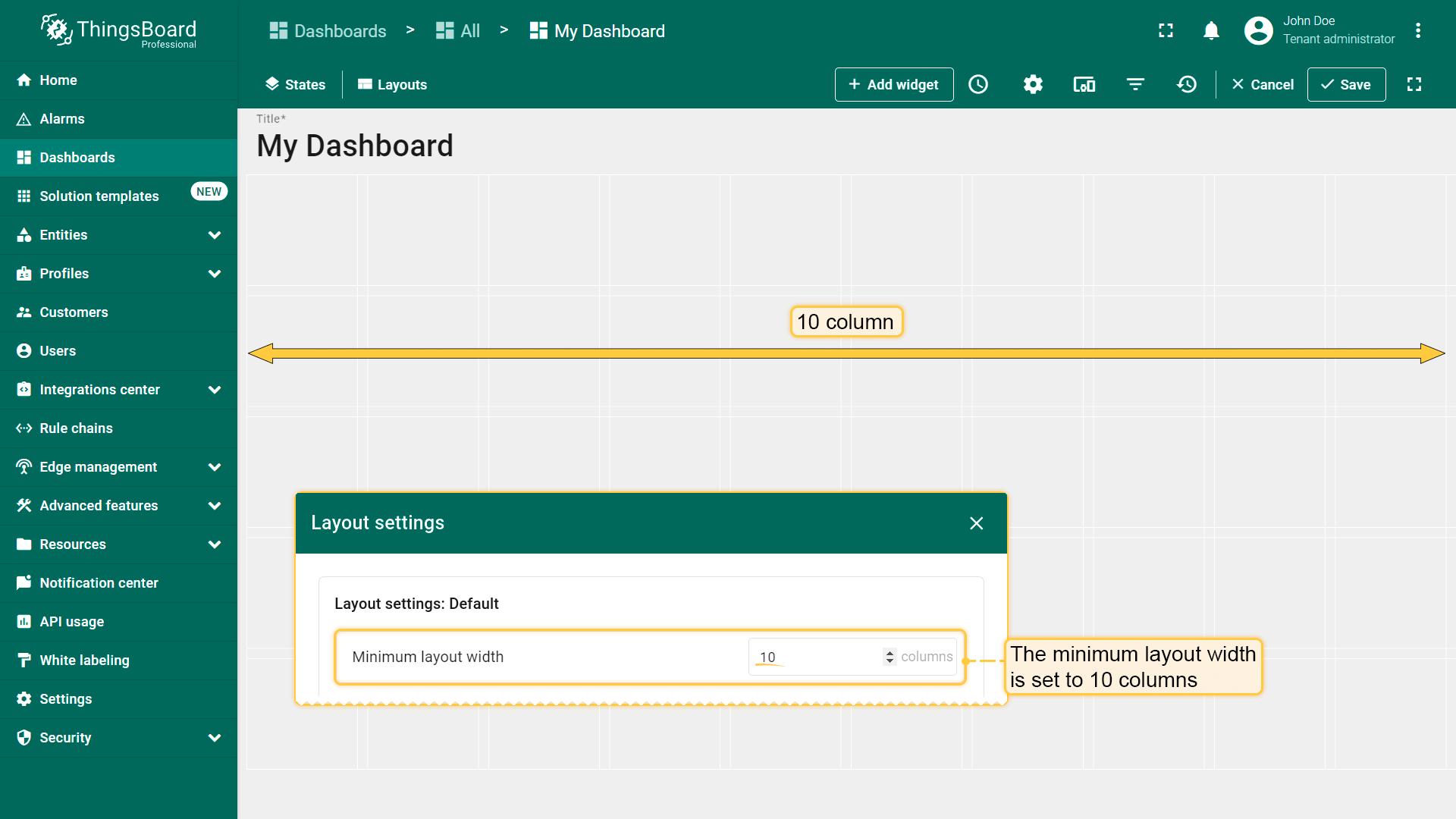
最小布局宽度
默认最小列数为24。可增加或减少该数值。最小列数为10。建议此参数值大于或等于列数。
By default, the minimum number of columns is 24. You can increase or decrease this number. The minimum number of columns is 10. We recommend that the value of this parameter be equal to or more than the column count.
With these settings, the minimum layout width is set to 10 columns.
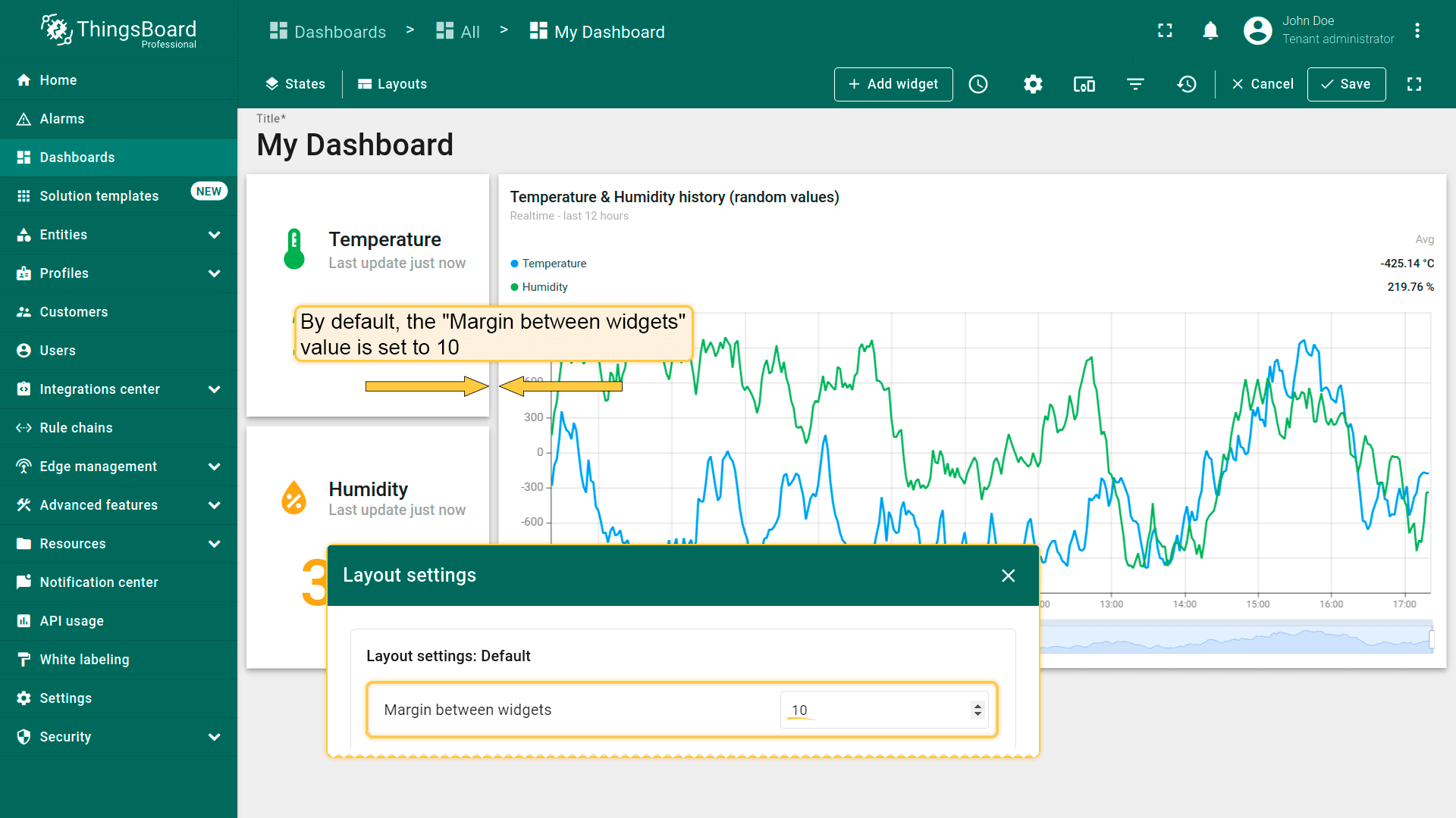
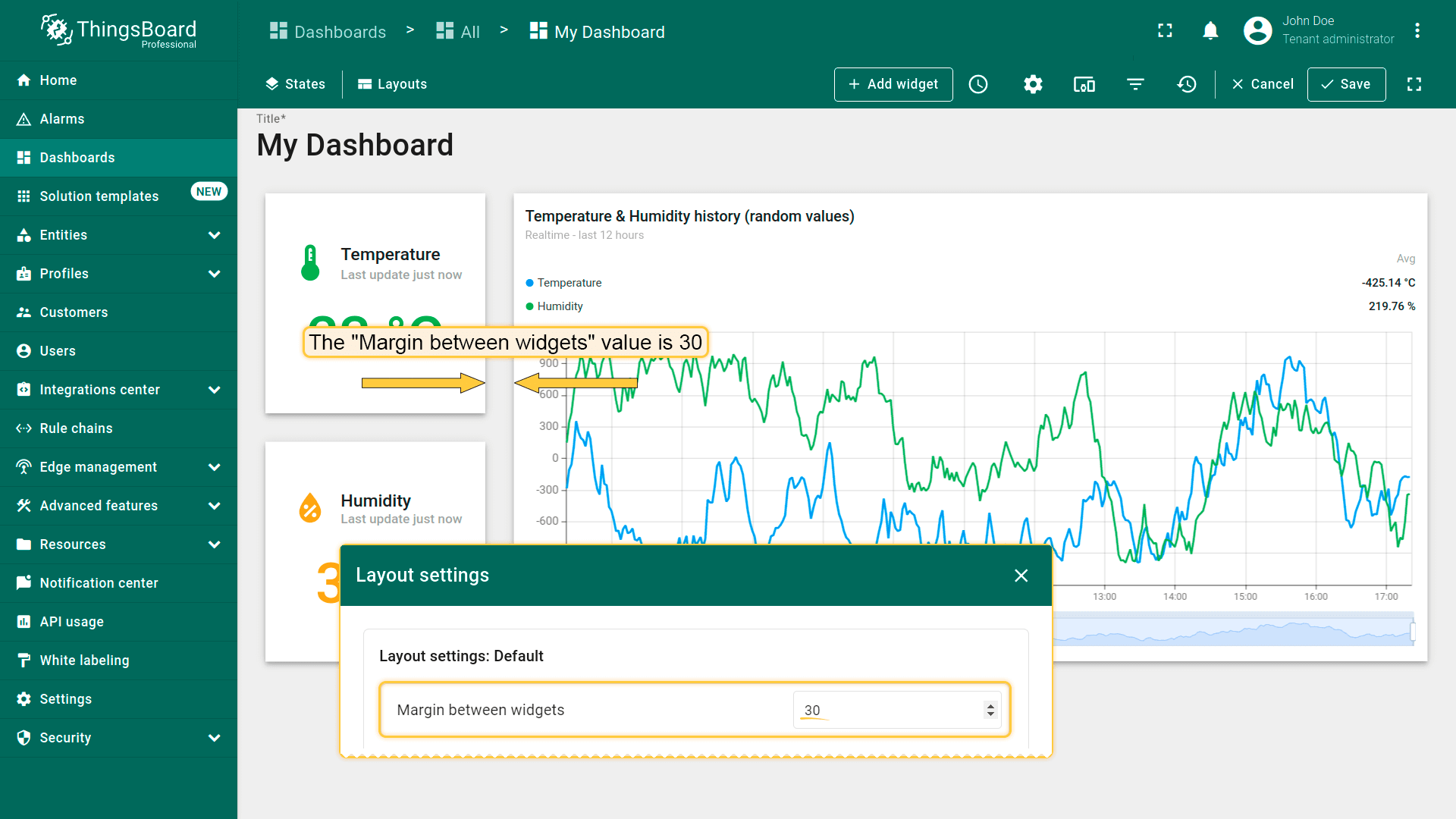
This field type determines the distance between widgets;
By default, the margin is set to 10;
You can decrease or increase the distance between widgets.
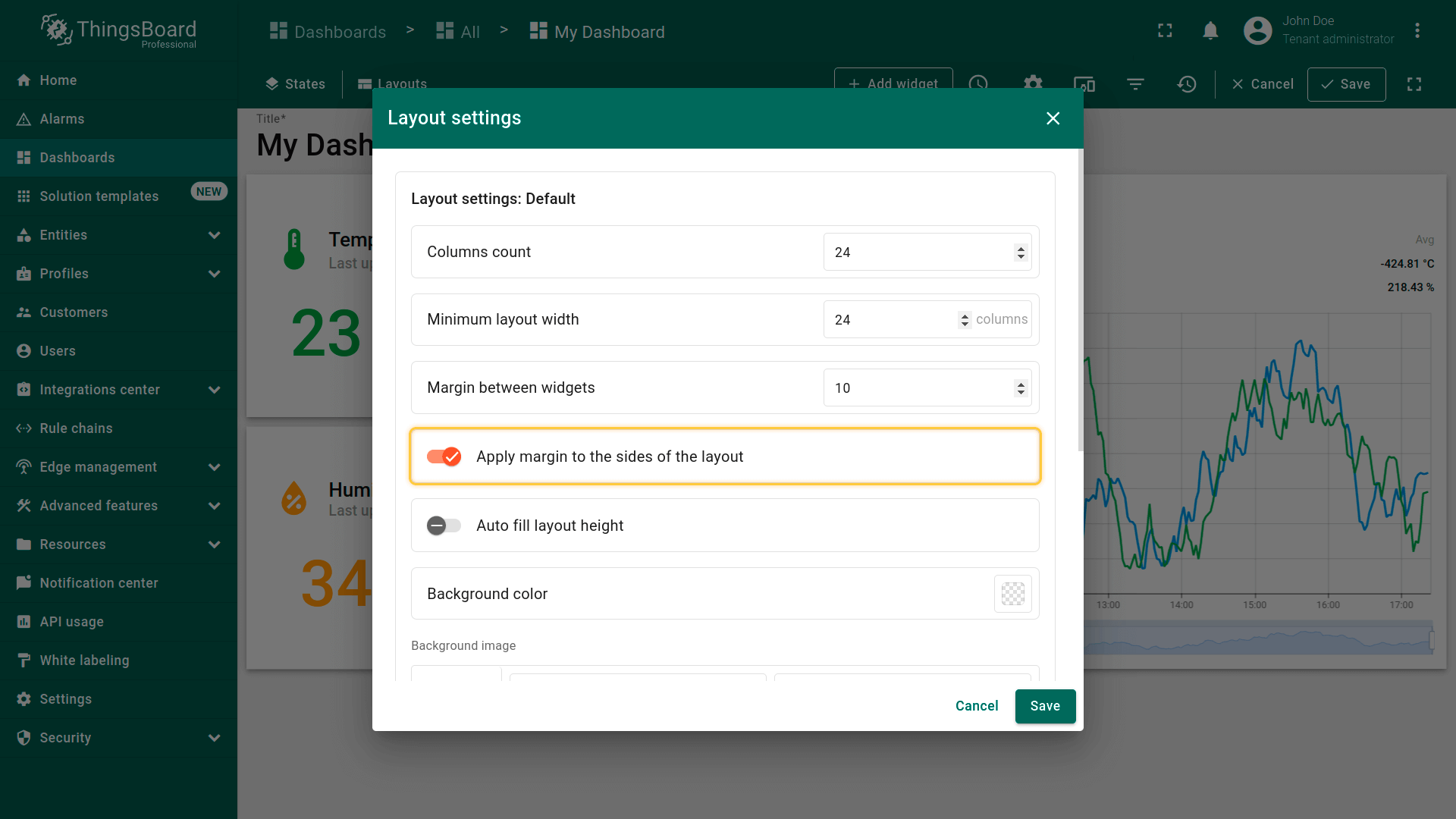
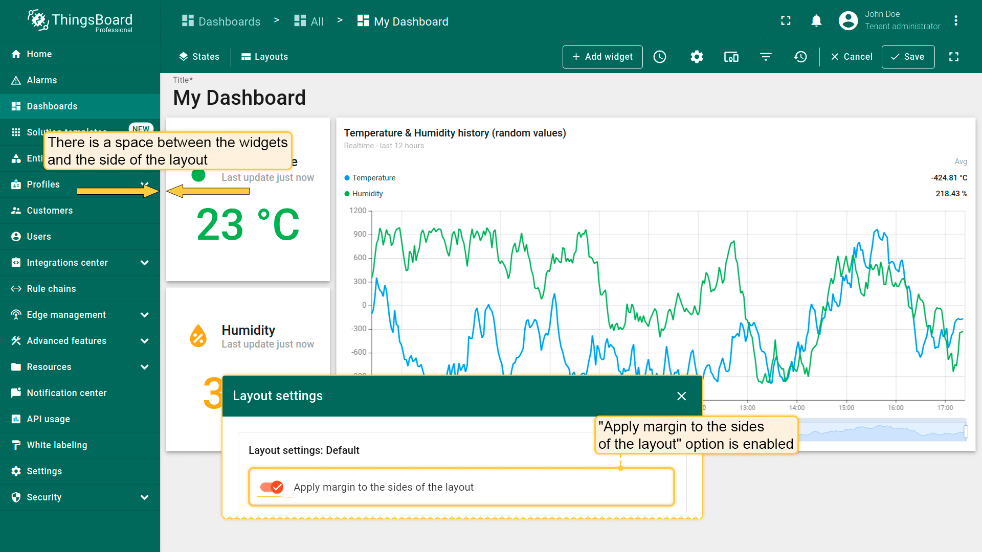
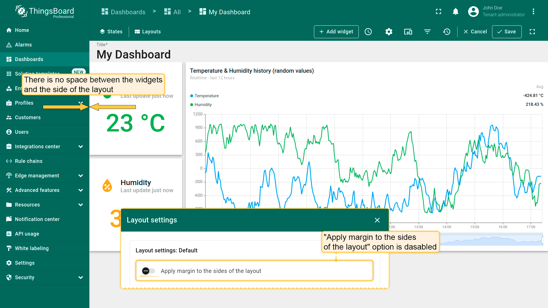
将边距应用到布局两侧
此参数决定是否应将“部件间距”值应用到布局两侧。
This parameter determines whether the "Margin between widgets" value should be applied to the sides of the layout;
There is a space between the widgets and the side of the layout;
There is no space between the widgets and the side of the layout.
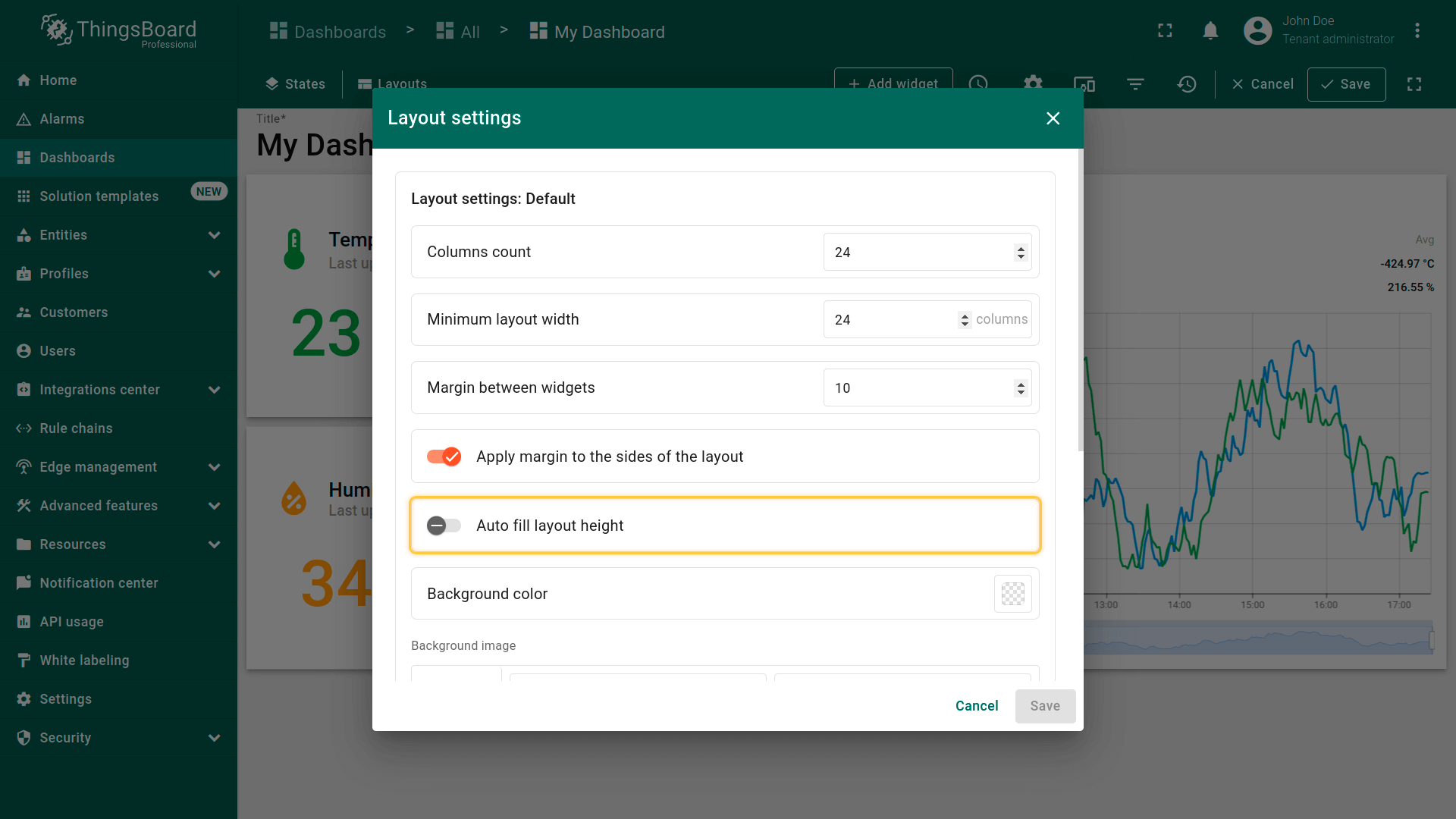
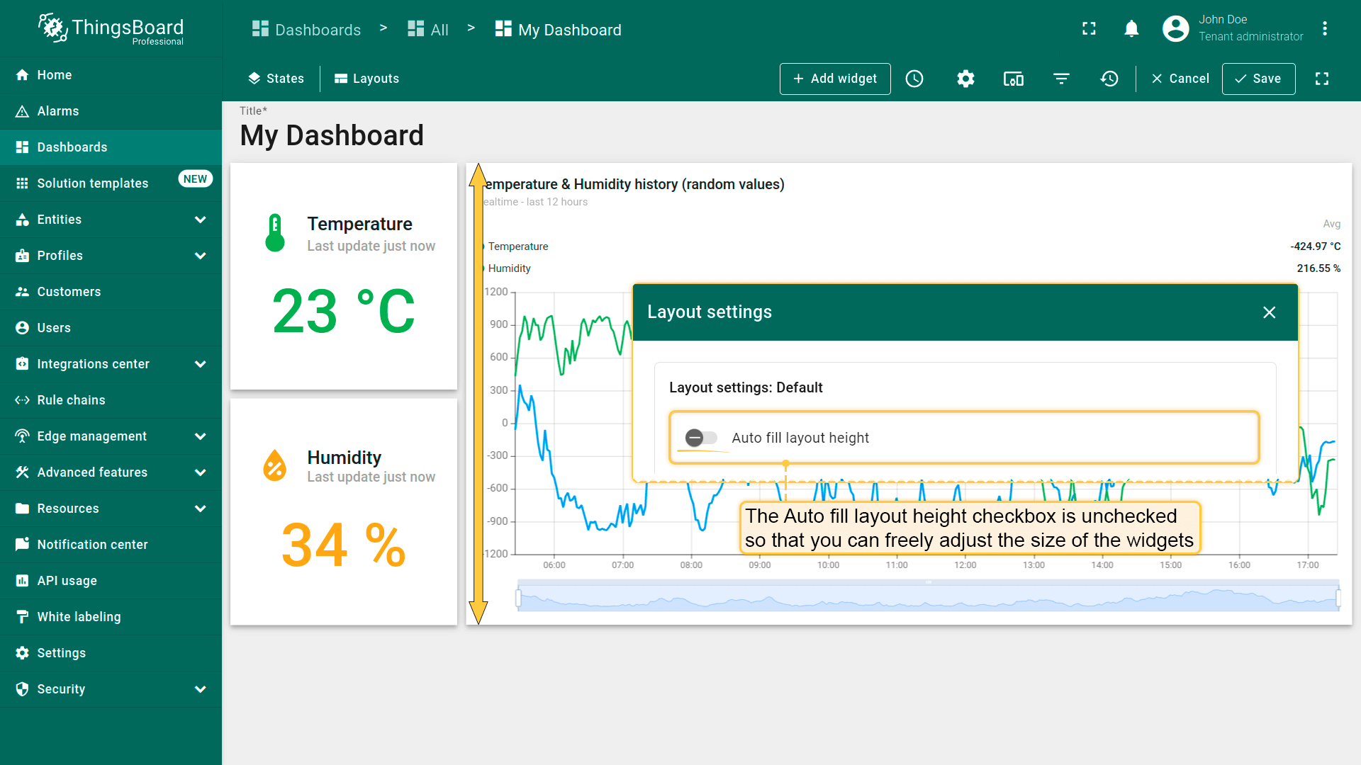
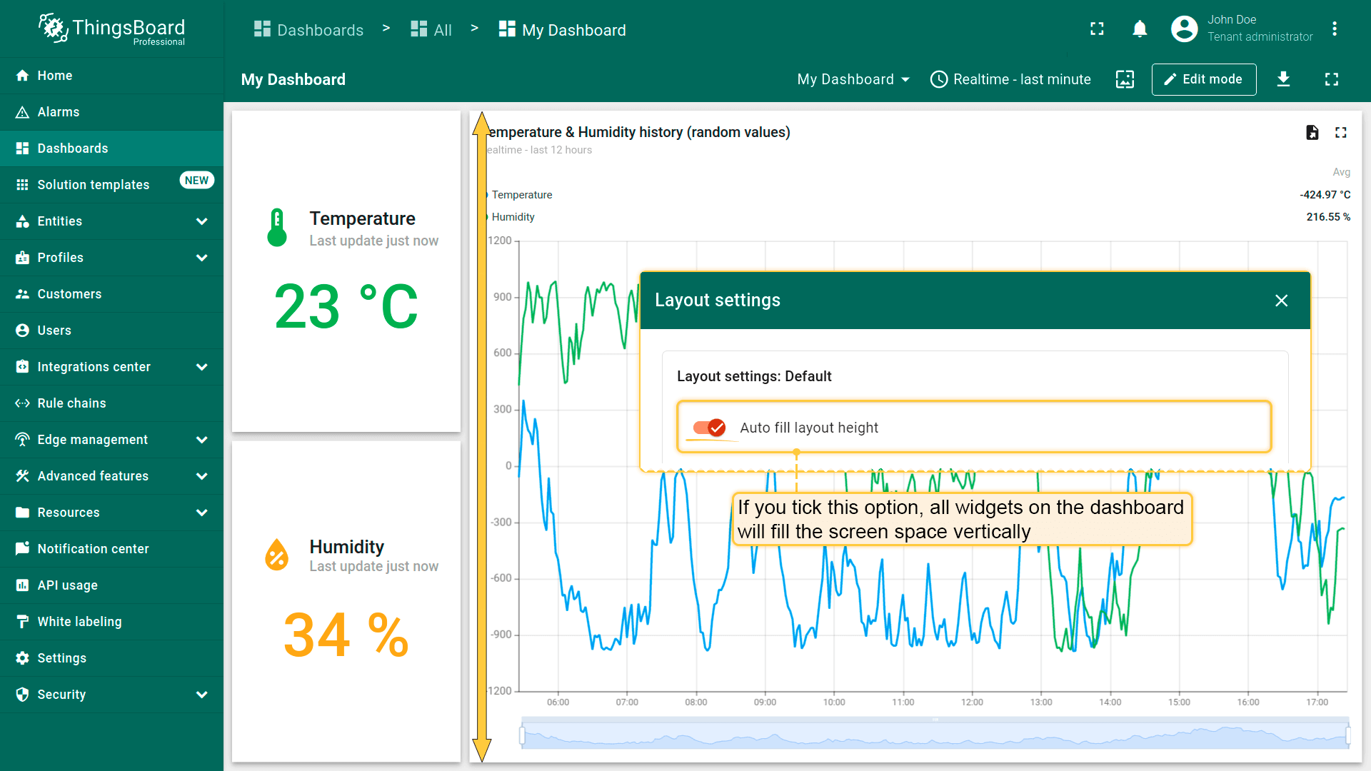
By default, the "Auto fill layout height" checkbox is unchecked;
The "Auto fill layout height" checkbox is unchecked so that you can freely adjust the size of the widgets;
If you tick this option, all widgets on the dashboard will fill the screen space vertically.
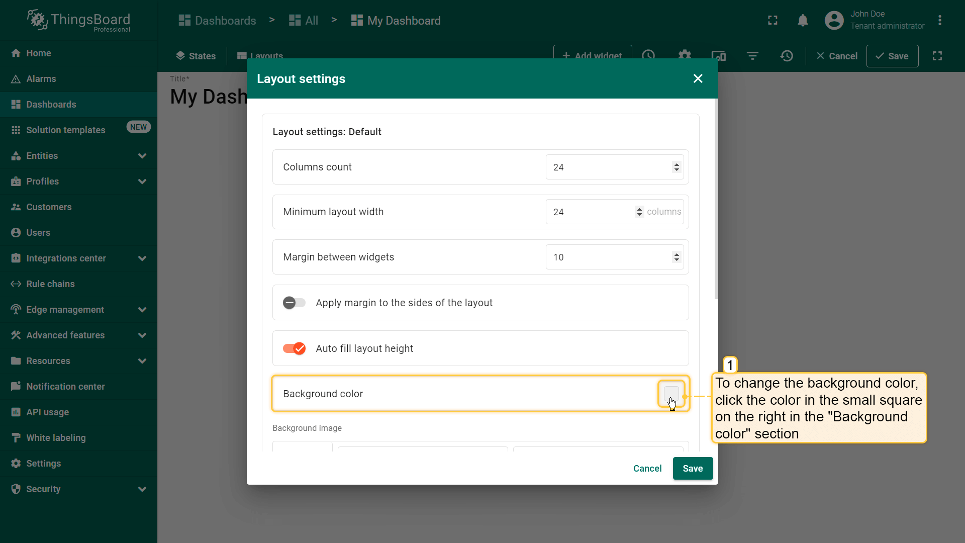
The "Background color" option allows you to customize the color that you'd like to be on the dashboard's background;
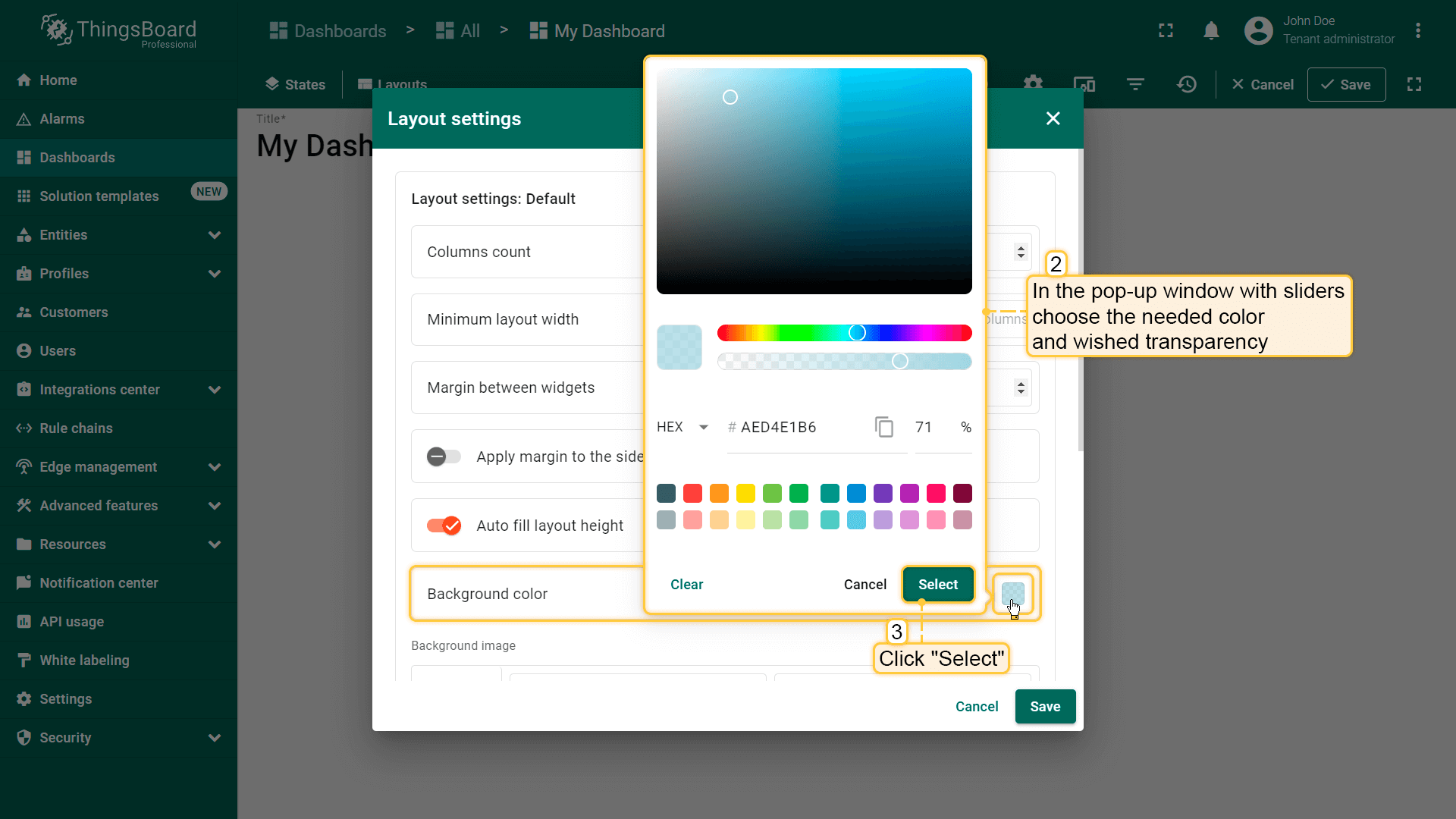
To change the background color, click the color in the small square on the right in the background color section. In the popup window, select the desired color and transparency. Then click "Select". Afterward, apply the layout settings;
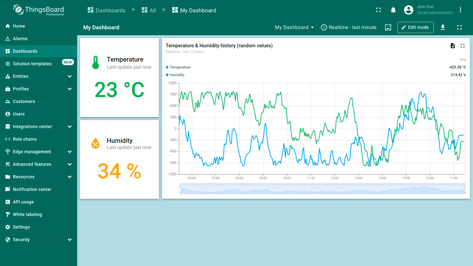
After saving, you can see the customized background.
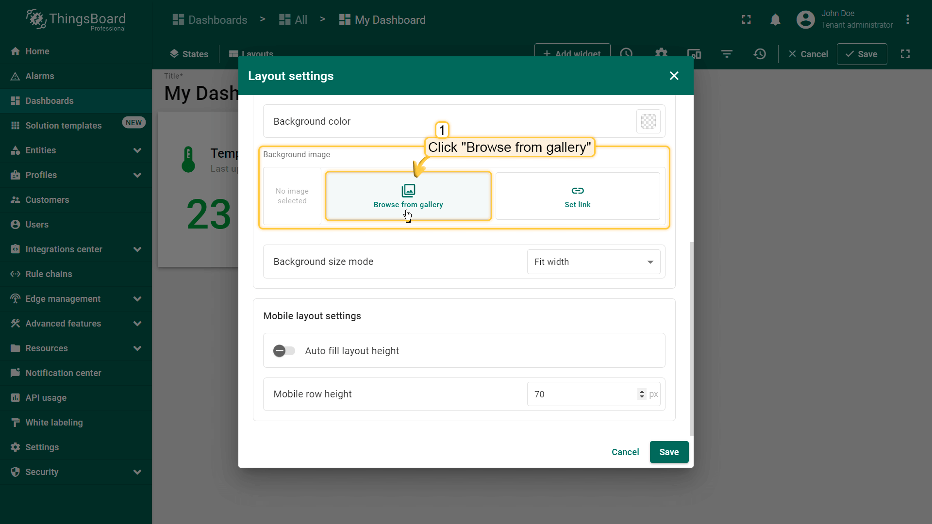
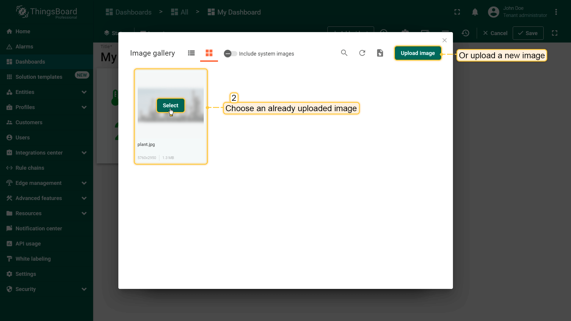
要从图库选择图片,点击“Browse from gallery”。选择已上传的图片或添加新图片。
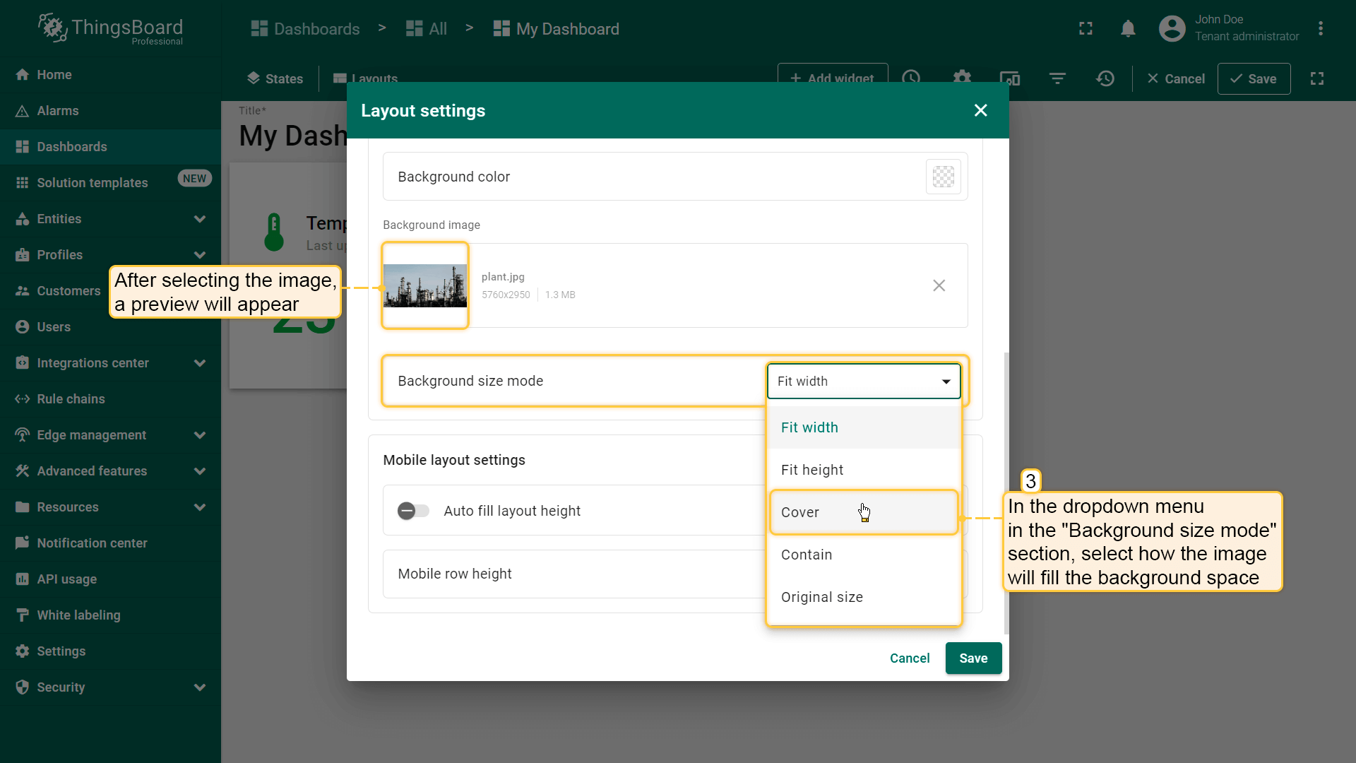
要更精确地调整图片位置,点击“背景尺寸模式”部分的下拉菜单,选择图片如何填充背景区域。
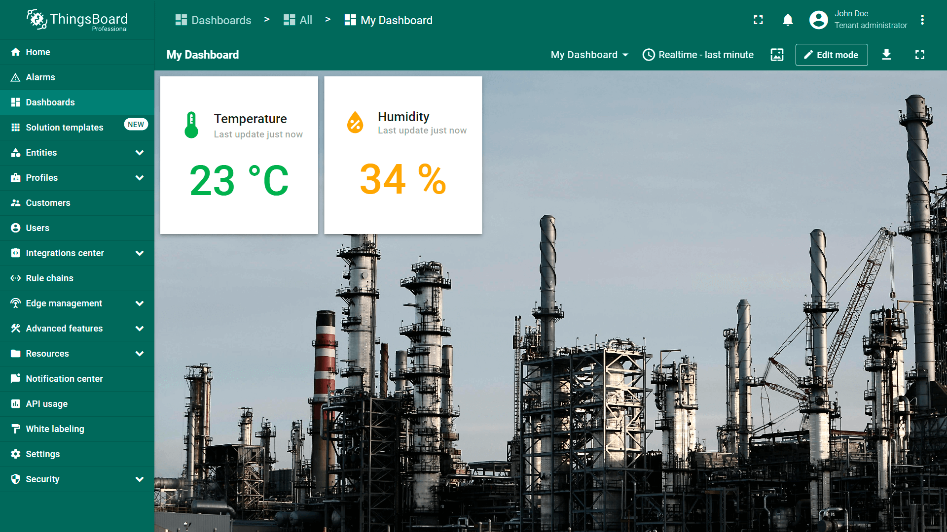
例如,选择“Cover”并点击“Save”查看背景变化。
This option allows you to set an image as the background of the dashboard. You can choose an image from the Image gallery or set a direct link. To select an image from the gallery, click "Browse from gallery";
Choose an already uploaded image or add a new one;
To more precisely adjust the position of the image, click the dropdown menu of the "Background size mode" section and select how exactly the image will fill the background space. For example, let's choose "Cover" and click "Save" to see how the background has changed.
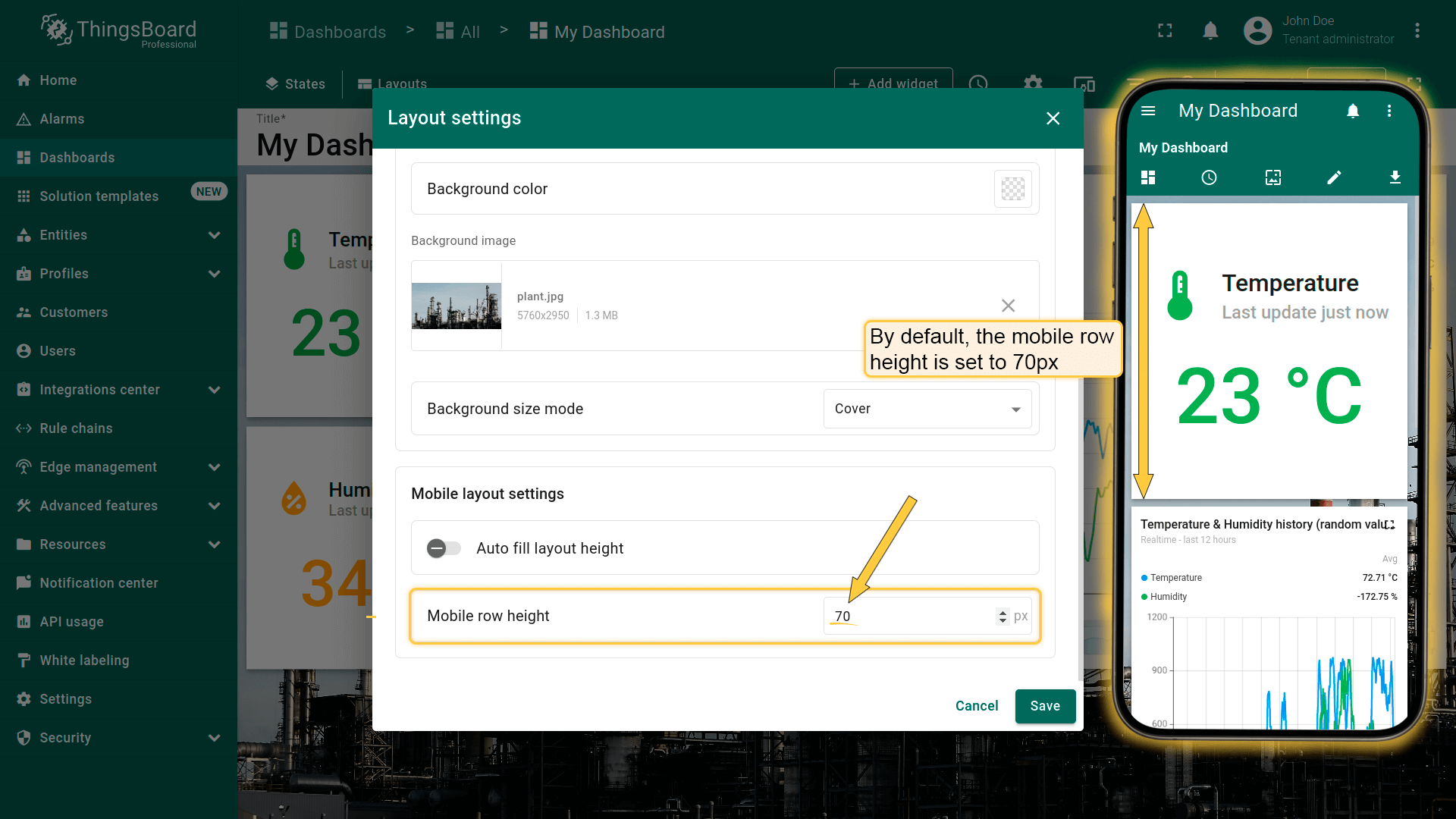
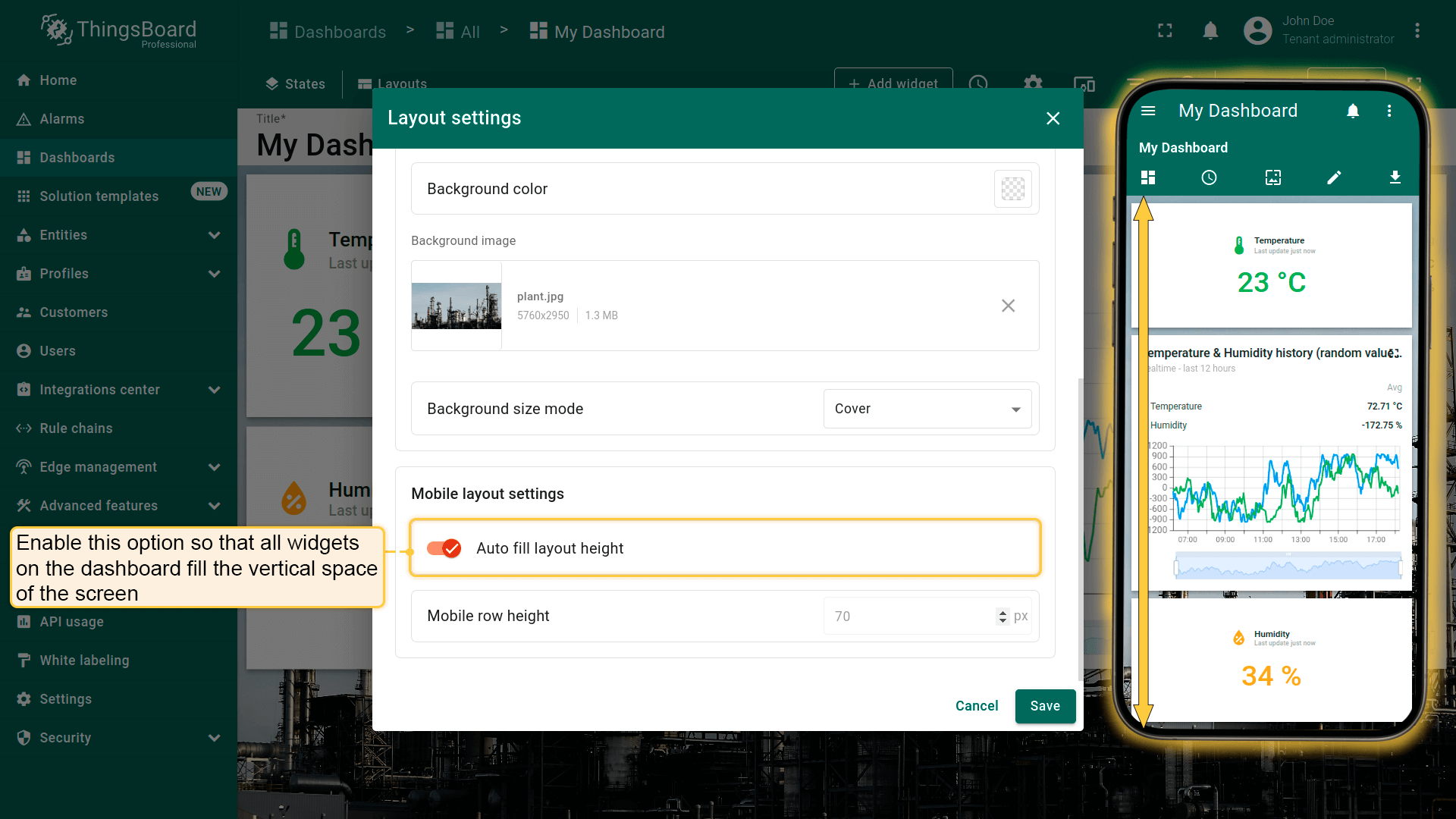
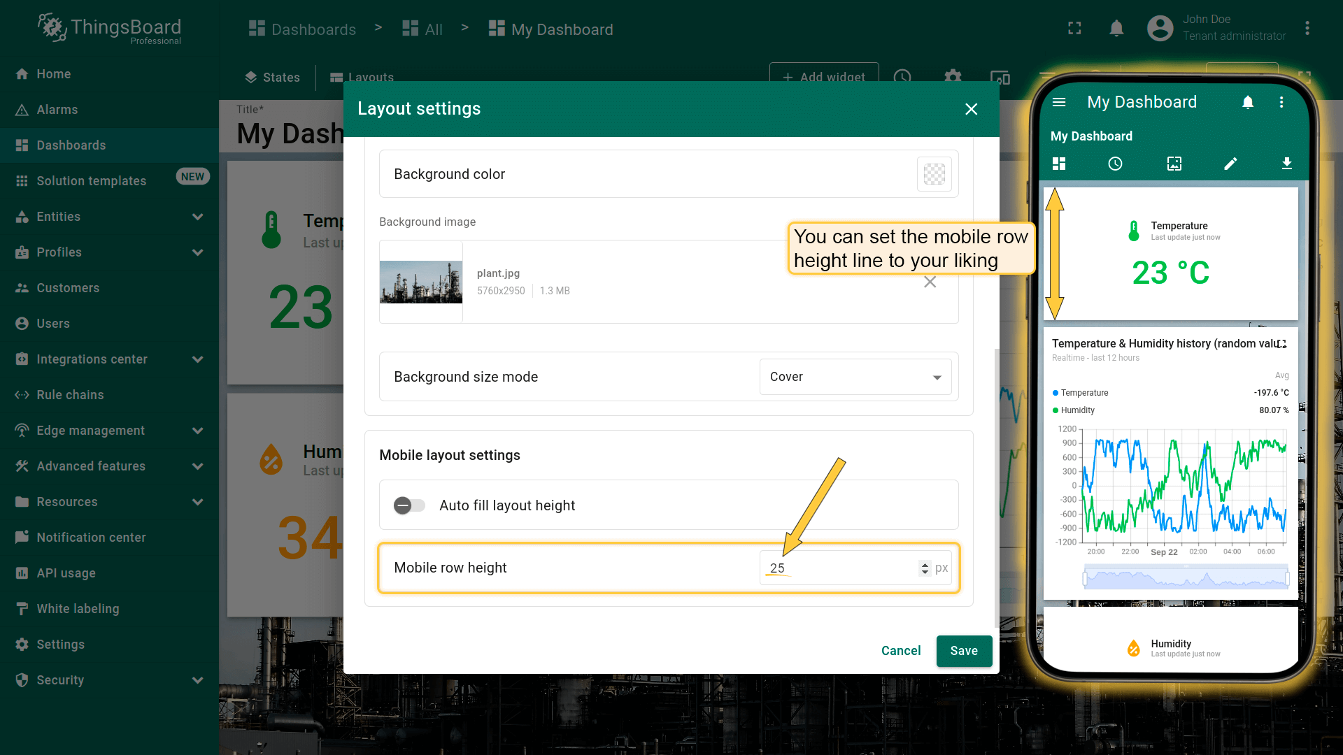
By default, the "Auto fill layout height" checkbox is unchecked so that you can freely adjust the size of the widgets for your mobile device;
If you tick "Auto fill layout height" option, all the widgets on the Dashboard will fill in vertically in the space of the screen.