ThingsBoard中的地图部件使您能够在地图上可视化实体和数据。可放置标记、区域、路线等地理对象,尤其适用于涉及物理位置的IoT解决方案。
在ThingsBoard 4.0中,我们全面改进了地图部件,使其更灵活、更易配置,在地理空间数据处理方面更强大。
使用场景
- 实时实体位置跟踪(车辆、无人机、人员)
- 路线可视化与移动分析(物流、公共交通、历史路径)
- 对象布局可视化(工厂布局、停车场、平面图)
- 交互式地图(用户放置标记、地理围栏创建)
地图部件类型
- Map部件:使用OpenStreetMap、Google Maps、HERE或Tencent等底图显示真实世界位置。
- Image Map部件:适用于室内布局或相对定位,适合平面图、智能停车、工厂区域等,支持自定义背景图像。
- Trip Map和Route Map部件:在地图上可视化移动。Trip Map包含动画播放和时序控制,以增强跟踪可视化。
主要改进:
- 轻松在地图上放置元素。 通过几次点击即可添加标记、多边形或圆形。底层会触发自定义函数,捕获点击位置的坐标并将其作为属性存储到目标实体。
- 全新的统一Trip Map部件。 将Trip Animation和Route Map部件的功能合并为一个强大工具:
- 支持动画路线、移动标记和停靠点。
- 包含一套专用标记图标。
- 提供多种路线样式选项,包括路径装饰和可见点。
- 提供可自定义的时序控制(日期格式、播放速度等)。
- 动态地图图层切换。 在部件内直接切换地图类型(标准、卫星、混合或自定义图层)。
- 参考图层支持。添加透明叠加图层以提供额外地图上下文或背景视觉效果。
- 地图项(Marker/Polygon/Circle)配置改进
- 每种叠加类型现均有独立设置,互不冲突。
- 更优的坐标验证减少错误(缺失键或错误配置的数据源更少)。
- 内置标记形状开箱即用,同时支持自定义图标。
- 新增「Range」颜色模式——根据键值(如温度或状态)动态改变标记颜色。
- 为每种叠加设置独立的「点击操作」和「标签操作」,实现更精确的交互。
- 轻松分组叠加层——一键切换多个地图项的可见性。
- 改进编辑体验——点击任意地图项即可查看上下文编辑选项。
- 设置坐标值时现可选择属性作用域(如shared、server-side、telemetry)。
- 使用额外数据源。 拉取额外值用于标签、工具提示或想在地图上显示的任何额外信息。
- 灵活的控制面板布局。 将地图控件(缩放、图层切换器、自定义按钮)移至部件任意角落,便于适配不同UI布局。
- 地图比例尺显示。 添加可选比例尺,帮助用户直观估算地图上的距离。
- 自定义操作按钮。 在地图上直接添加自定义按钮,每个可触发特定自定义操作(如创建实体、切换视图或打开URL)。
以上功能及更多已全部集成到ThingsBoard 4.0的全新地图部件中。
向仪表板添加地图部件
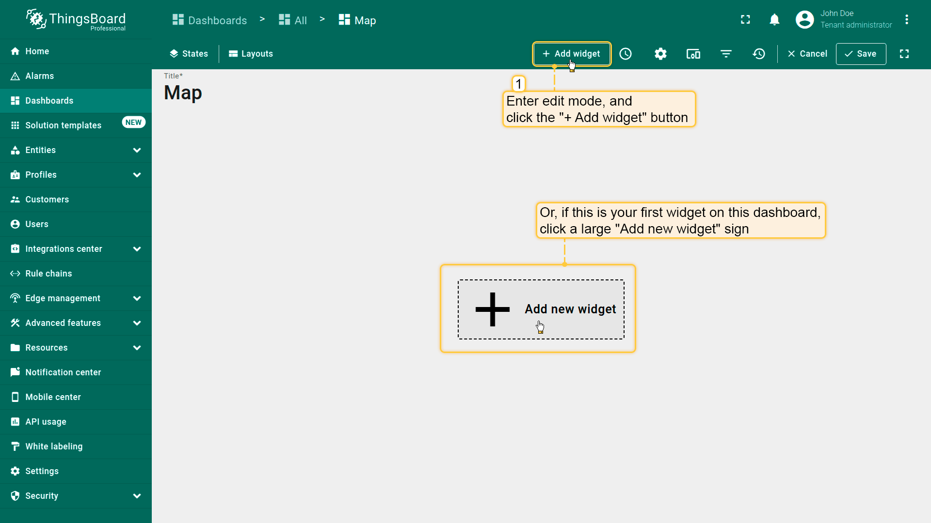
向仪表板添加地图部件,请按以下步骤操作:
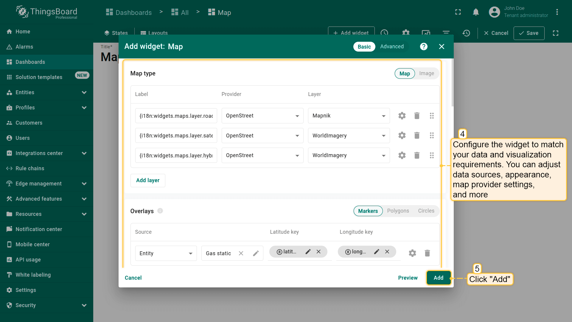
- 在仪表板编辑模式下,点击屏幕顶部的「Add widget」按钮,或点击屏幕中央的大图标「Add new widget」(若为本仪表板第一个部件)。
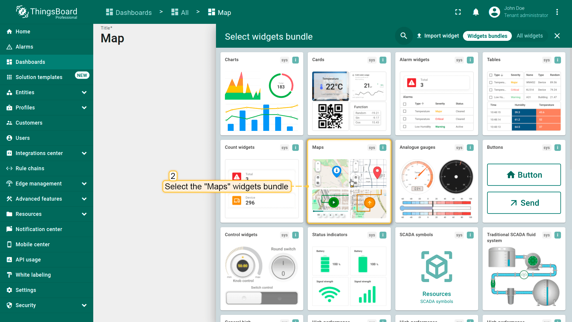
- 找到「Maps」部件包并点击。该类别包含所有可用的地图部件类型。
- 选择最适合您使用场景的地图部件。
- 配置部件以匹配您的数据和可视化需求。可调整数据源、外观、地图提供商设置等。
- 点击部件配置窗口右下角的「Add」将部件添加到仪表板。
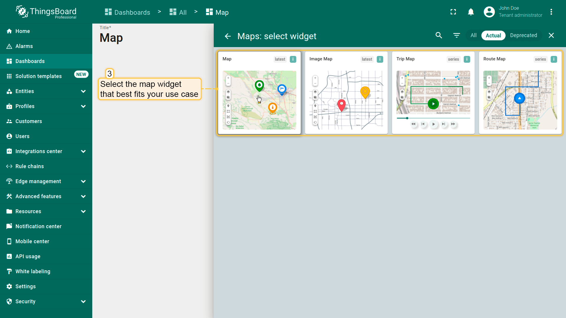
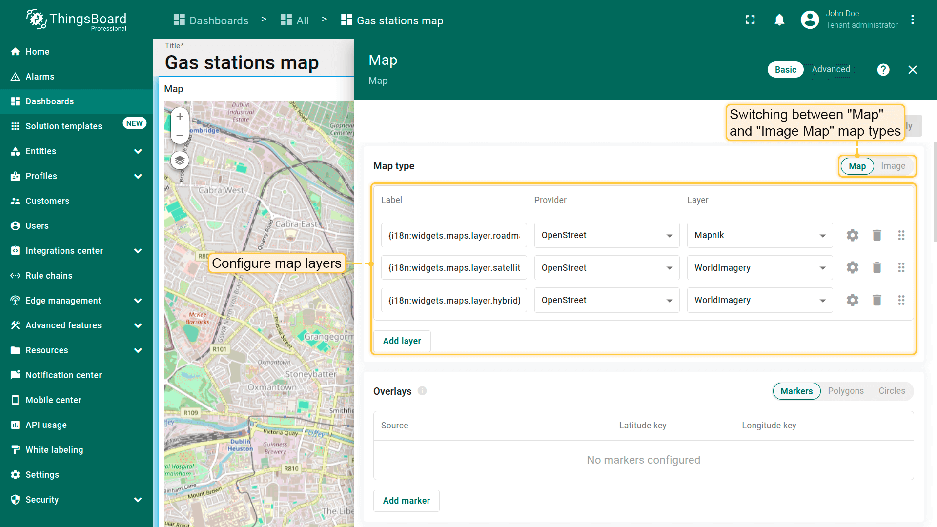
地图类型
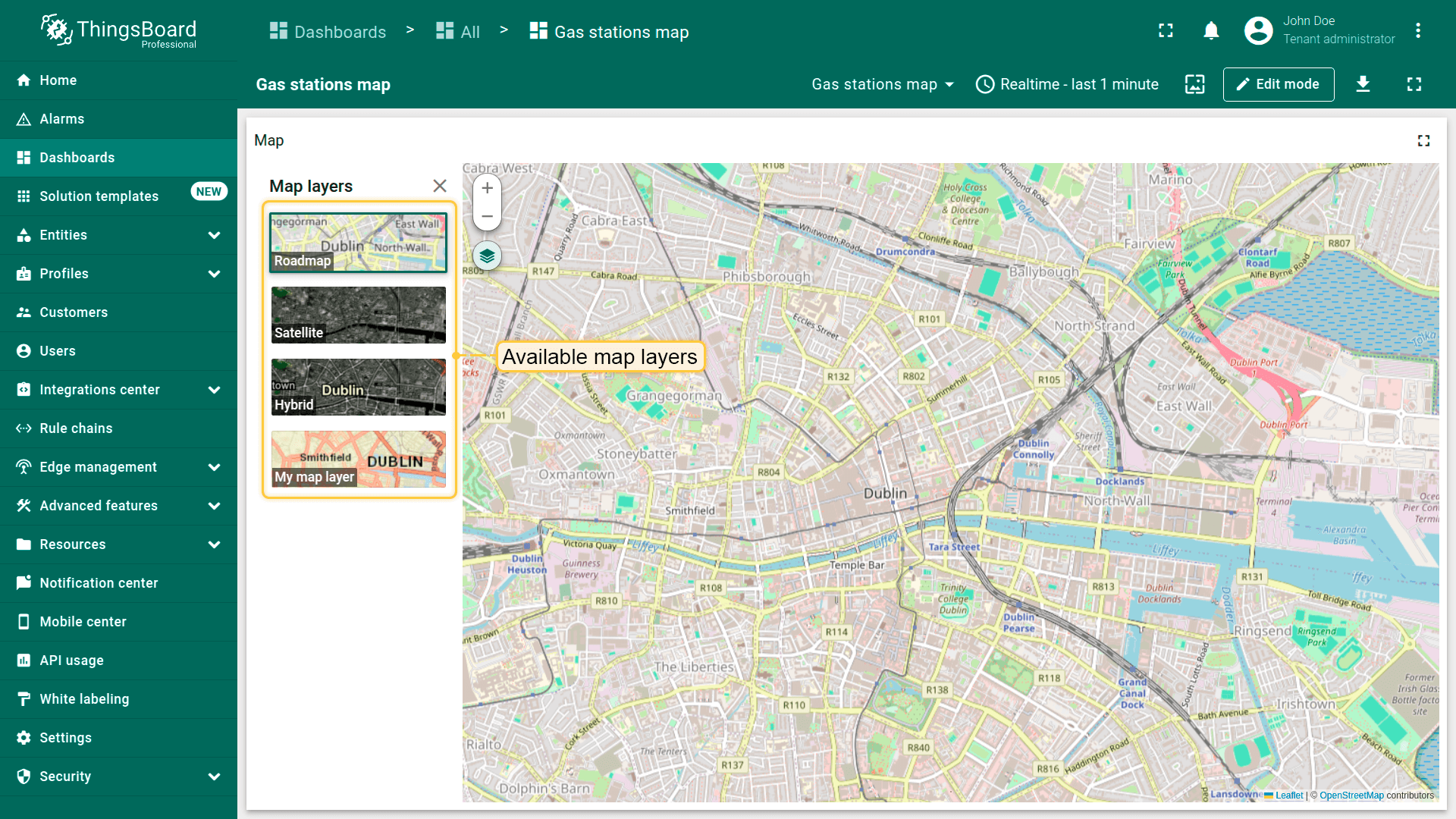
配置地图部件的首要步骤是选择地图类型。 ThingsBoard提供多种地图部件,包括Image Map(可自定义背景图像作为地图)。
您还可以配置地图图层,在部件内通过几次点击即可在标准、卫星、混合或自定义图层之间灵活切换。
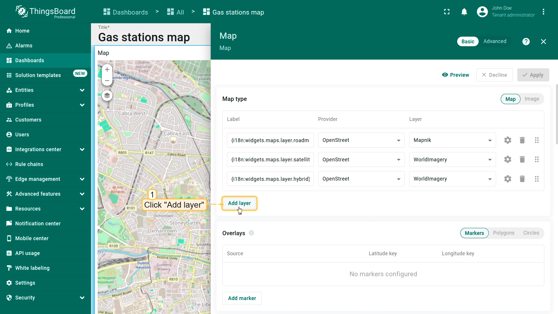
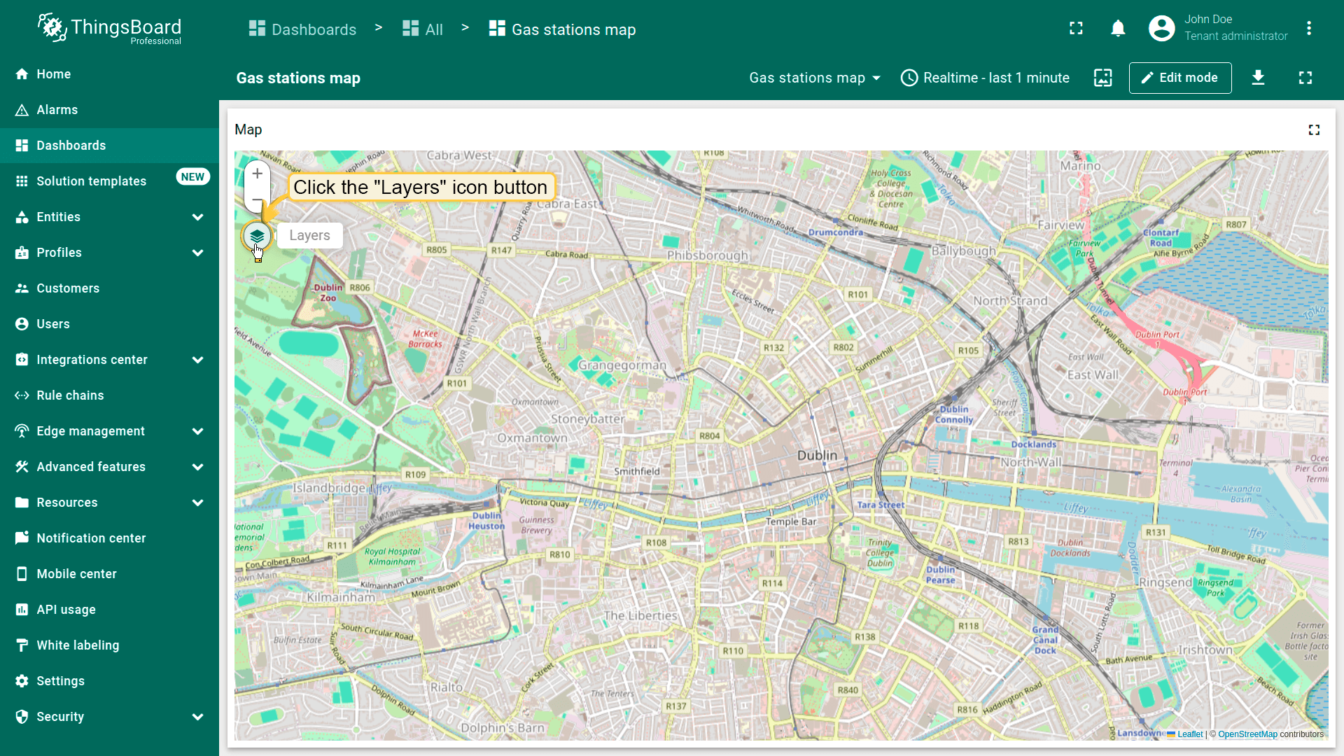
添加新地图图层
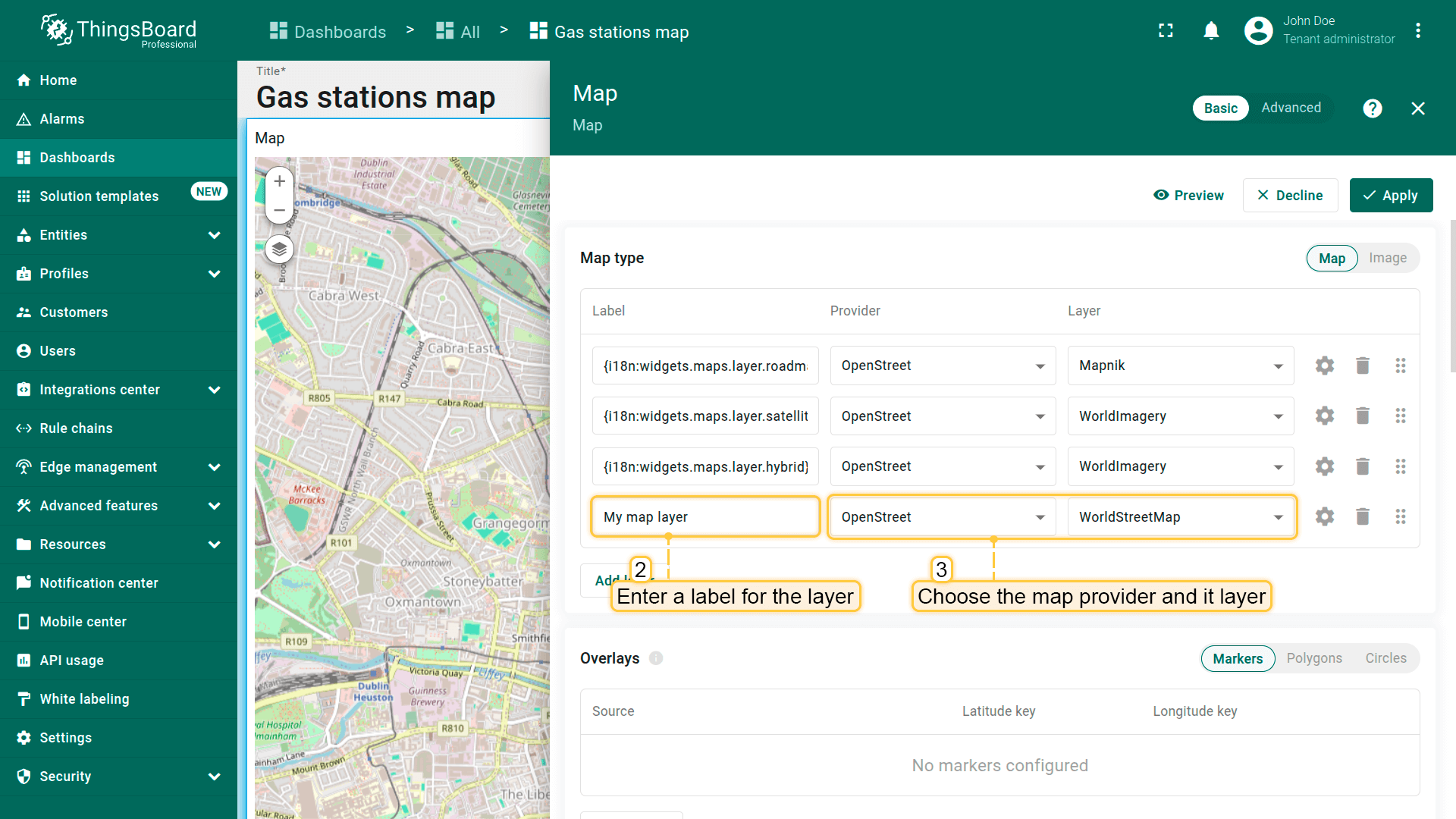
按以下步骤为地图部件添加图层:
- 点击「Add layer」。
- 输入图层标签——该名称将显示在部件的图层切换器中。
- 从可用选项(OpenStreetMap、Google、HERE、Tencent)中选择地图提供商,或指定自定义瓦片服务器。
- 应用更改。
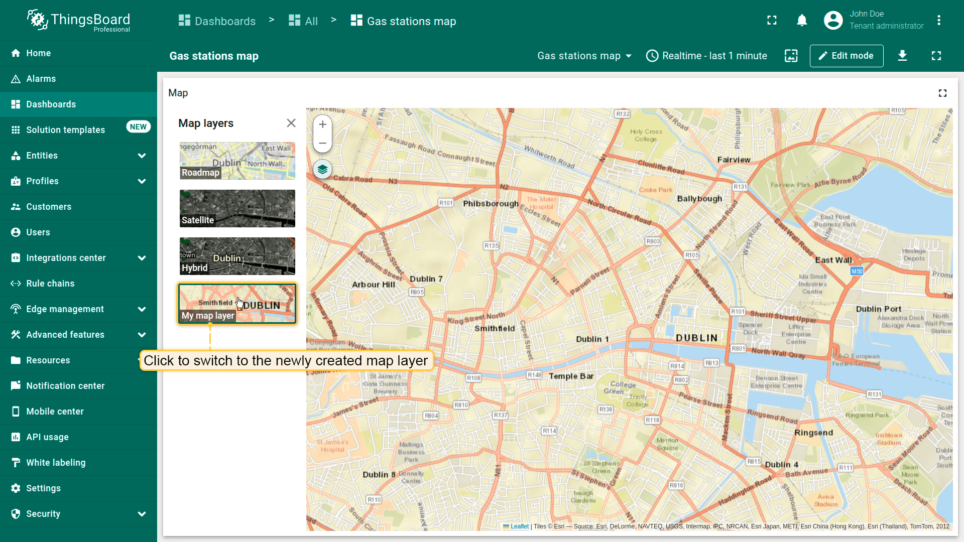
现在在部件上切换到新图层。
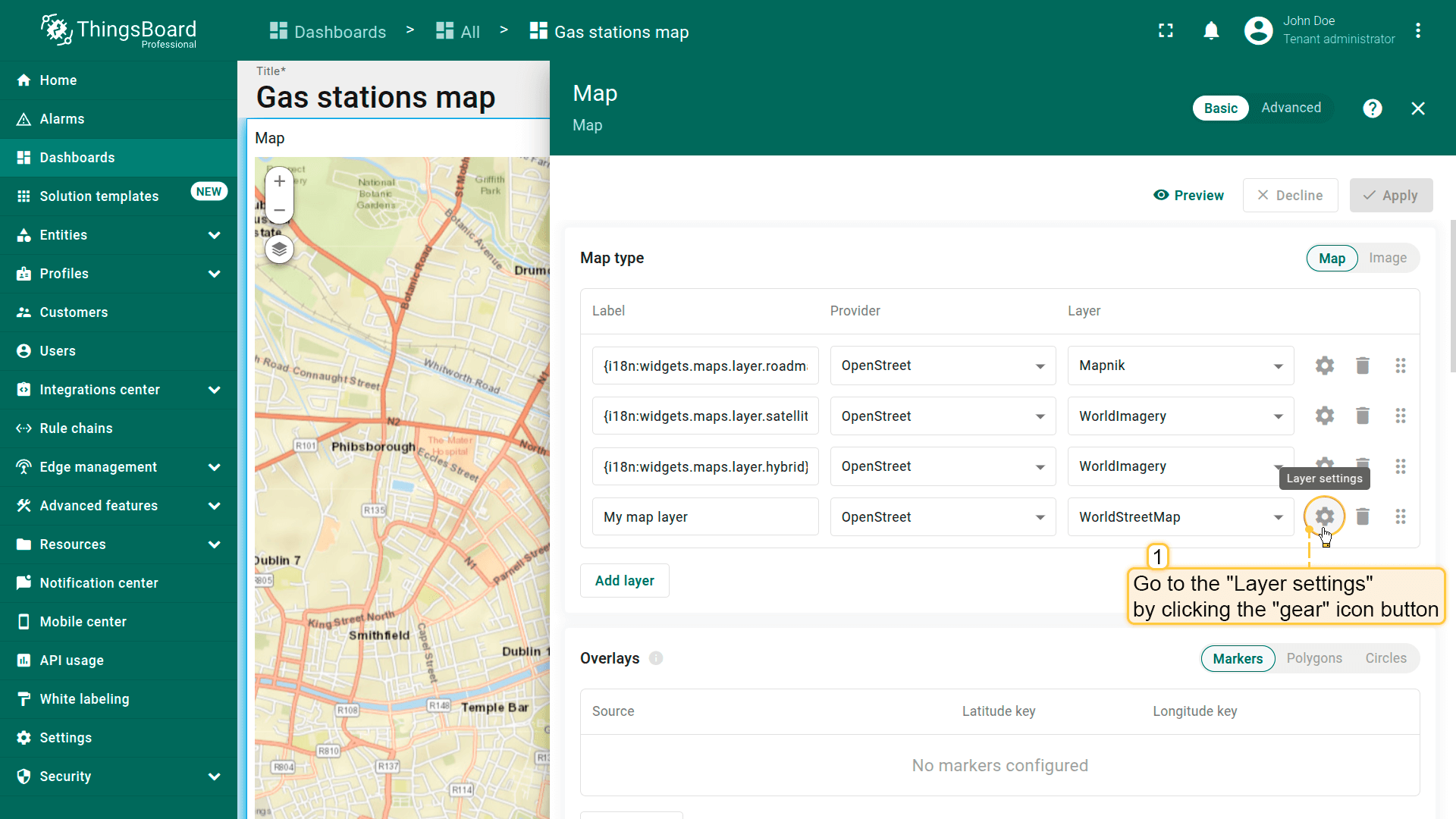
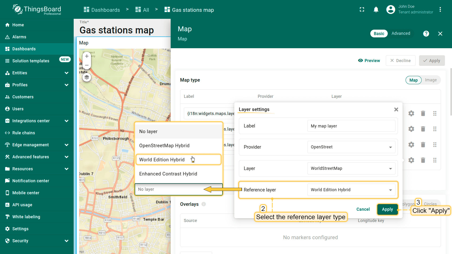
在「Layer settings」中,您还可以启用「Reference layer」选项——一种包含标注地图元素的特殊透明叠加图层:
- 点击「gear」图标进入「Layer settings」。
- 从下拉菜单中选择图层类型,若不使用则保留「No layer」。
- 应用更改。
叠加层
地图项是显示在地图部件上的视觉元素,用于表示实体和数据的空间位置、区域或影响范围。 这些元素有助于根据空间数据可视化并与设备、资产或其他追踪对象进行交互。
ThingsBoard支持以下地图项类型:
- marker(标记)为基于实体中指定坐标的地图上的点。用于显示设备、资产、车辆或任何追踪对象的位置。
- polygon(多边形)为由多个连接点构成的平面闭合图形。用于表示地图上的区域或边界。可用于标记资产或其他对象。多边形基于实体中指定的坐标。
- circle(圆形)为由中心点和半径定义的平面图形,边界点与中心点等距。适合用于可视化影响区或覆盖范围。圆形基于实体中指定的坐标。
每种地图项类型均绑定到实体,并根据以attributes或telemetry形式提供的坐标进行可视化。 您可以直接在部件设置中自定义其外观、行为和交互规则。
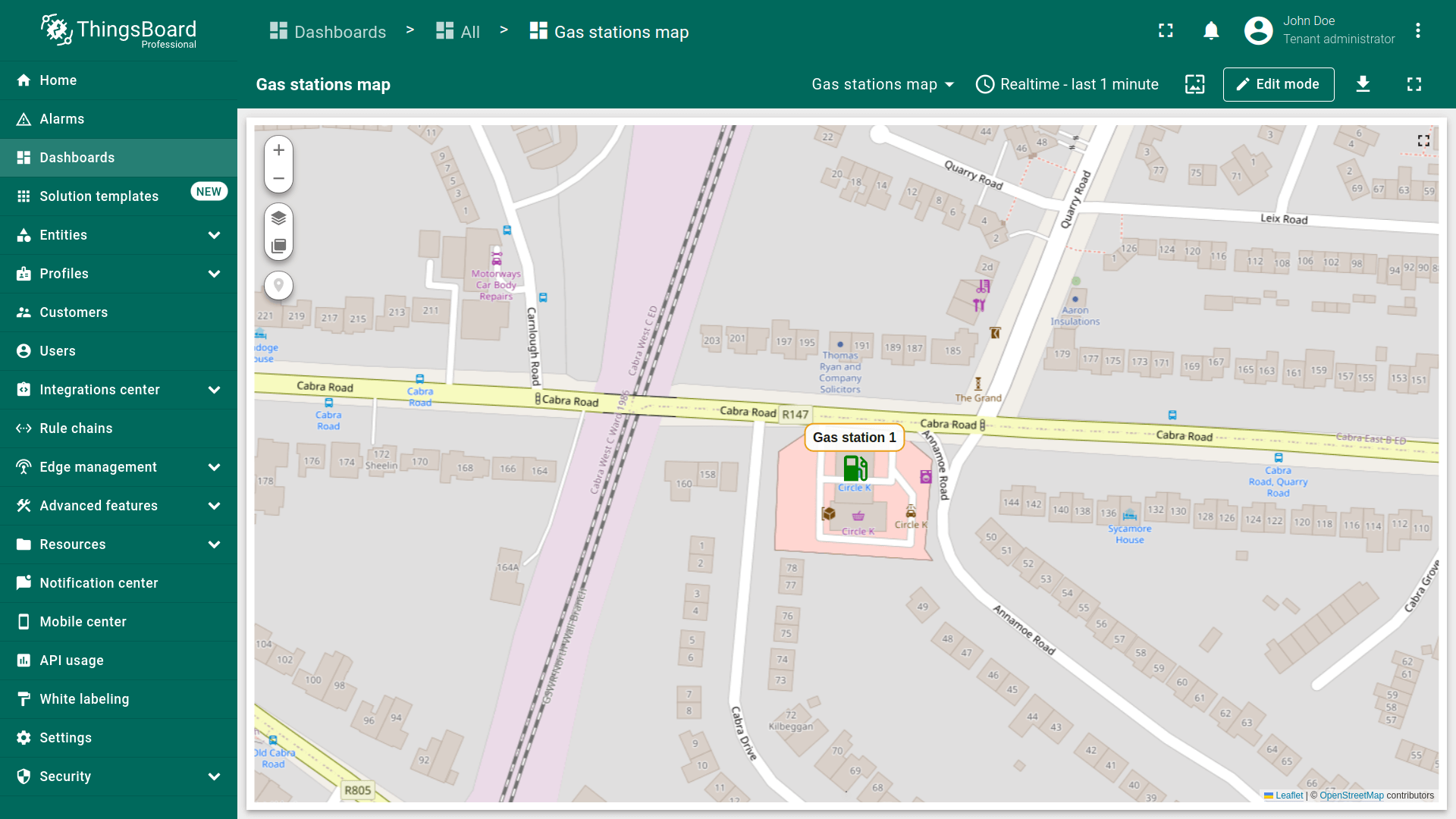
标记
标记常用于表示建筑、固定传感器、车辆追踪或任何其他静态或移动实体的位置。
要在地图上显示,实体必须以attributes或telemetry形式提供以下格式的坐标:
1
Latitude,Longitude
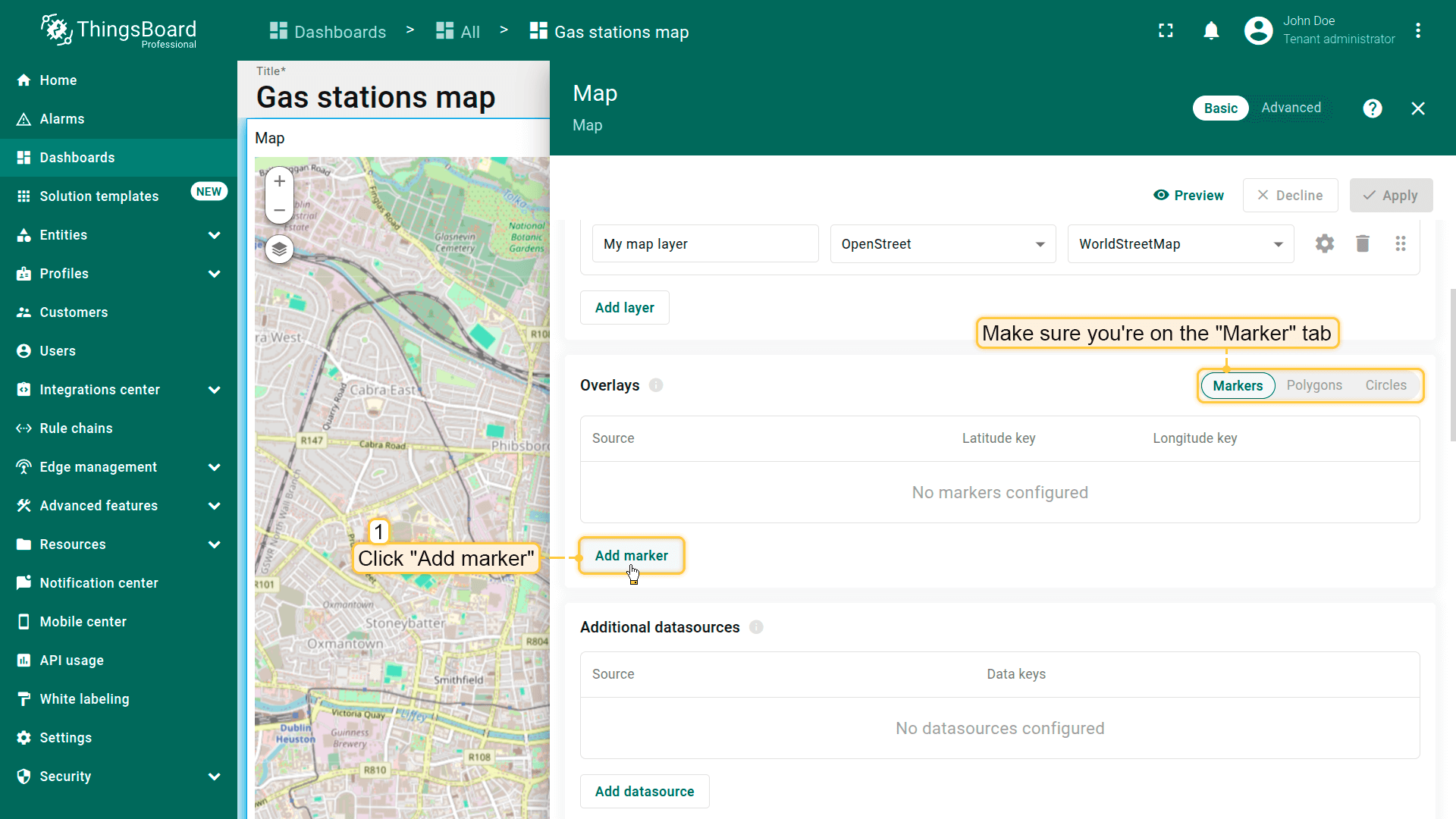
在地图上放置标记
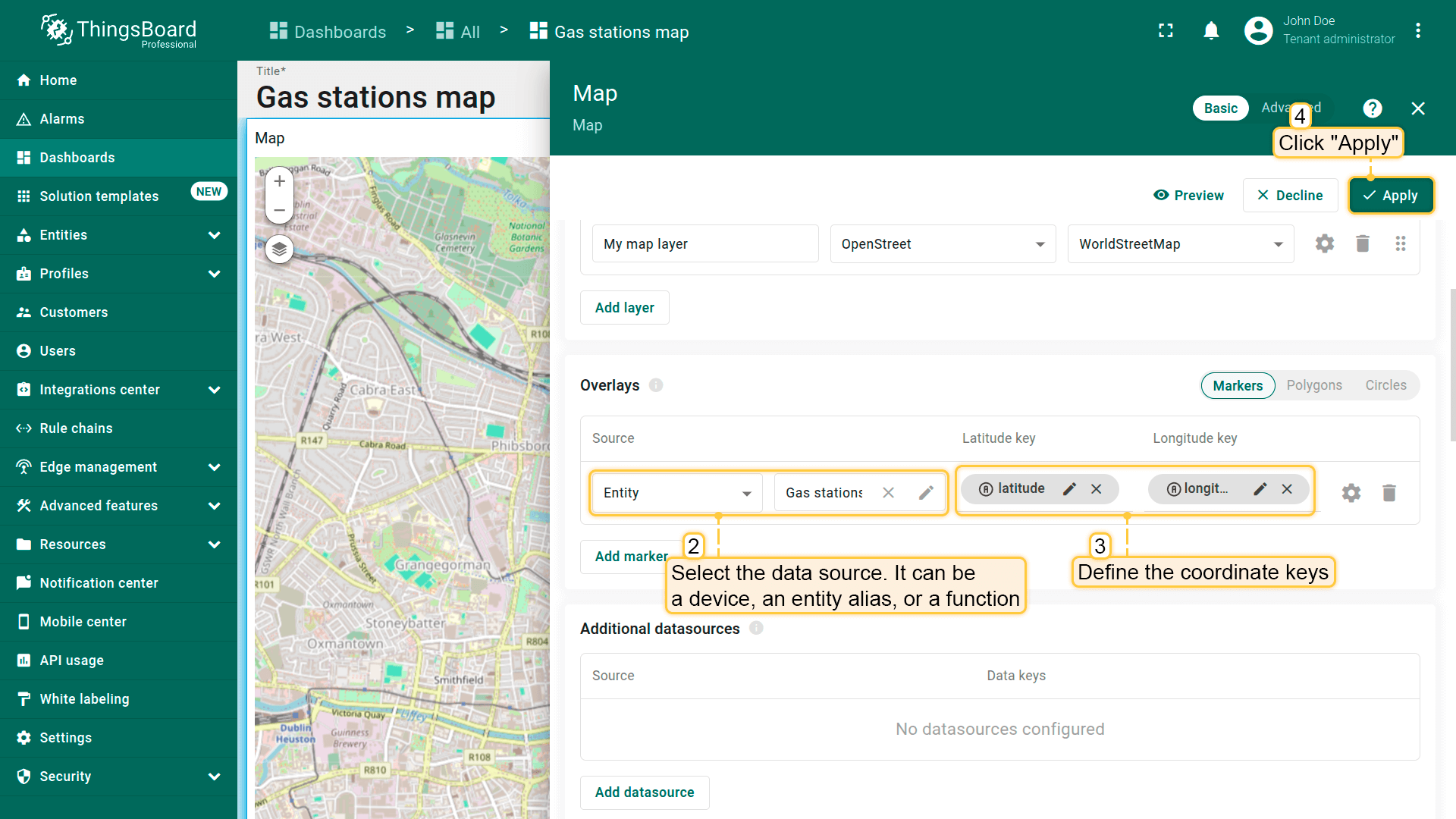
在地图上放置标记请按以下步骤操作:
- 进入部件编辑模式并打开「Overlays」区域。
- 确保位于「Marker」选项卡,点击「Add marker」。
- 选择数据源——可为设备、entity alias或function。
- 定义坐标键。默认ThingsBoard使用latitude和longitude作为标记的坐标键。若实体使用不同键名,请在此更新。
- 应用更改。
标记将根据指定坐标显示在地图上。

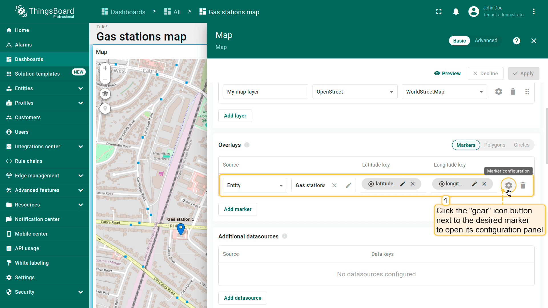
标记配置
要配置特定标记,切换到地图部件编辑模式。在「Overlays」区域,点击目标标记旁的「gear」图标按钮打开其配置面板。
Datasource(数据源)
指定标记的数据源。可为:
- device
- entity alias
- function
如有需要,可使用数据筛选缩小选择范围(例如按名称或类型筛选)。
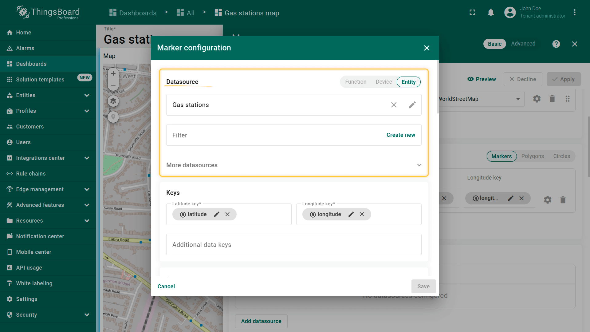
Keys(键)
定义坐标键。 默认ThingsBoard使用latitude和longitude作为默认坐标键。 若实体使用自定义键名,请相应更新。
您还可以定义用于动态展示元素的额外键,例如标记颜色、tooltip内容、Label文本等。
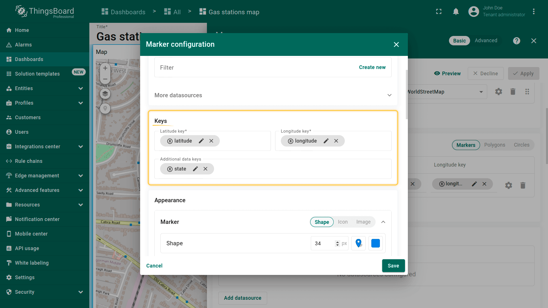
Marker(标记)
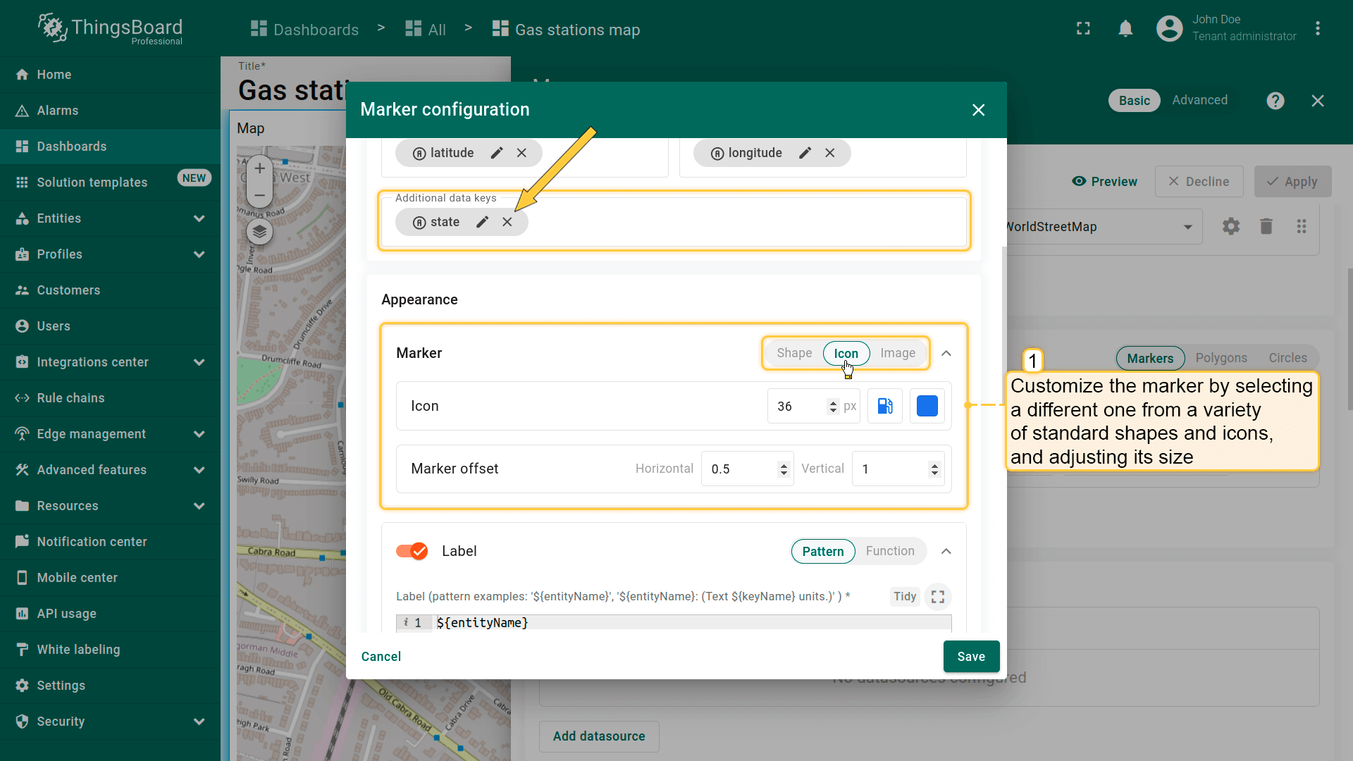
本区域定义标记在地图上的显示方式。 可从多种标准形状和图标中选择、调整大小和颜色,或使用自定义图片以实现完全视觉定制。
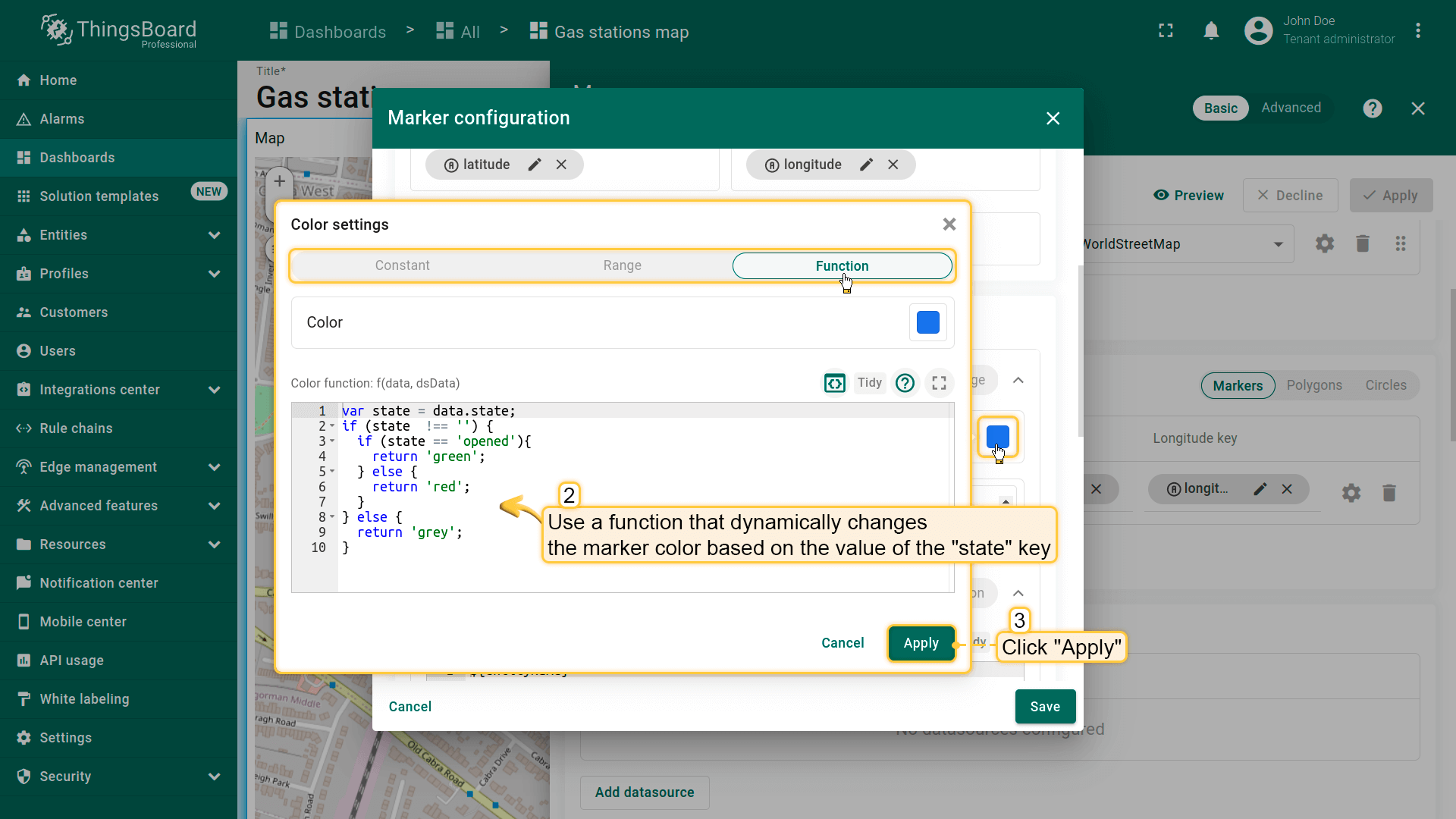
标记样式示例:本示例演示如何配置标记样式,使其根据「state」键的值自动变色:
- 绿色标记 — 当state = “opened”
- 红色标记 — 当state为其他值
- 灰色标记 — 当不存在state键
此方法可直观反映标记状态,大幅提升监控效率。
- Customize the marker by selecting a different one from a variety of standard shapes and icons, and adjusting its size.
- Use a function that dynamically changes the marker color based on the value of the "state" key.
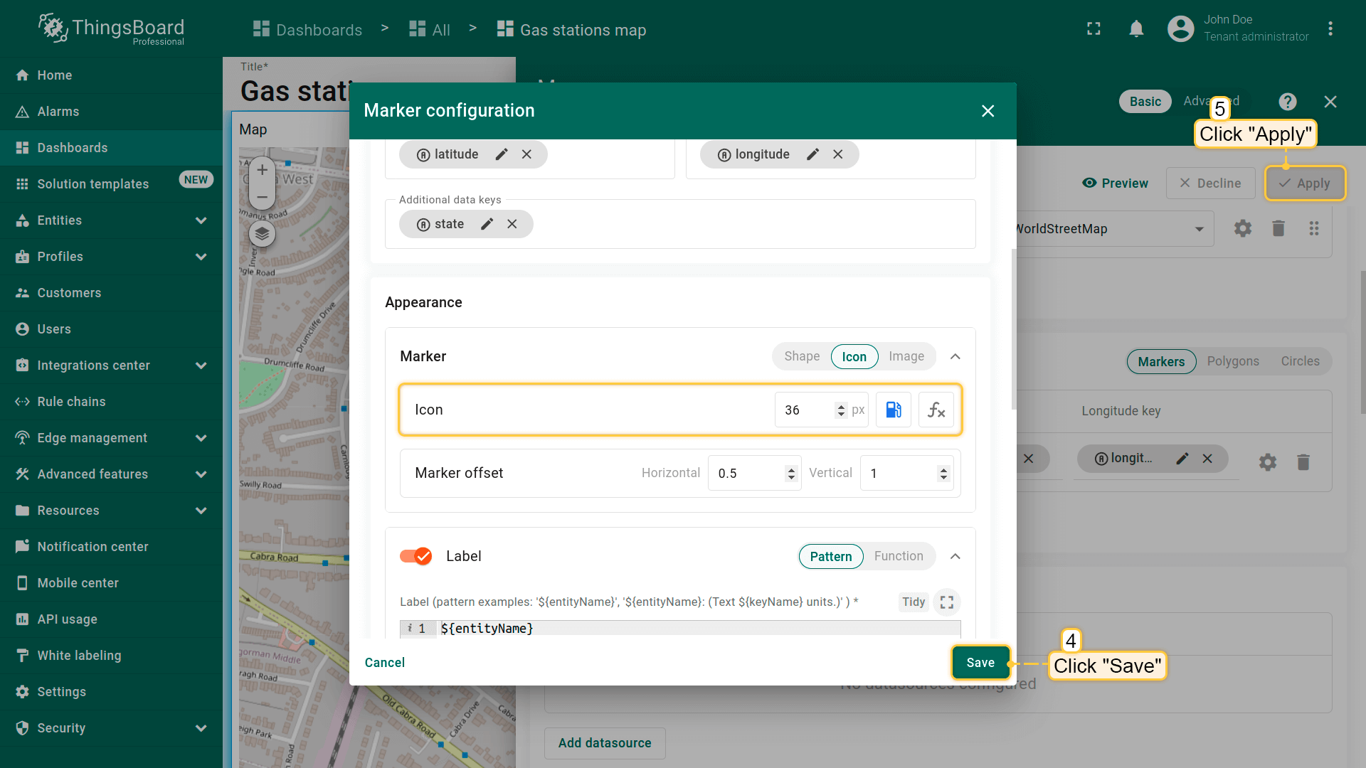
- Apply all changes.
基于“state”键值的变色函数:
1
2
3
4
5
6
7
8
9
10
var state = data.state;
if (state  !== '') {
  if (state == 'opened'){
    return 'green';
  } else {
    return 'red';
  }
} else {
  return 'grey';
}
当前「state」键值为「opened」,故标记显示为绿色。
一旦「state」键值变为其他值,标记将变为红色。
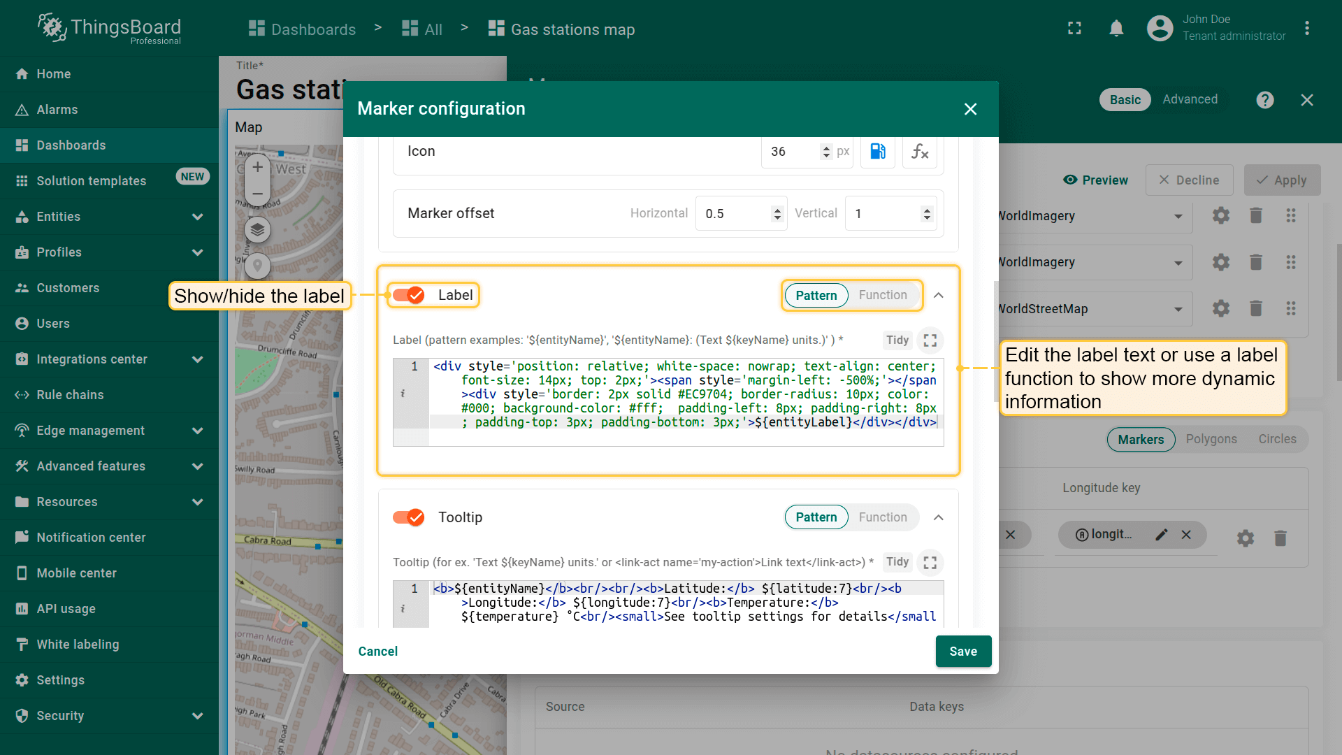
Label(标签)
标记标签位于图标上方,默认显示实体名称。 可编辑标签文本或使用label函数显示更多动态信息。
标签样式示例:
1
2
3
4
<div style='position: relative; white-space: nowrap; text-align: center; font-size: 14px; top: 2px;'>
    <span style='margin-left: -500%;'></span>
    <div style='border: 2px solid #EC9704; border-radius: 10px; color: #000; background-color: #fff;  padding-left: 8px; padding-right: 8px; padding-top: 3px; padding-bottom: 3px;'>${entityName}</div>
</div>

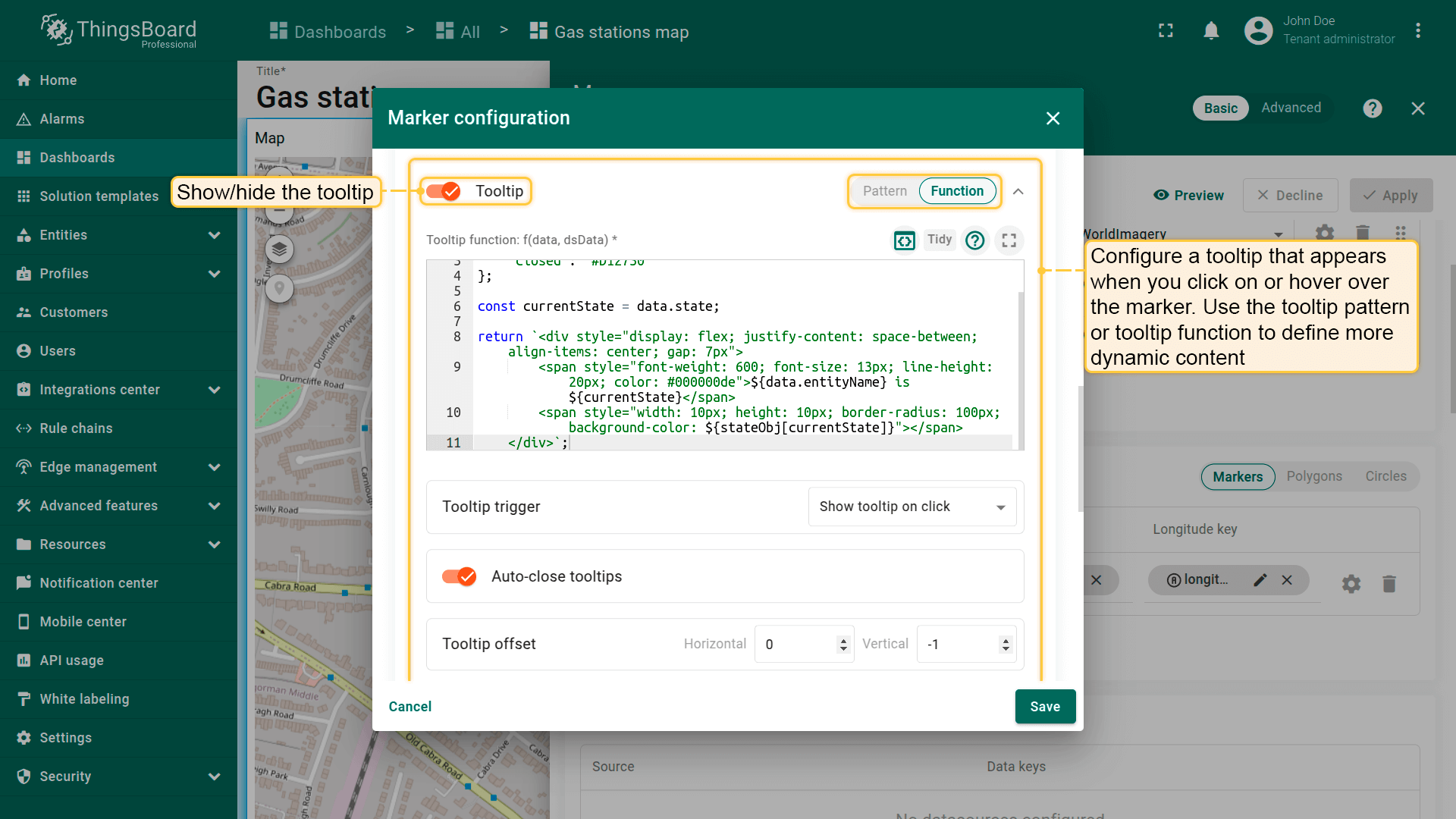
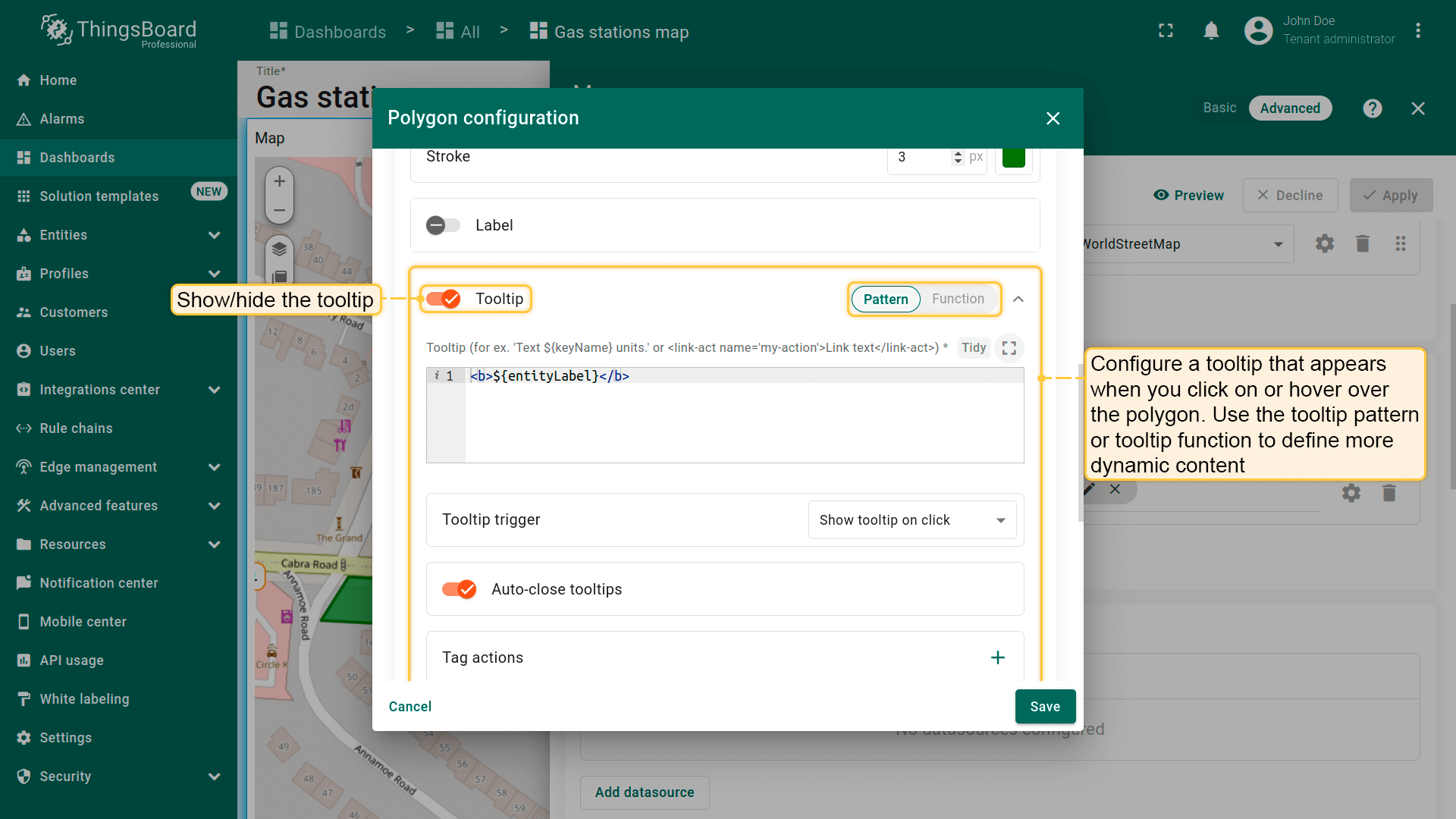
Tooltip(提示)
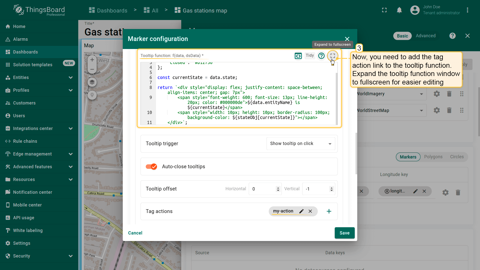
在此配置点击或悬停标记时显示的tooltip。 使用tooltip模式或tooltip函数定义更动态的内容,也可完全隐藏tooltip。
例如,您希望tooltip通过从「Keys」区域「Additional data keys」中指定的「state」键获取值,以显示加油站的开/关状态。 将下方函数粘贴到Tooltip function窗口:
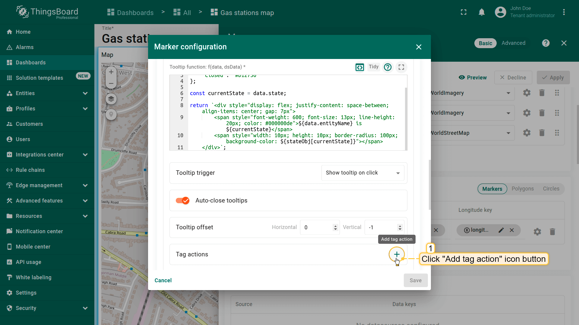
Tag actions(标签操作)
可将操作以标签形式添加到tooltip。可切换至新dashboard状态或另一个dashboard、打开外部URL,或触发自定义操作。 更多可用操作类型及配置方法请参阅部件操作文档。
首先需添加tag action,然后在tooltip函数中引用其名称:
- Click the "Add tag action" icon button.
- Configure the action and click "Add".
- Now, you need to add the tag action link to the tooltip function. Expand the tooltip function window to fullscreen for easier editing.
- Edit the function by adding a link to the tag action. Be sure to specify the tag action name correctly.
- Apply all changes.
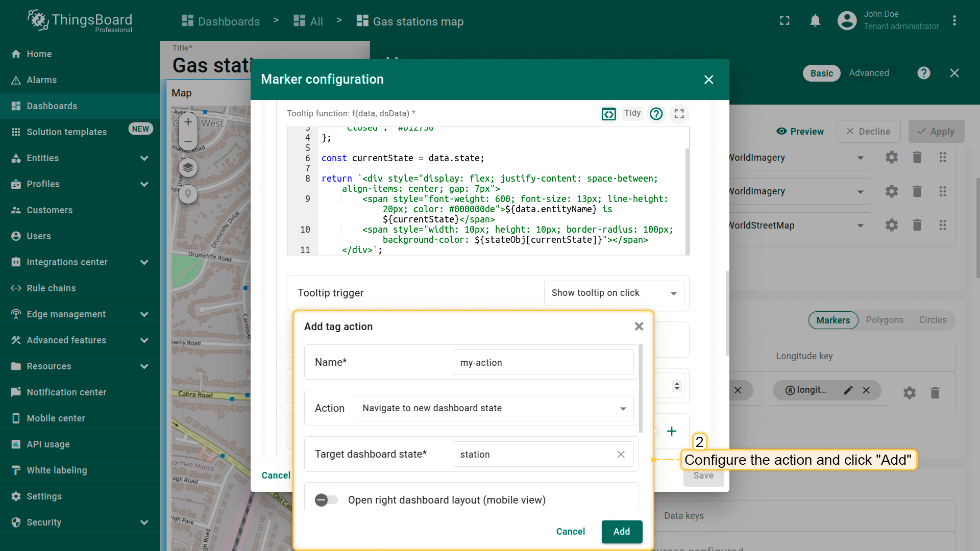
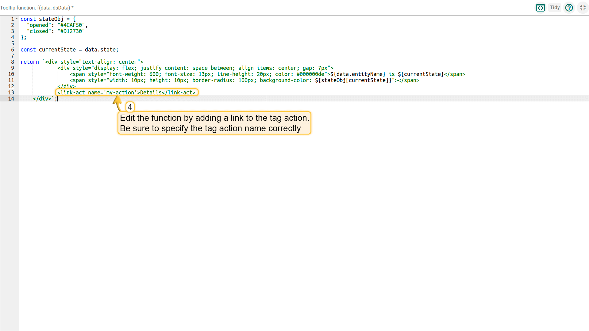
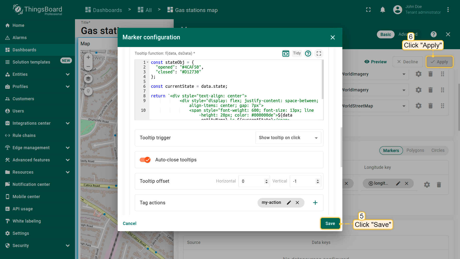
下方函数已包含对名为「my-action」的tag action的引用。 若您为tag action使用了不同名称,请将「my-action」替换为您的实际tag名称。 使用此函数替换之前的tooltip函数:
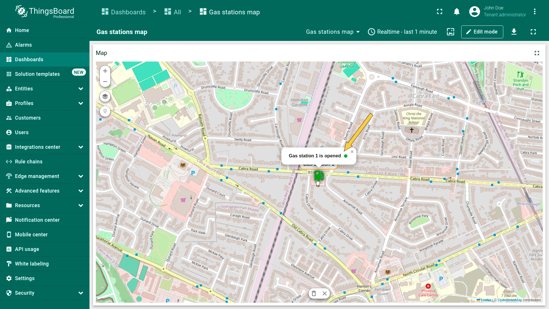
点击标记。在出现的tooltip中会看到标签——点击它。在标签设置中定义的操作将被执行。

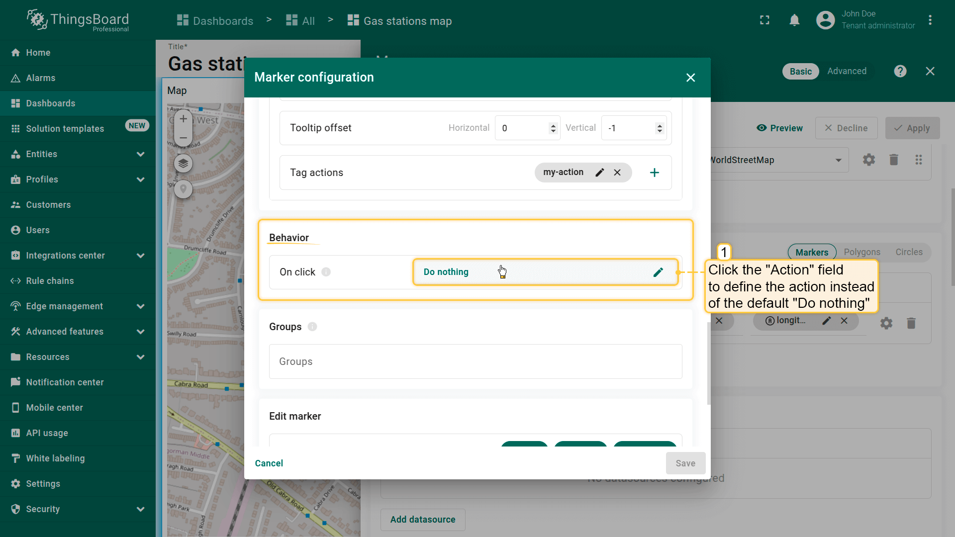
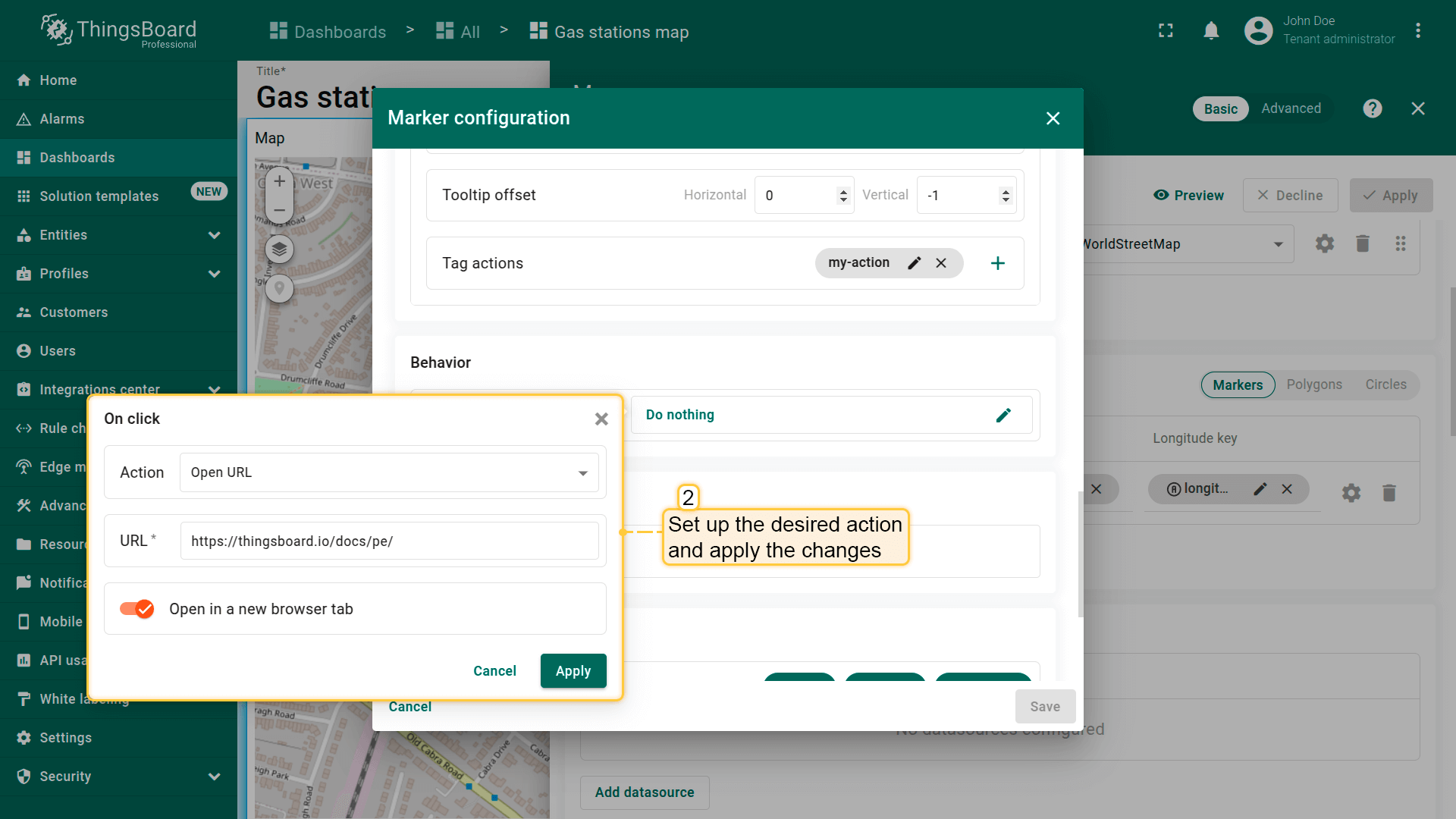
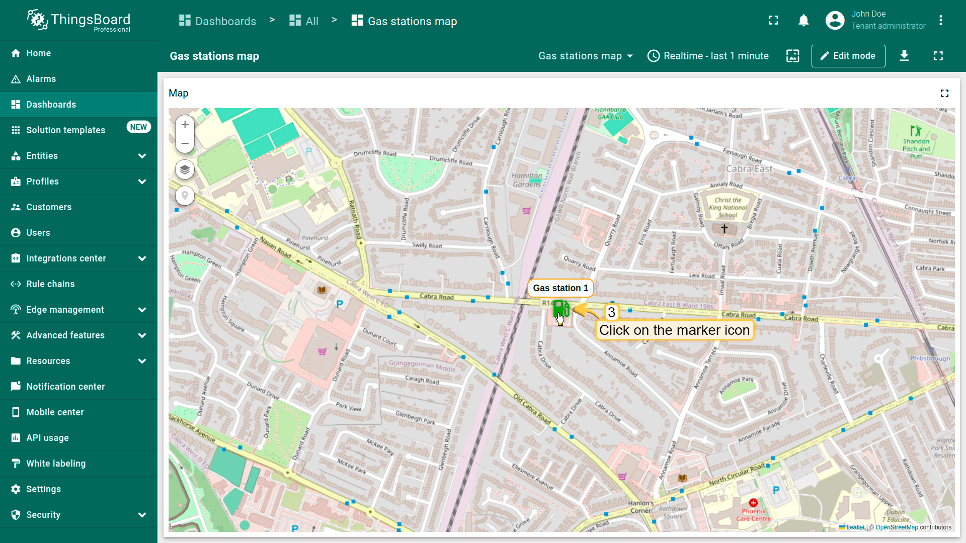
Behavior(行为)
设置点击标记时的行为。
- Go to the "Behavior" section and click the "On click" action field to define the action instead of the default "Do nothing".
- Set up the desired action and apply the changes.
- Click on the marker.
- The action you specified in the action settings will be triggered.
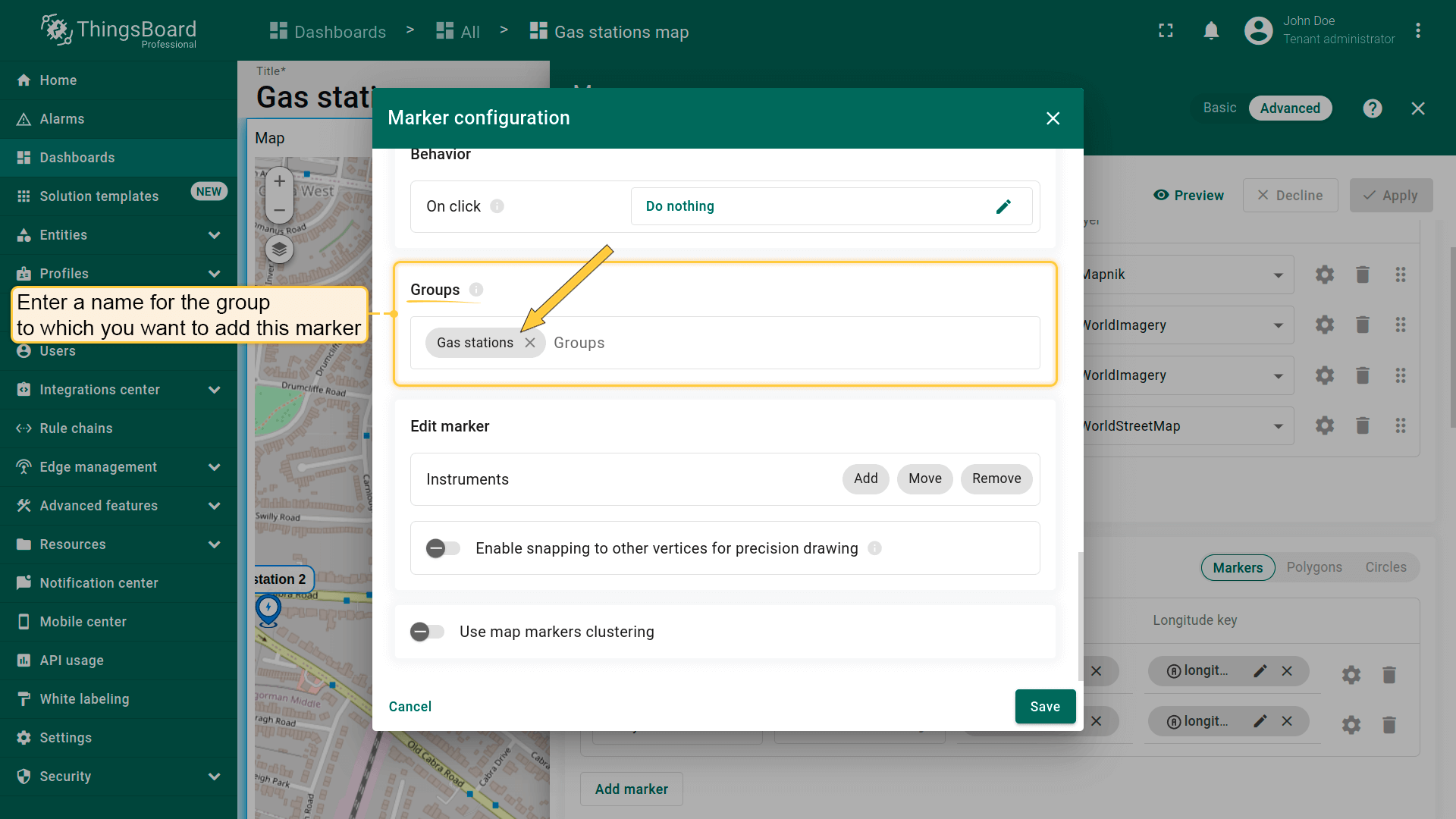
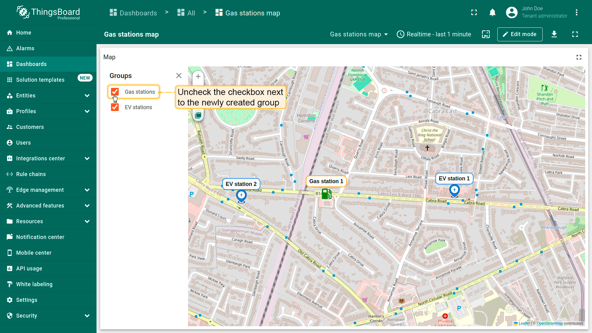
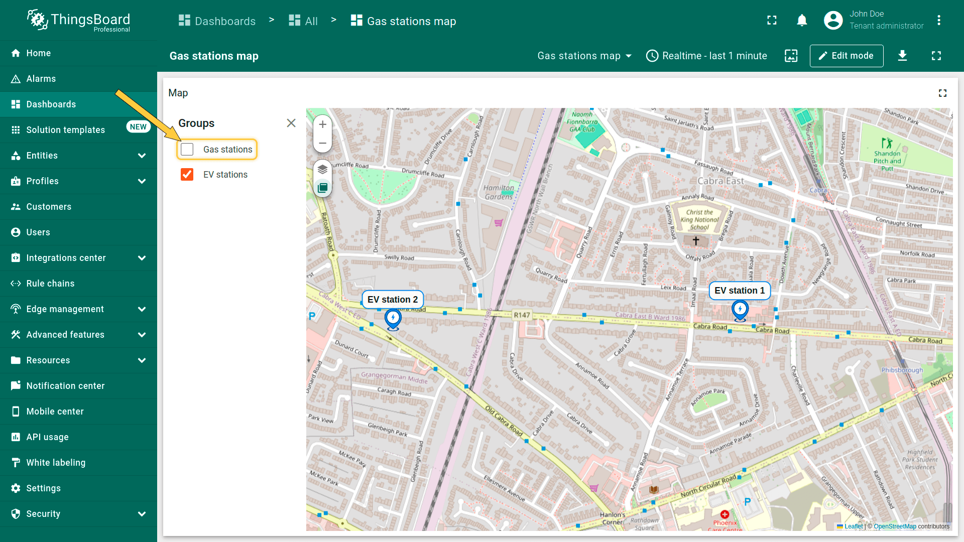
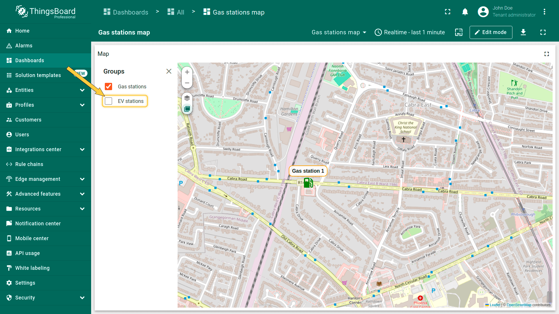
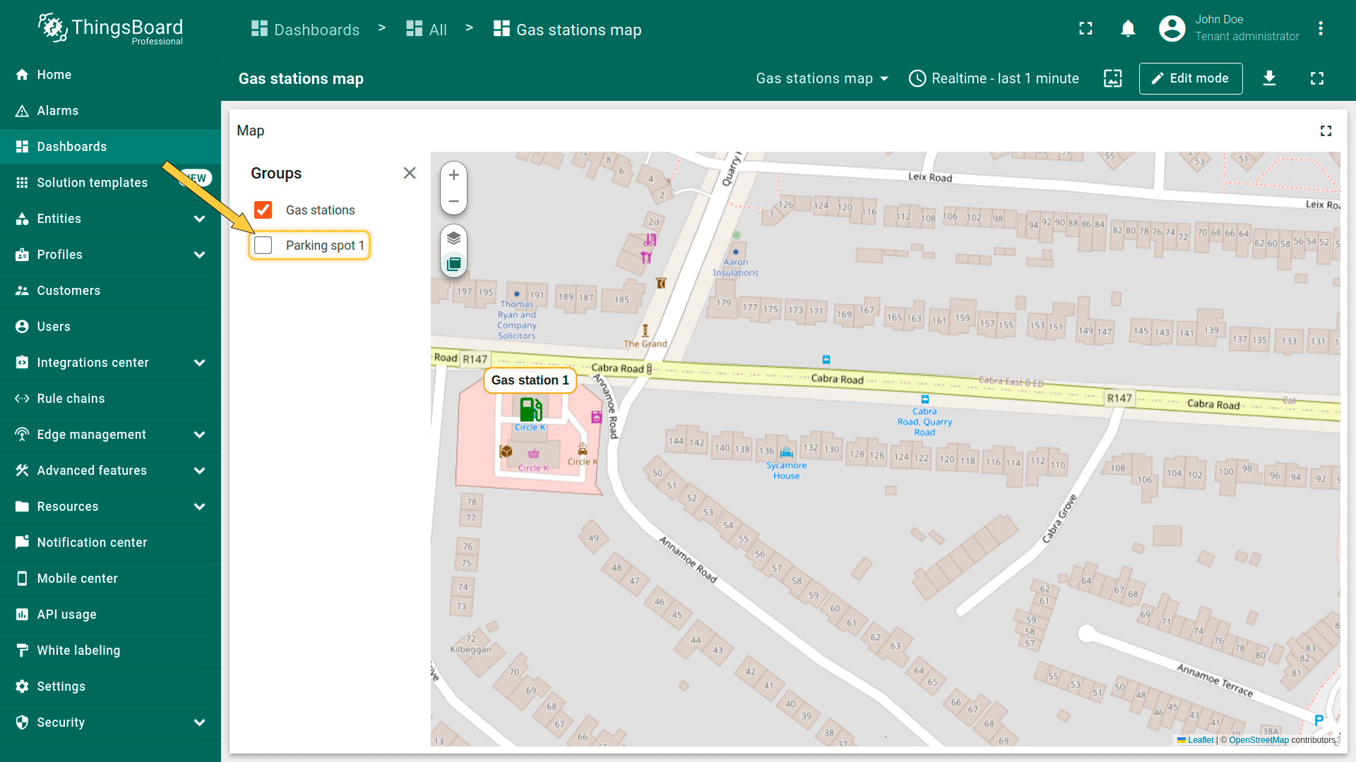
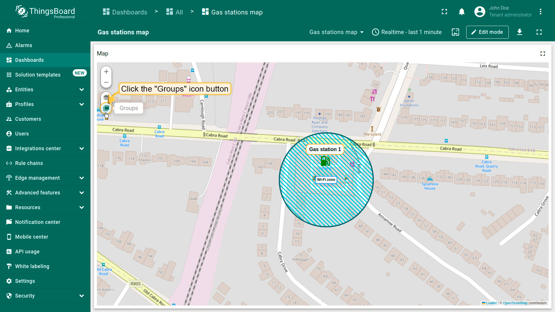
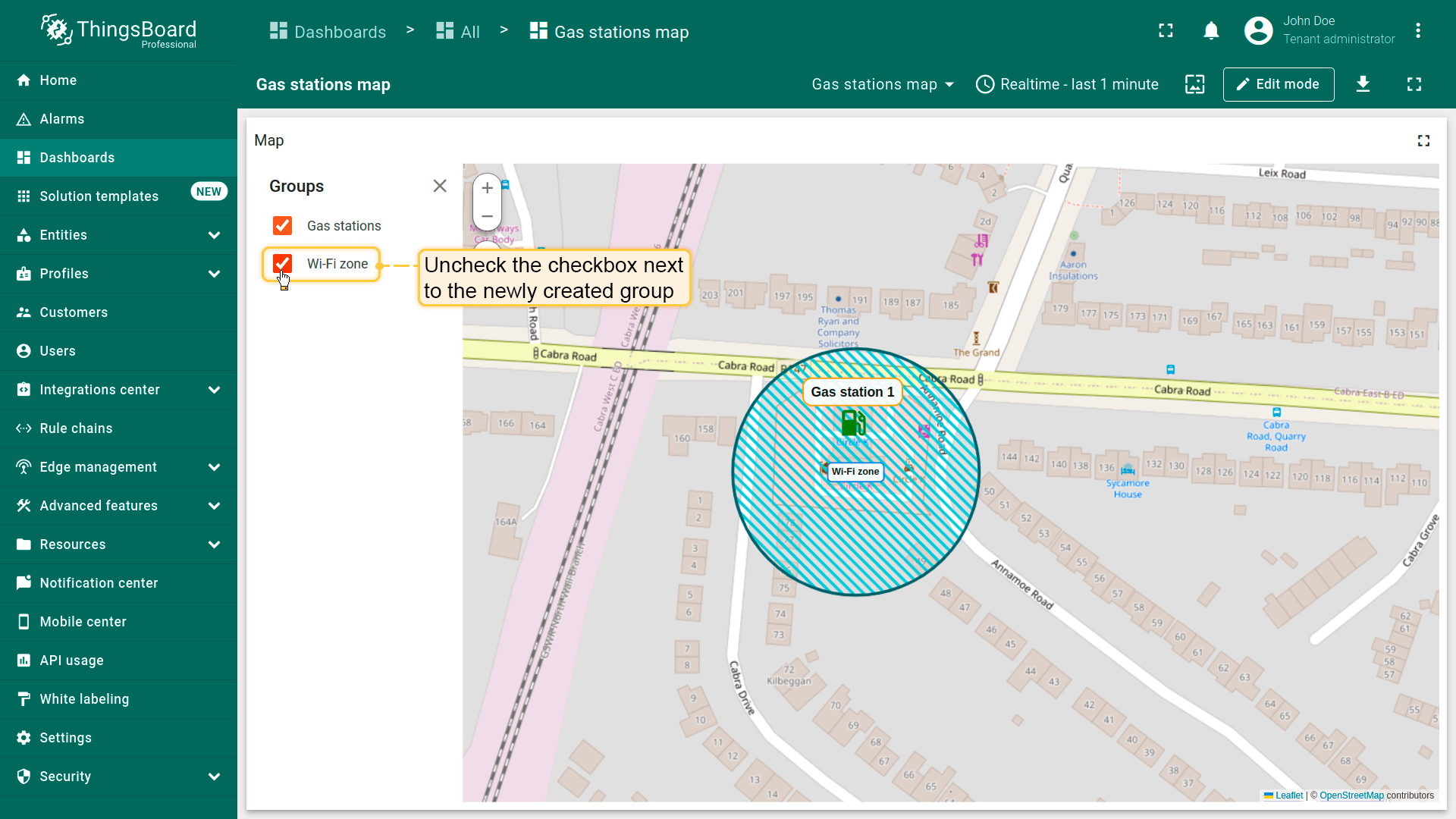
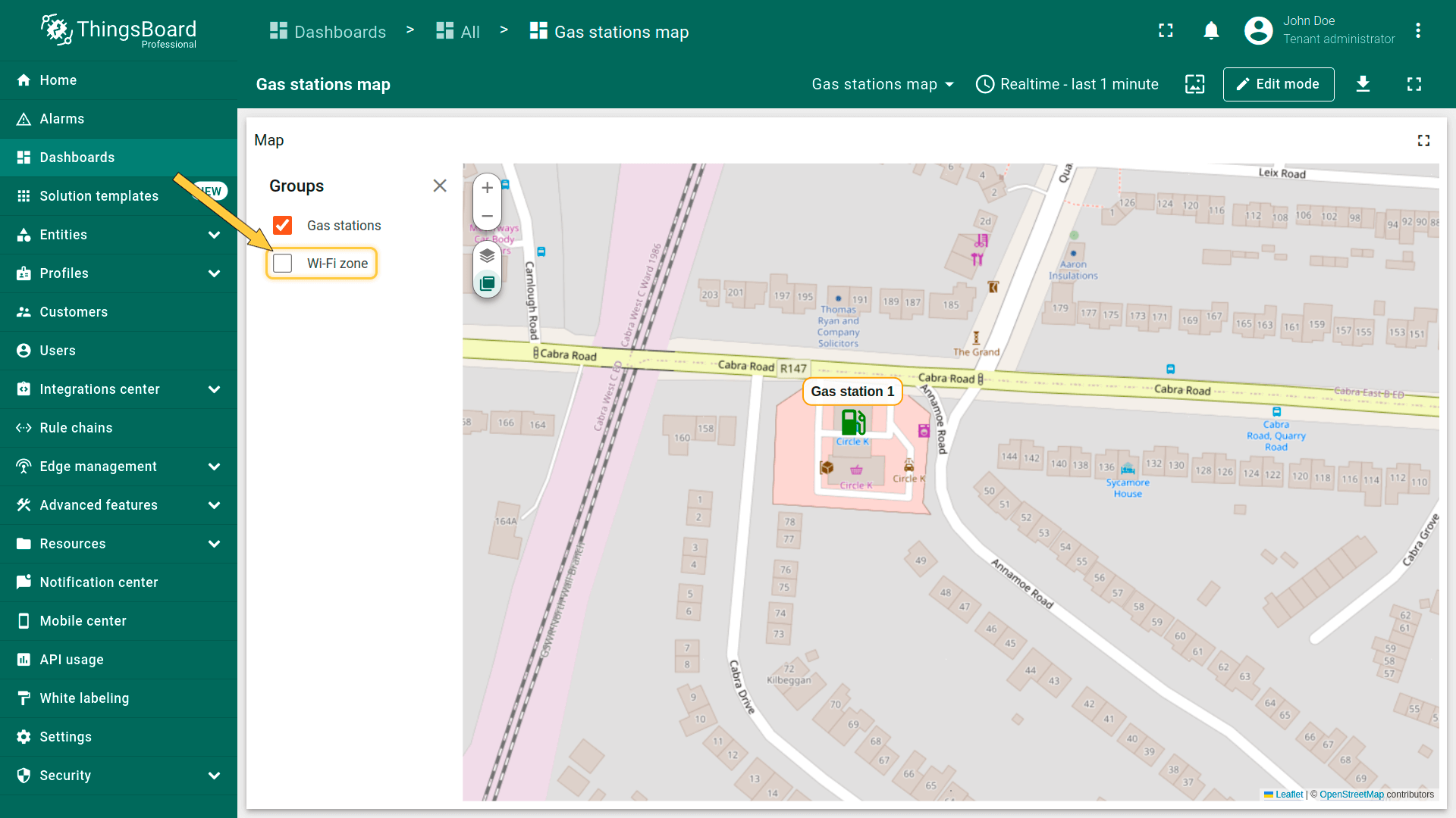
Groups(分组)
标记可分组,便于后续通过「Groups」选项卡显示或隐藏分组元素。
- 在「Groups」区域输入要将此标记加入的组名称。
- 部件上将出现「Groups」图标按钮。点击它。
- 要隐藏某组,取消勾选其名称旁的复选框。
- 该组中的标记将被隐藏。

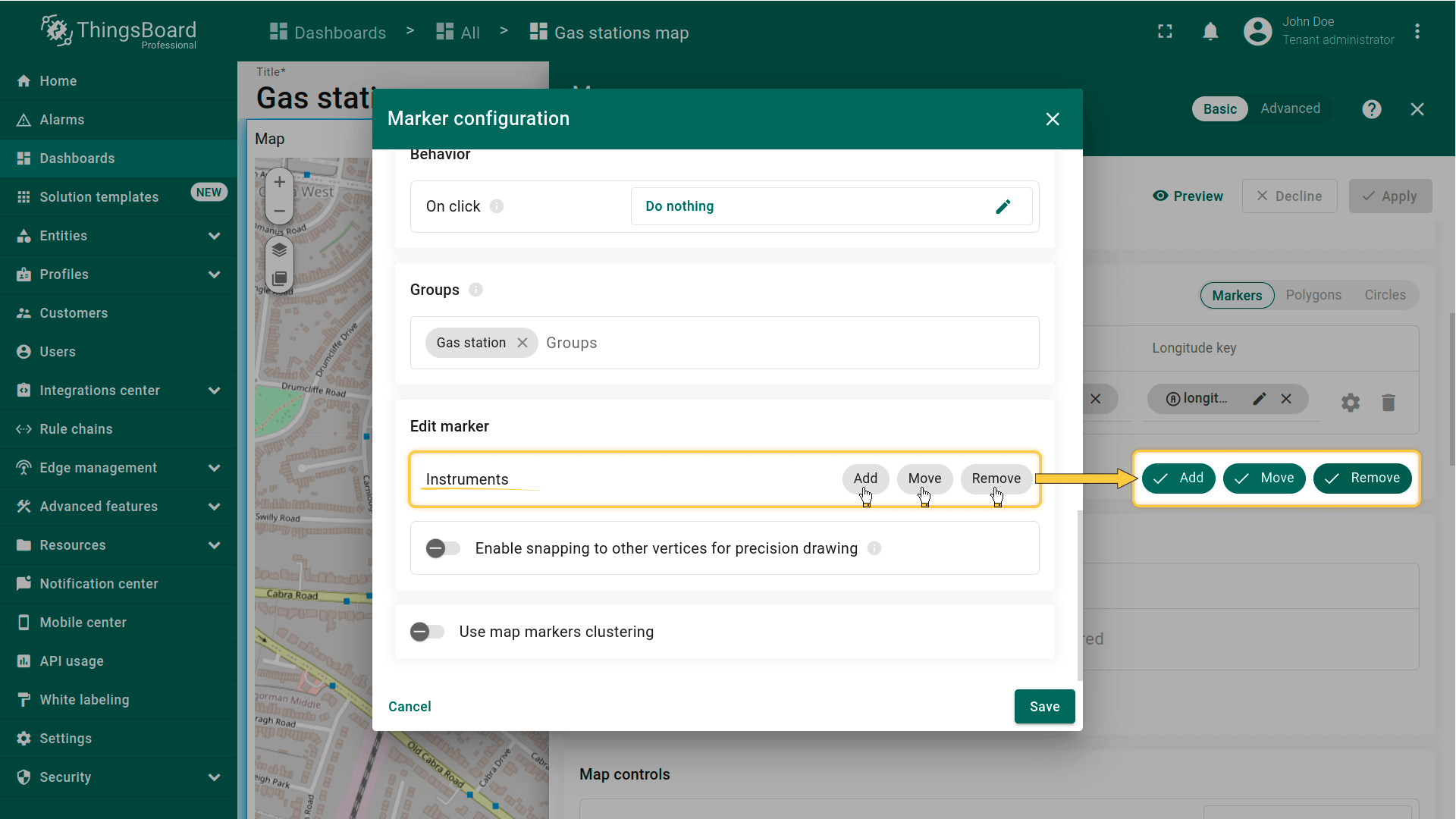
Marker editing tools(标记编辑工具)
可使用内置工具对标记执行 Add(添加)/ Move(移动)/ Delete(删除)等操作。默认这些工具为禁用状态。
勾选要启用的工具旁的复选框。
- You can use the built-in tools to perform operations on markers such as Add / Move / Delete. By default, these tools are disabled. Check the boxes next to the tools you want to enable.
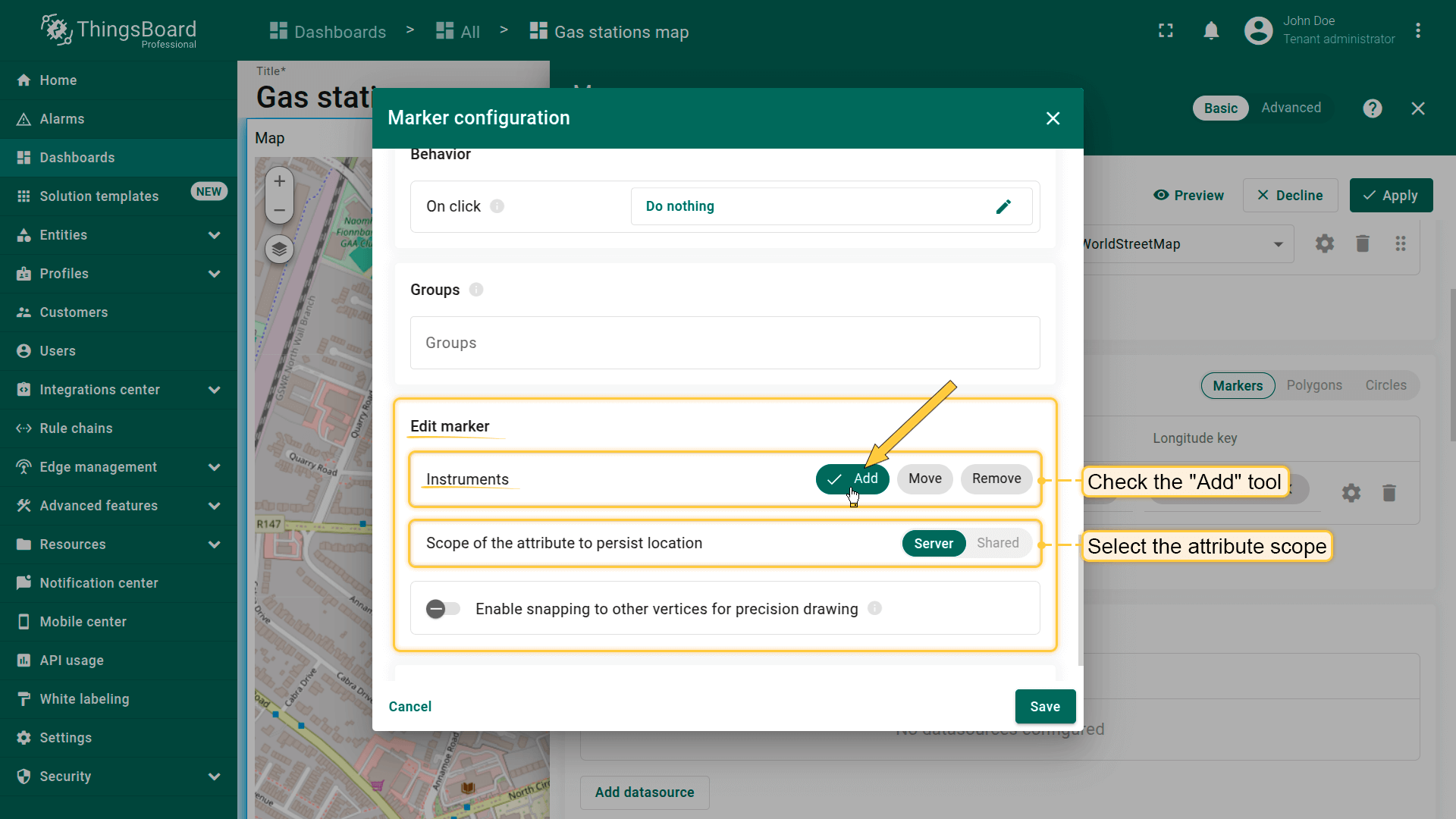
添加标记
若实体未设置坐标,可使用地图部件工具手动放置标记——其坐标将自动保存为实体的attributes。
首先,向地图添加标记放置工具:
- 在「Edit marker」区域勾选「Add」工具。
- 选择坐标存储的属性作用域:「Server」或「Shared」。
- 可选:启用吸附到其他顶点以精确绘制。
- 然后保存更改。
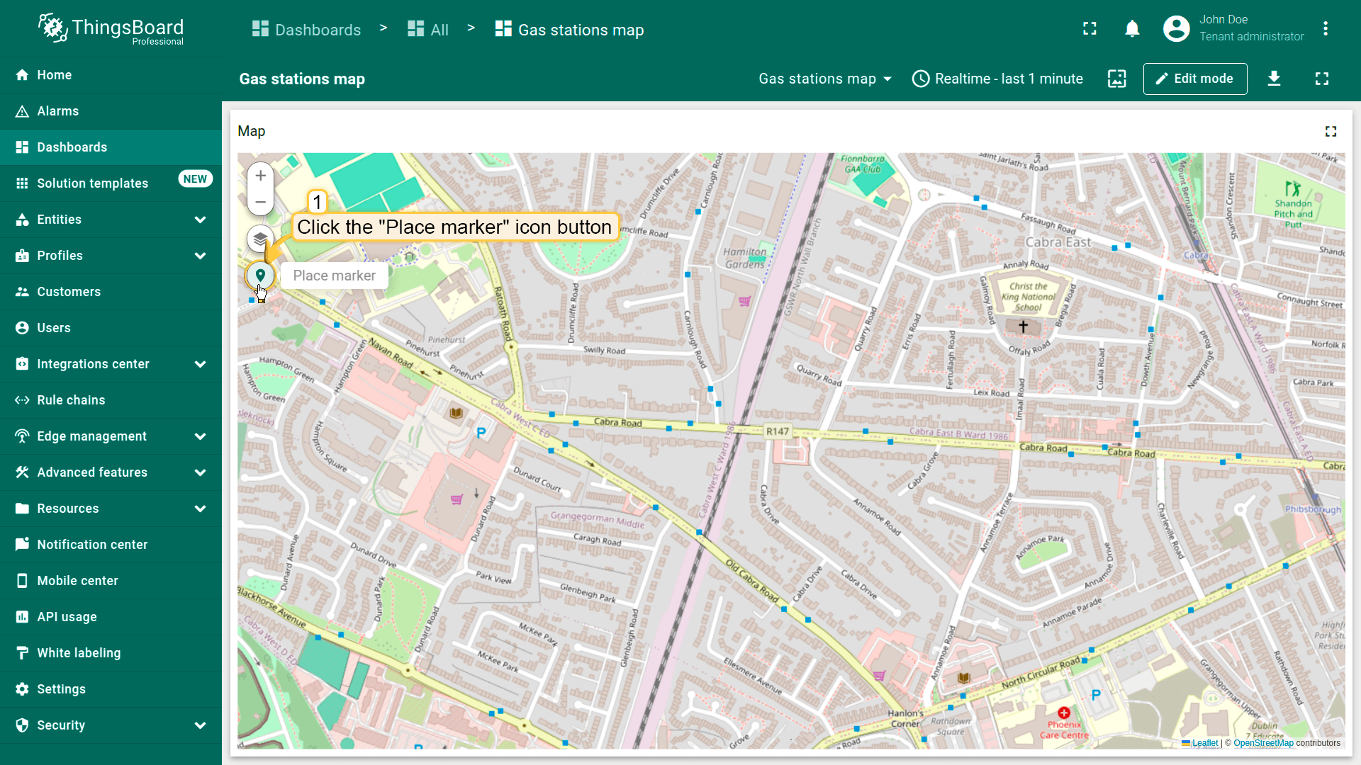
现在可在地图上放置标记:
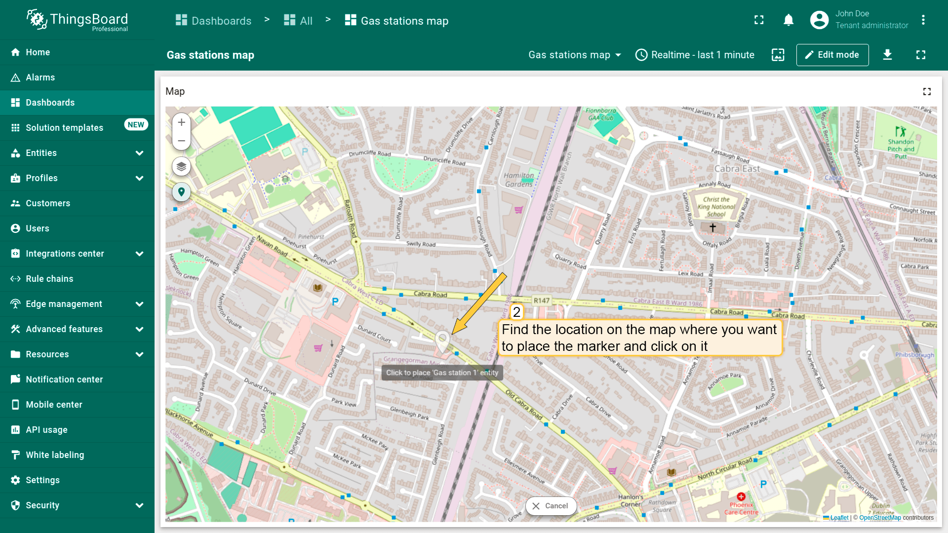
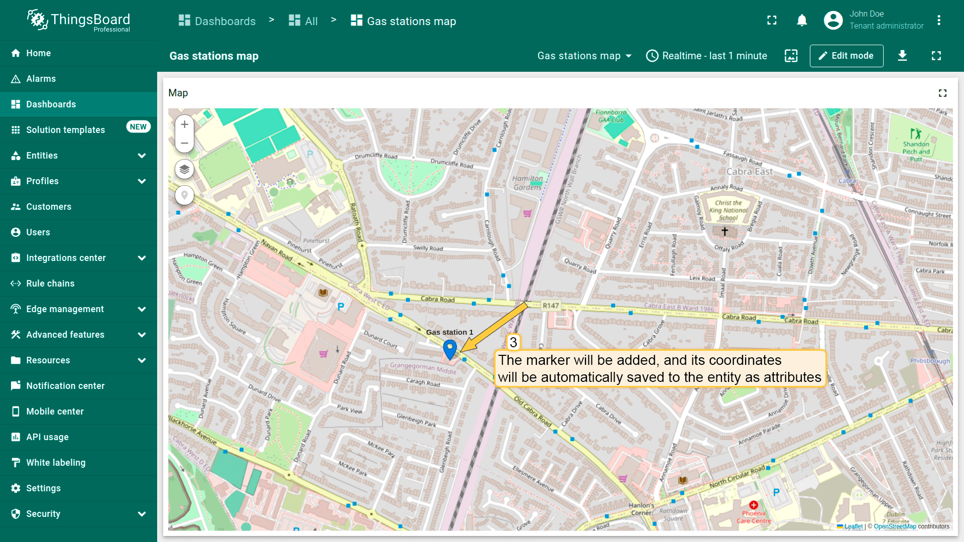
- 在地图部件上找到并点击「Place marker」图标按钮。若使用包含多个实体的alias作为数据源,需从下拉菜单中选择对应实体。
- 在地图上找到要放置标记的位置并点击。
- 标记将被添加,其坐标将自动保存为实体的attributes。
- On the map widget, locate and click the "Place marker" icon button. If you're using an alias with multiple entities as the data source, you'll need to select the appropriate entity from the dropdown menu.
- Find the location on the map where you want to place the marker and click on it.
- The marker will be added, and its coordinates will be automatically saved to the entity as attributes.
此外,勾选所需工具旁的复选框可移动或删除标记。
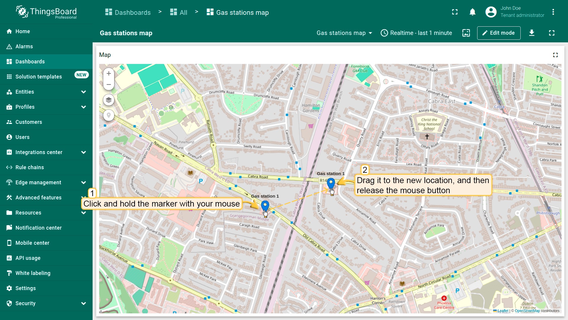
移动标记
别忘了在「Edit marker」区域的标记设置中启用「Move」工具。
要移动标记,用鼠标点击并按住标记,拖至新位置后松开鼠标。
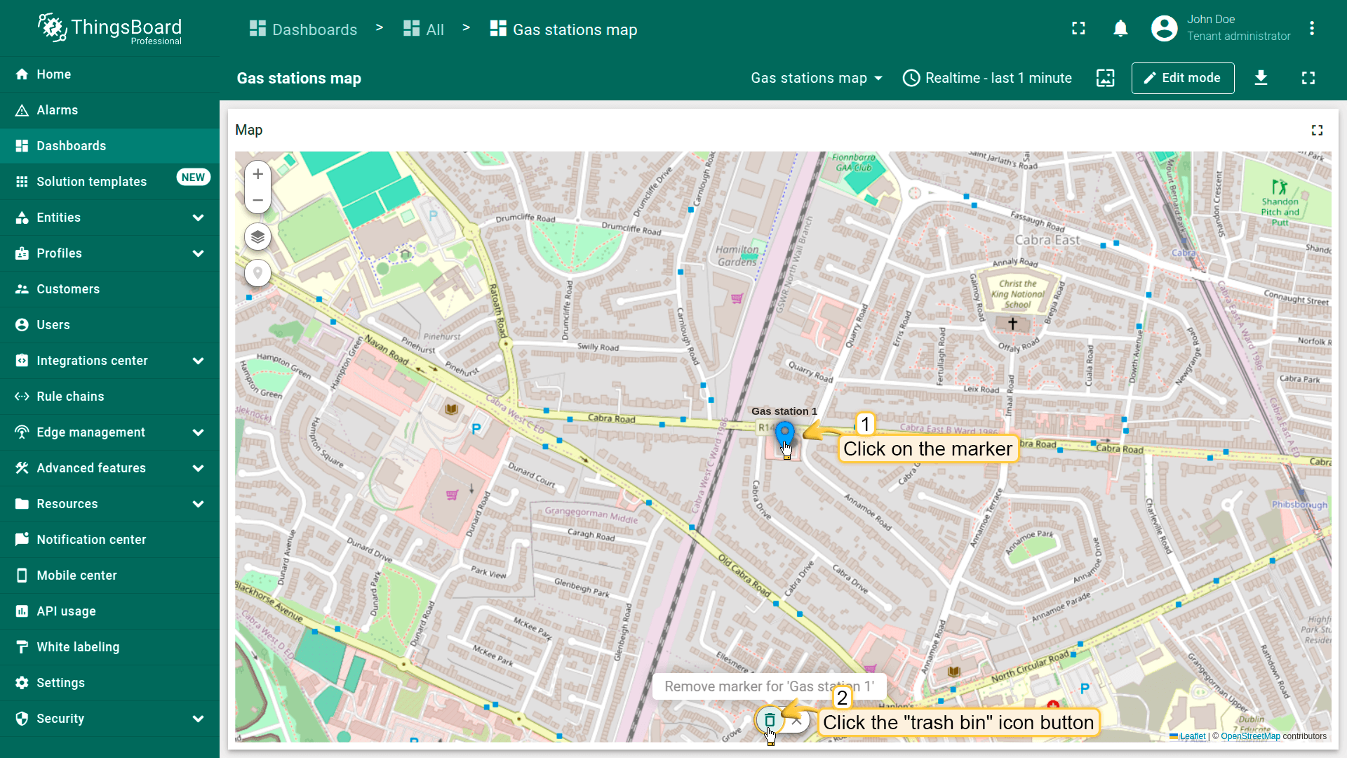
删除标记
别忘了在「Edit marker」区域的标记设置中启用「Remove」工具。
要删除标记,点击该标记,然后点击部件底部菜单中的垃圾桶图标。
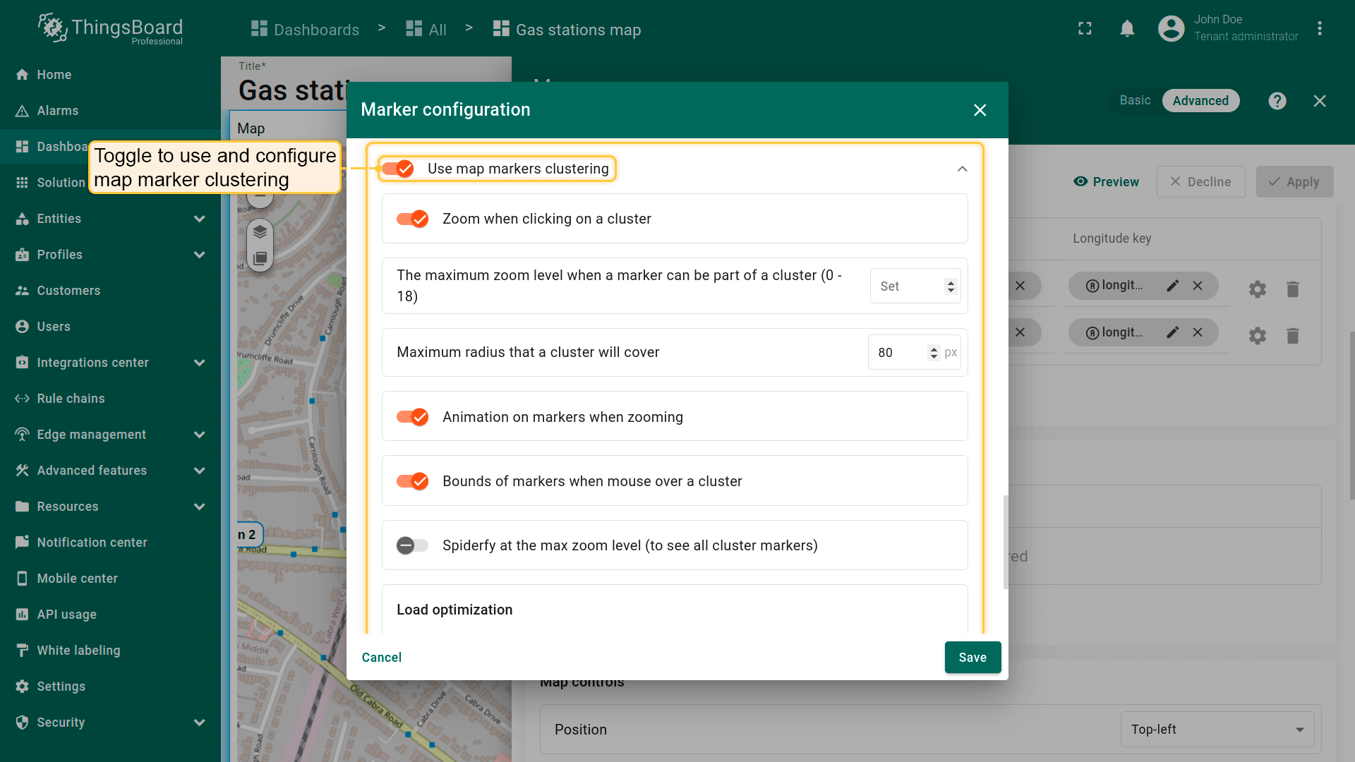
使用地图标记聚类
地图聚类功能会在特定缩放级别下,将同一可见区域内的多个标记自动归为一组——以一个圆形图标显示组内数量,而非逐个显示标记。
在展示大量标记时,可显著提升地图可读性。

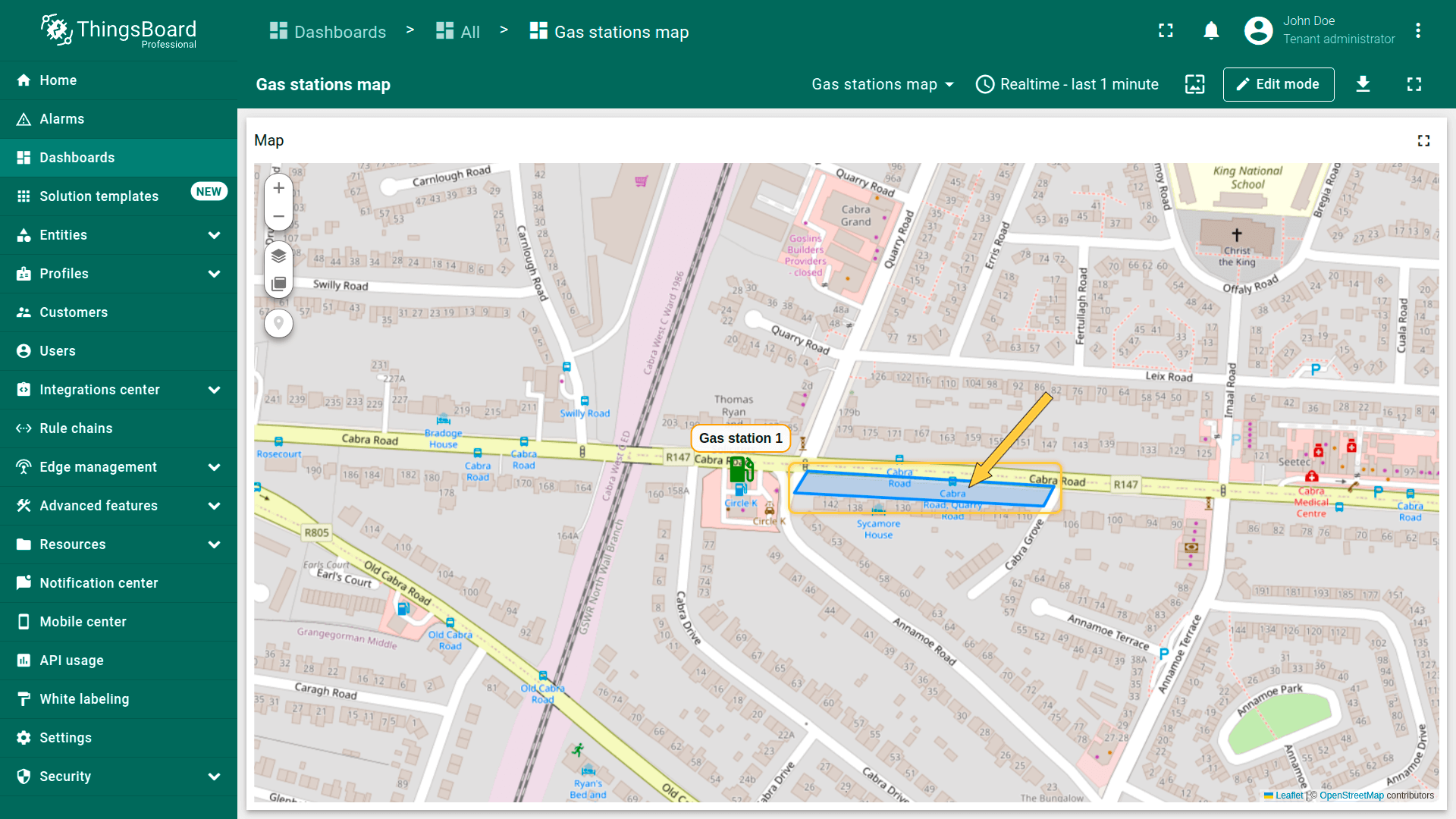
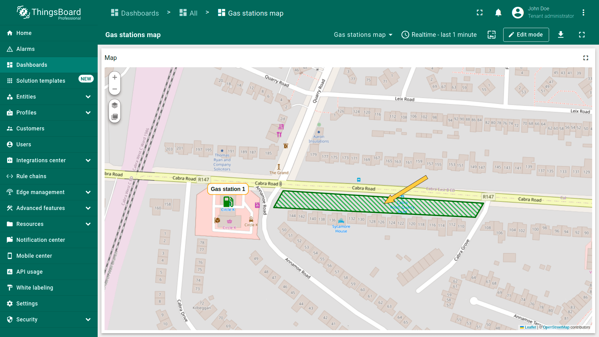
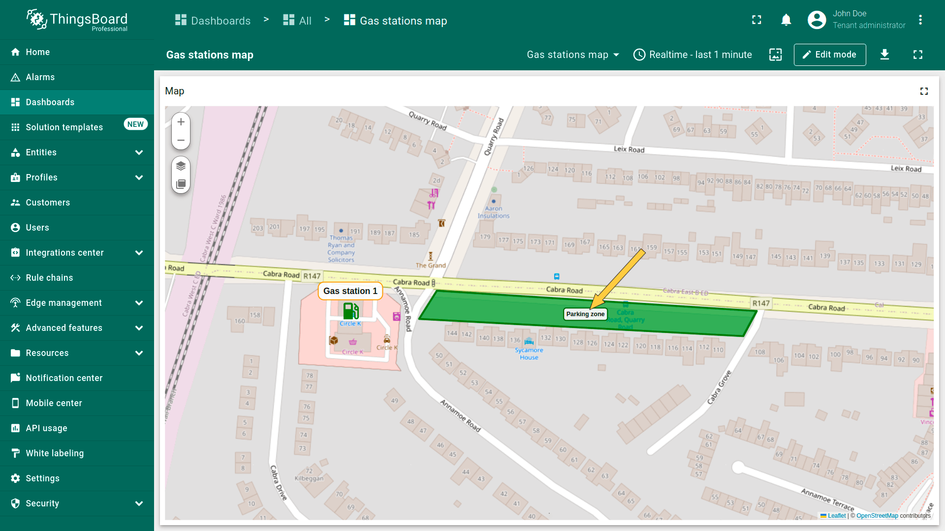
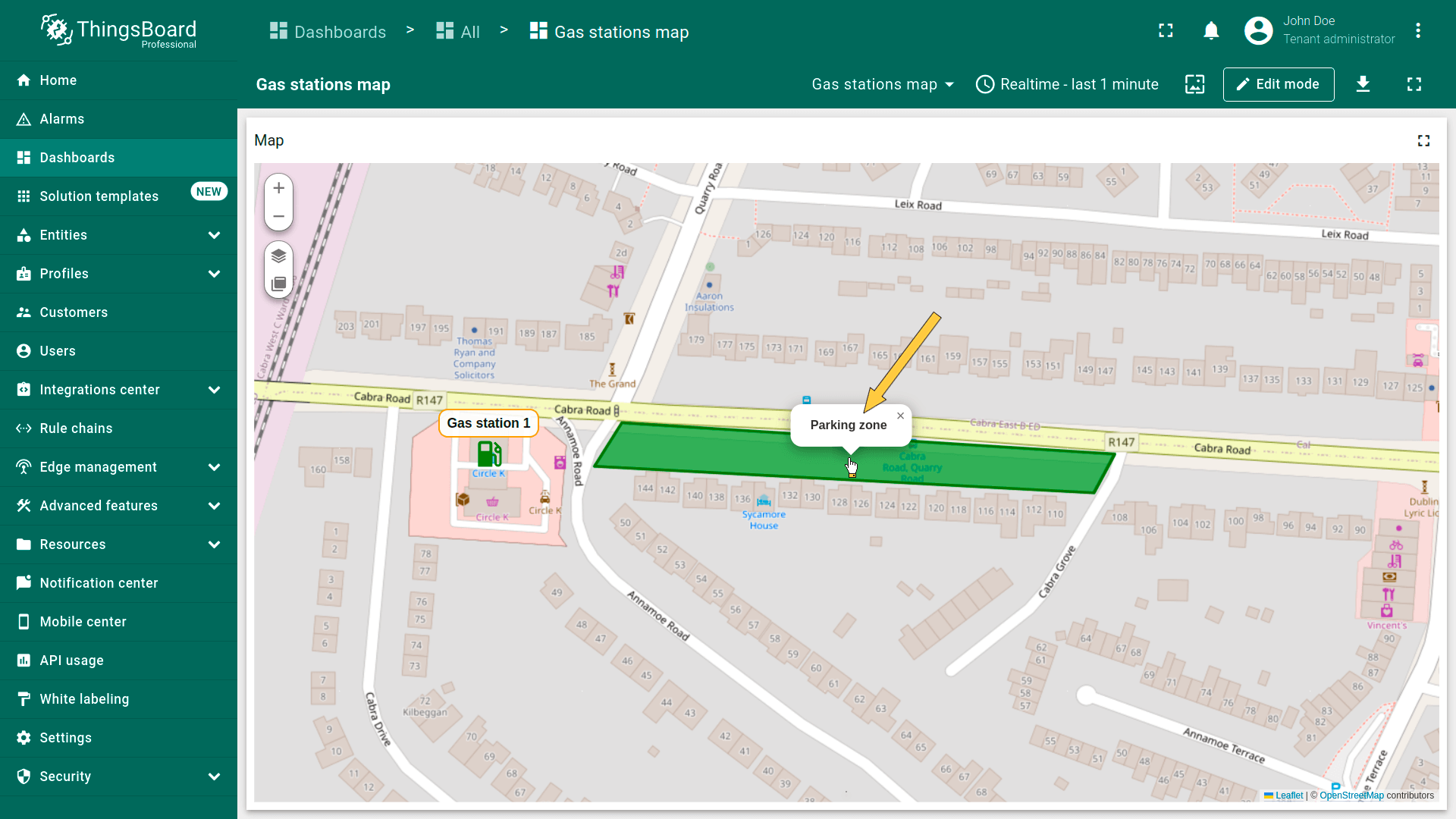
多边形
多边形为由有限个点定义的平面图形。 可用于标记建筑、场地、服务区、覆盖区或限区等区域。
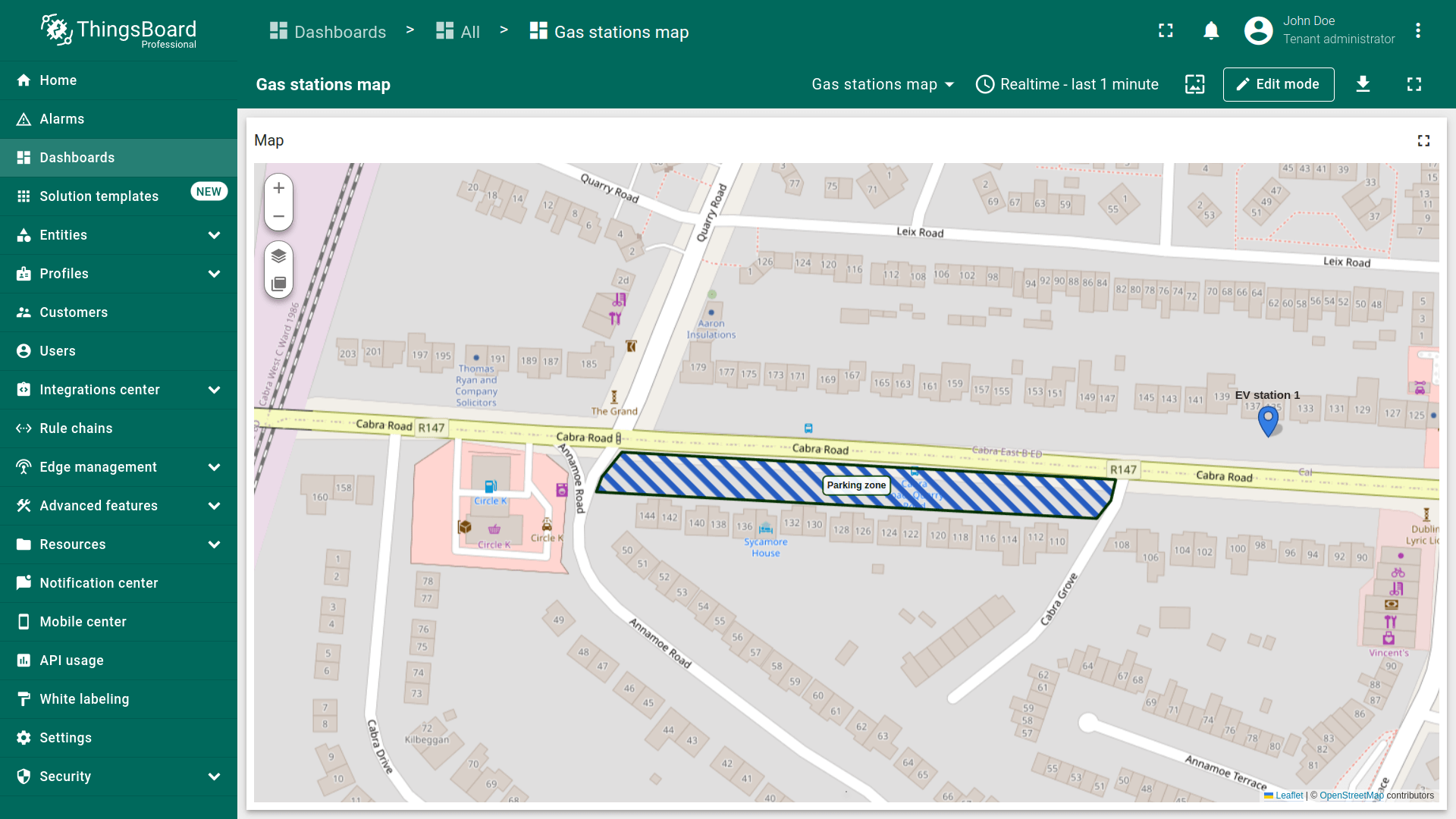
要将实体显示为多边形,需以attributes或telemetry形式提供以下格式的坐标:
1
[[1Latitude,1Longitude],[2Latitude,2Longitude],...,[nLatitude,nLongitude]]
其中 n 为构成多边形的坐标数量。
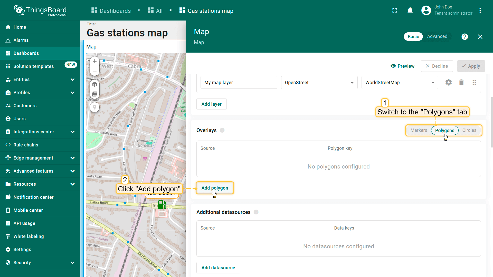
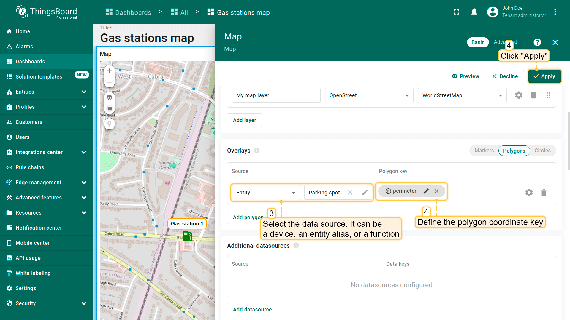
添加多边形
在地图上放置多边形请按以下步骤操作:
- 进入部件编辑模式并打开「Overlays」区域。
- 切换到「Polygons」选项卡,点击「Add polygon」。
- 选择要表示为多边形的实体。可为设备、entity alias或function。
- 定义包含多边形坐标的键。默认ThingsBoard使用「perimeter」键从实体attributes读取多边形坐标。若使用不同键,请相应更新。
- 点击「Apply」——多边形将根据实体数据显示在地图上。
多边形配置
要配置特定多边形,切换到地图部件编辑模式。 在「Overlays」区域的「Polygon」选项卡中,点击目标多边形旁的「gear」图标按钮打开其配置面板。
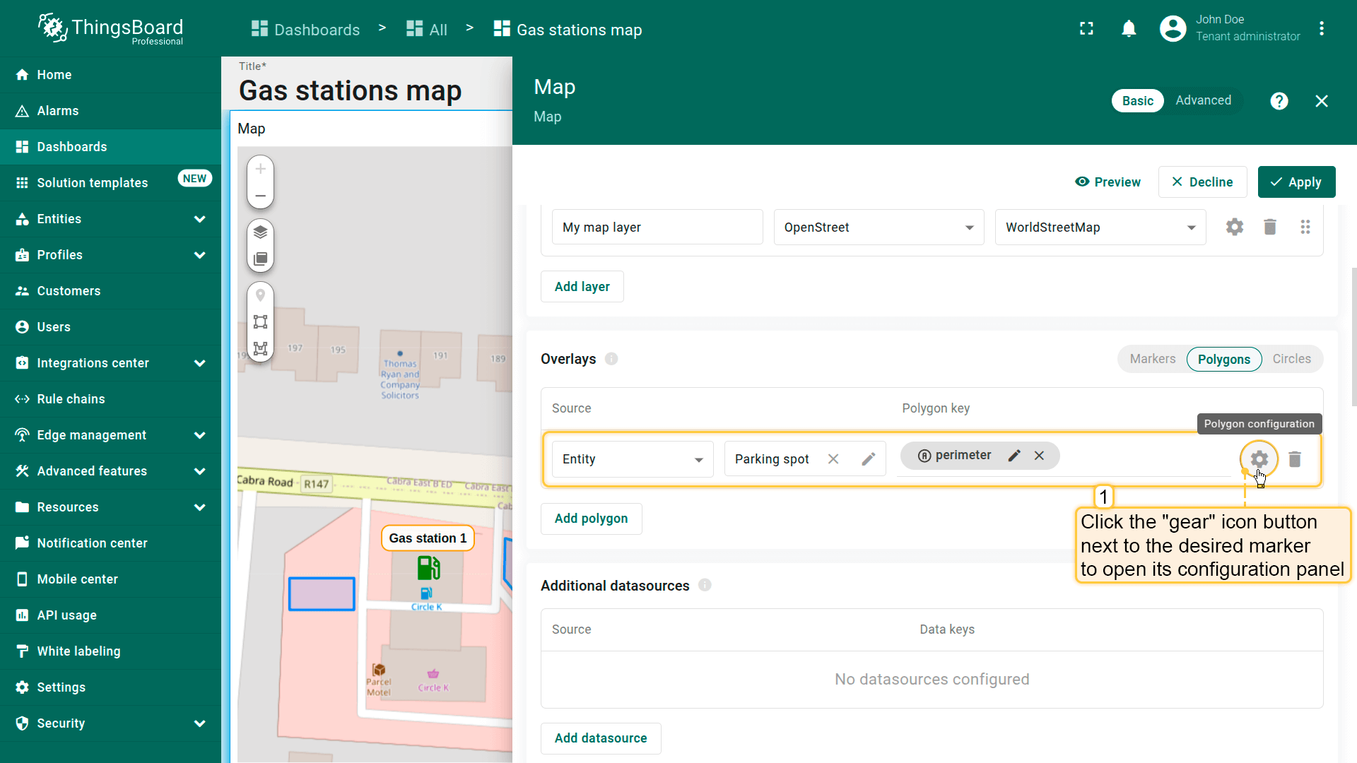
Datasource(数据源)
指定多边形的数据源——可为设备、entity alias或function。
如有需要,可应用筛选缩小选择范围。
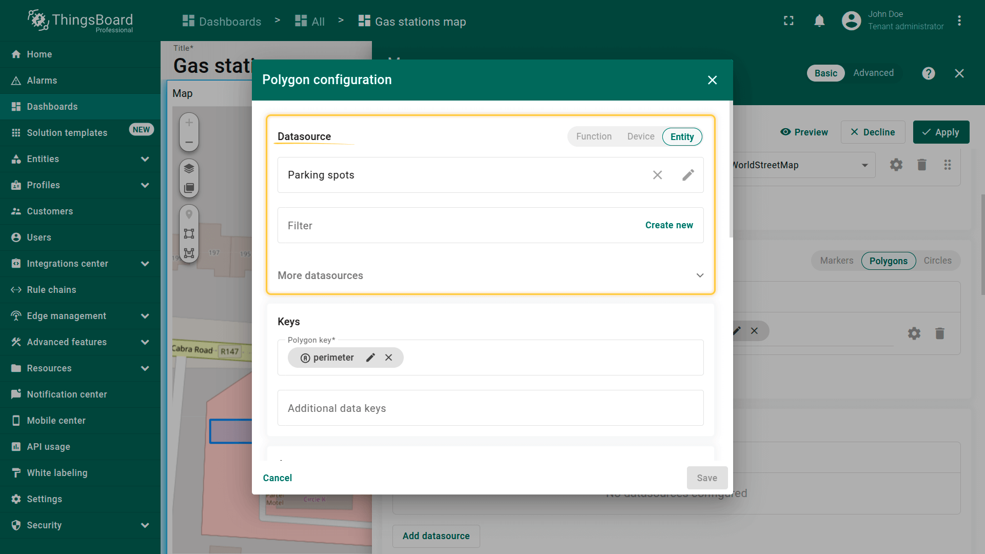
Keys(键)
定义包含多边形坐标的键。 默认ThingsBoard使用「perimeter」作为多边形键。若实体使用不同键名,请在此更新。
额外data keys可用于labels、tooltips或直接在地图上显示额外信息。
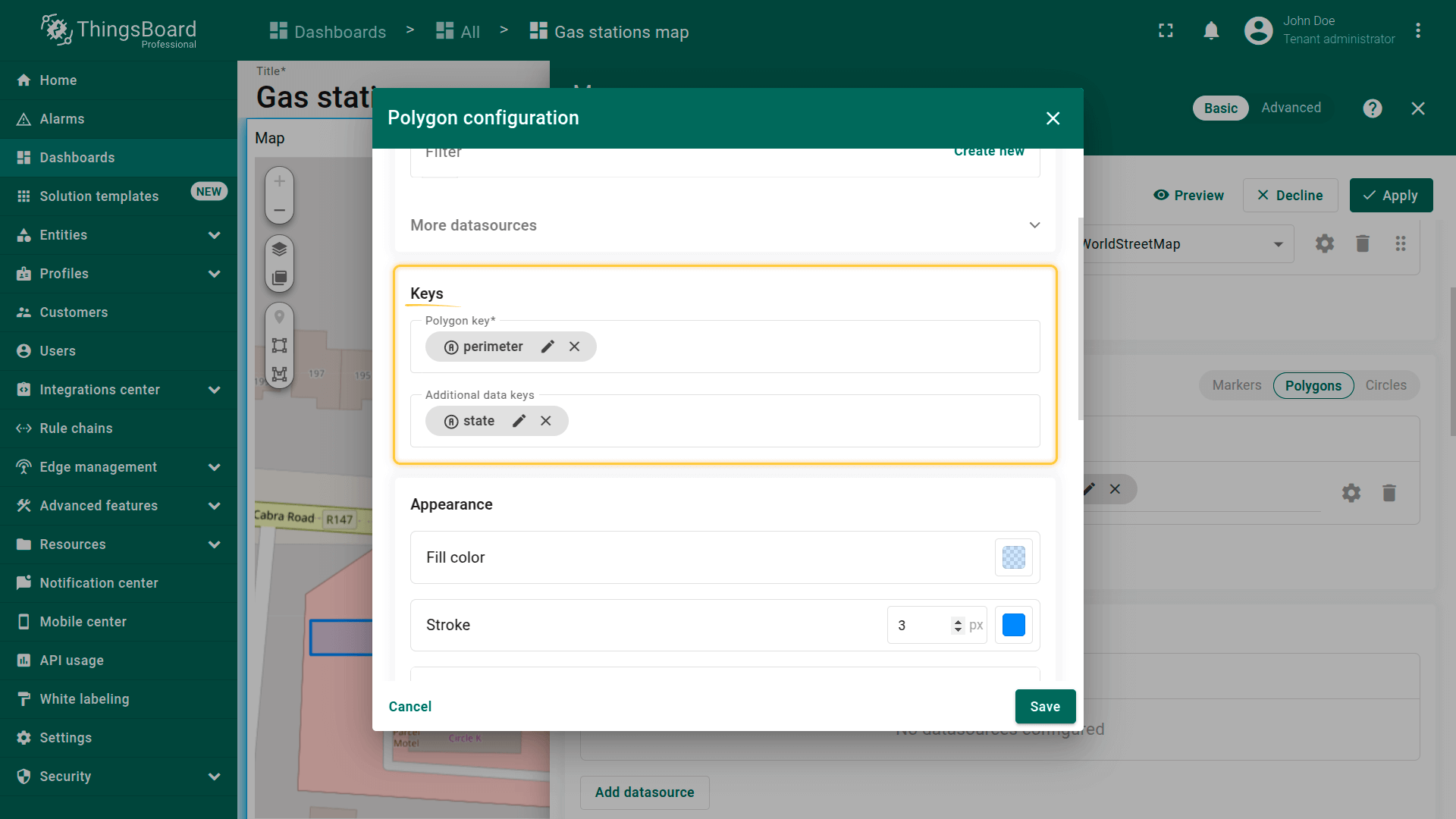
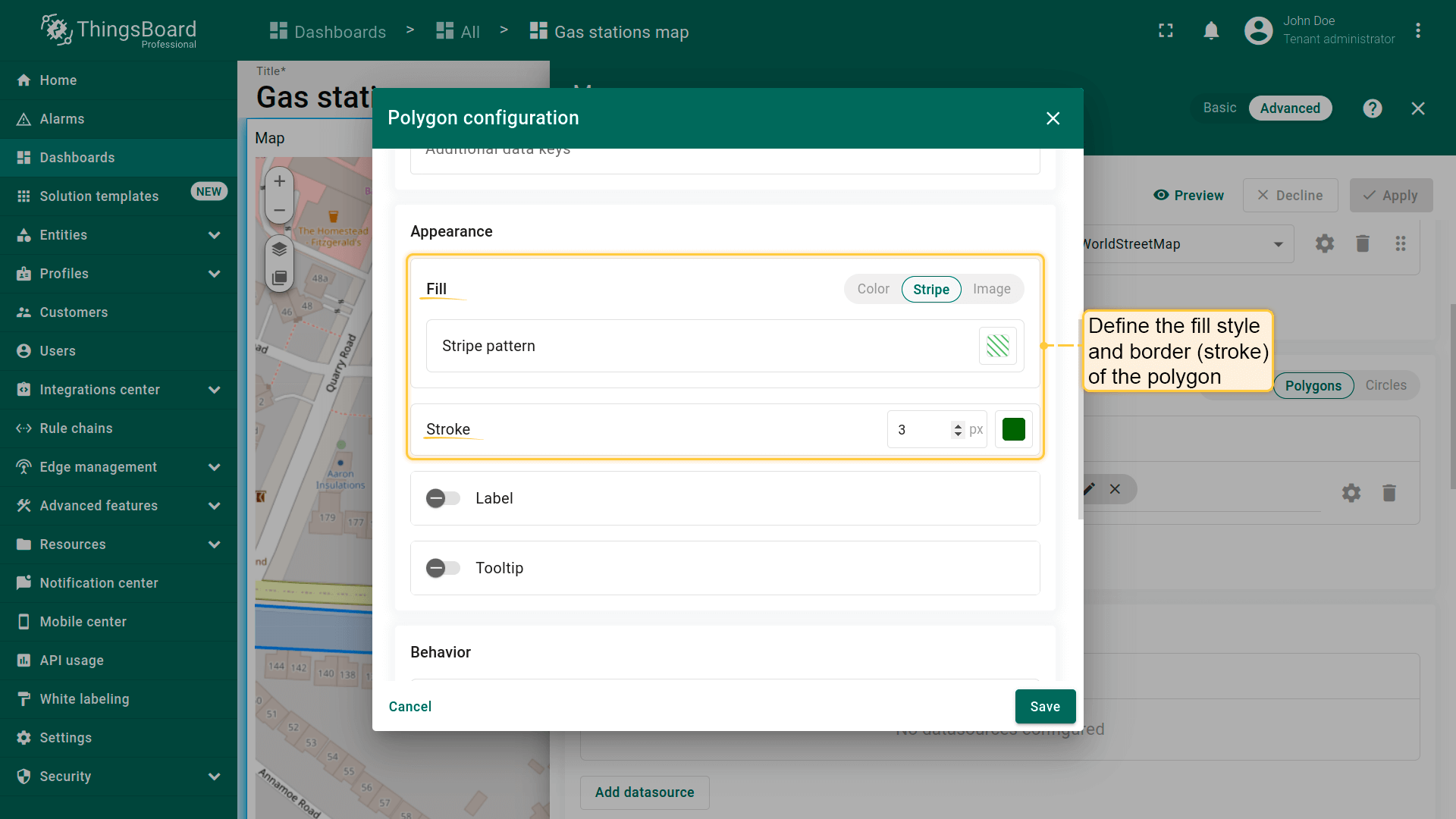
填充多边形
Fill(填充)— 定义多边形在地图上的填充方式:
- Color(颜色)— 设置纯色填充。
- Stripe(条纹)— 使用斜线填充代替纯色,便于标识特殊区域。
- Image(图片)— 可使用图片作为背景填充。
Stroke(描边)— 定义多边形轮廓:
- Border color(边框颜色)
- Line thickness(线宽)
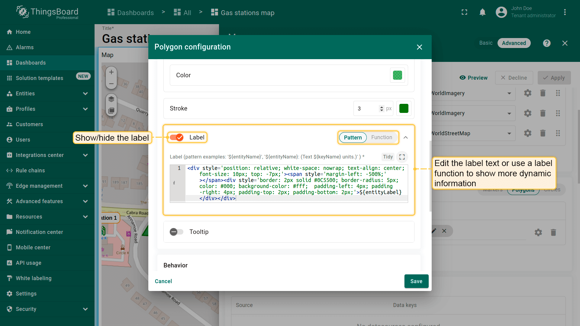
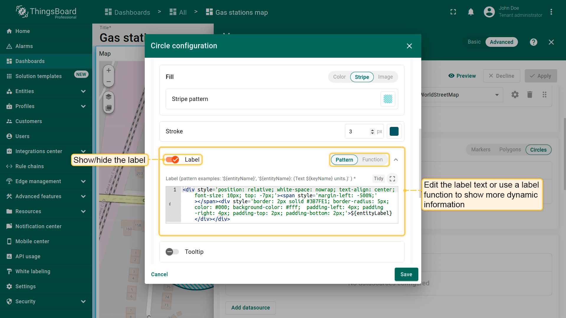
Label(标签)
配置显示在多边形上方的标签。 默认标签显示与该多边形关联的实体名称。可手动编辑标签文本或使用label函数显示动态信息。
例如,标签可显示多边形的当前状态,便于用户快速了解其状况。 若需要,也可完全隐藏标签。
1
2
3
4
<div style='position: relative; white-space: nowrap; text-align: center; font-size: 10px; top: -7px;'>
  <span style='margin-left: -500%;'></span>
  <div style='border: 2px solid #3388FF; border-radius: 5px; color: #000; background-color: #fff;  padding-left: 4px; padding-right: 4px; padding-top: 2px; padding-bottom: 2px;'>${entityLabel}</div>
</div>
Tooltip(提示)
在此配置点击或悬停多边形时显示的tooltip。 使用tooltip模式或tooltip函数定义更动态的内容。 也可完全隐藏tooltip。
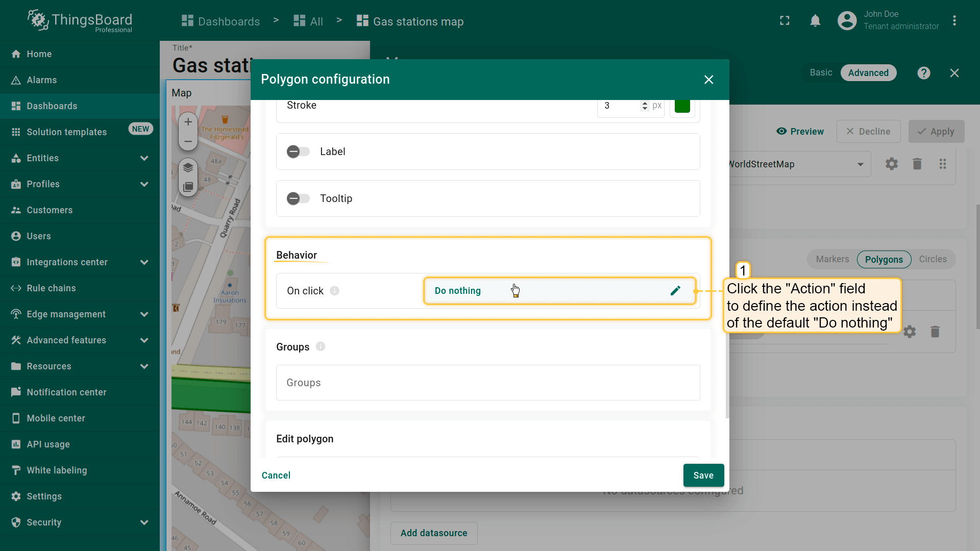
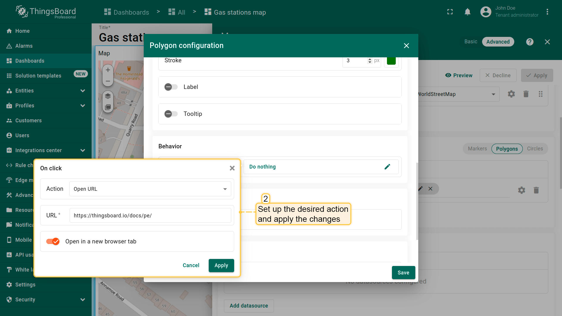
Behavior(行为)
- Go to the "Behavior" section and click the "On click" action field to define the action instead of the default "Do nothing".
- Set up the desired action and apply the changes.
- Click on the polygon.
- The action you specified in the action settings will be triggered.
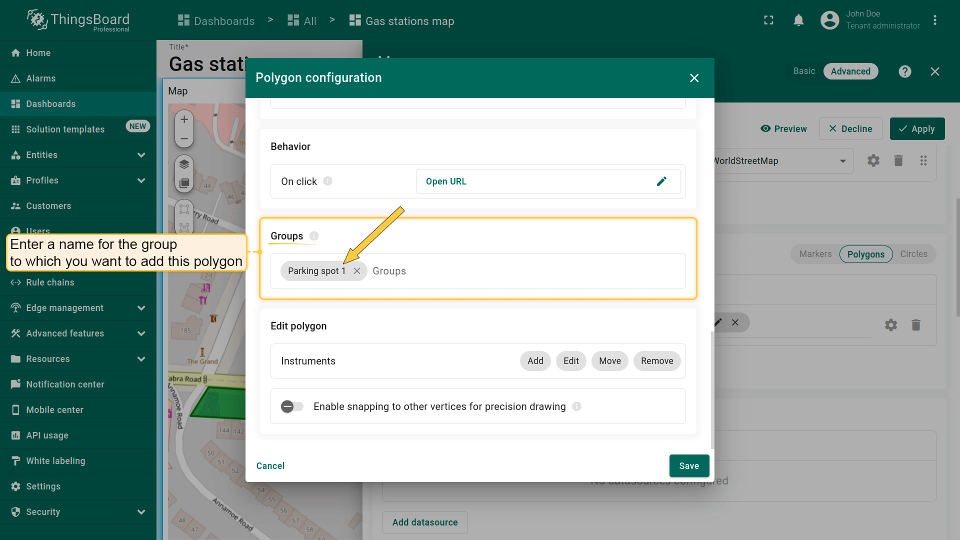
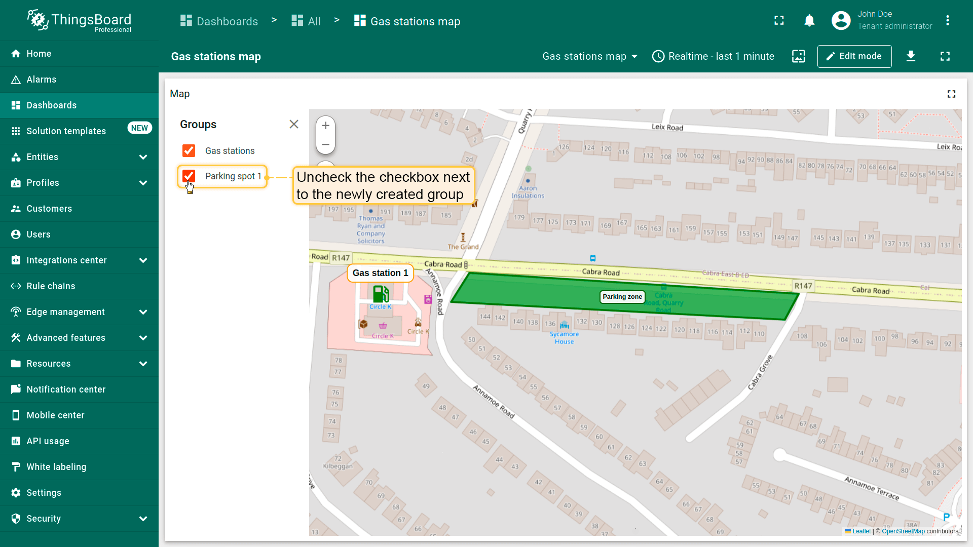
Groups(分组)
多边形可分组,便于后续通过「Groups」选项卡显示或隐藏分组元素。
- In the "Groups" section, enter a name for the group to which you want to add this polygon;
- A "Groups" icon button will appear on the widget. Click on it;
- To hide a group, uncheck the box next to its name.
- The polygon that belong to this group have been hidden.

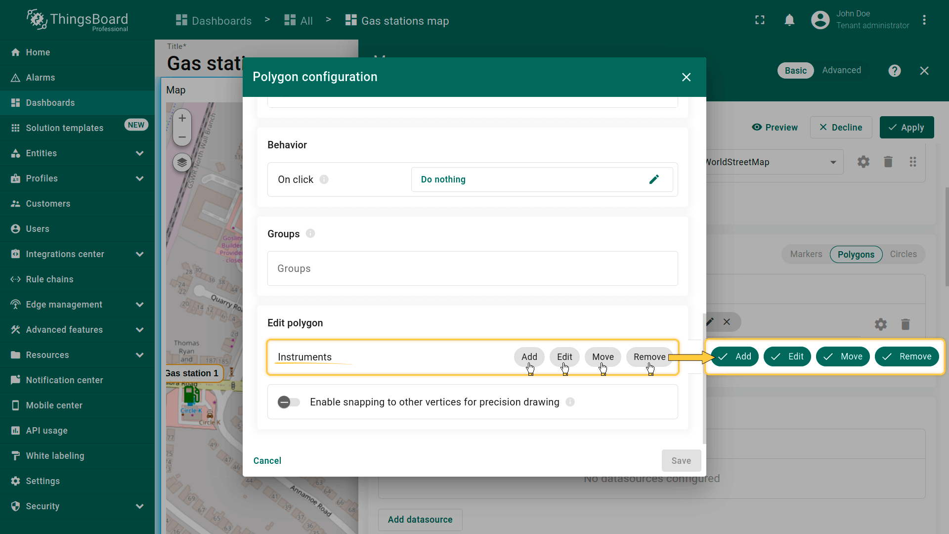
Polygon editing tools(多边形编辑工具)
可使用内置工具对多边形执行 Add(添加)/ Edit(编辑)/ Move(移动)/ Delete(删除)等操作。默认这些工具为禁用状态。
勾选要启用的工具旁的复选框。
- You can use the built-in tools to perform operations on markers such as Add / Move / Delete. By default, these tools are disabled. Check the boxes next to the tools you want to enable.
添加多边形
若实体未设置多边形坐标,可使用地图部件工具手动放置多边形——其坐标将自动保存为实体的attribute。
首先,向地图添加多边形放置工具:
- 在「Edit marker」区域勾选「Add」工具。
- 选择坐标存储的属性作用域:「Server」或「Shared」。
- 可选:启用吸附到其他顶点以精确绘制。
- 然后保存更改。
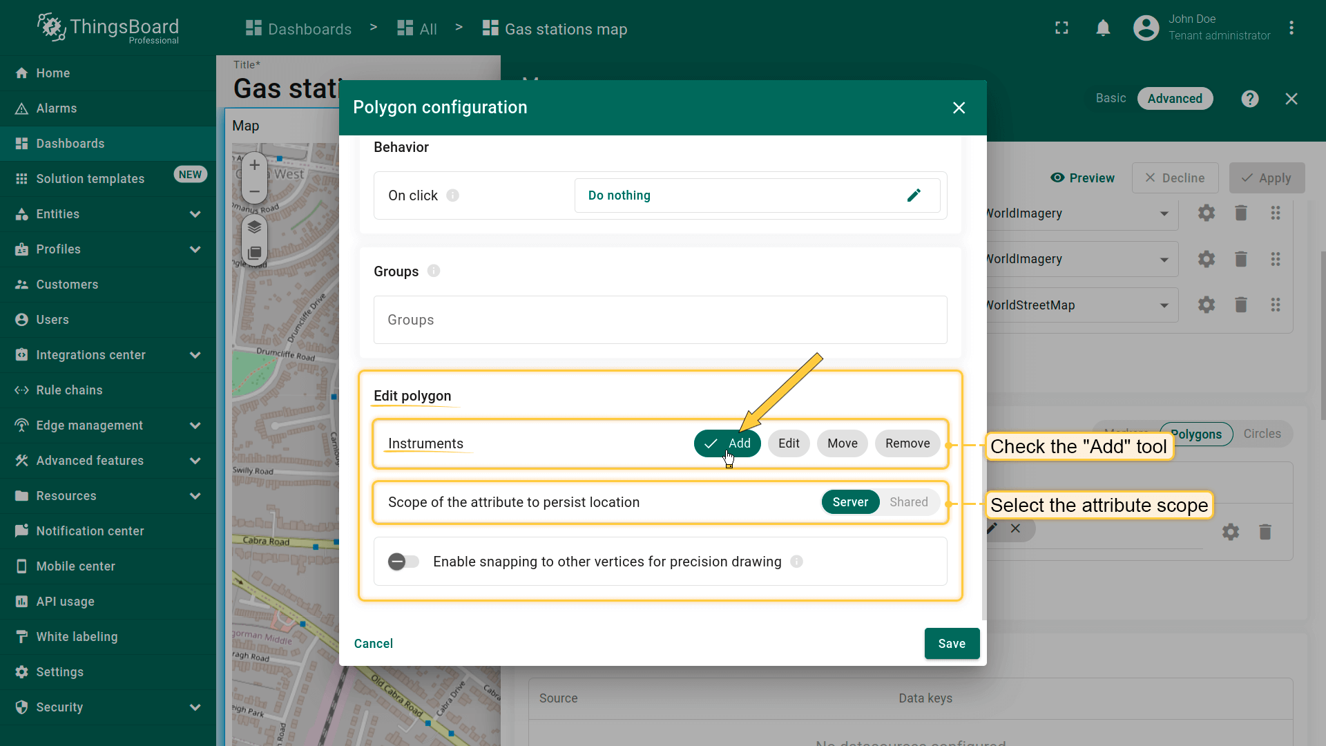
现在可在地图上放置多边形:
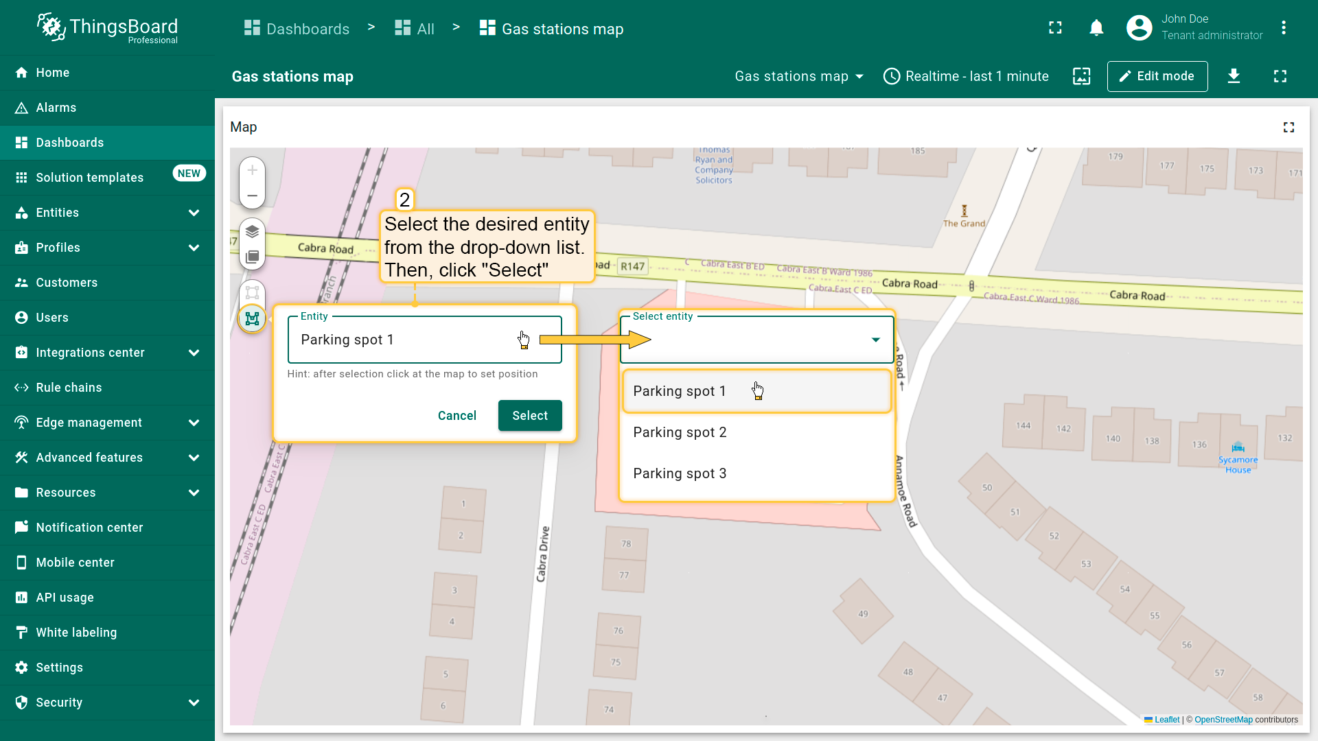
- The map widget now offers two tools for adding a polygon: "Drew rectangle" and "Drew polygon". Choose the option that suits your needs.
- If you're using an alias with multiple entities as the data source, select the desired entity from the dropdown list.
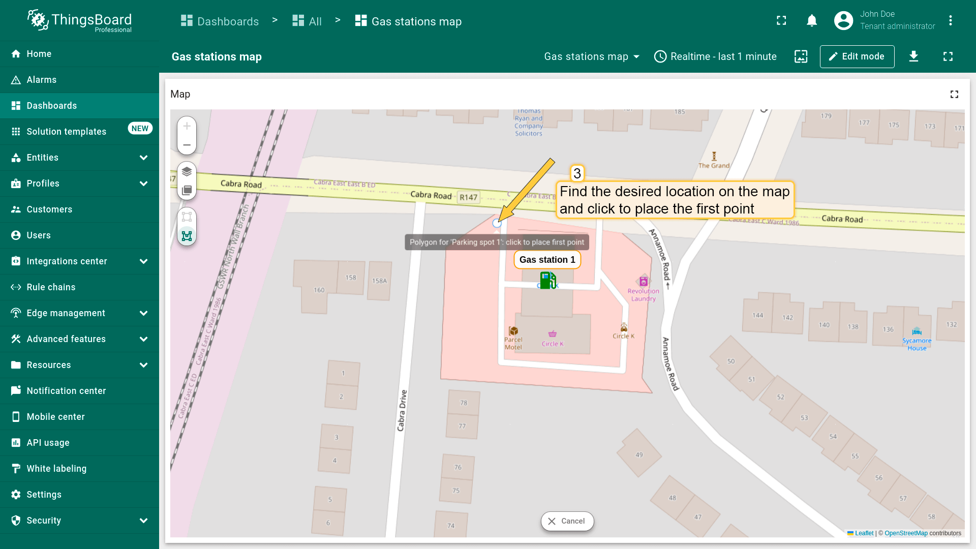
- Find the desired location on the map and click to place the first point;
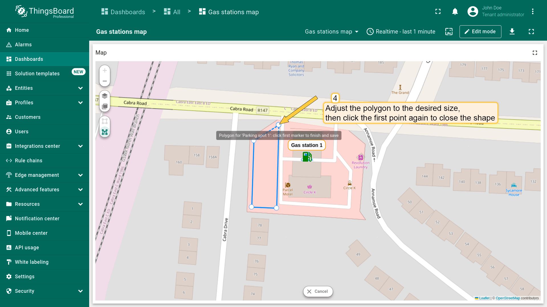
- Adjust the polygon to the desired size, then click again to finish. If you're using "Drew polygon", make sure to close the shape by clicking the first point once you've placed all others.
- The polygon will be added, and its coordinates will be automatically saved to the entity as attribute.

编辑多边形
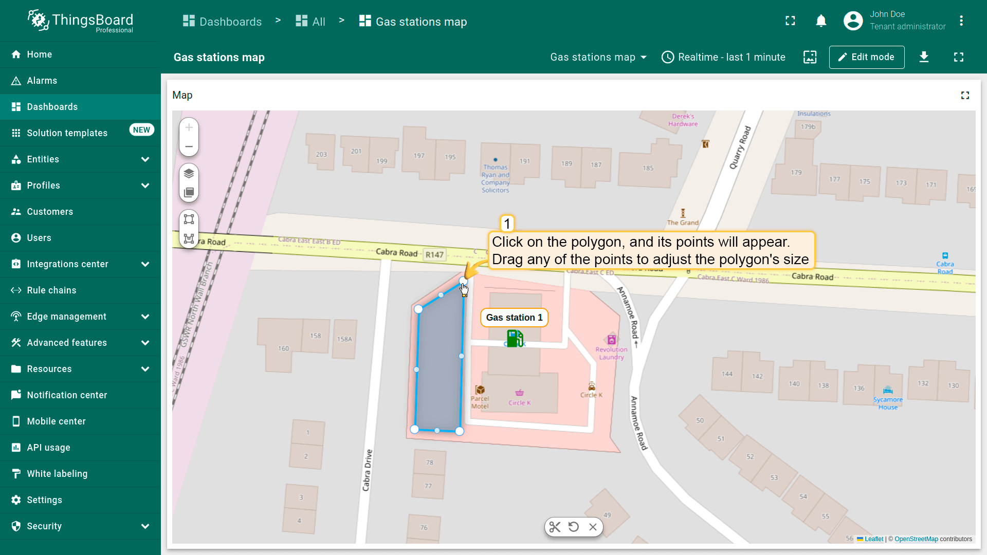
别忘了在「Edit polygon」区域的多边形设置中启用「Edit」工具。
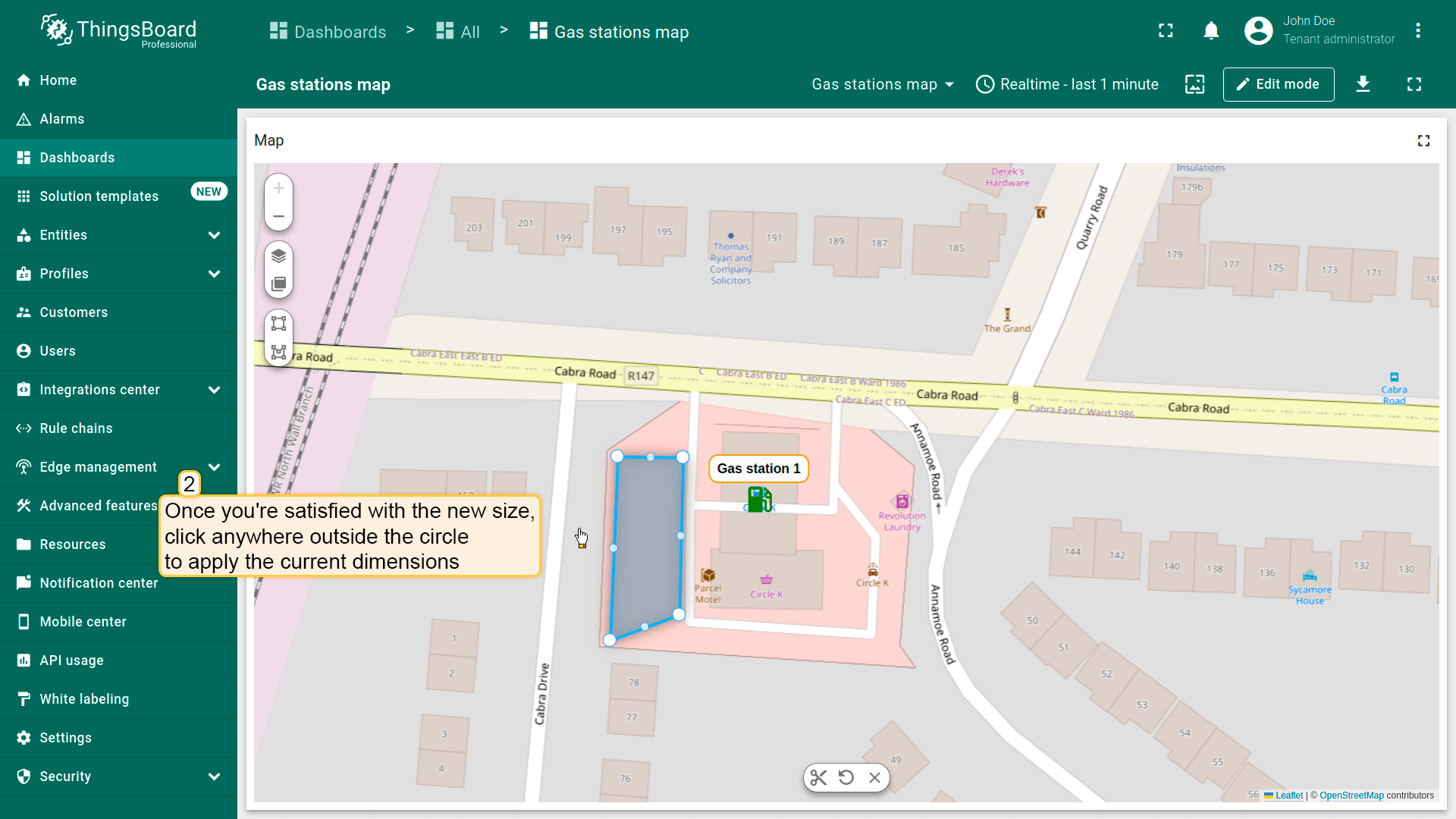
要调整多边形大小,点击它——顶点将显示。 Drag any of the points to adjust the polygon’s size.

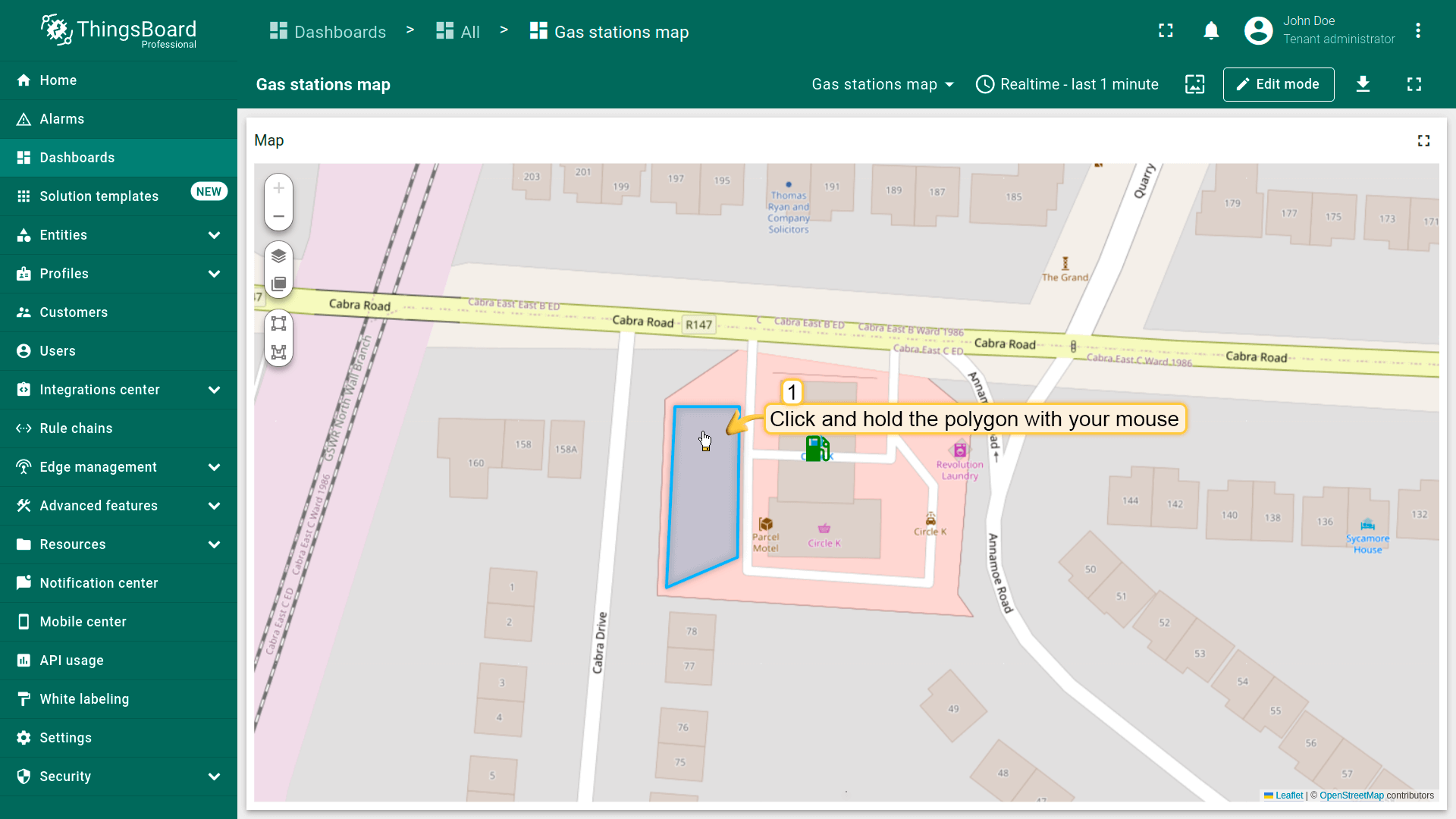
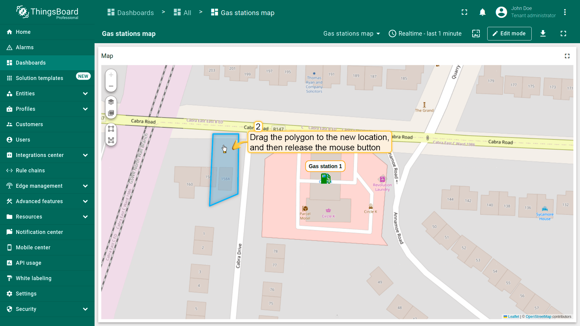
移动多边形
别忘了在「Edit polygon」区域的多边形设置中启用「Move」工具。
要移动多边形,点击多边形,按住鼠标并拖至新位置。
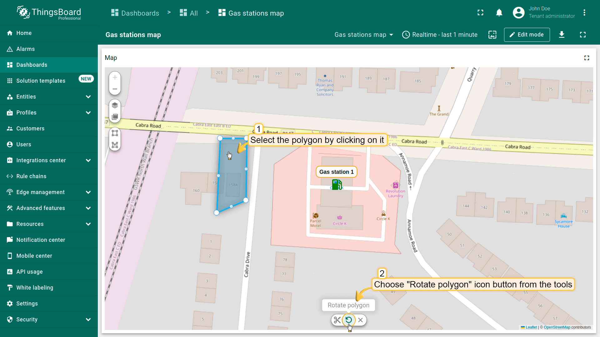
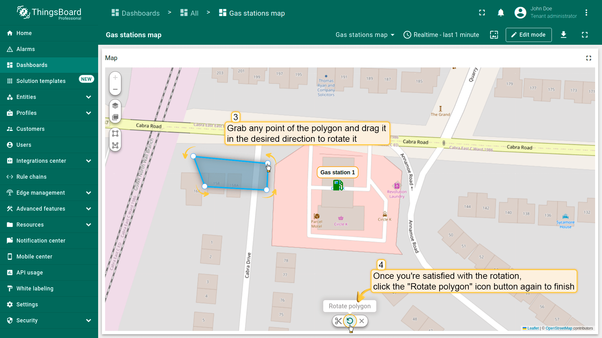
旋转多边形
要旋转多边形:
- Select the polygon by clicking on it, then click the "Rotate polygon" icon button from the tools at the bottom.
- Grab any point of the polygon and drag it in the desired direction to rotate it.
- Once you're satisfied with the rotation, click the "Rotate polygon" icon button again to finish.
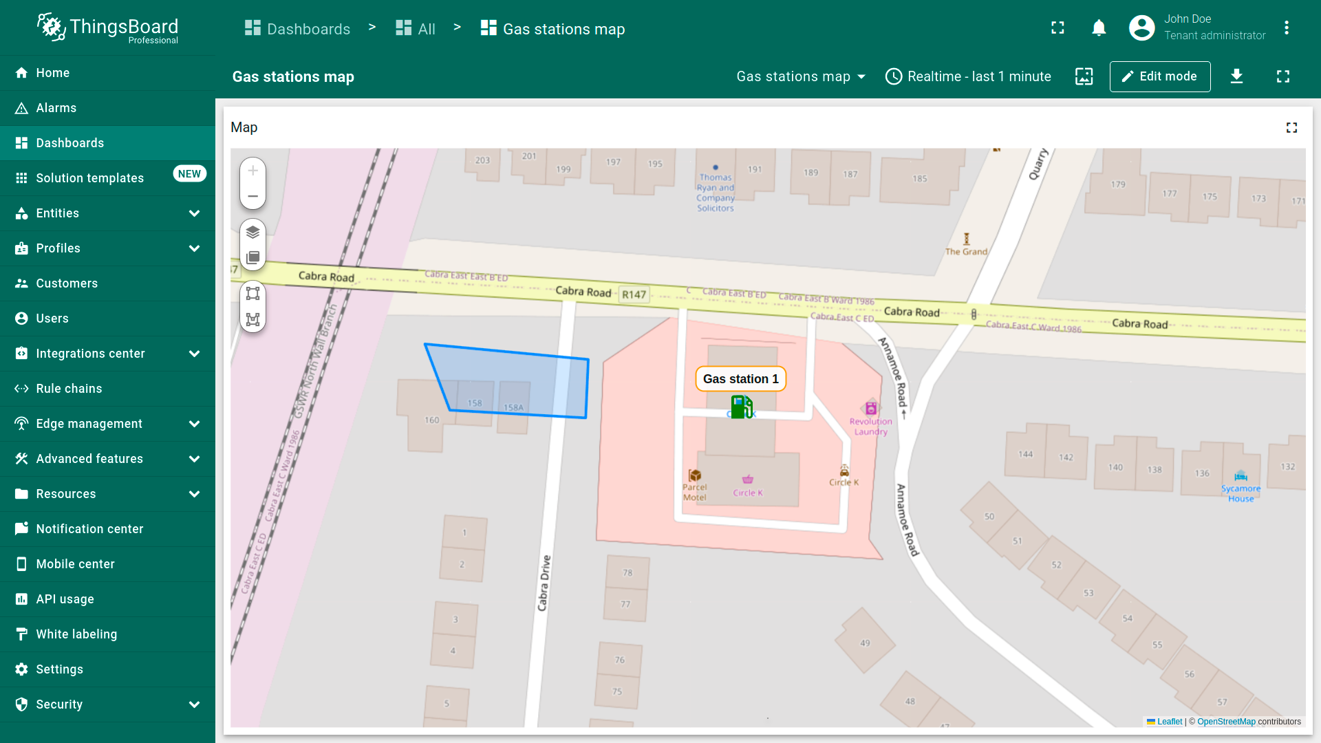
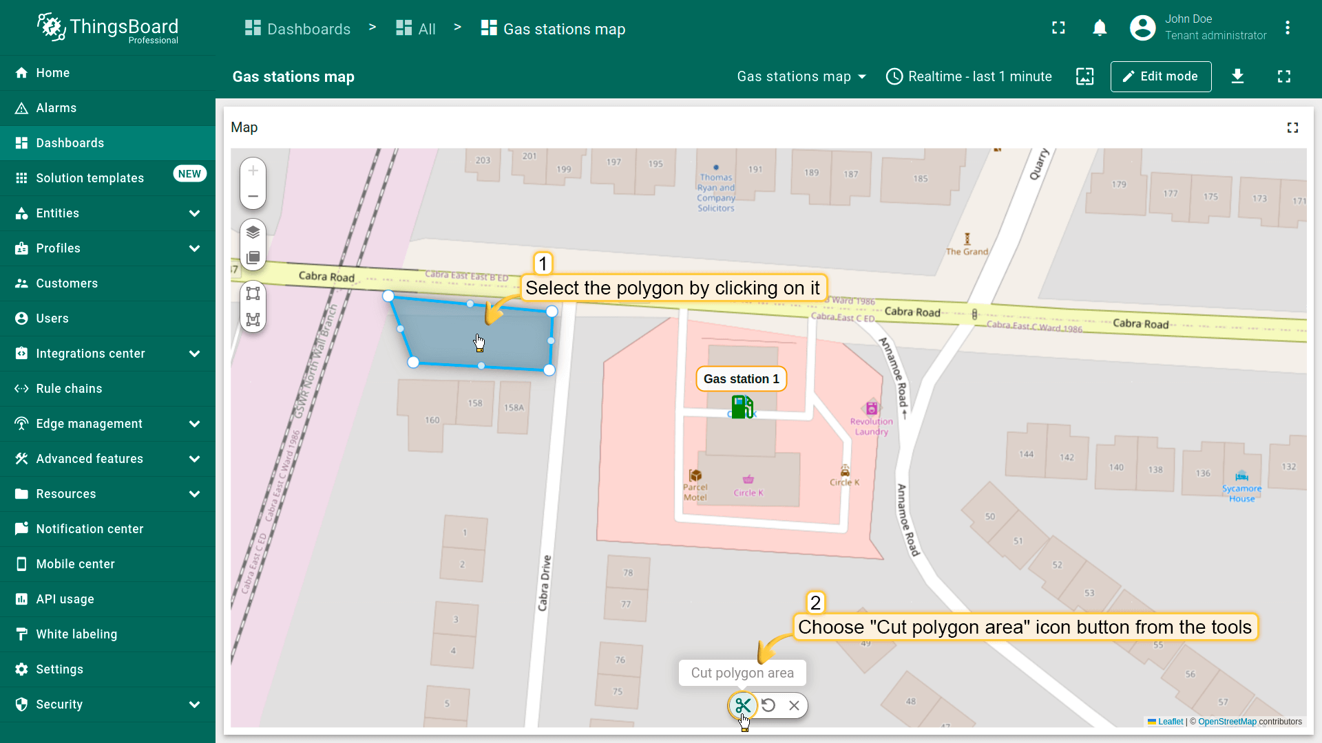
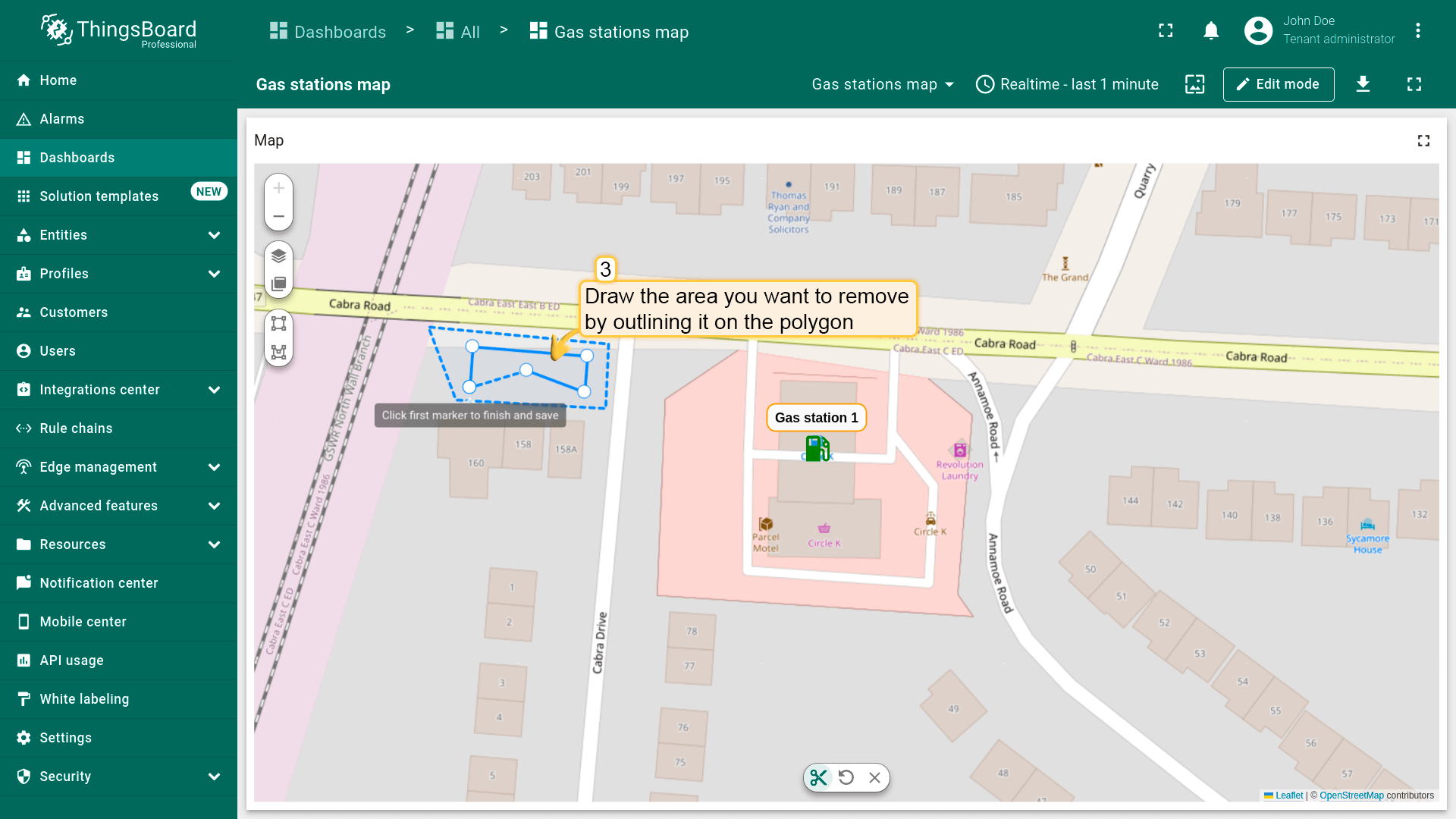
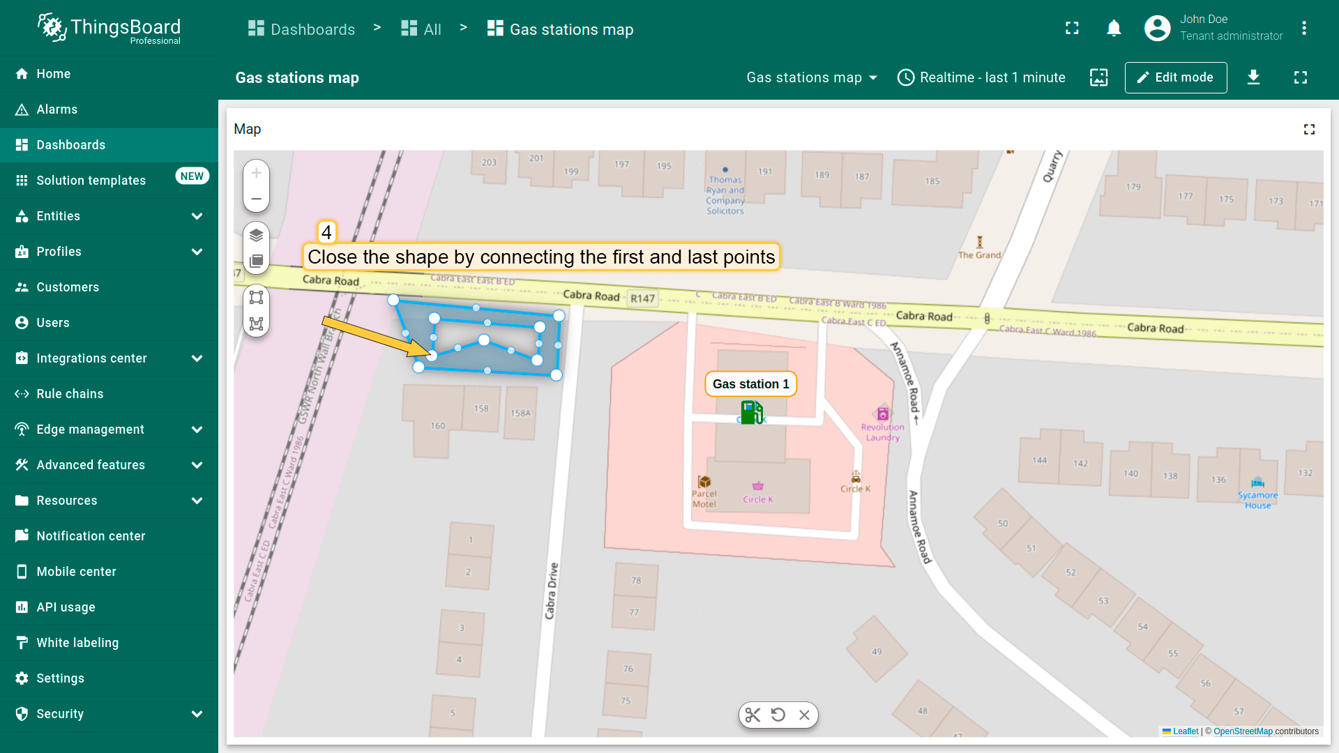
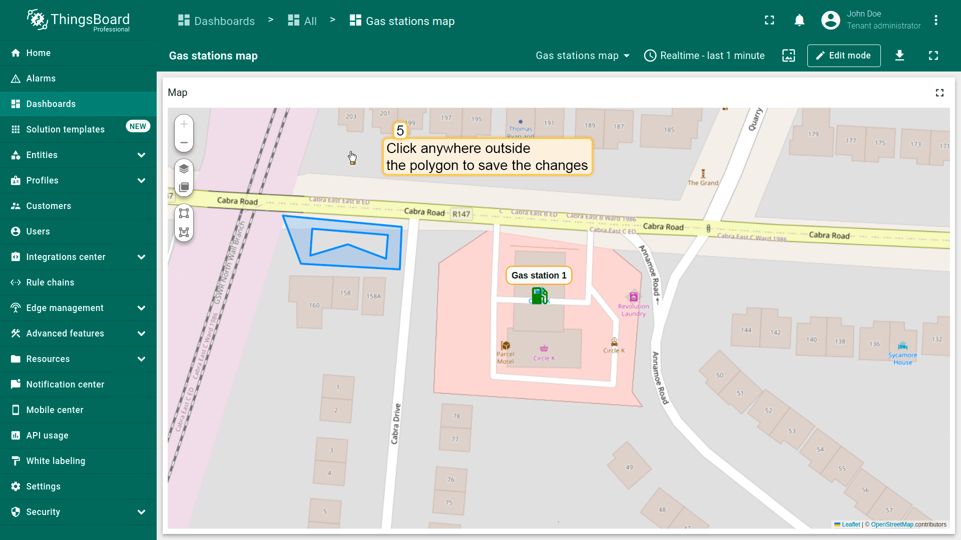
裁剪多边形区域
从多边形中裁剪出区域:
- Select the polygon by clicking on it, then choose "Cut polygon area" from the tools at the bottom.
- Draw the area you want to remove by outlining it on the polygon.
- Close the shape by connecting the first and last points.
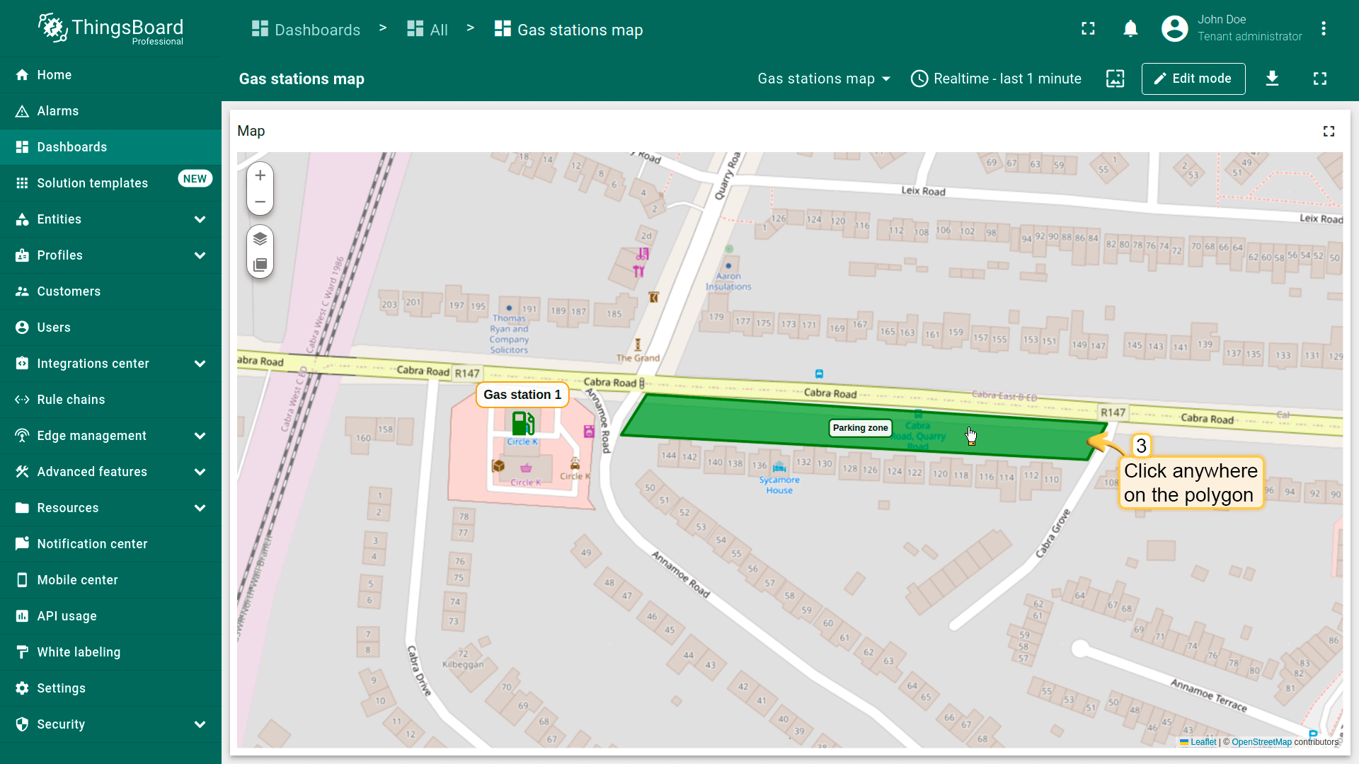
- Click anywhere outside the polygon to save the changes.
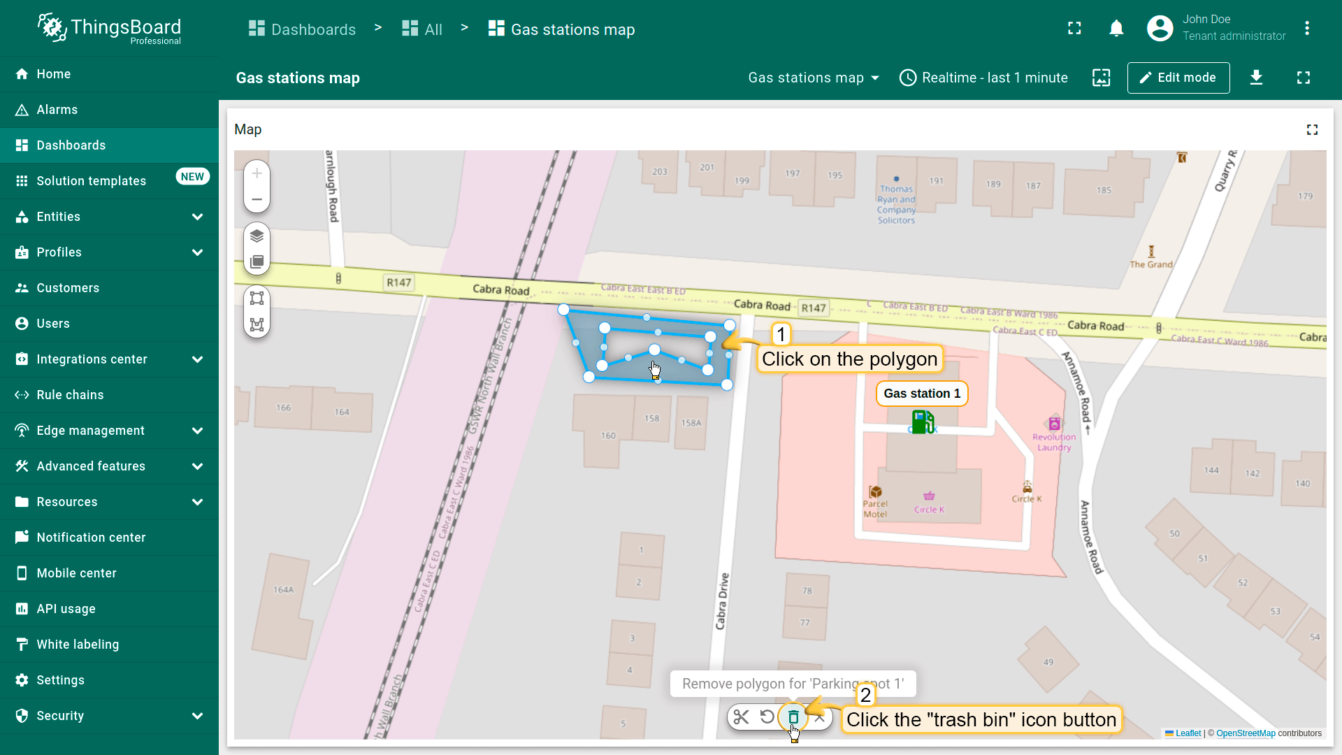
删除多边形
别忘了在「Edit polygon」区域的多边形设置中启用「Remove」工具。
要删除多边形,点击它,然后点击部件底部菜单中的「trash bin」图标。
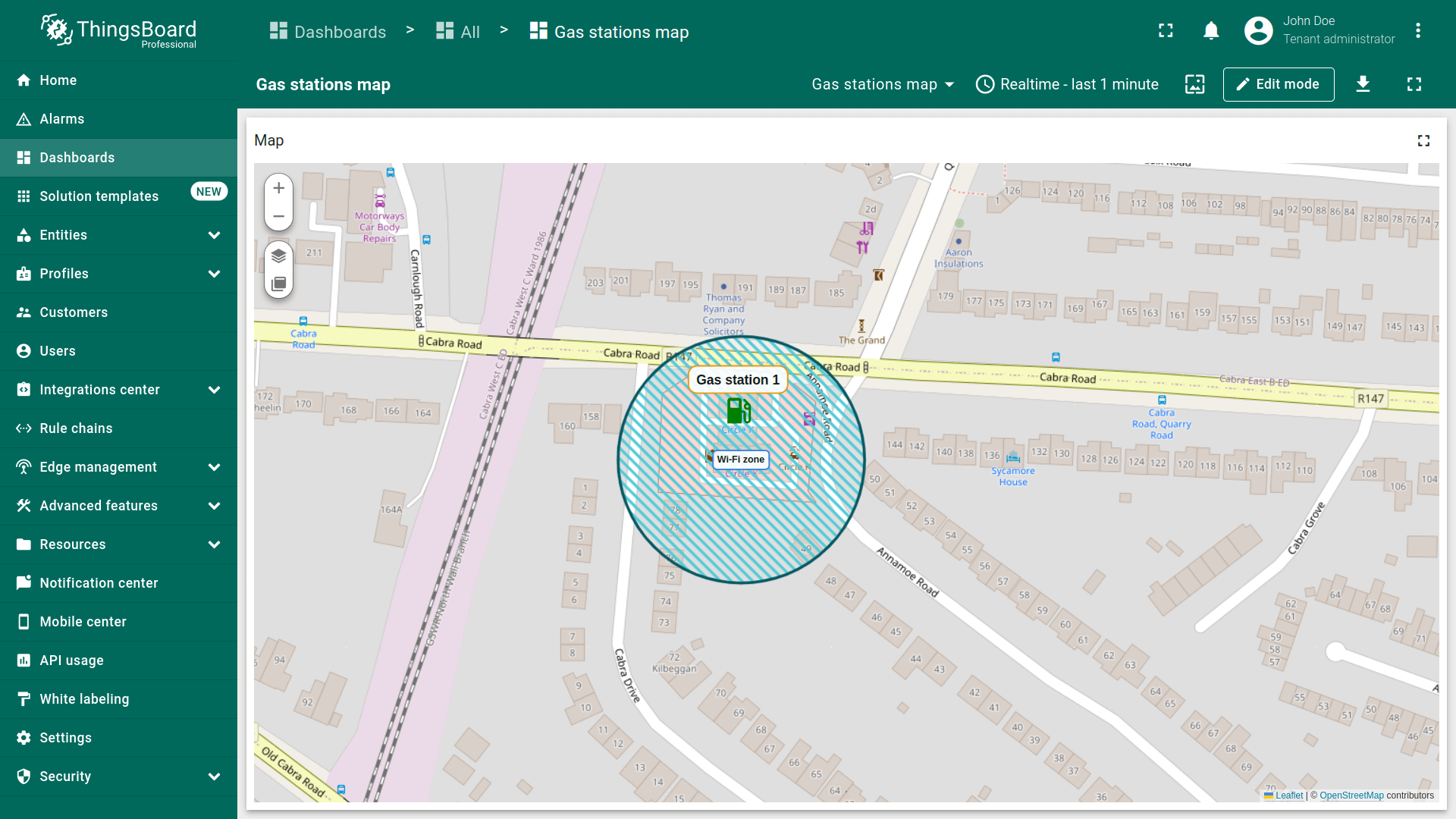
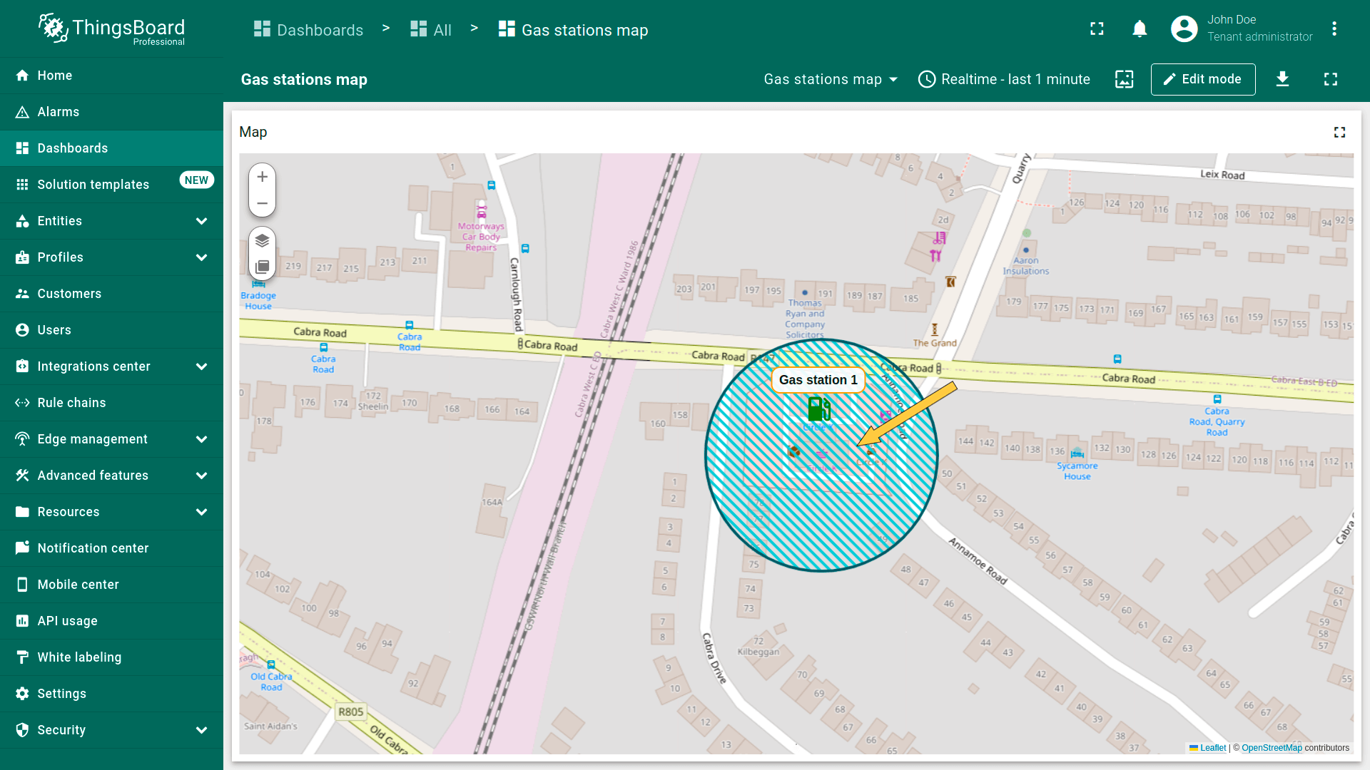
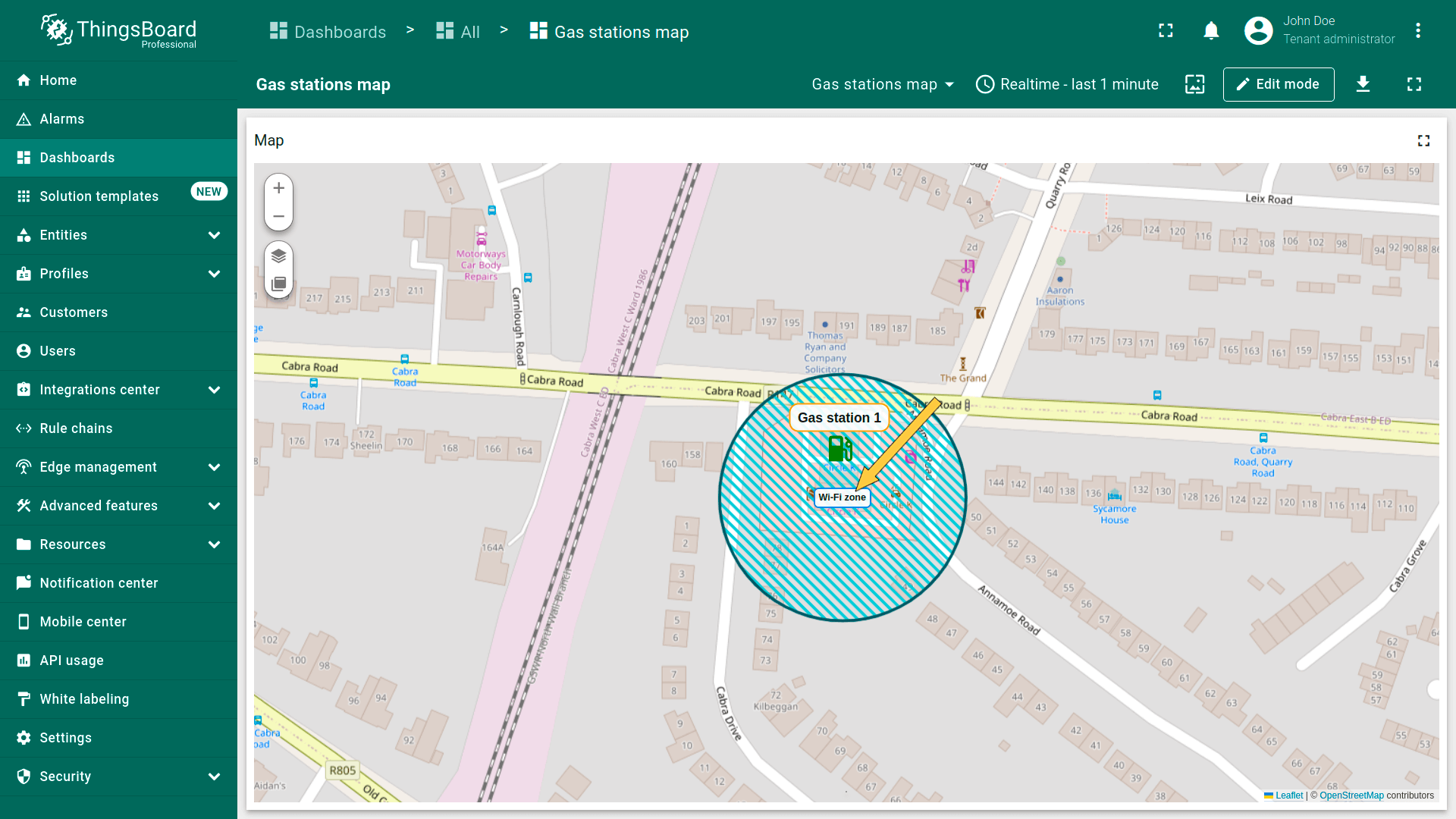
圆形
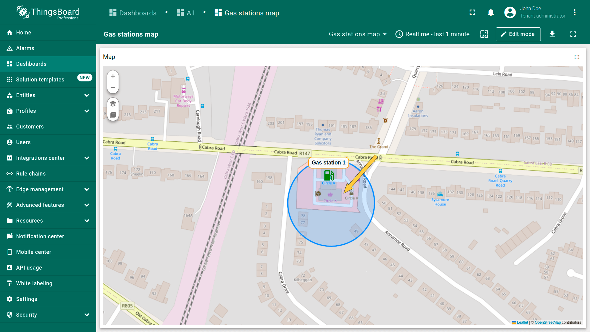
圆形为平面图形,其边界点与固定中心点距离相等。 可用于定义影响区,例如Wi-Fi覆盖区或传感器范围等。 可用圆形标记资产及其他实体。
圆形坐标需遵循以下格式:
1
{"latitude":CoordinateLatitude, "longitude":CoordinateLongitude, "radius":radius}
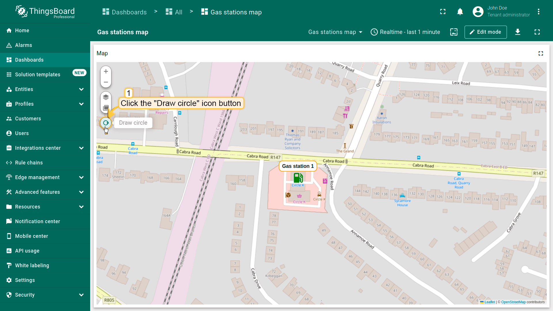
添加圆形
你可以使用属性或遥测中的预定义坐标,用圆形标记资产或其他实体。本示例使用设备作为数据源,并关联类型为“Parking spots”的资产。
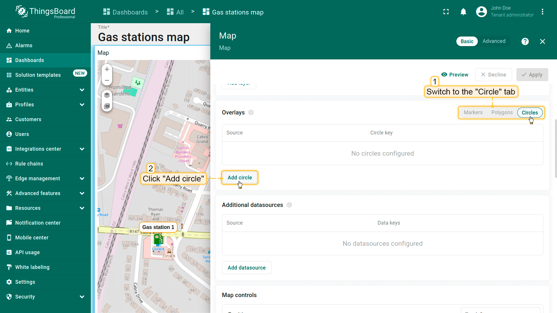
在地图上放置圆形的步骤如下:
- 进入部件编辑模式并打开“Overlays”区域。
- 切换到“Circles”选项卡并点击“Add circle”。
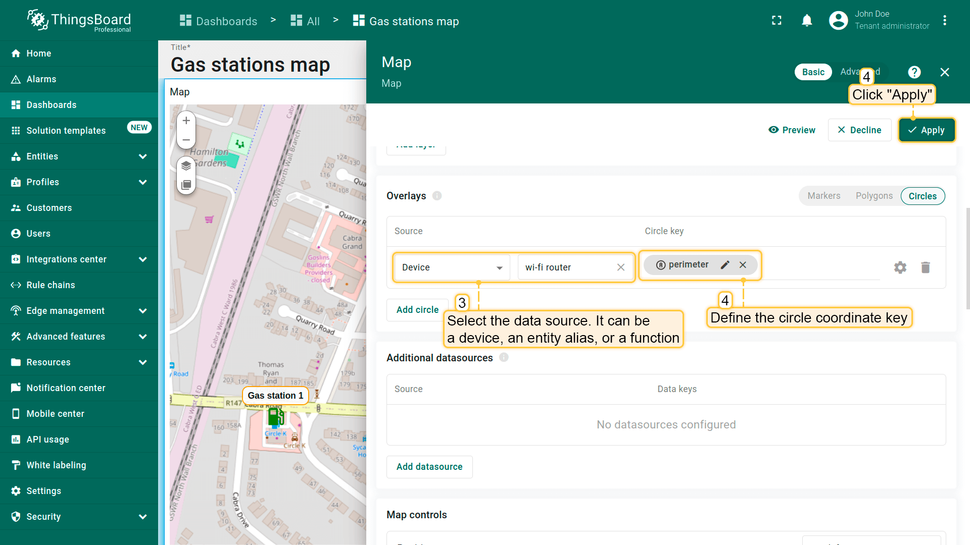
- 选择要以圆形表示的实体,可为设备、实体别名或函数。
- 定义包含圆形坐标的键。ThingsBoard默认使用“perimeter”键从实体属性读取圆形坐标;若你的实体使用不同键名,请在此更新。
- 点击“Apply”,圆形会根据实体数据显示在地图上。
圆形配置
要配置特定圆形,切换到地图部件编辑模式。 在「Overlays」区域的「Circle」选项卡中,点击目标圆形旁的「gear」图标按钮打开其配置面板。
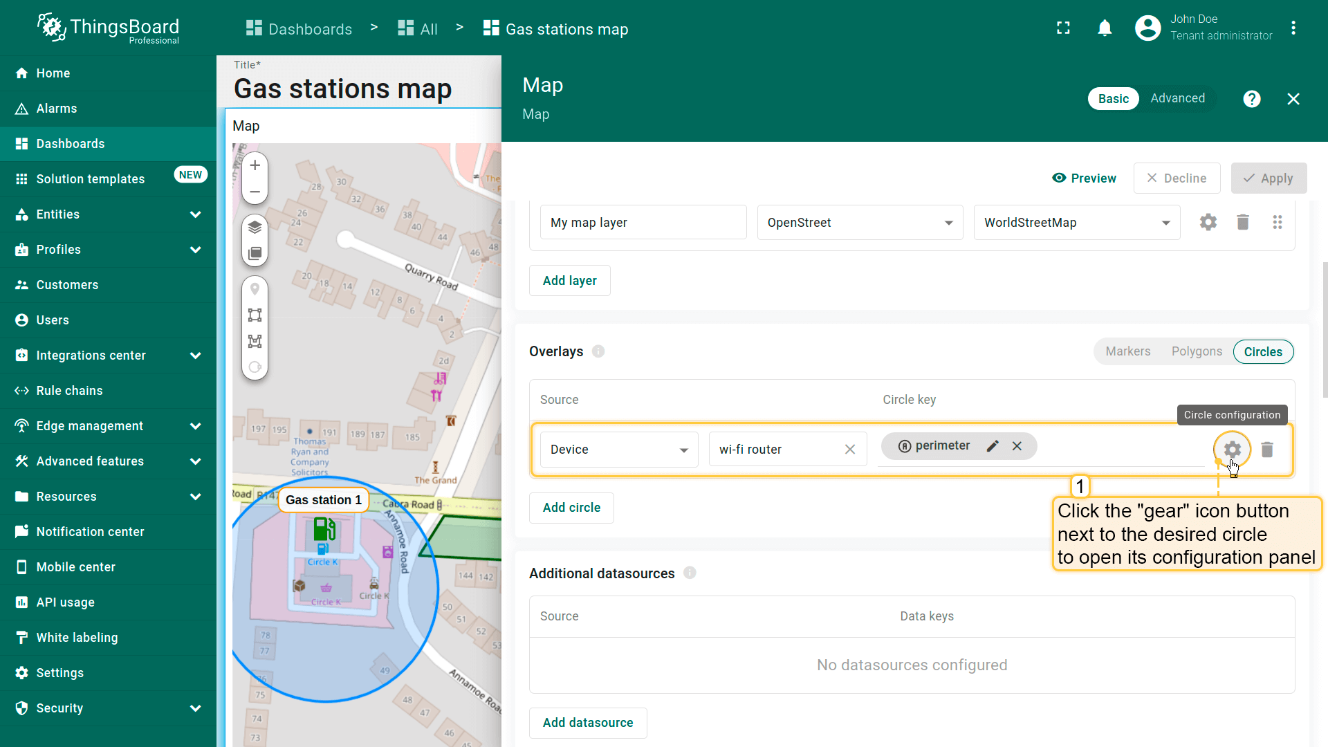
Datasource(数据源)
指定圆形的数据源——可为设备、entity alias或function。 如有需要,可应用筛选缩小选择范围。
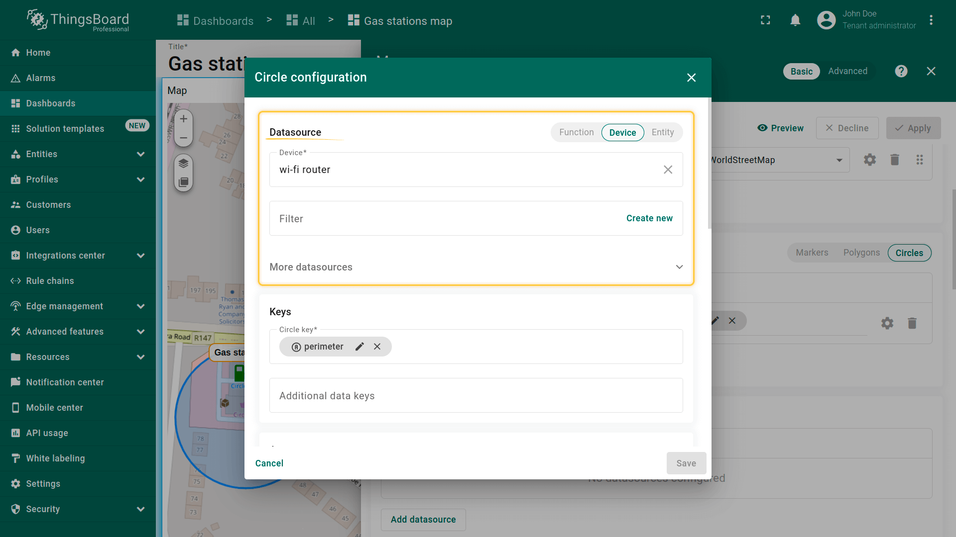
Keys(键)
定义包含圆形坐标的键。默认ThingsBoard使用「perimeter」作为圆形键。若实体使用不同键名,请在此更新。
额外data keys可用于labels、tooltips或直接在地图上显示额外信息。
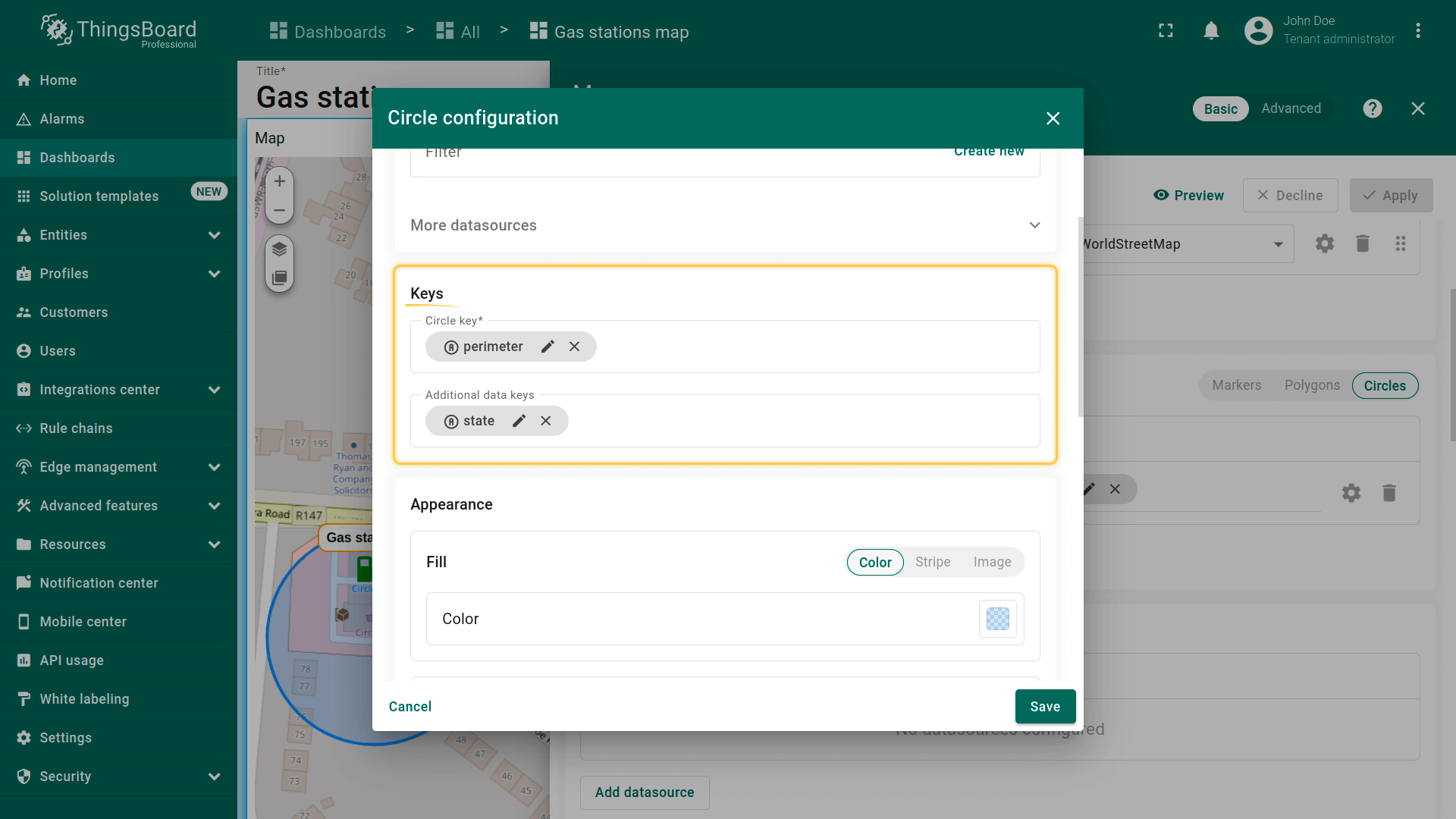
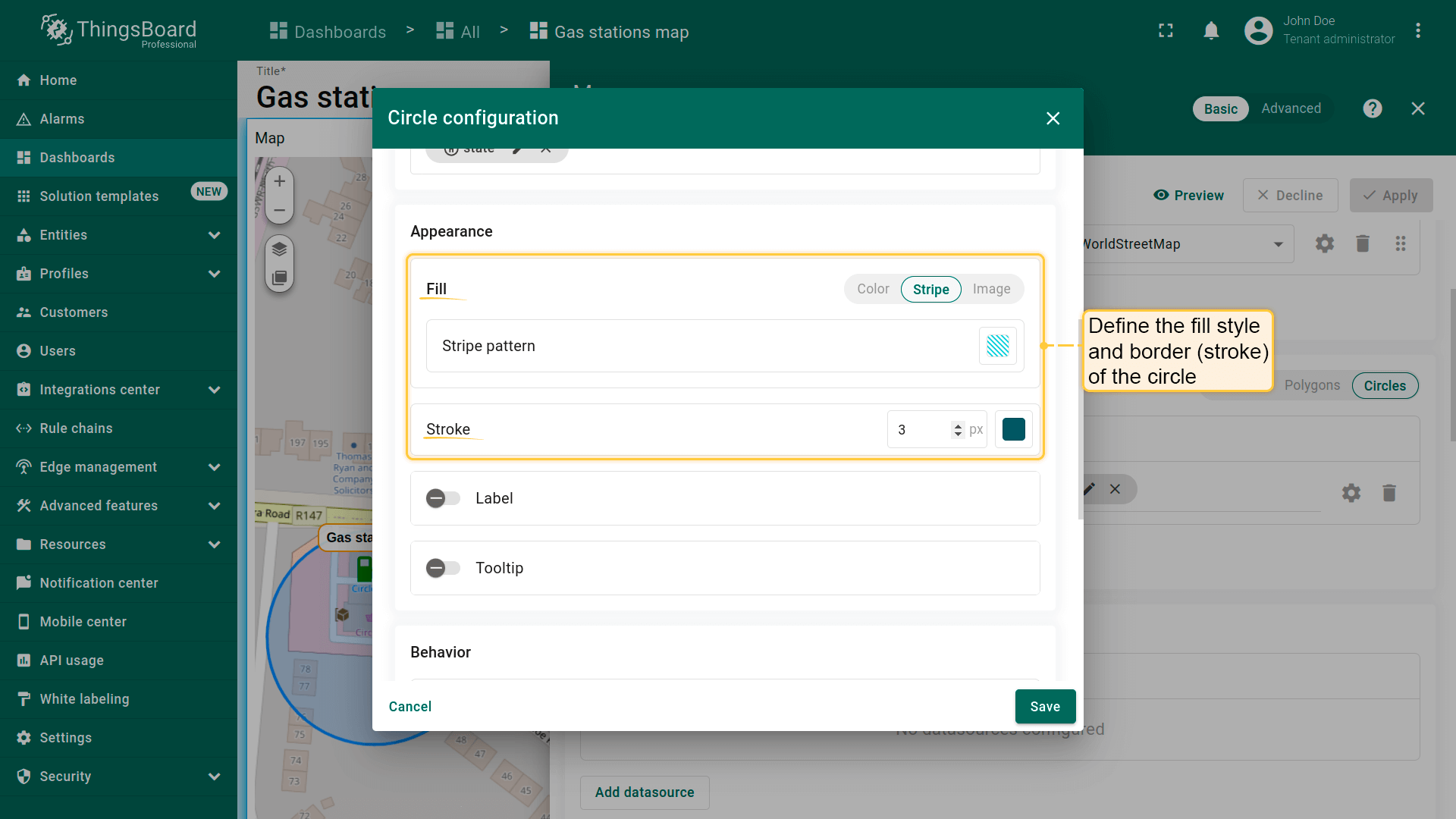
填充圆形
Fill(填充)— 定义圆形在地图上的填充方式:
- Color(颜色)— 设置纯色填充。
- Stripe(条纹)— 使用斜线填充代替纯色,便于标识特殊区域。
- Image(图片)— 可使用图片作为背景填充。
Stroke(描边)— 定义圆形轮廓:
- Border color(边框颜色)
- Line thickness(线宽)
Label(标签)
配置显示在圆形上方的标签。默认标签显示与该圆形关联的实体名称。可手动编辑标签文本或使用label函数显示动态信息。
例如,标签可显示圆形的当前状态,便于用户快速了解其状况。若需要,也可完全隐藏标签。
1
2
3
4
<div style='position: relative; white-space: nowrap; text-align: center; font-size: 10px; top: -7px;'>
    <span style='margin-left: -500%;'></span>
    <div style='border: 2px solid #3B7FE1; border-radius: 5px; color: #000; background-color: #fff;  padding-left: 4px; padding-right: 4px; padding-top: 2px; padding-bottom: 2px;'>${entityLabel}</div>
</div>
- Configure the label displayed above the circle. By default, the label shows the name of the entity linked to that circle. You can manually edit the label text or use a label function to display dynamic information.
- Custom circle label.
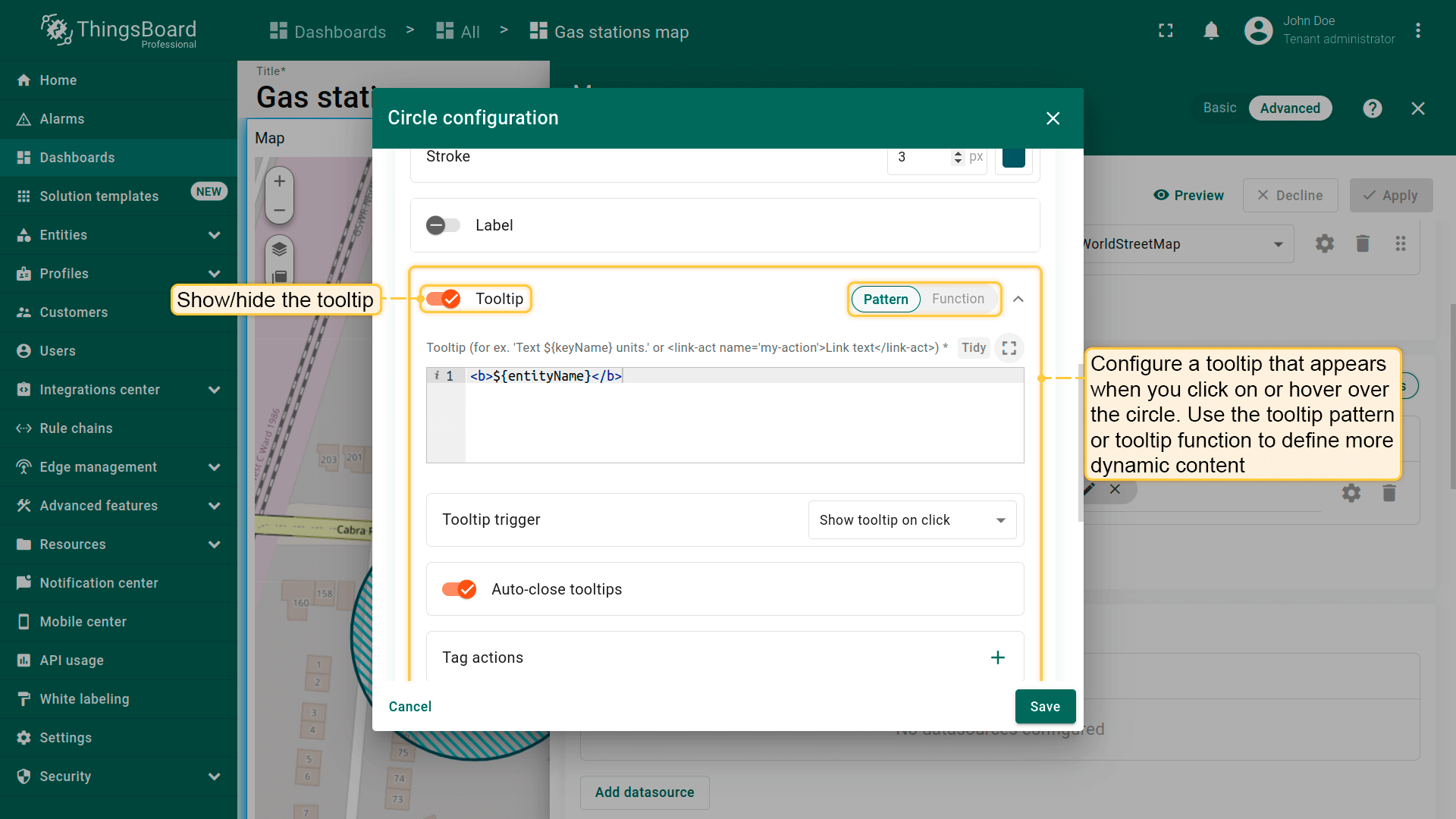
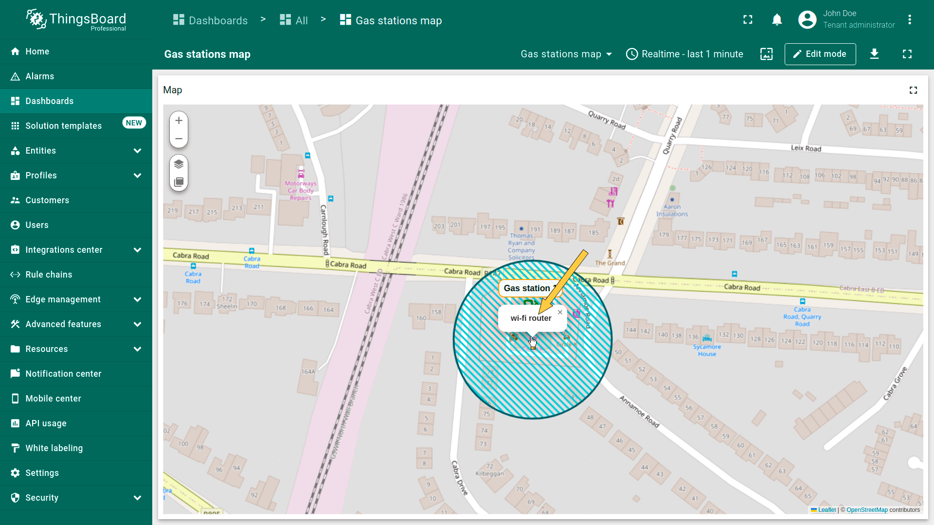
Tooltip(提示)
- Use tooltip pattern or tooltip function.
- Click on the circle to display the tooltip.
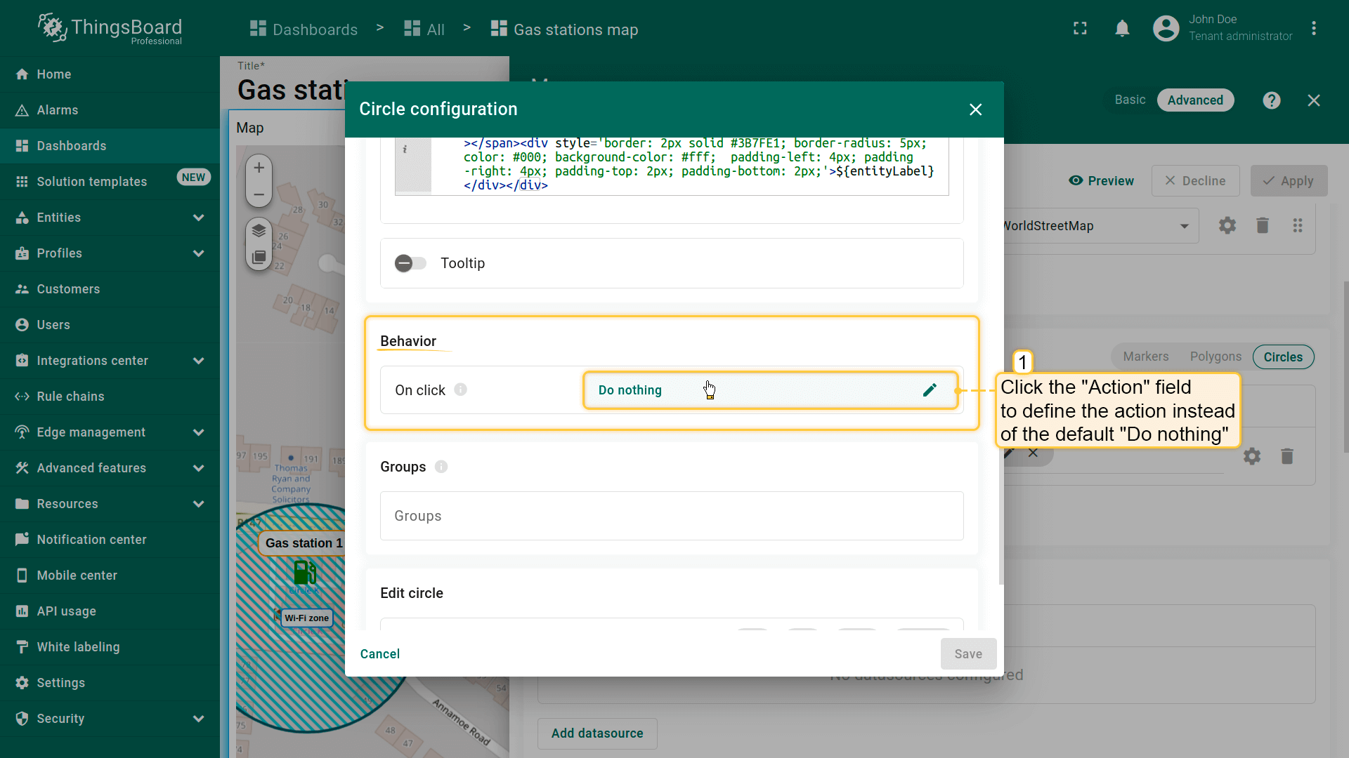
Behavior(行为)
设置点击圆形时的行为。
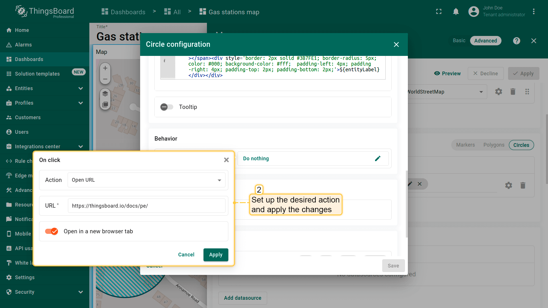
- Go to the "Behavior" section and click the "On click" action field to define the action instead of the default "Do nothing".
- Set up the desired action and apply the changes.
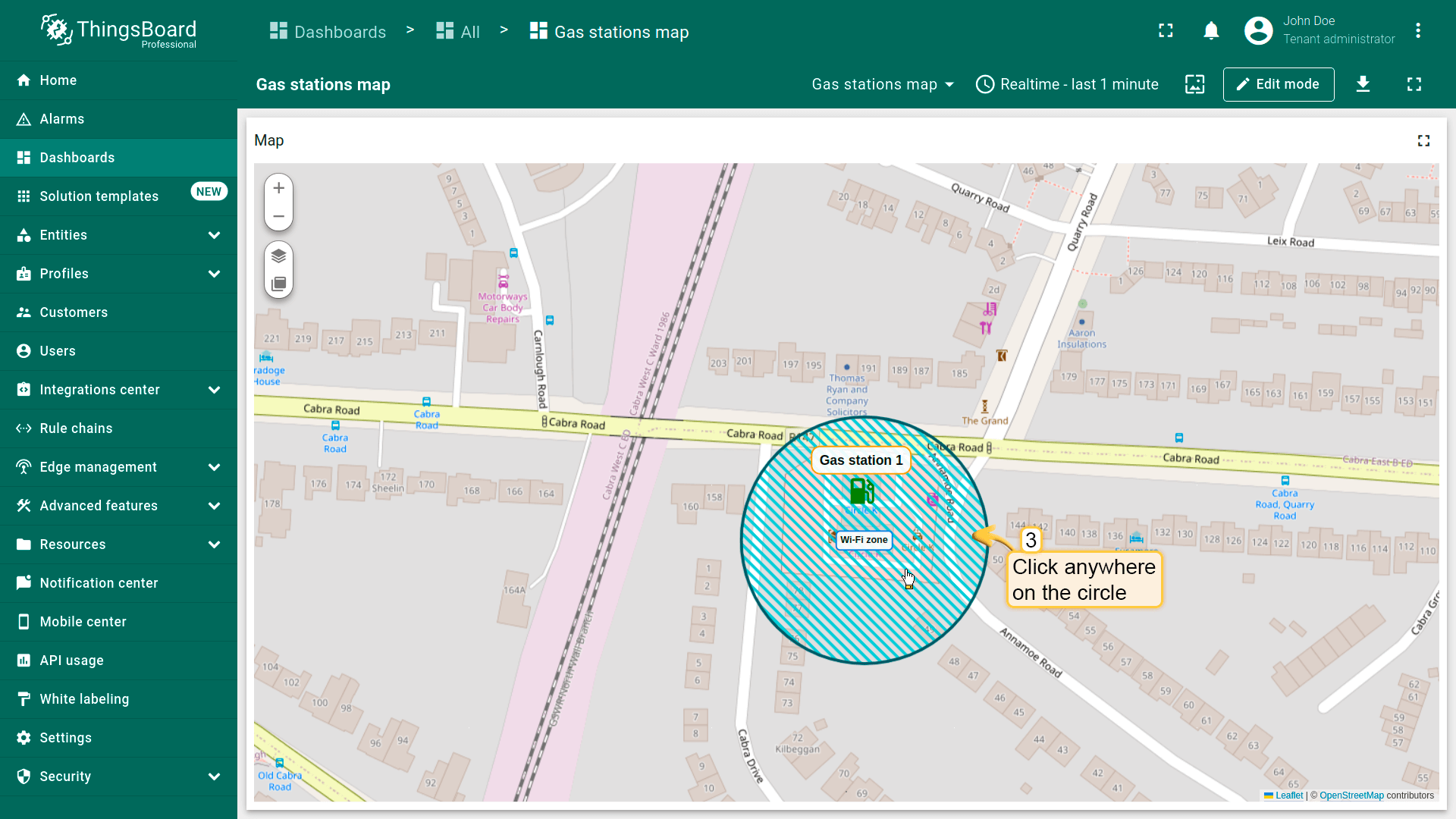
- Click on the circle.
- The action you specified in the action settings will be triggered.

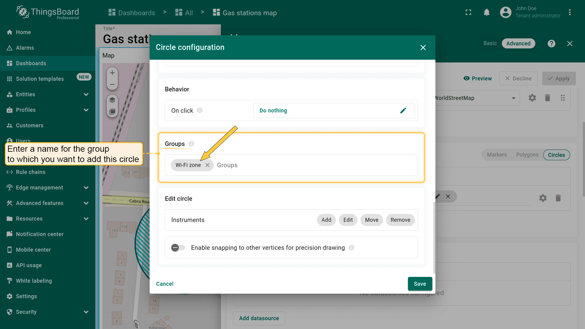
Groups(分组)
圆形可分组,便于后续通过「Groups」选项卡显示或隐藏分组元素。
- In the "Groups" section, enter a name for the group to which you want to add this circle.
- Click on the "Groups" icon button.
- To hide a group, uncheck the box next to its name.
- The circle that belong to this group have been hidden.
Circle editing tools(圆形编辑工具)
可使用内置工具对圆形执行 Add(添加)/ Move(移动)/ Delete(删除)等操作。默认这些工具为禁用状态。
勾选要启用的工具旁的复选框。

添加圆形
若实体未设置圆形坐标,可使用地图部件工具手动放置圆形——其坐标将自动保存为实体的attribute。
首先,向地图添加圆形放置工具:
- 在「Edit marker」区域勾选「Add」工具。
- 选择坐标存储的属性作用域:「Server」或「Shared」。
- 可选:启用吸附到其他顶点以精确绘制。
- 然后保存更改。

现在可在地图上放置圆形:
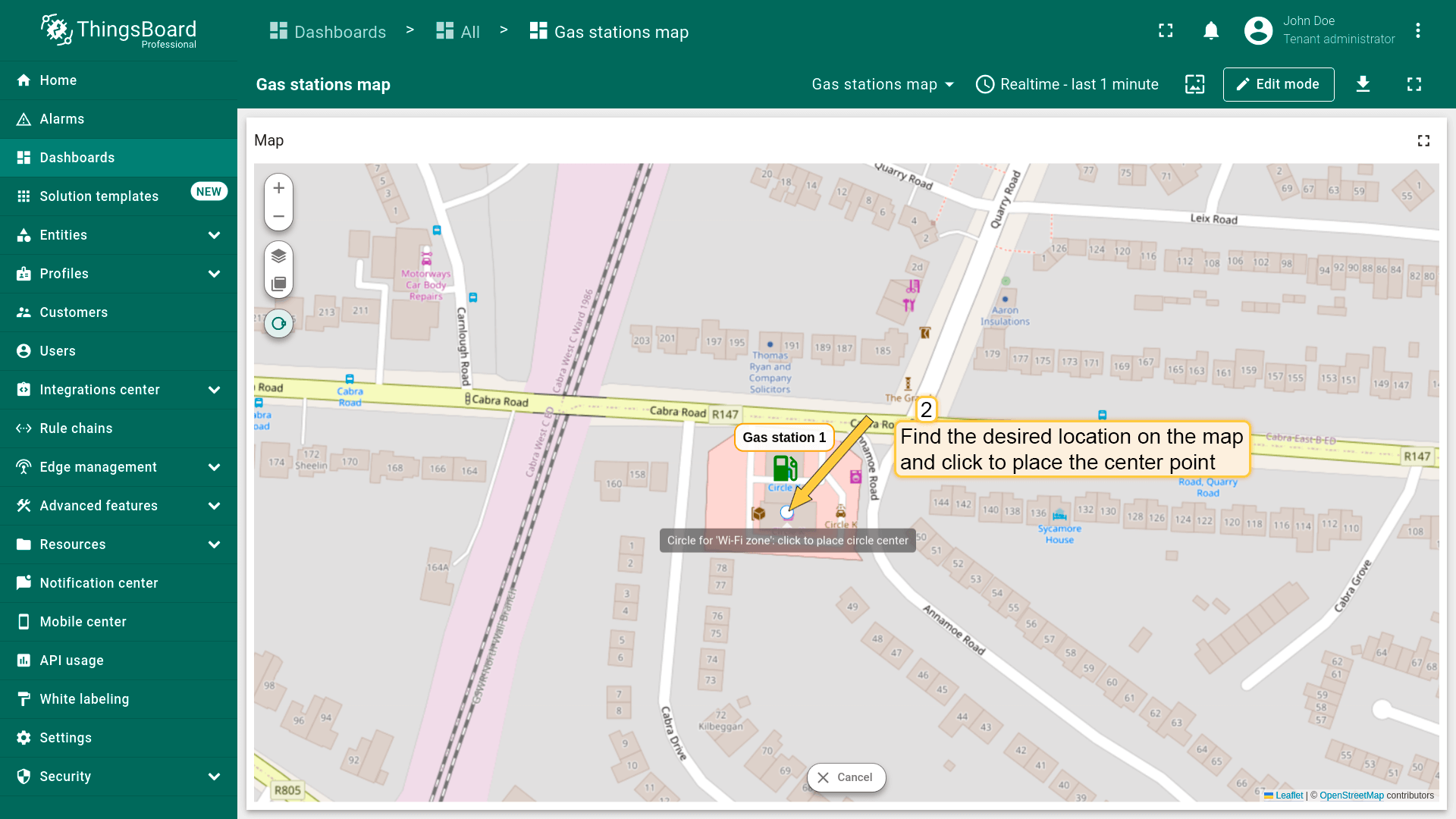
- The map widget now offers a tool for adding a circle: "Draw circle". Click on this icon button to begin.
- Find the desired location on the map and click to place the first point;
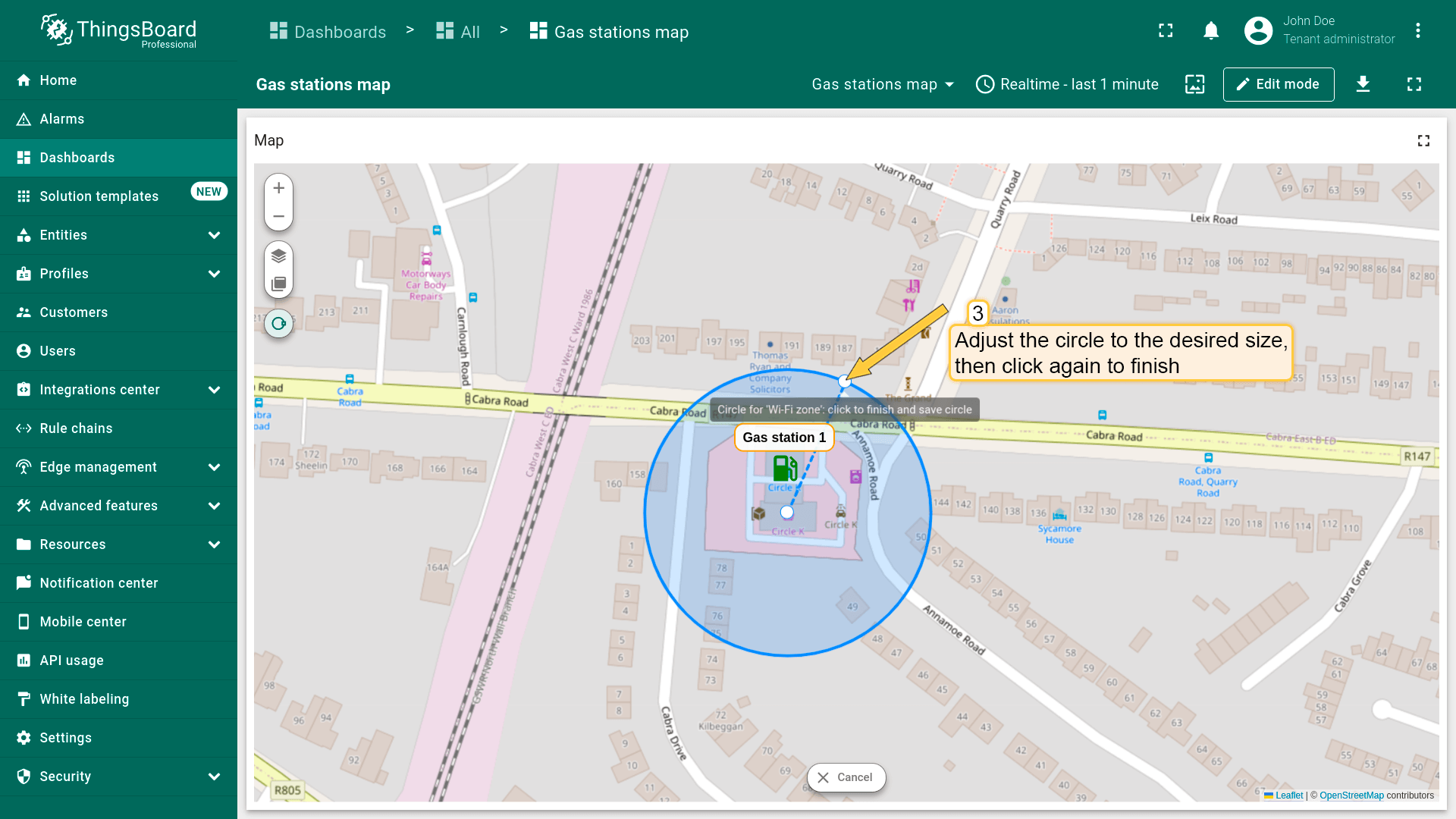
- Adjust the circle to the desired size, then click again to finish.
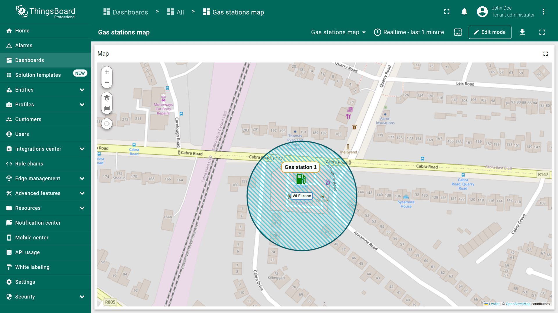
- The circle has been added to the map.
编辑圆形
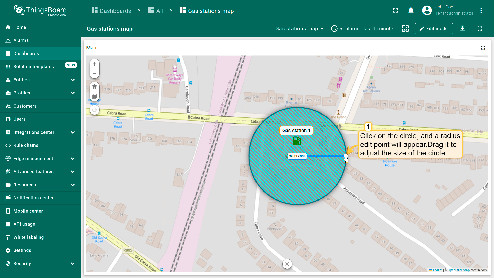
别忘了在「Edit polygon」区域的圆形设置中启用「Edit」工具。
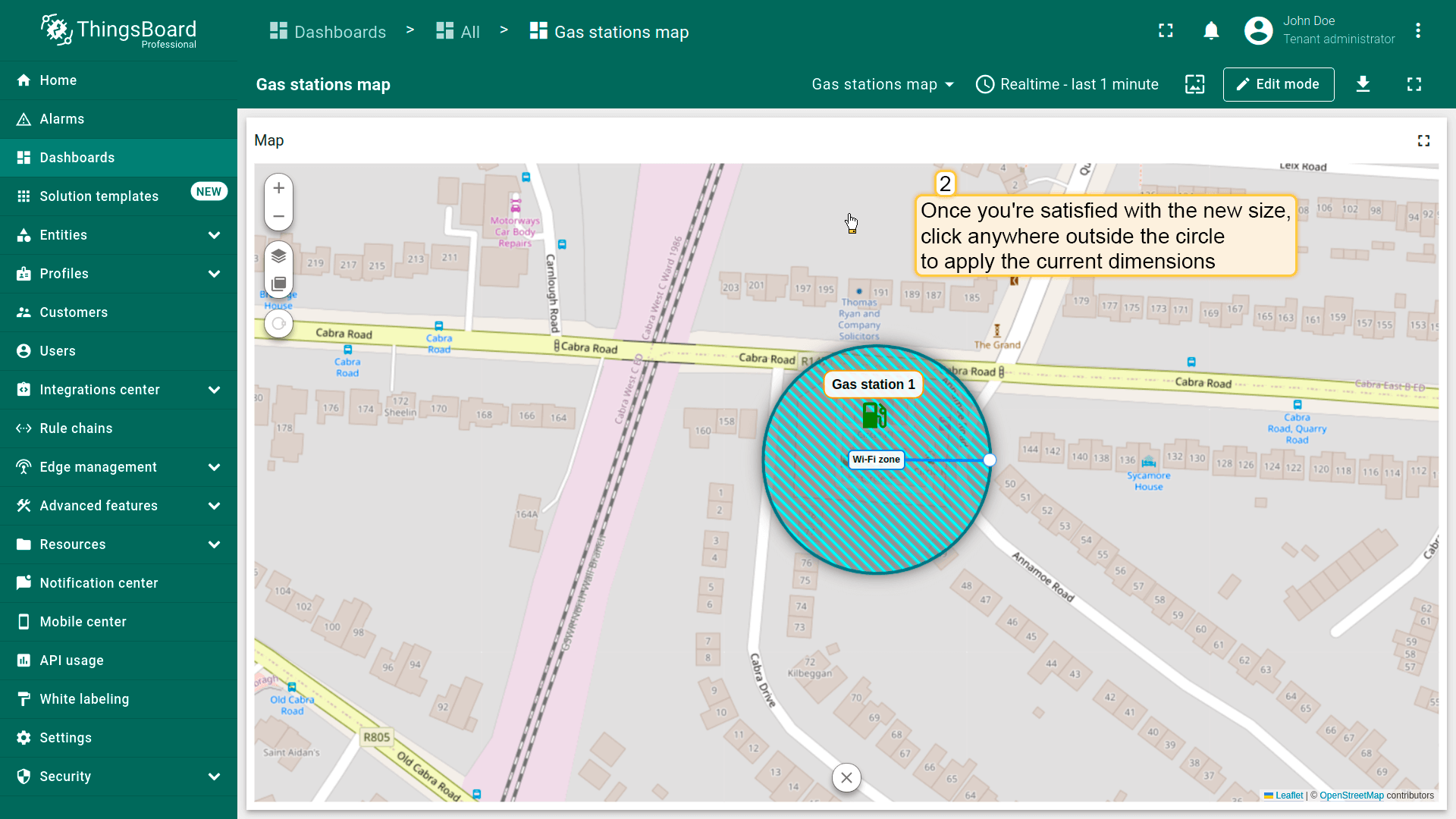
要调整圆形大小,点击它——半径控制点将出现。拖动该点以调整圆形尺寸。 确认新尺寸后,点击圆形外任意位置以应用当前尺寸。
移动圆形
别忘了在「Edit circle」区域的圆形设置中启用「Move」工具。
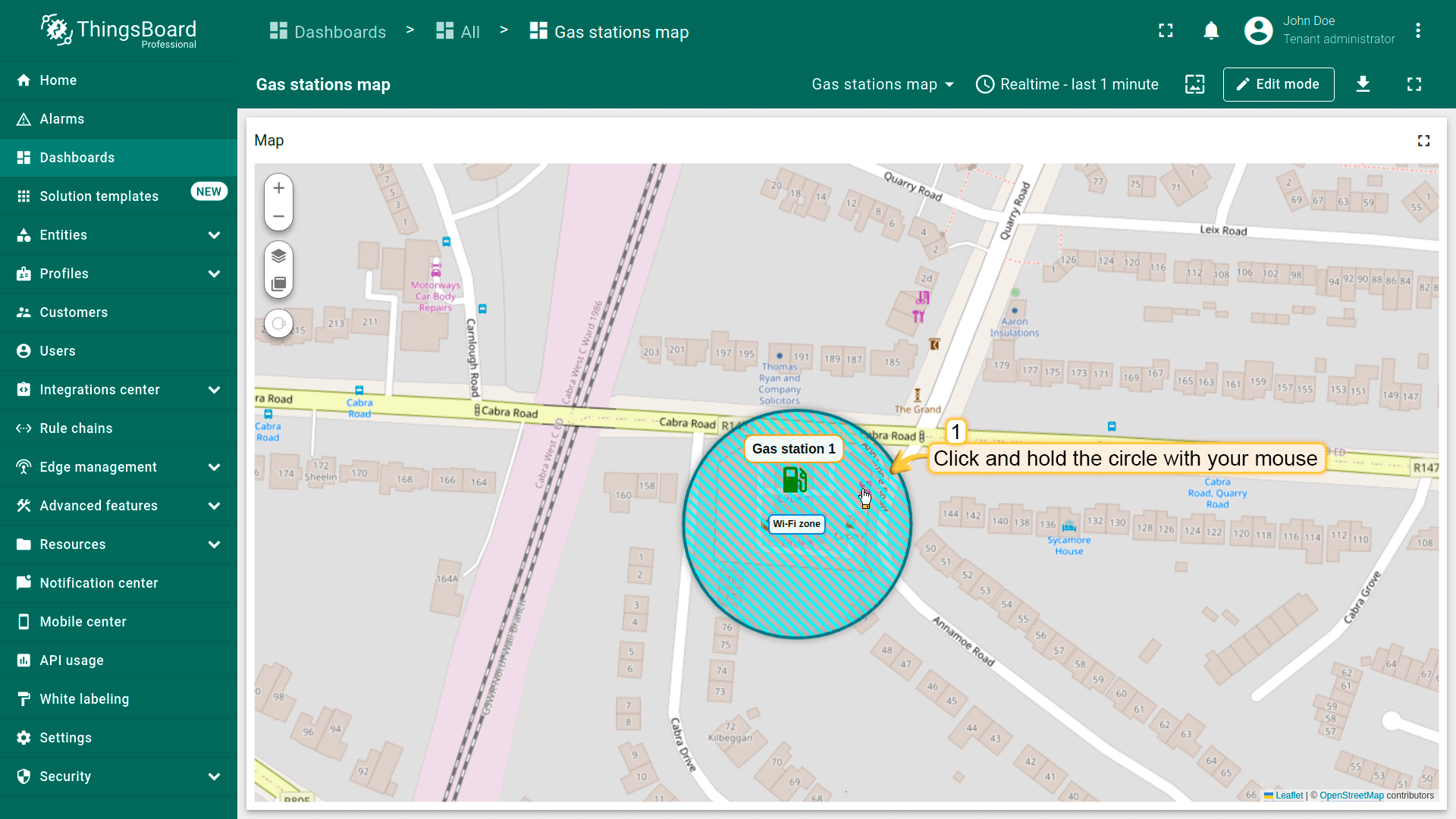
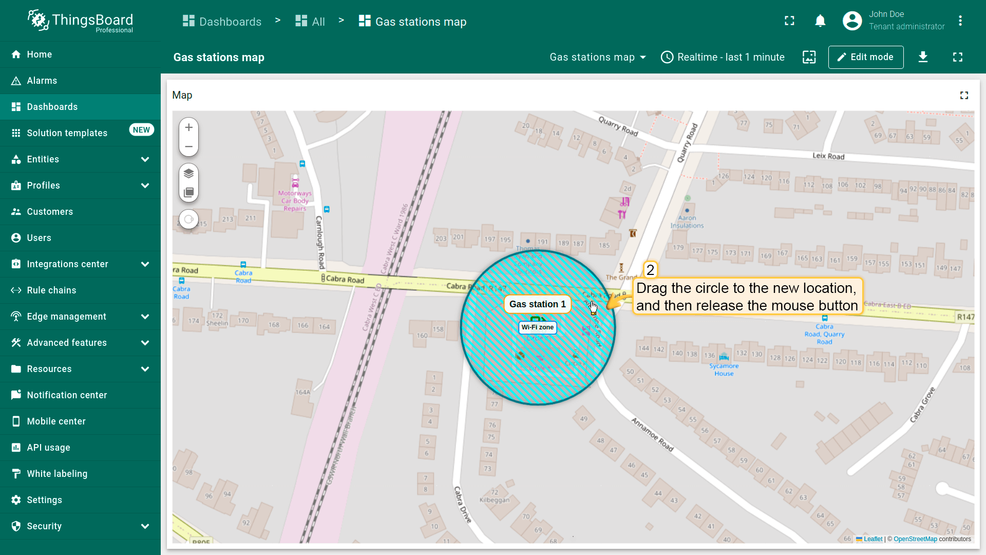
要移动圆形,点击它,按住鼠标并将圆形拖至新位置。
删除圆形
别忘了在「Edit polygon」区域的圆形设置中启用「Remove」工具。
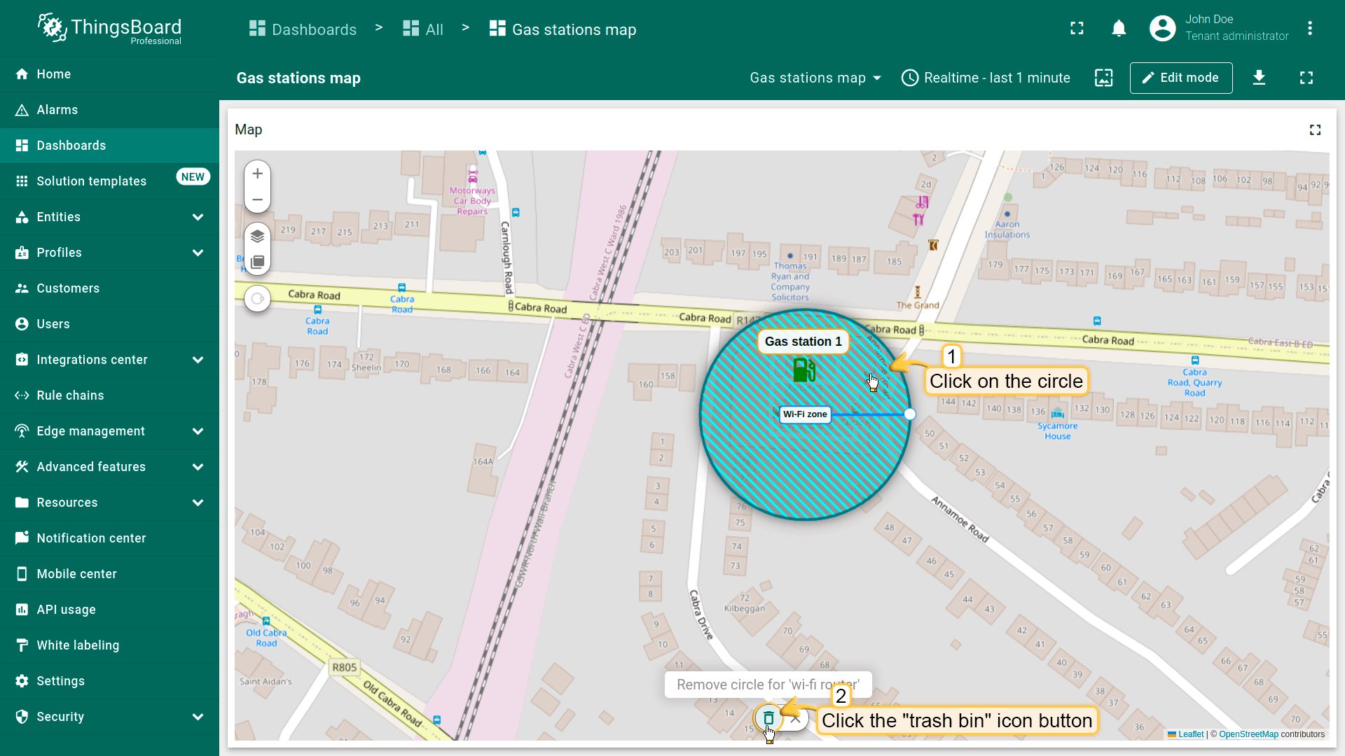
要删除圆形,点击它,然后点击部件底部菜单中的「trash bin」图标。
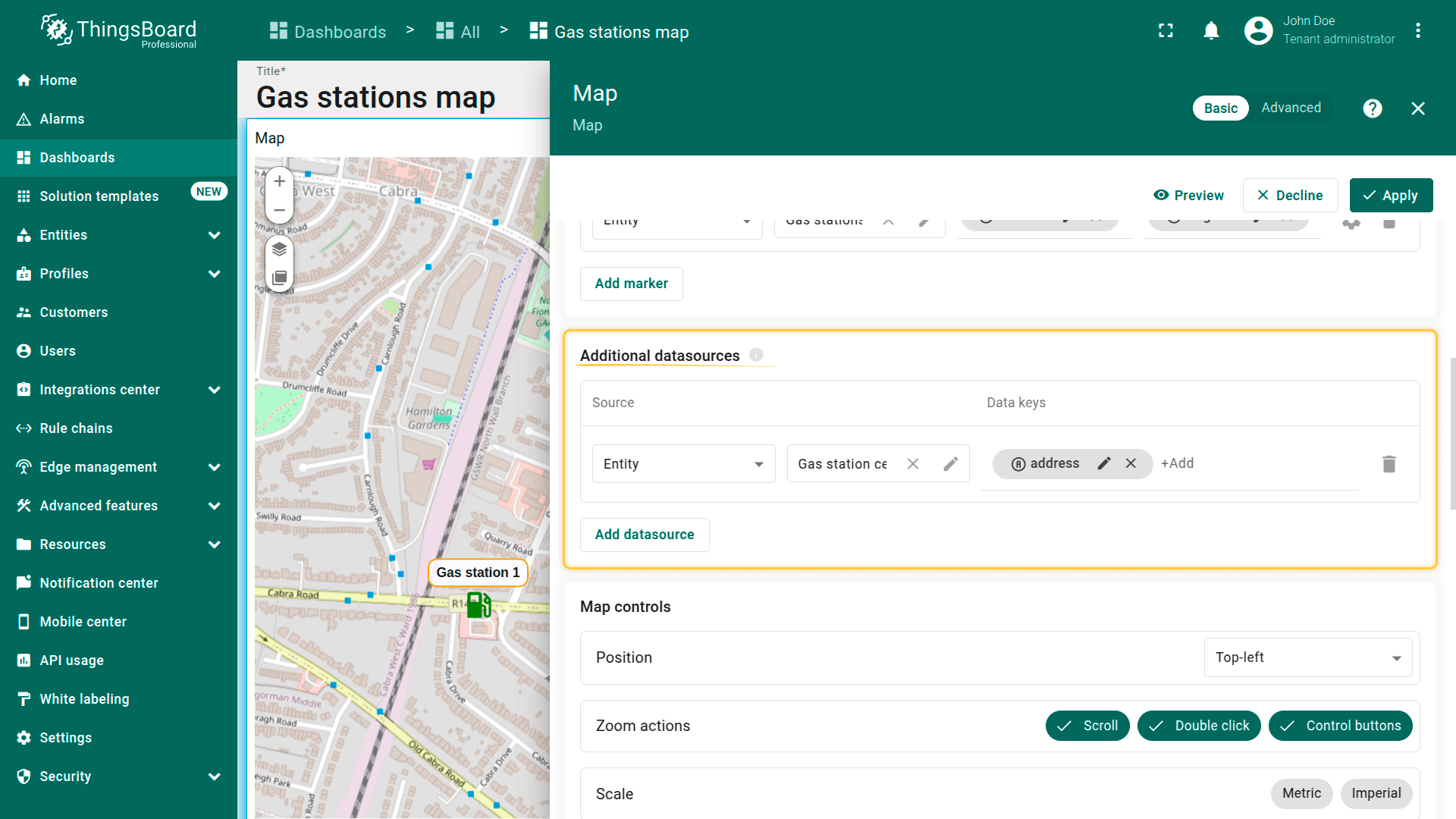
附加数据源
附加数据源为辅助数据源,可用于在主实体上处理、筛选或叠加数据。 常用于地图叠加功能或需要提供额外上下文或信息的tooltip。
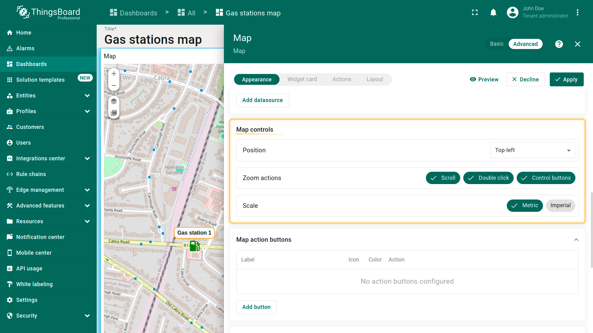
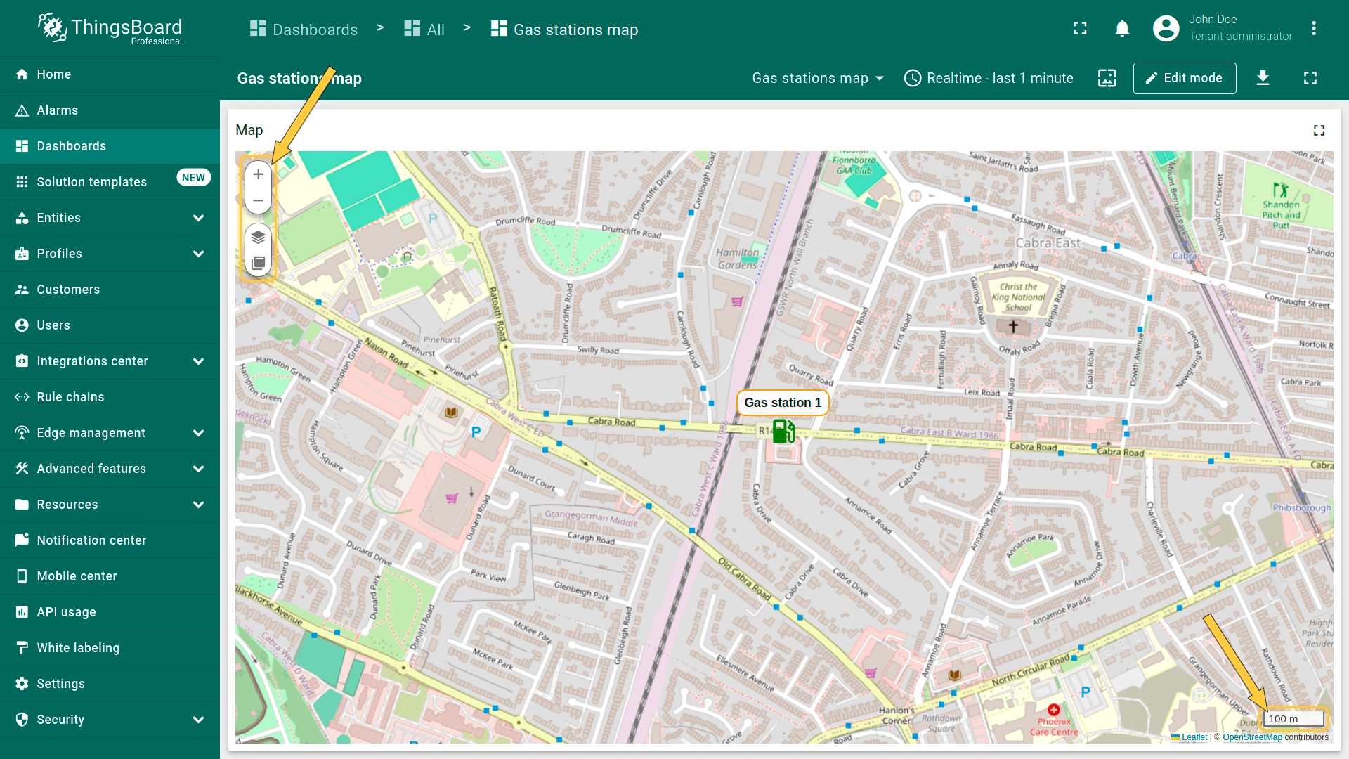
地图控件
地图控件为部件内地图控制按钮的配置设置。可:
- 指定控件元素的位置(如左上、右下等);
- 配置缩放交互(按钮、鼠标滚轮或双击);
- 选择缩放比例单位:公制或英制。
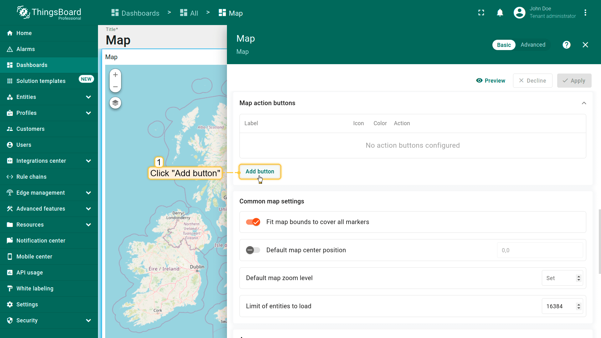
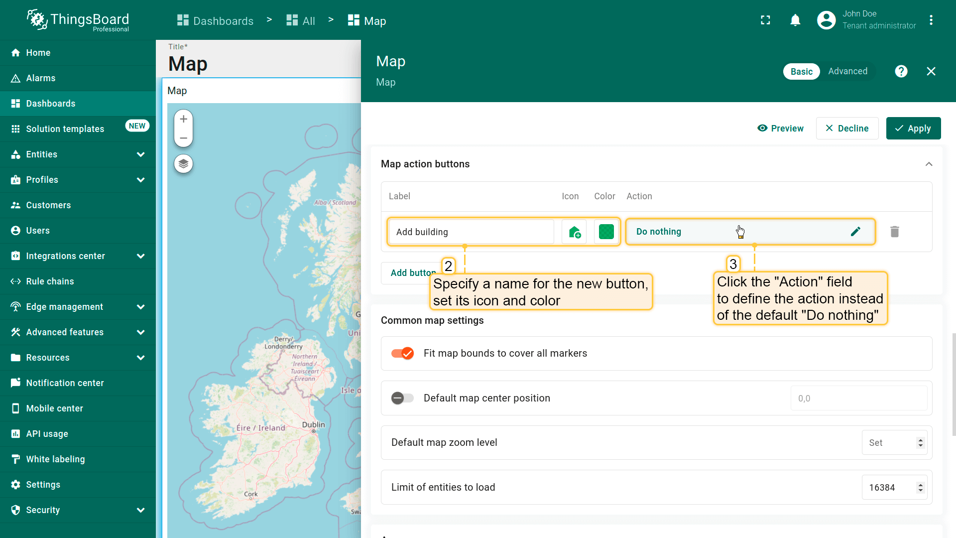
地图操作按钮
地图操作按钮为显示在地图顶部的交互按钮,可触发预定义操作。 更多可用操作类型及配置方法请参阅部件操作文档。
下面以添加允许用户在地图上放置新对象的操作按钮为例。
- 在「Map action buttons」区域点击「Add button」。
- 为新按钮指定名称——本例为「Add building」——并设置图标和颜色。
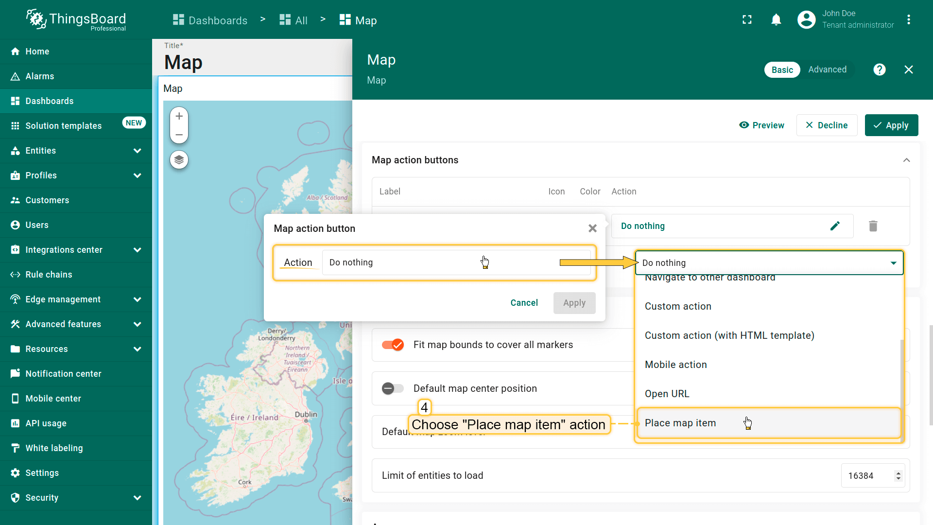
- 点击「Action」字段定义操作,将默认「Do nothing」改为「Place map item」。
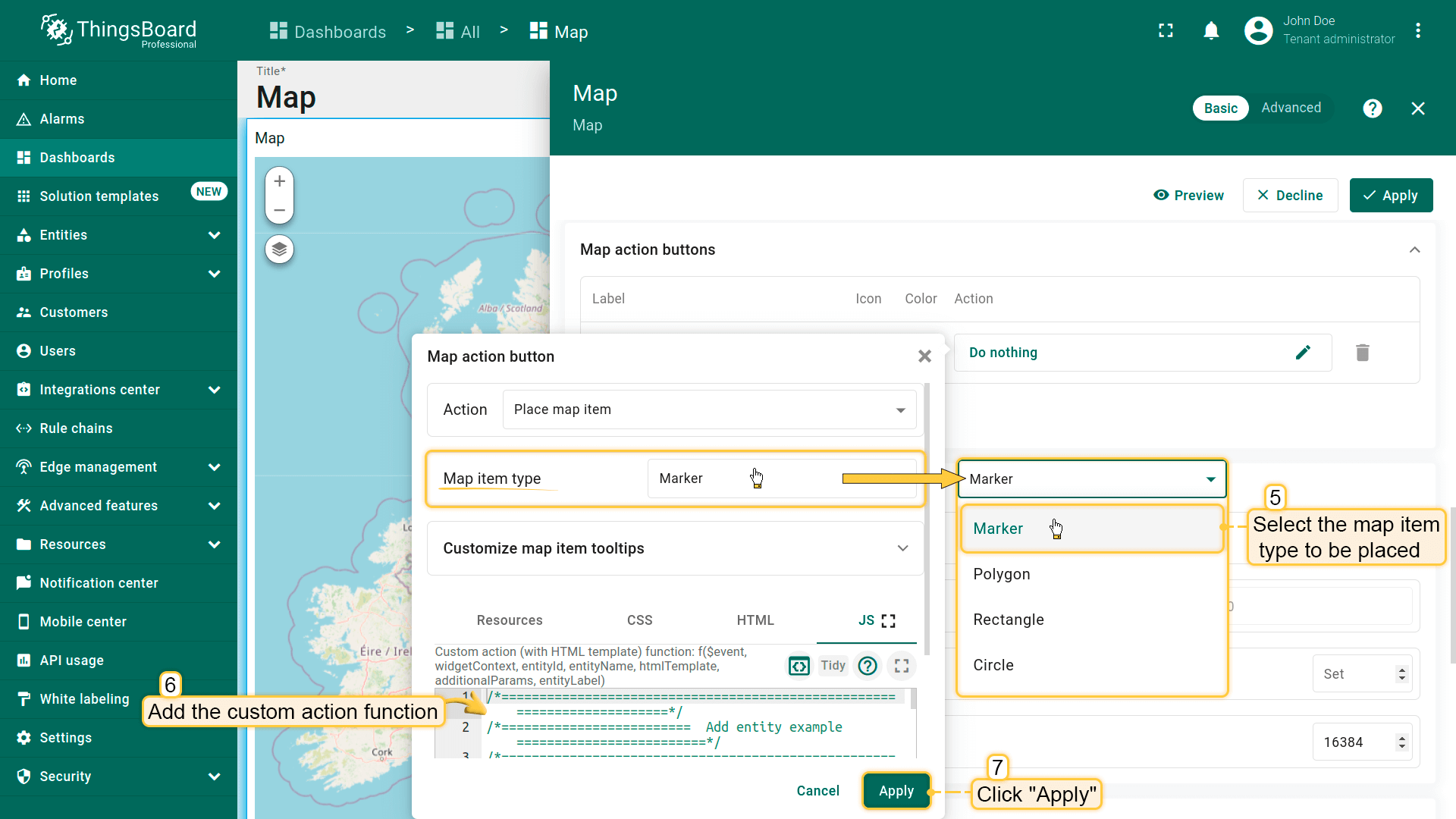
- 选择要放置的地图项类型——本例为「Marker」。
- 自定义操作函数字段包含默认函数,用于显示创建设备或资产的对话框——恰好满足需求。
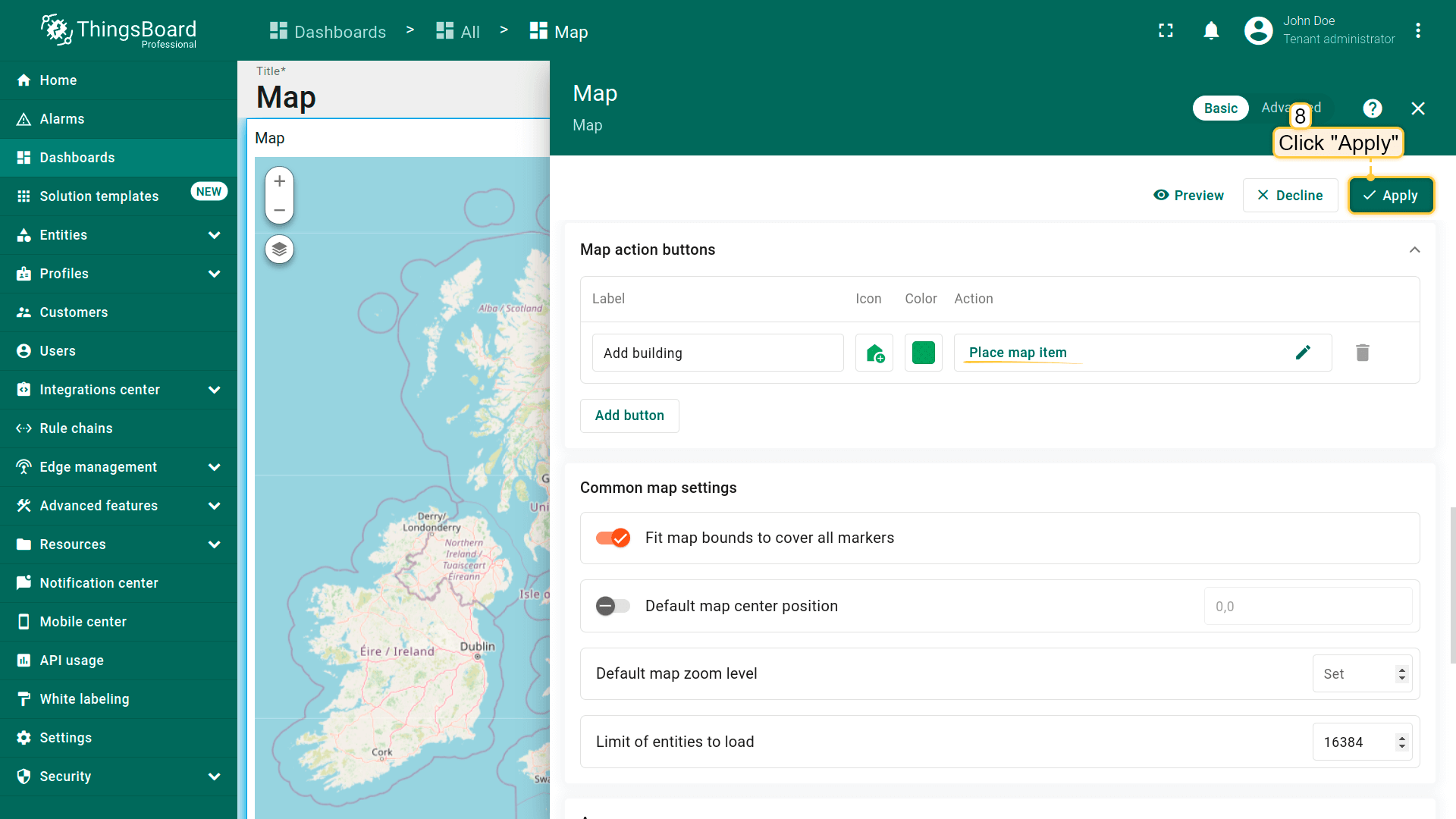
- 保存更改。
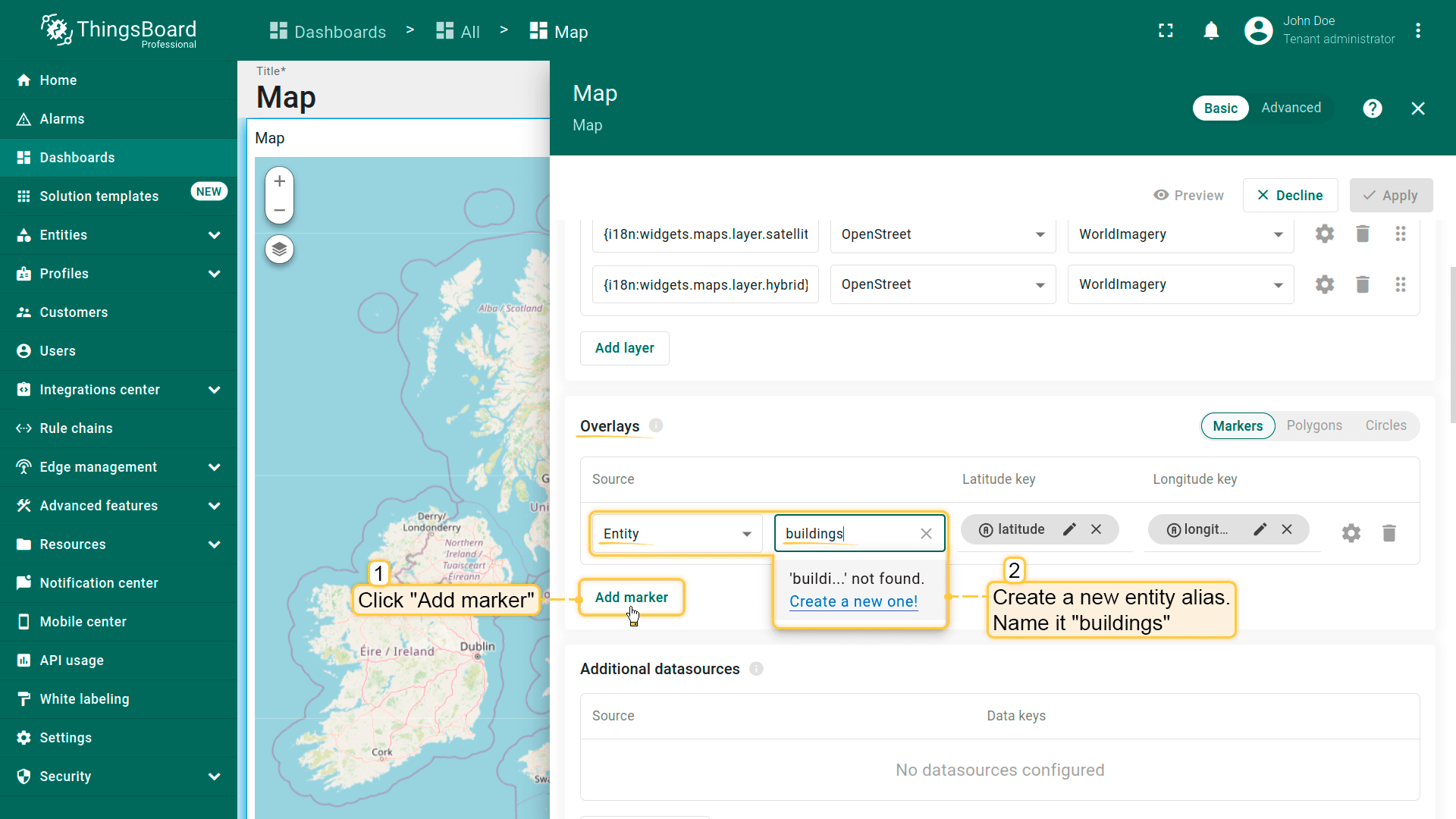
为确保新建实体立即显示在地图上,需正确配置数据源。
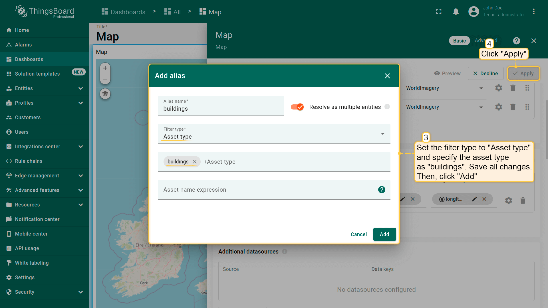
- 在「Overlays」区域的「Marker」选项卡下创建新entity alias作为数据源,命名为「buildings」。
- 因将创建asset type为「buildings」的资产,将filter type设为「Asset type」并指定类型为「buildings」。
- 应用所有更改。
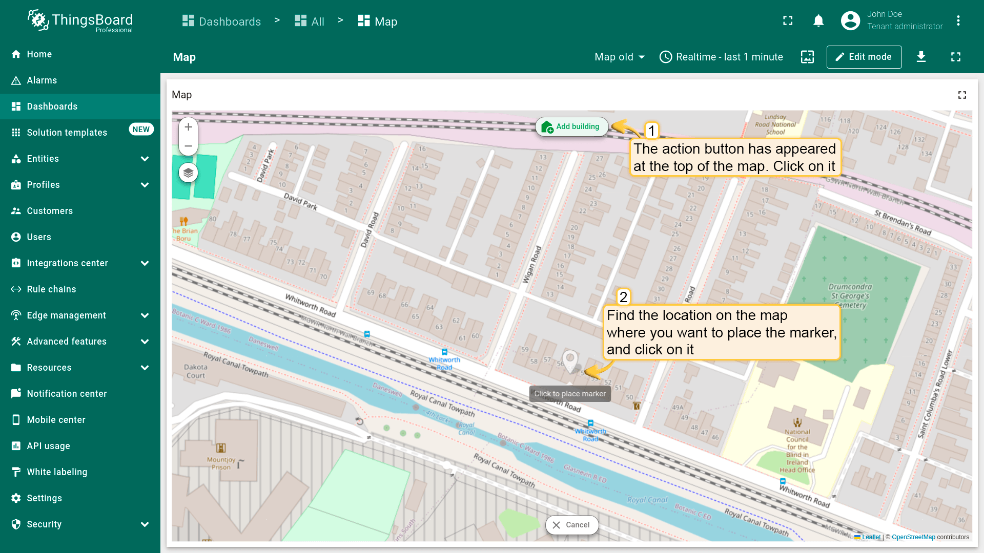
现在,标为「Add building」的操作按钮已出现在地图顶部。
- 在地图上找到要放置实体的位置并点击。
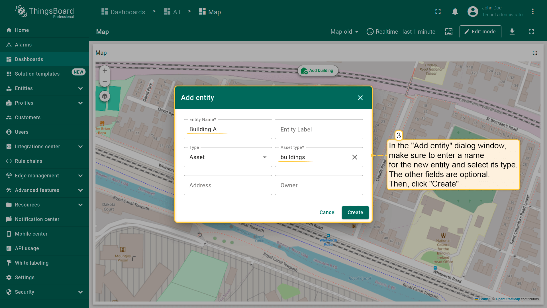
- 在弹出的「Add entity」对话框中输入新实体名称并选择类型——Asset。其他字段可选。
- 然后点击「Create」。
新标记已添加到地图。

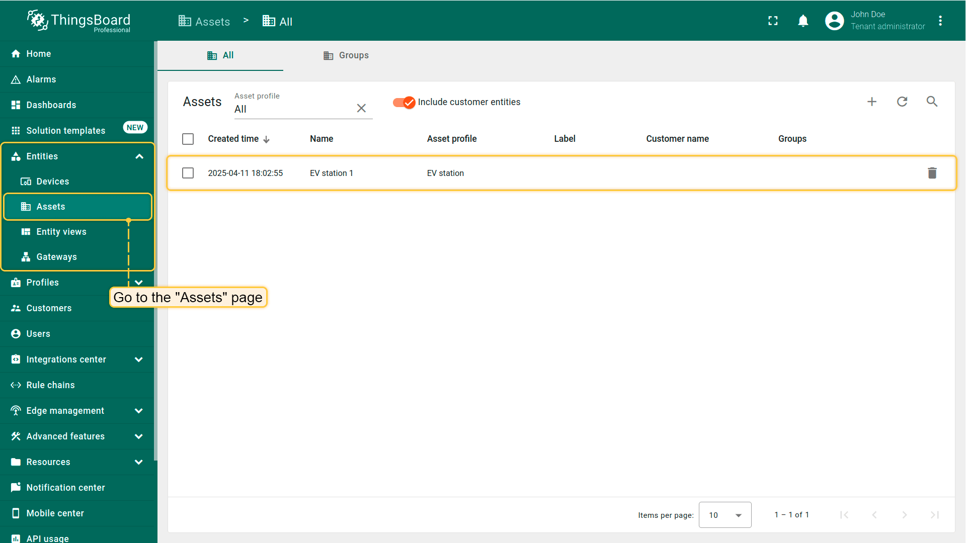
进入「Assets」页面——可找到新建资产「Building A」。

通用地图设置
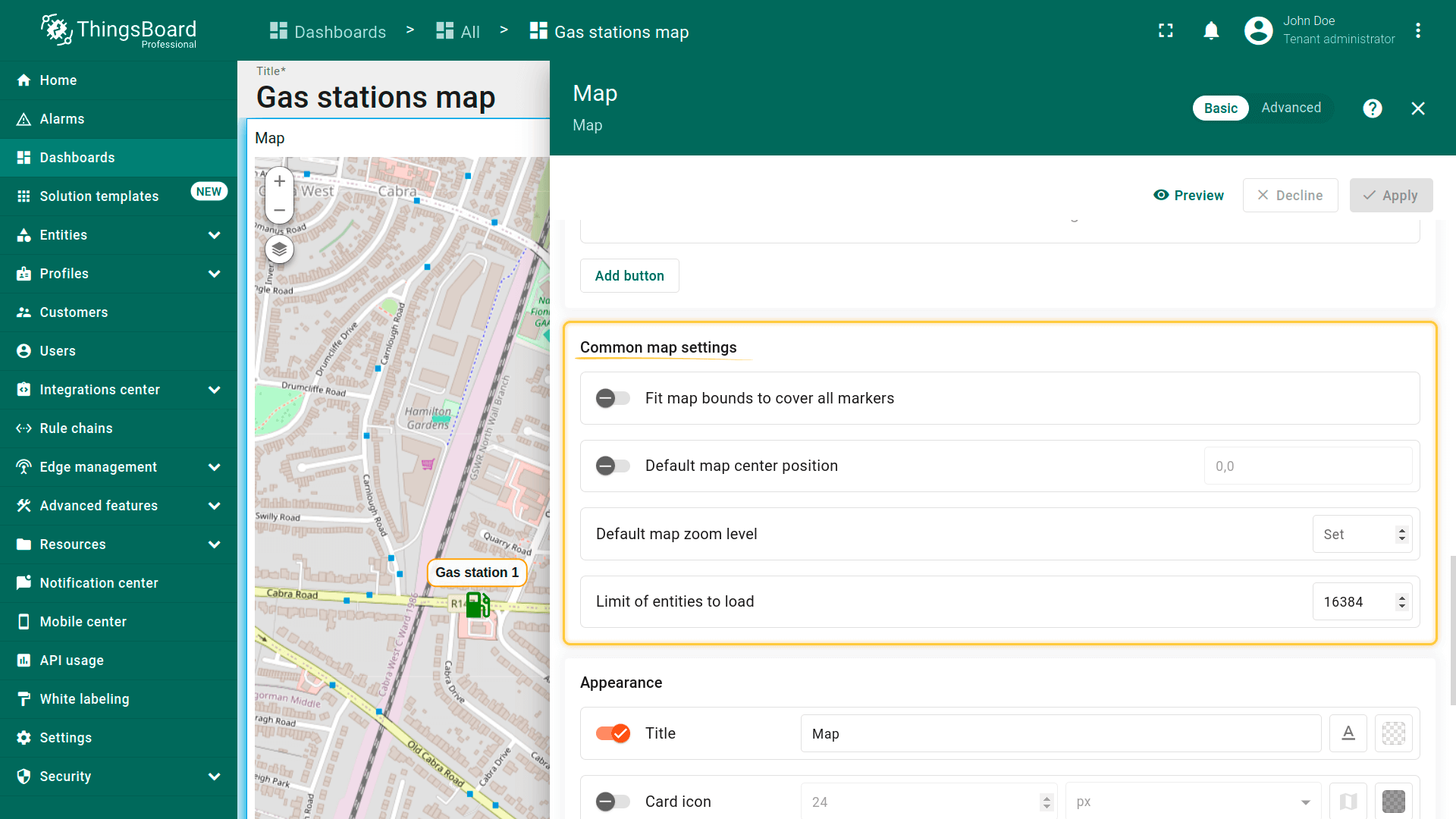
通用地图设置为ThingsBoard中地图部件的基础全局设置,定义地图加载时的行为及初始显示内容。
- Fit map bounds to cover all markers(使地图边界覆盖所有标记):在部件加载时自动调整缩放和位置,使所有标记可见。
- Default map center position(默认地图中心位置):在禁用自动缩放时设置地图中心(lat/lng坐标)。用作部件打开时的初始位置。
- Default map zoom level(默认地图缩放级别):设置默认缩放级别(例如7为国家级视图,15为街道级视图)。
- Limit of entities to load(加载实体数量限制):限制加载到地图上的实体数量。有助于在大量数据时保护性能(例如限制100可防止一次加载超过100个标记)。
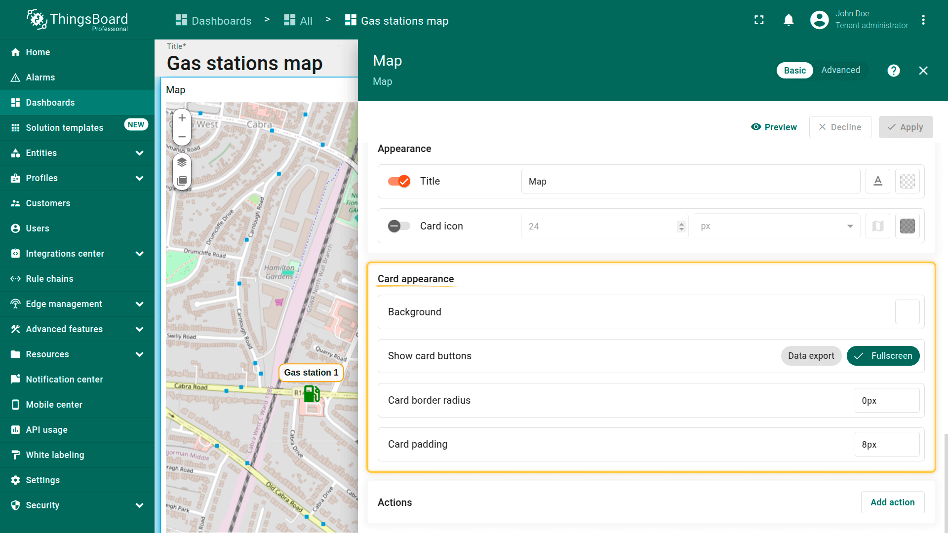
外观
自定义部件外观。
- Title(标题)– 设置显示在地图顶部的部件名称。便于在dashboard上识别地图(如「Vehicle Tracking」「Sensor Locations」)。
- Card icon(卡片图标)– 定义部件标题栏中显示的图标(标题旁)。可用于在视觉上体现地图的用途或主题(如GPS、地图、交通图标)。

卡片外观
卡片外观区域控制部件在dashboard上的视觉外观。
- Background(背景):设置卡片背景颜色。
- Show card buttons(显示卡片按钮):启用或禁用右上角的编辑和全屏按钮。
- Card border radius(卡片圆角):定义卡片圆角大小。
- Card padding(卡片内边距):设置地图内容与卡片边缘之间的内边距。
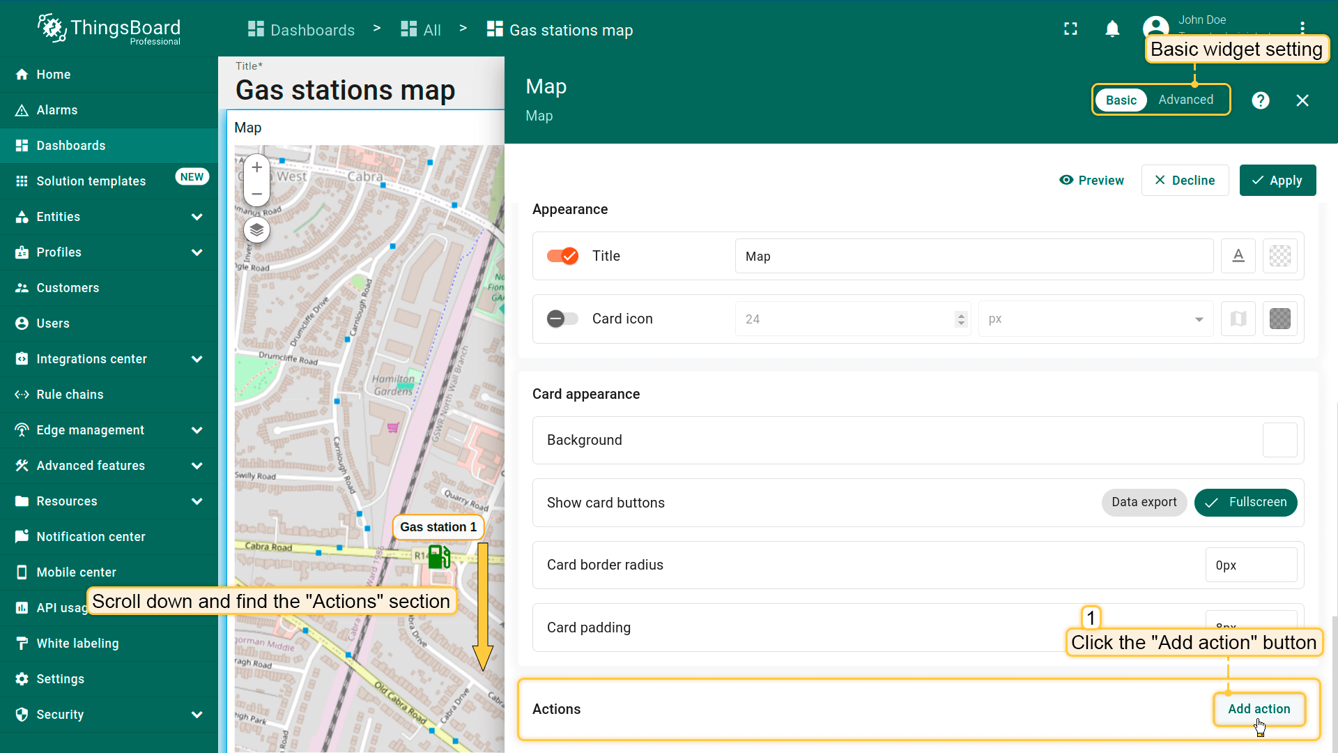
操作
可向部件标题栏添加触发预定义操作的按钮。更多可用操作类型请参阅此链接。
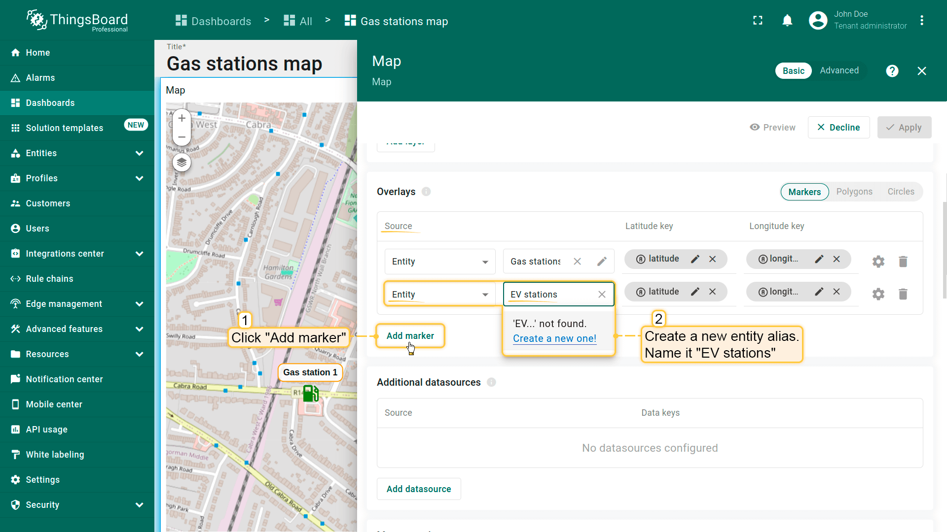
例如,添加允许用户在地图上放置充电站的按钮:
首先,为确保新建实体立即显示在地图上,需正确配置数据源。
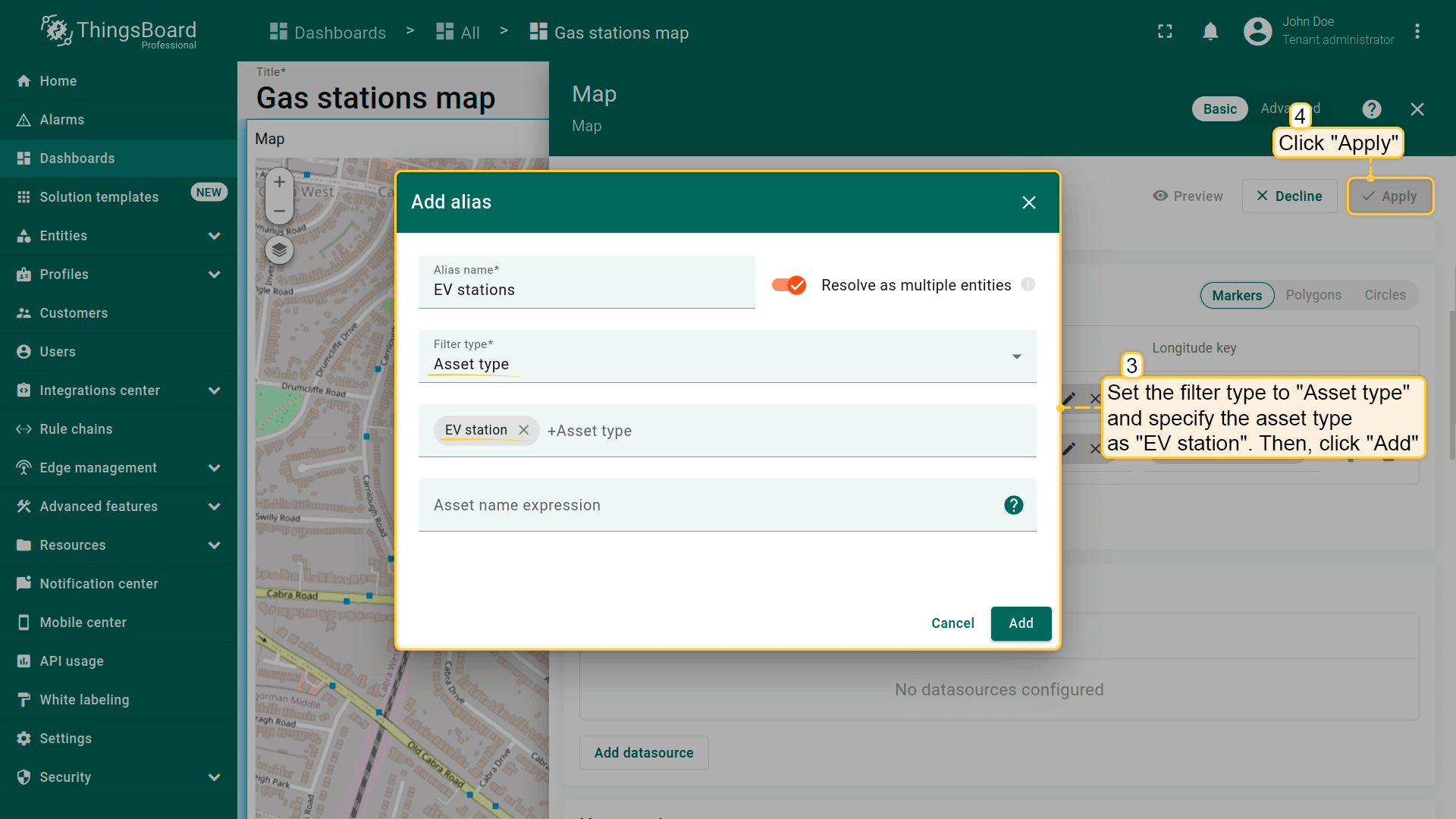
- 在「Overlays」区域的「Marker」选项卡下创建新entity alias作为数据源,命名为「EV stations」。
- 因将创建类型为「EV station」的实体,将filter type设为「Asset type」并指定类型为「EV station」。
- 应用更改。
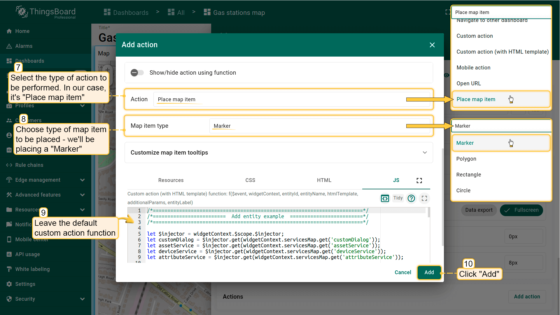
接下来配置操作:
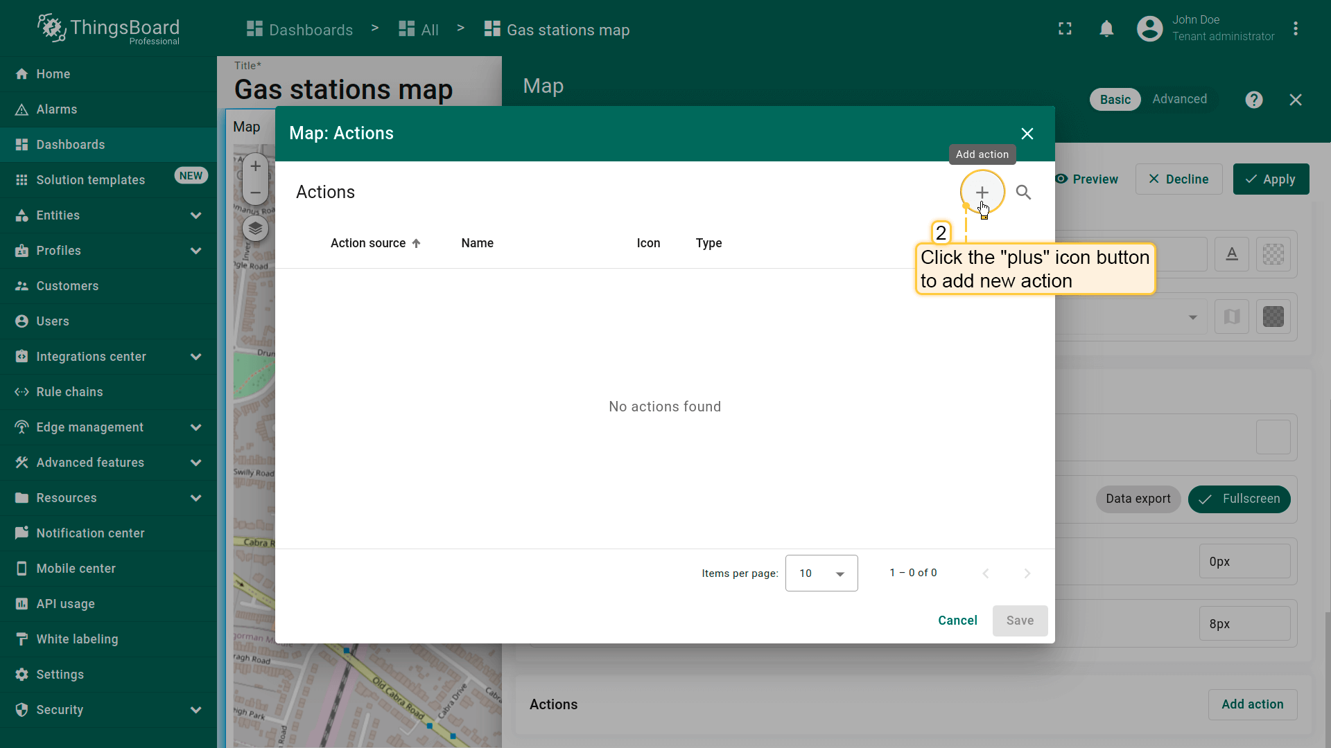
- 滚动到「Actions」区域并点击「Add action」按钮。
- 将打开新窗口显示所有已创建操作。点击右上角「plus」图标添加。
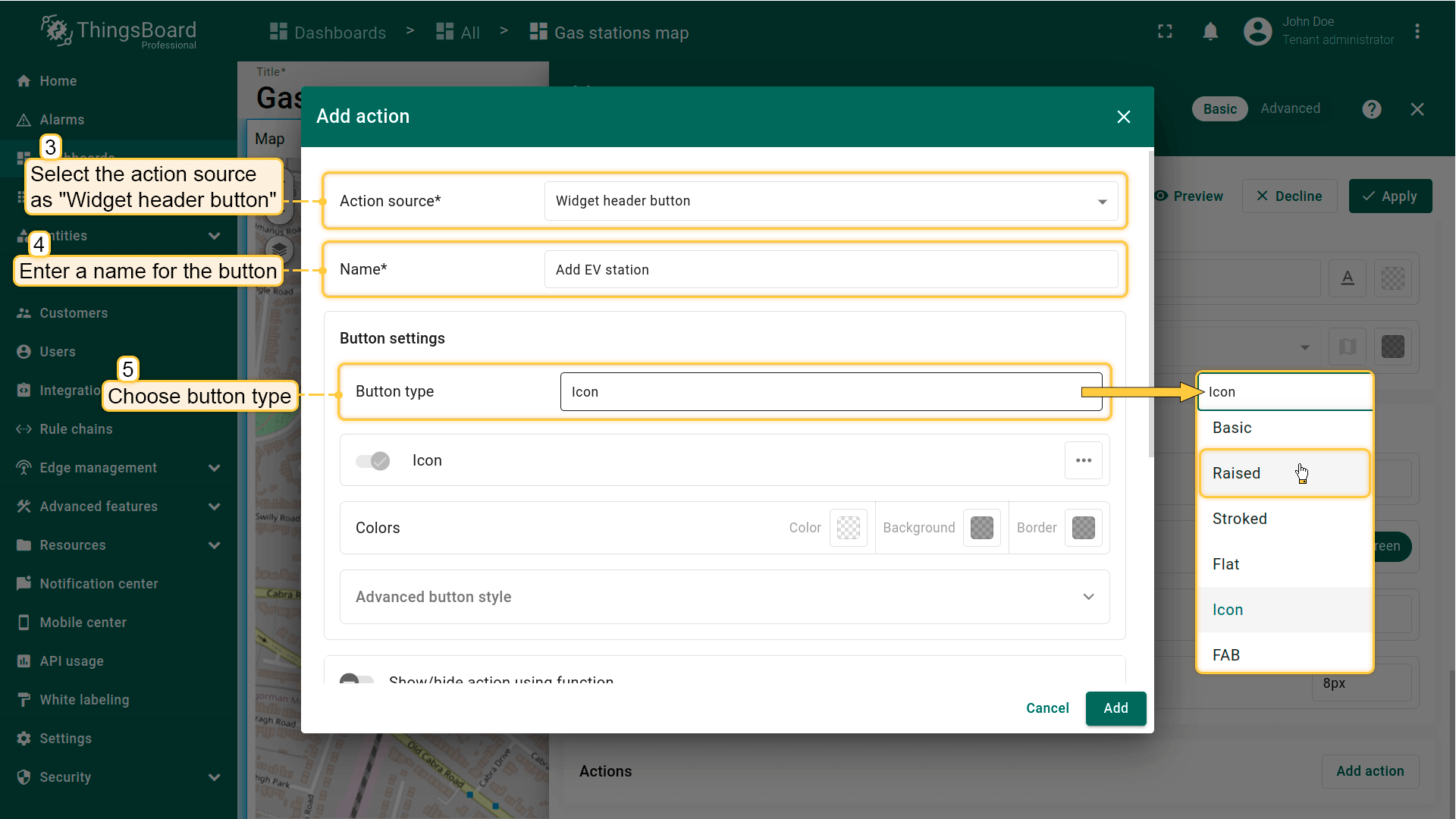
- 选择操作源为「Widget header button」,输入按钮名称并选择类型。
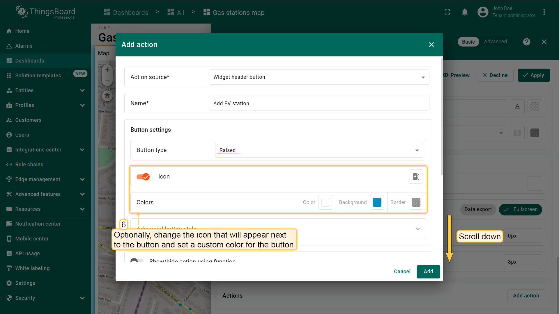
- 可选:更改按钮旁图标或完全隐藏。也可为按钮设置自定义颜色。
- 从下拉菜单选择要执行的操作类型。本例为「Place map item」。
- 选择要放置的地图项类型——本例为「Marker」。
- Custom action function 字段已包含默认函数,用于打开创建设备或资产的对话框——恰好满足需求。
- 在「Action」区域的下拉菜单中选择「Place map item」。选择要放置的地图项类型——本例为「Marker」。Custom action function字段包含用于创建设备或资产对话框的默认函数——恰好满足需求。
- 然后点击「Add」。
- 应用所有更改并保存dashboard。
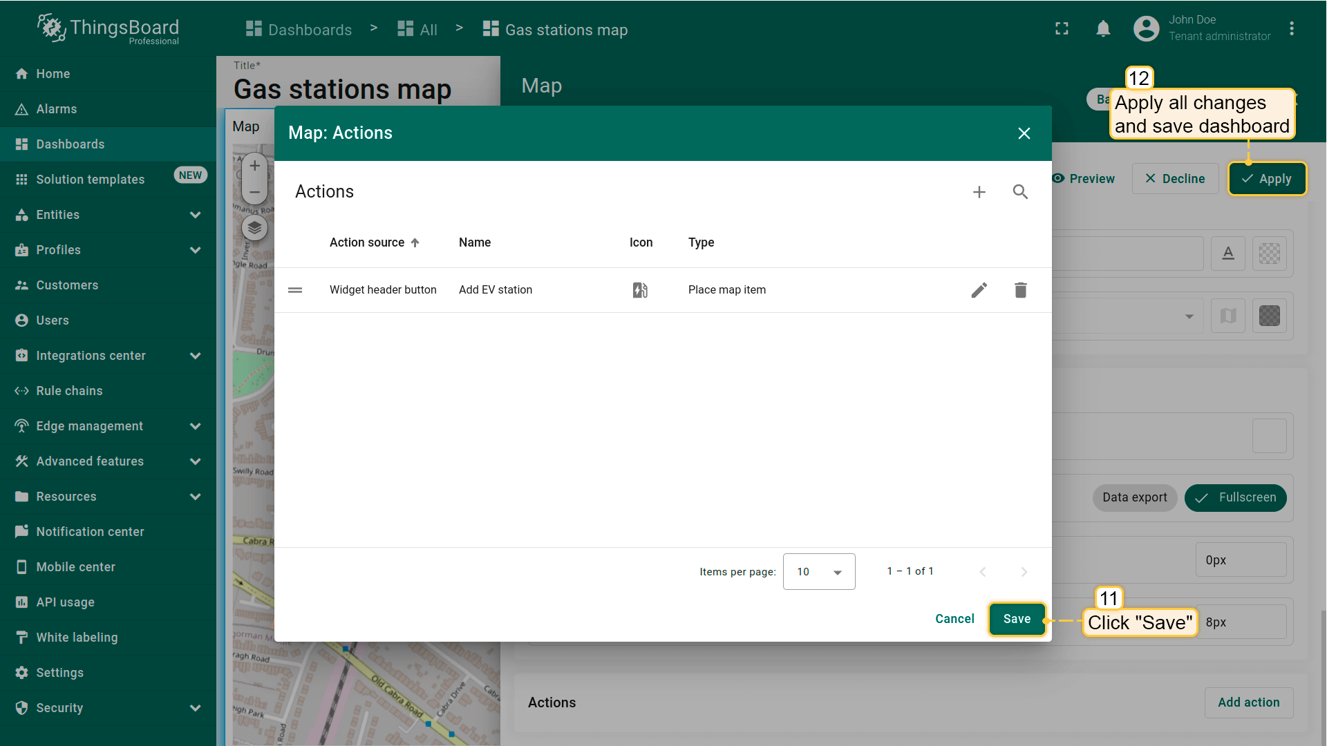
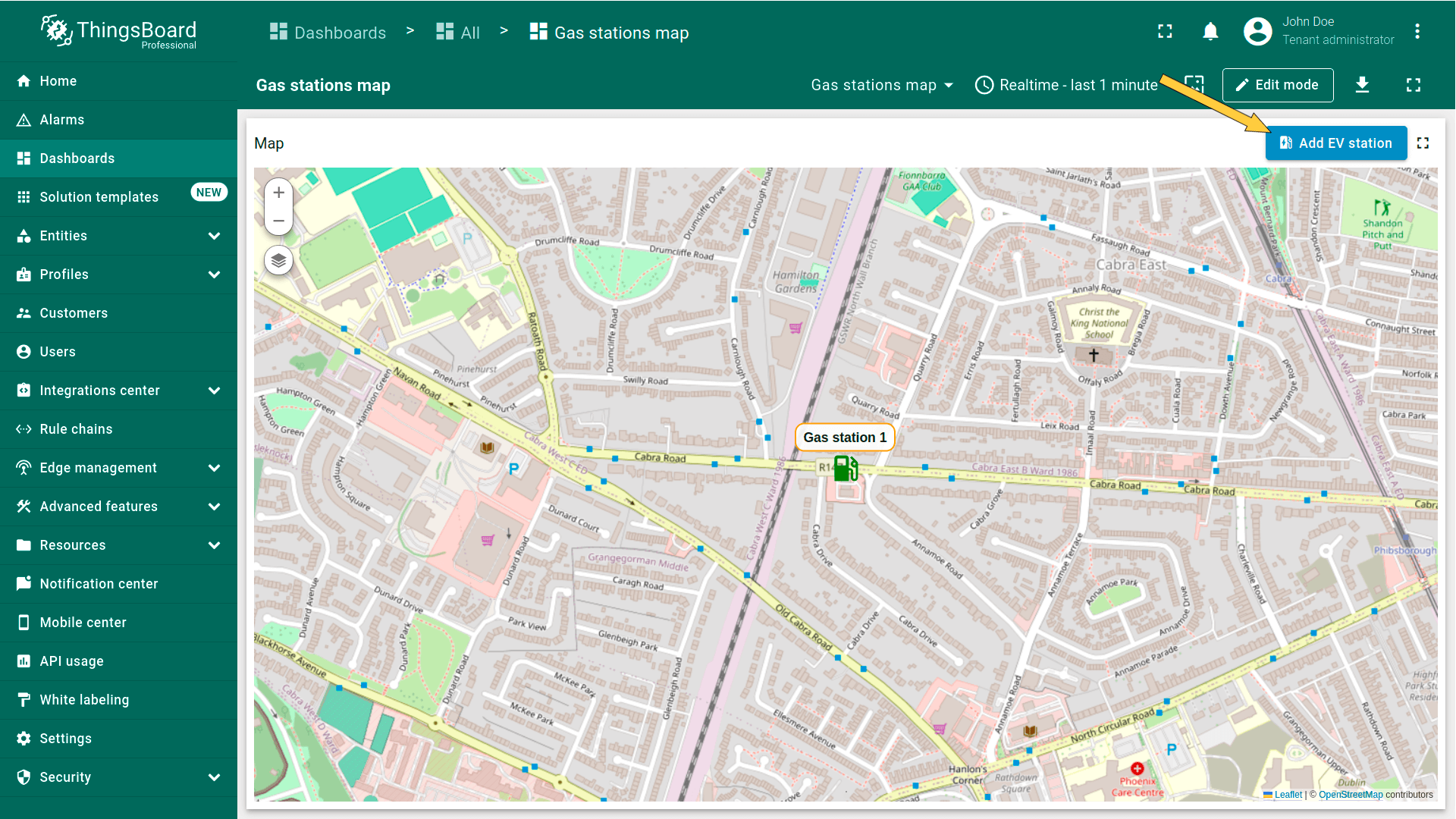
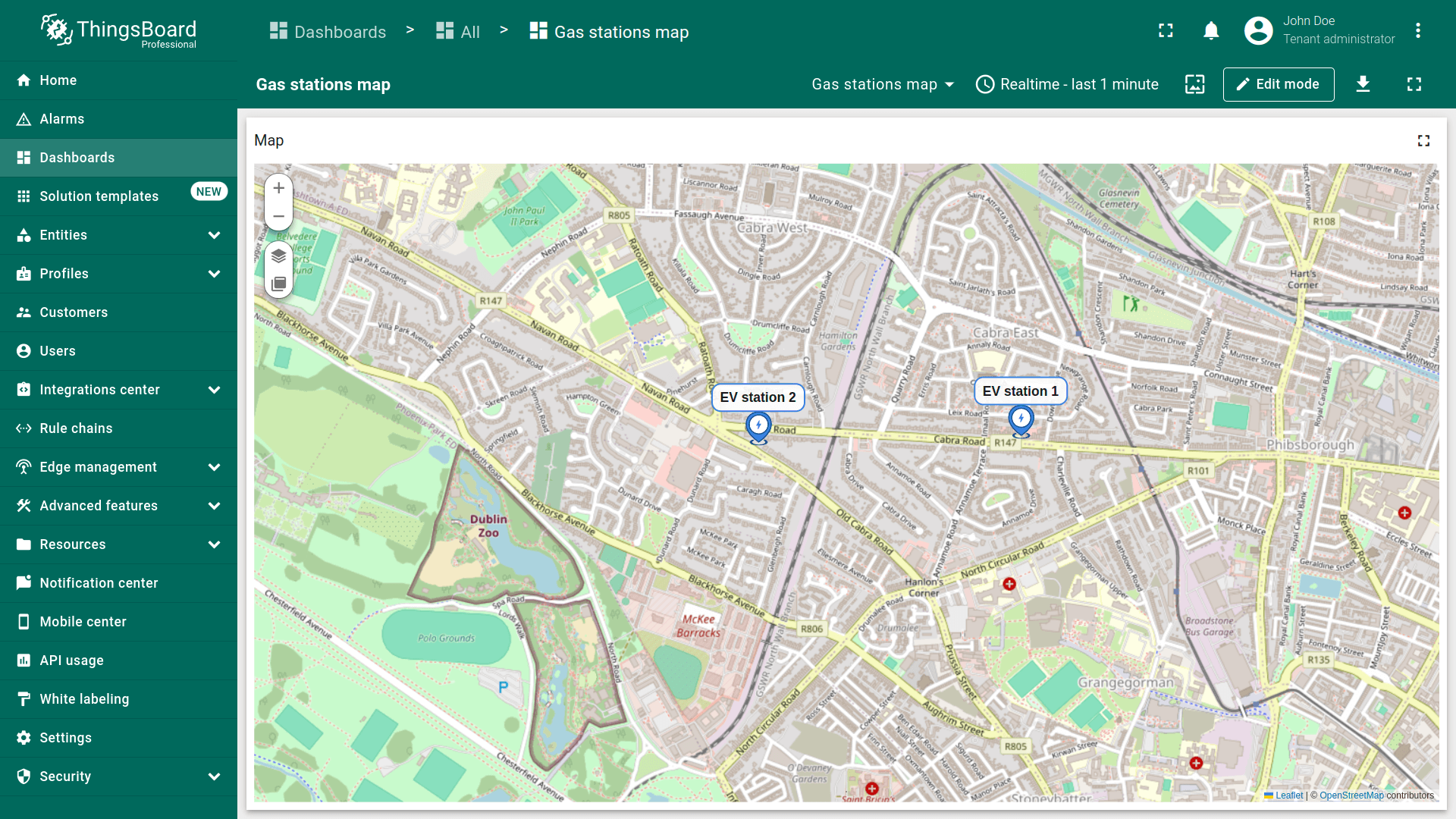
标为「Add EV station」的新操作按钮已出现在地图顶部。使用它:
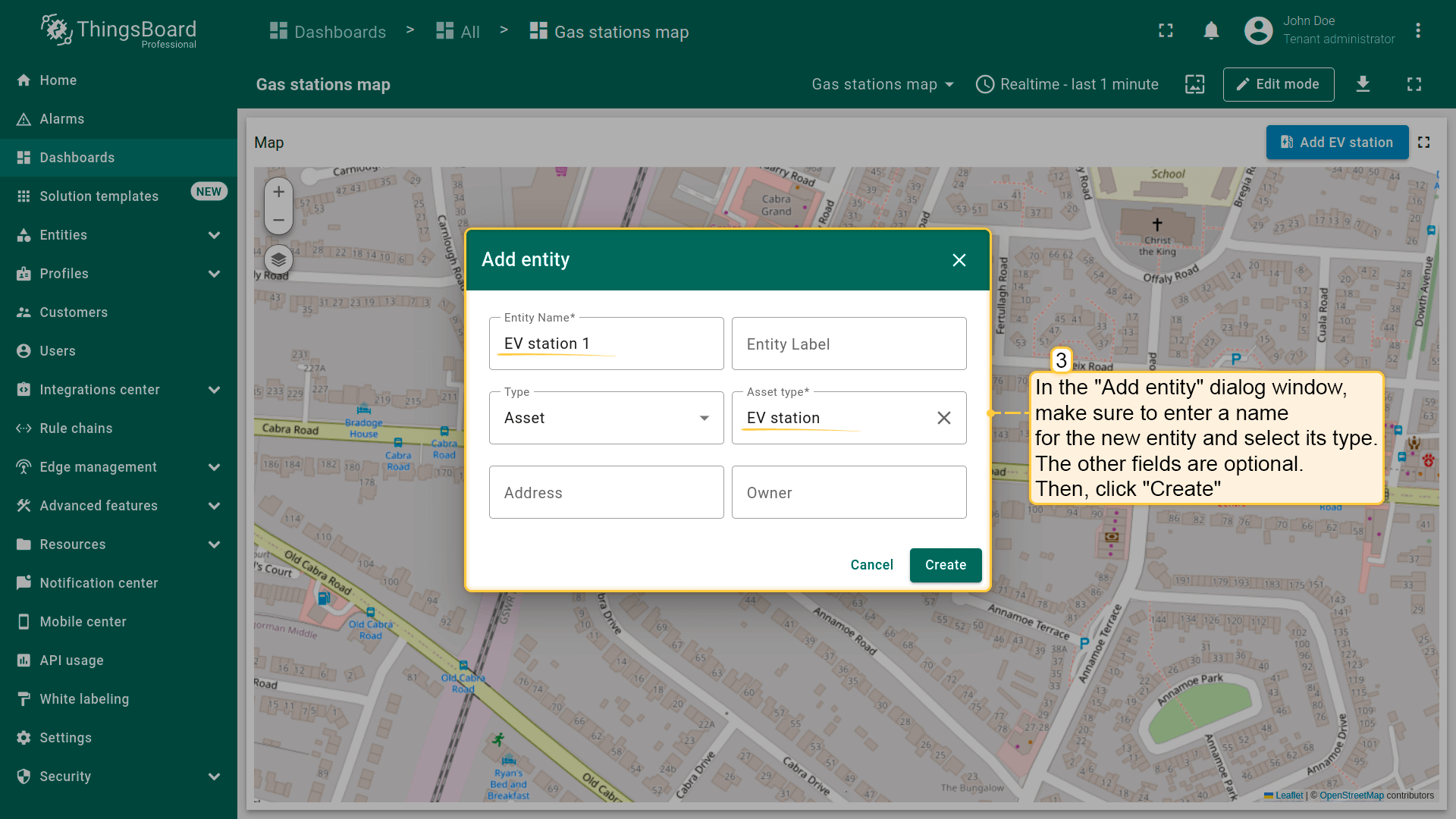
- Click the newly created "Add EV station" button. Then, find the location on the map where you want to place the EV station and click on it.
- In the "Add entity" dialog that appears, make sure to enter a name for the new entity and select its type — Asset. The other fields are optional. Then click "Create".
- The new "EV station" marker is now added to the map.

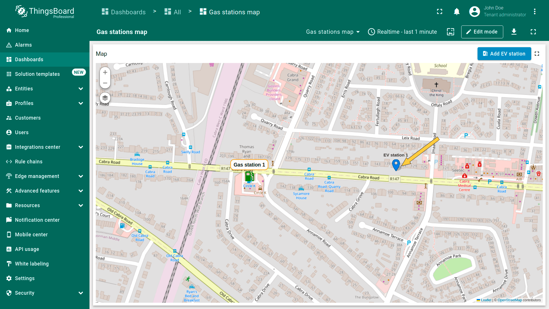
进入「Assets」页面——可找到新建资产「EV station 1」。