简介
ThingsBoard部件为可无缝集成到任意 IoT Dashboard 的额外UI模块。提供数据可视化、远程设备控制、告警管理及静态自定义HTML等内容展示等终端用户功能。 每个部件定义根据所提供的功能代表特定的 Widget Type。
创建新部件定义
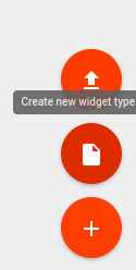
要创建新部件定义,进入”Widget Library”并打开现有”Widgets Bundle”或新建一个。在”Widgets Bundle”视图中,点击屏幕右上角的”+”按钮,然后点击”Create new widget”按钮。
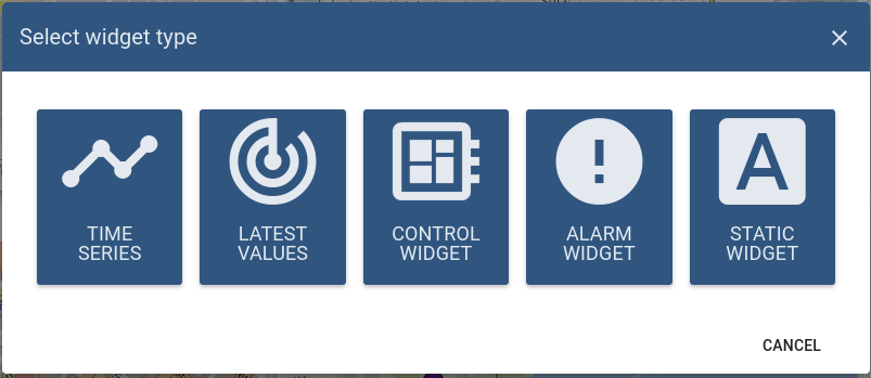
将出现 “Select widget type” 窗口,选项对应你要开发的 部件类型。
随后会打开预填充的 “Widget Editor” 页面,根据所选部件类型提供初始模板。
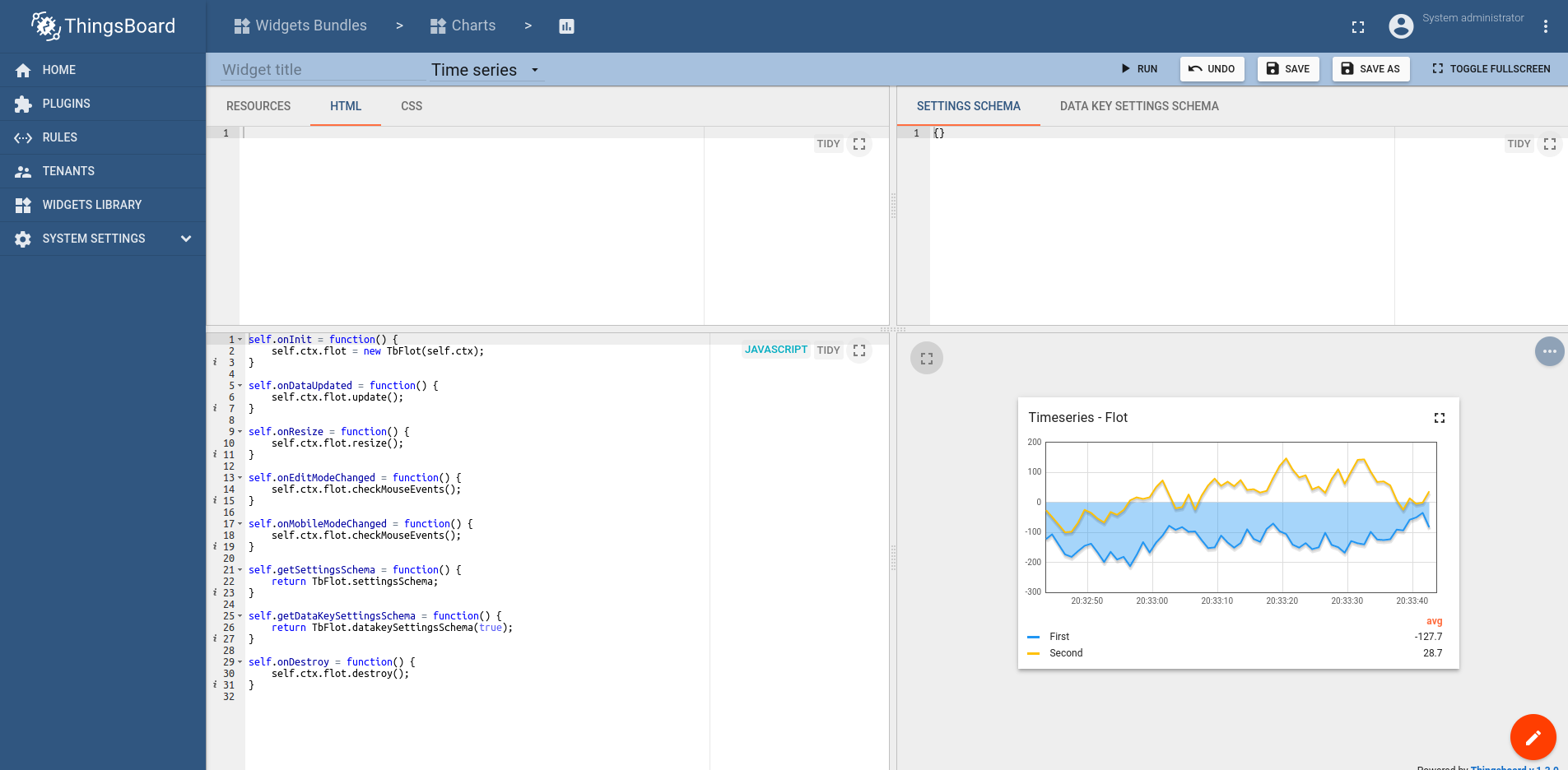
Widget Editor概览
Widget Editor视图是用于开发自定义部件定义的迷你IDE。 包含 顶部工具栏 和四个主要区域:
Widget Editor工具栏

工具栏包含以下项:
- Widget Title 字段 - 指定部件定义标题
- Widget Type 选择器 - 指定部件定义的 类型
- Run 按钮 - 运行部件代码并在 Widget preview 区域查看结果
- Undo 按钮 - 将各编辑区还原到最近保存状态
- Save 按钮 - 保存部件定义
- Save as 按钮 - 指定新部件类型名和目标 Widgets Bundle 以保存副本
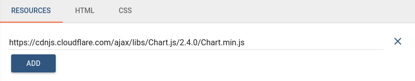
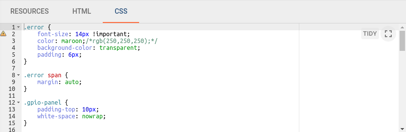
Resources/HTML/CSS section(资源/HTML/CSS区域)
本区域包含三个选项卡:
第一个 Resources 选项卡用于指定部件使用的外部JavaScript/CSS资源。
第二个 HTML 选项卡包含部件的HTML代码(注:部分部件动态生成HTML,因此初始HTML可能为空)。
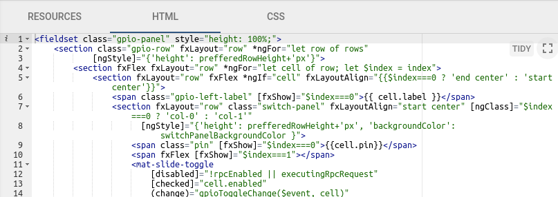
第三个 CSS 选项卡包含部件专用的CSS样式定义。
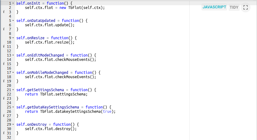
JavaScript section(JavaScript区域)
本区域包含根据 Widget API 编写的全部部件相关JavaScript代码。
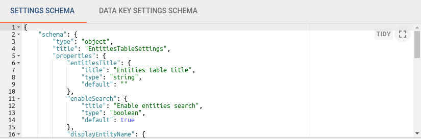
Settings schema section(设置schema区域)
本区域包含两个选项卡:
第一个 Settings schema 选项卡用于指定部件设置的JSON schema,以通过react-schema-form builder 自动生成UI表单。 生成的UI表单显示在部件设置 Appearance 选项卡的 Advanced 模式中。 此schema序列化的Settings对象用于存储特定部件设置,并可从部件JavaScript代码访问。
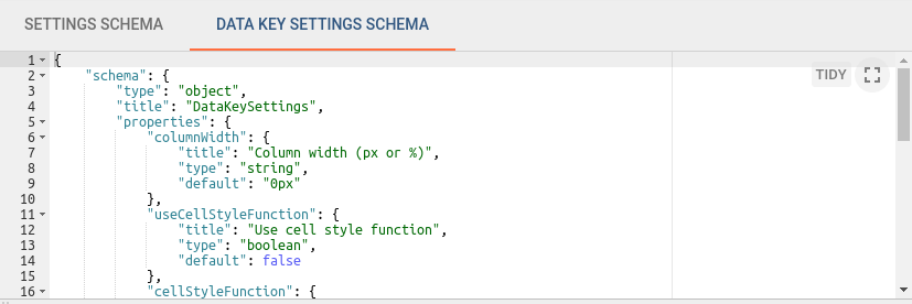
第二个 Data key settings schema 选项卡用于指定data key设置的JSON schema,以通过react-schema-form builder 自动生成UI表单。 生成的UI表单显示在 Data key configuration 对话框的 Advanced 选项卡中。 此schema序列化的Settings对象用于存储部件中定义的数据源各data key的特定设置。 这些设置可从部件JavaScript代码访问。
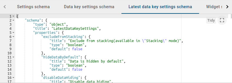
第三个 Latest data key settings schema 选项卡用于指定Latest data key的JSON schema,以通过react-schema-form builder 自动生成UI表单。 Latest data key settings schema 仅对 Time series 部件可用。 生成的UI表单显示在Latest keys的 Data key configuration 对话框的 Advanced 选项卡中。 此schema序列化的Settings对象用于存储部件中定义的数据源各data key的特定设置。 这些设置可从部件JavaScript代码访问。
自v3.4起,自动生成的高级部件设置JSON表单已由 Angular components 替代。 为自定义部件创建新设置schema时,别忘了从 Widget Settings 选项卡中移除components。
以下是 settings schema 的基础示例:
1
2
3
4
5
6
7
8
9
10
11
12
13
14
15
16
17
18
19
20
21
22
23
24
25
26
27
28
29
30
31
32
33
34
35
36
37
38
39
40
   {
      "schema": {
         "type": "object",
         "title": "Settings",
         "properties": {
             "cardType": {
                "title": "Card type",
                "type": "string",
                "default": "Average"
             },
             "cardTitle": {
                "title": "Card title",
                "type": "string",
                "default": "Gateways online"
             }
          },
          "required": ["cardType"]
         },
      "form": [
      {
         "key": "cardType",
         "type": "rc-select",
         "multiple": false,
         "items": [
         {
           "value": "avg",
           "label": "Average"
         },
         {
           "value": "max",
           "label": "Maximum"
         },
         {
           "value": "min",
           "label": "Minimum"
         }]
      },
      "cardTitle"
      ]
   }
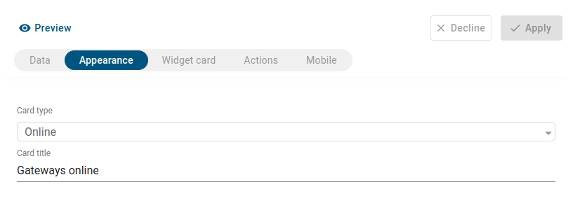
应用 settings schema 后的结果将显示在部件设置的 Appearance 选项卡中:
schema 属性支持 Number、Boolean、String、Object 等类型。 在 form 数组中,每个属性可指定为 input、checkbox、dropdown、functional field(JS、HTML、CSS)、image selection、color picker 或 array of properties。 字段可按条件显示并分组到逻辑块中。
以下是自定义 settings schema 的复杂示例:
1
2
3
4
5
6
7
8
9
10
11
12
13
14
15
16
17
18
19
20
21
22
23
24
25
26
27
28
29
30
31
32
33
34
35
36
37
38
39
40
41
42
43
44
45
46
47
48
49
50
51
52
53
54
55
56
57
58
59
60
61
62
63
64
65
66
67
68
69
70
71
72
73
74
75
76
77
78
79
80
81
82
83
84
85
86
87
88
89
90
91
92
93
94
95
96
97
98
99
100
101
102
103
104
105
{
    "schema": {
        "type": "object",
        "properties": {
            "button": {
                "title": "Button settings",
                "type": "object",
                "properties": {
                    "color": {
                        "title": "Primary color",
                        "type": "string",
                        "default": "#545454"
                    },
                    "backgroundColor": {
                        "title": "Background color",
                        "type": "string",
                        "default": null
                    }
                }
            },
            "markerImage": {
                "title": "Custom marker image",
                "type": "string"
            },
            "markerImageSize": {
                "title": "Custom marker image size (px)",
                "type": "number",
                "default": 34
            },
            "useMarkerImageFunction": {
                "title": "Use marker image function",
                "type": "boolean",
                "default": false
            },
            "markerImageFunction": {
                "title": "Marker image function: f(data, images, dsData, dsIndex)",
                "type": "string"
            },
            "markerImages": {
                "title": "Marker images",
                "type": "array",
                "items": {
                    "title": "Marker image",
                    "type": "string"
                }
            }
        },
        "required": []
    },
    "form": [
        [
            {
                "key": "button",
                "items": [
                    {
                        "key": "button.color",
                        "type": "color"
                    },
                    {
                        "key": "button.backgroundColor",
                        "type": "color"
                    }
			    ]
        	}
        ],
        [
            "useMarkerImageFunction",
            {
                "key": "markerImage",
                "type": "image",
                "condition": "model.useMarkerImageFunction !== true"
            },
            {
                "key": "markerImageSize",
                "condition": "model.useMarkerImageFunction !== true"
            },
            {
                "key": "markerImageFunction",
                "type": "javascript",
                "helpId": "widget/lib/map/marker_image_fn",
                "condition": "model.useMarkerImageFunction === true"
            },
            {
                "key": "markerImages",
                "items": [
                    {
                        "key": "markerImages[]",
                        "type": "image"
                    }
                ],
                "condition": "model.useMarkerImageFunction === true"
            }
        ]
    ],
    "groupInfoes": [
        {
            "formIndex": 0,
            "GroupTitle": "Button Style Settings"
        },
        {
            "formIndex": 1,
            "GroupTitle": "Marker Settings"
        }
    ]
}
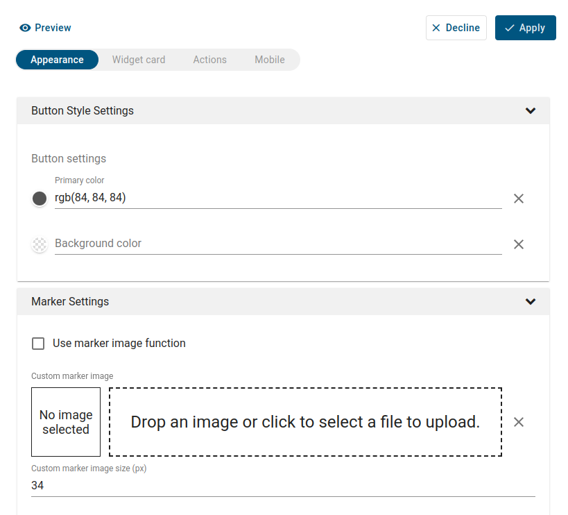
将自定义 settings schema 应用到部件后的效果:
Widget preview section(部件预览区域)
本区域用于预览和测试部件定义。 以包含一个从当前部件定义实例化的部件的迷你dashboard形式呈现。 具备典型ThingsBoard dashboard的大部分功能,但有若干限制。 例如,调试时在部件数据源区域仅能选择”Function”作为datasource类型。
部件代码调试技巧
最简单的调试方式为使用Web控制台输出。 在部件JavaScript代码任意位置放入 console.log(…) 函数。 然后点击 Run 按钮重启部件代码,在Web控制台查看调试信息。
另一种更有效的调试方式为调用浏览器调试器。 在要关注的部件代码处放入 debugger; 语句,然后点击 Run 按钮重启部件代码。 浏览器调试器(若已启用)将在debugger语句处自动暂停执行,可使用浏览器调试工具分析脚本执行。