概述
本指南将介绍图表部件:其功能、特性、部件的基本和高级设置,以及部件的数据键。
图表部件允许您使用可自定义的折线图和柱状图显示时序数据。此外,您还可使用多种饼图显示最新值。
如何创建图表部件
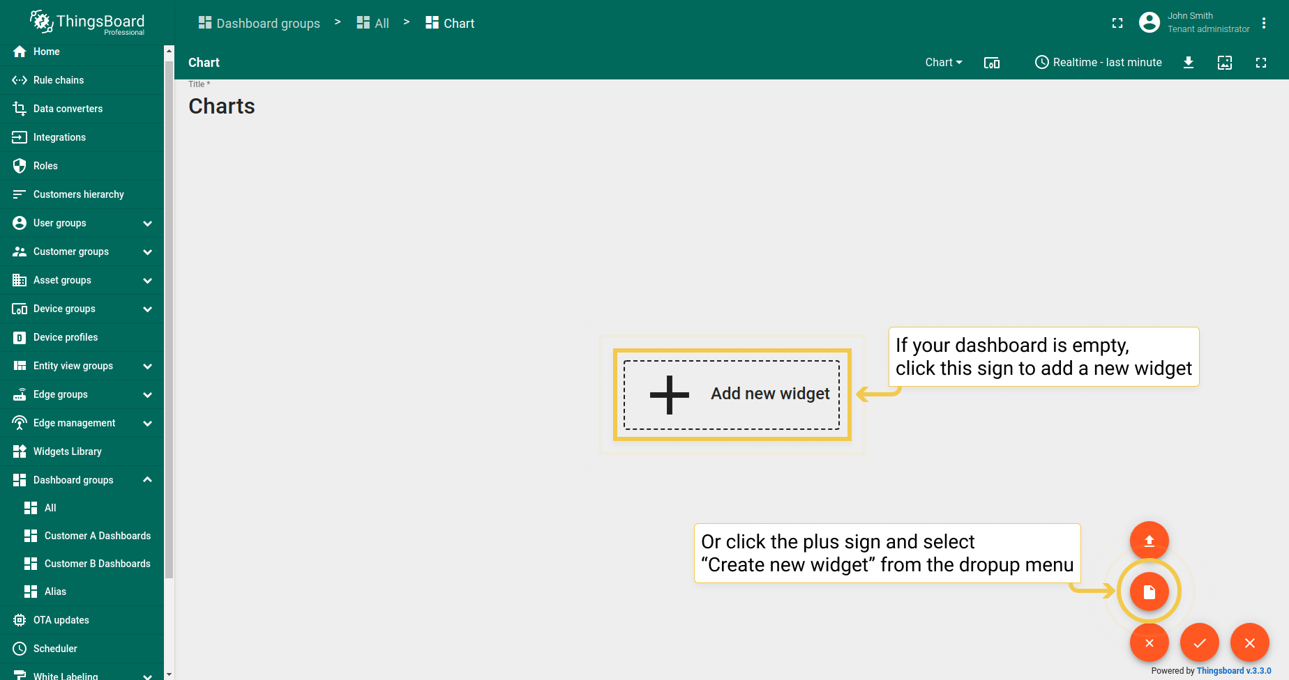
要将任意图表部件添加到仪表板,请执行:
- Enter edit mode by clicking the pencil icon in the lower right corner of the screen.
- To add a widget, either click the sign "Add new widget" in the center of the screen or open the drop up menu by clicking the plus icon and selecting "Create new widget".
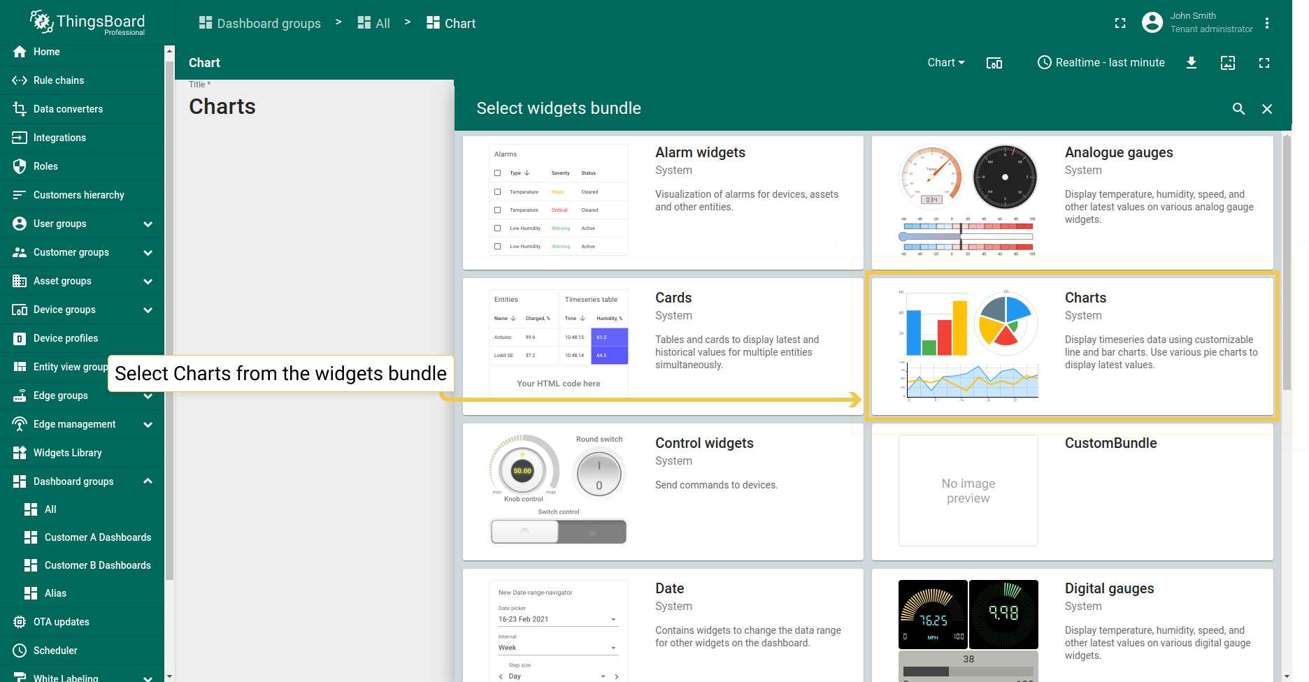
- From the widgets bundle, select Charts.
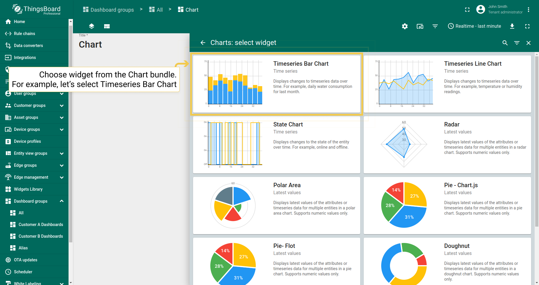
- Select the preferred widget from the Chart bundle.
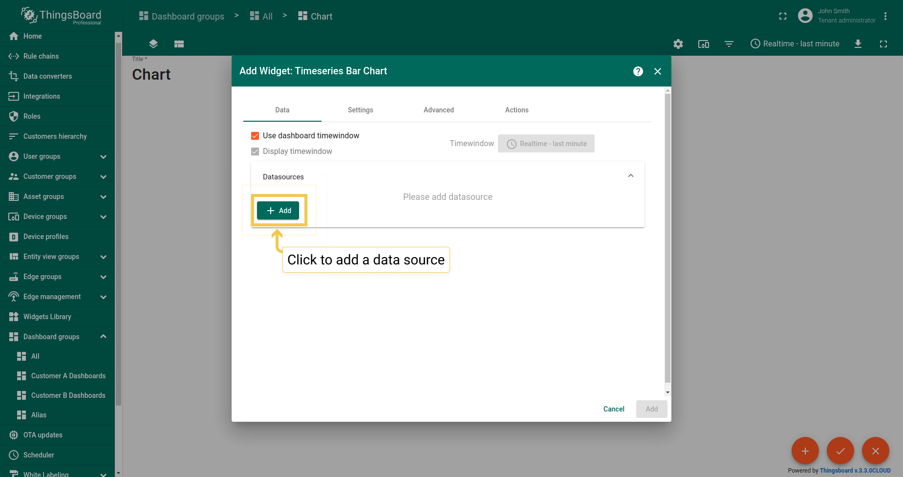
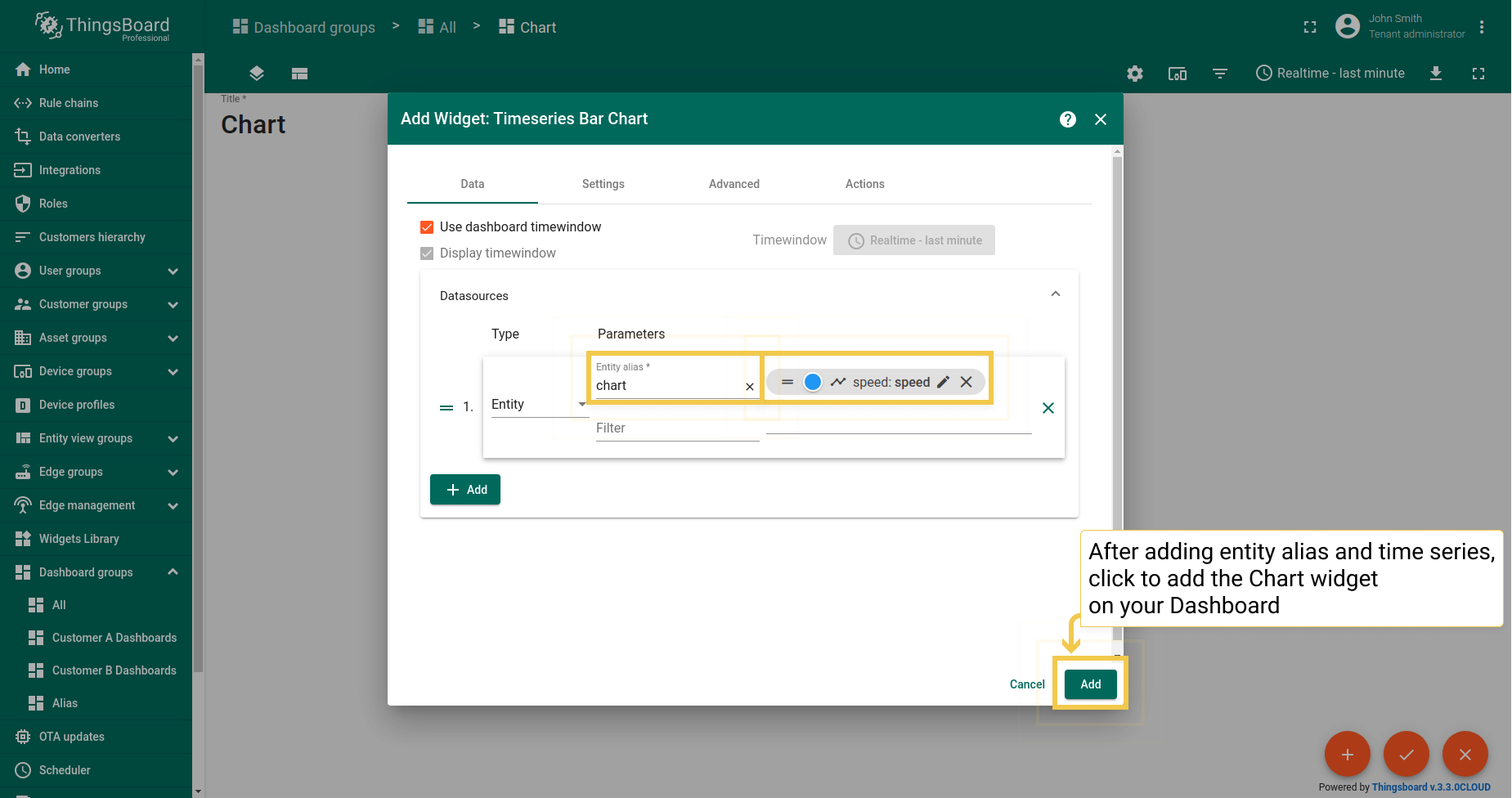
- In the "Add Widget" dialog, click the Add button to add a Data source.
- Add Entity alias and Entity time series, then click "Add".
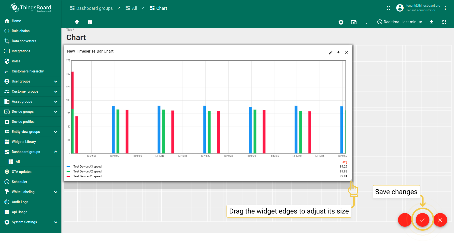
- While still in edit mode, drag the widget corners to adjust its size. After that, click the orange checkmark to save all applied changes.
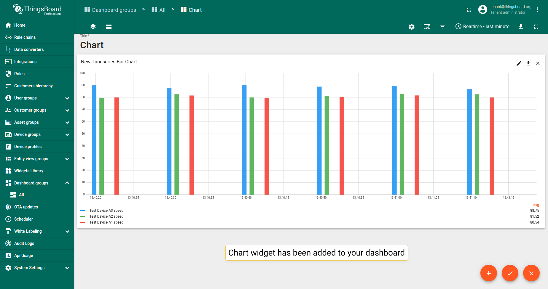
- Now you have the Chart widget on your dashboard.
图表部件类型
图表部件分为时序部件和最新值部件。时序部件用于可视化时序数据随时间的变化。当需要查看多个实体的最新属性值或时序数据时,使用最新值部件。
时序部件
时序部件可视化时序数据随时间的变化。此处了解如何设置时间窗口。
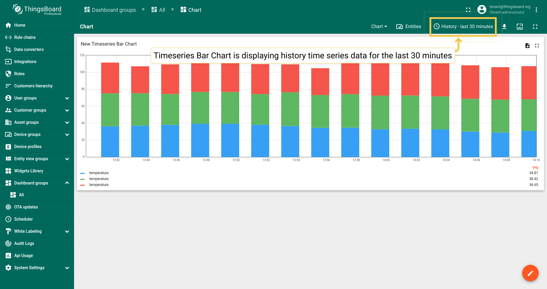
柱状图
柱状图部件显示时序数据随时间的变化。示例显示温度读数。
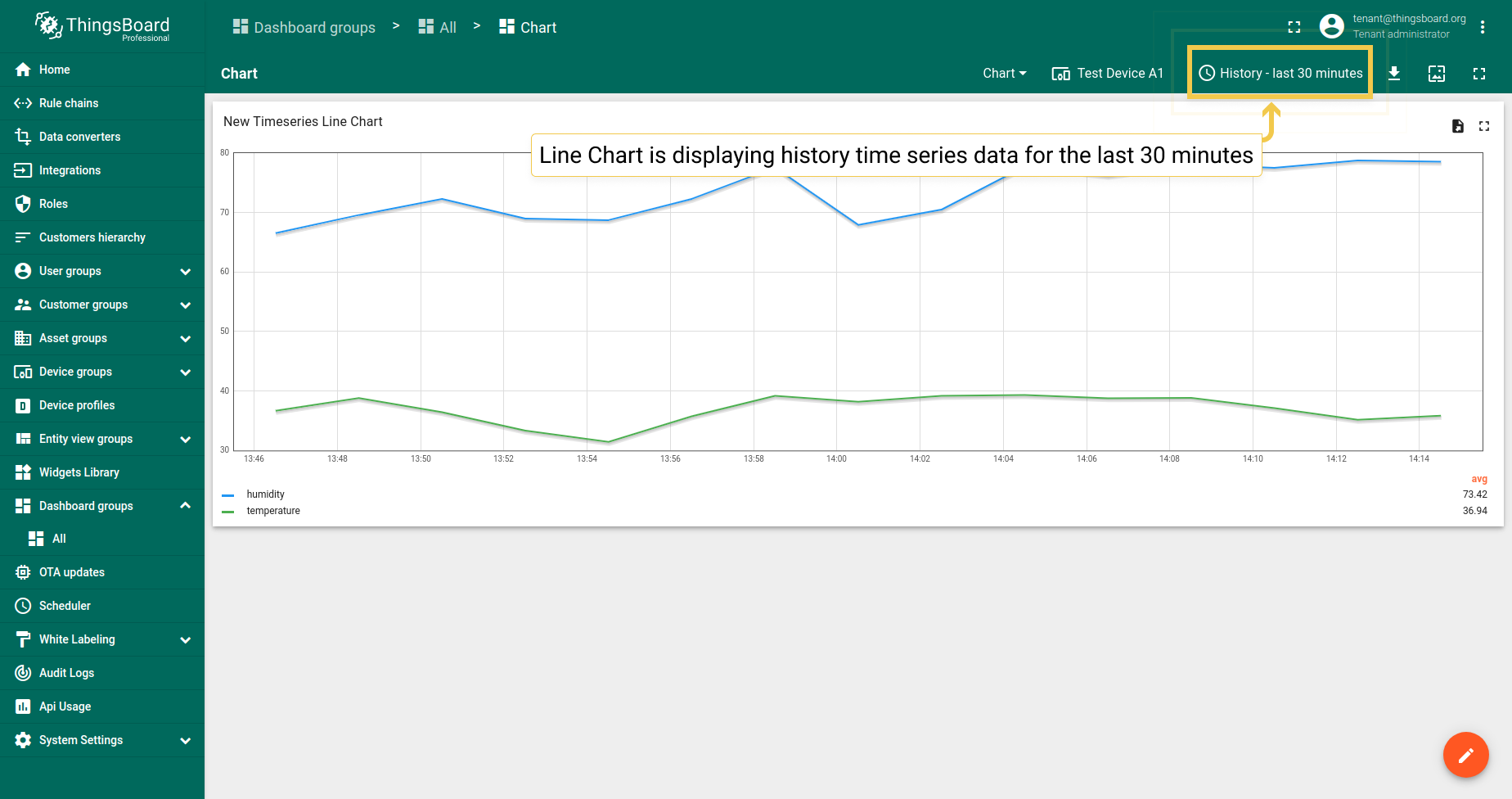
折线图
折线图部件显示时序数据随时间的变化。示例显示温度和湿度读数。
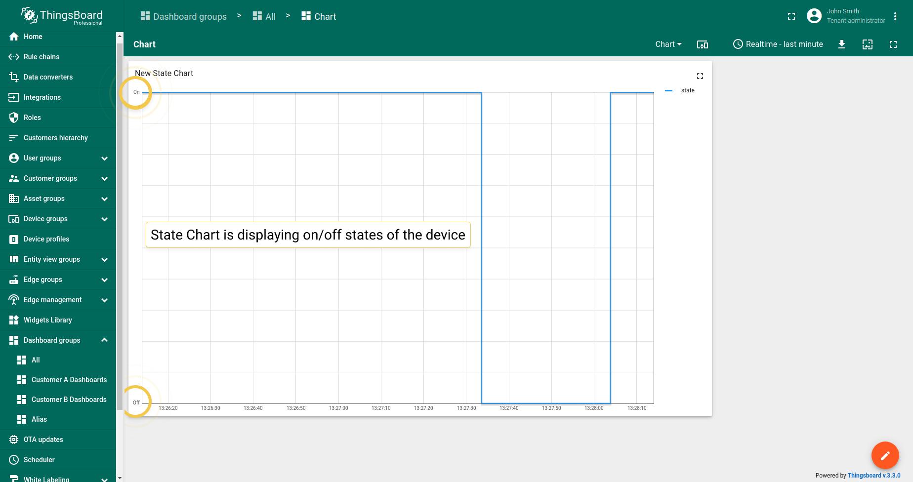
状态图
状态图部件显示实体状态随时间的变化。 例如,设备开关时其状态和条件。
最新值部件
最新值部件渲染多个实体的属性或时序数据的最新值。最新值部件主要支持数值。
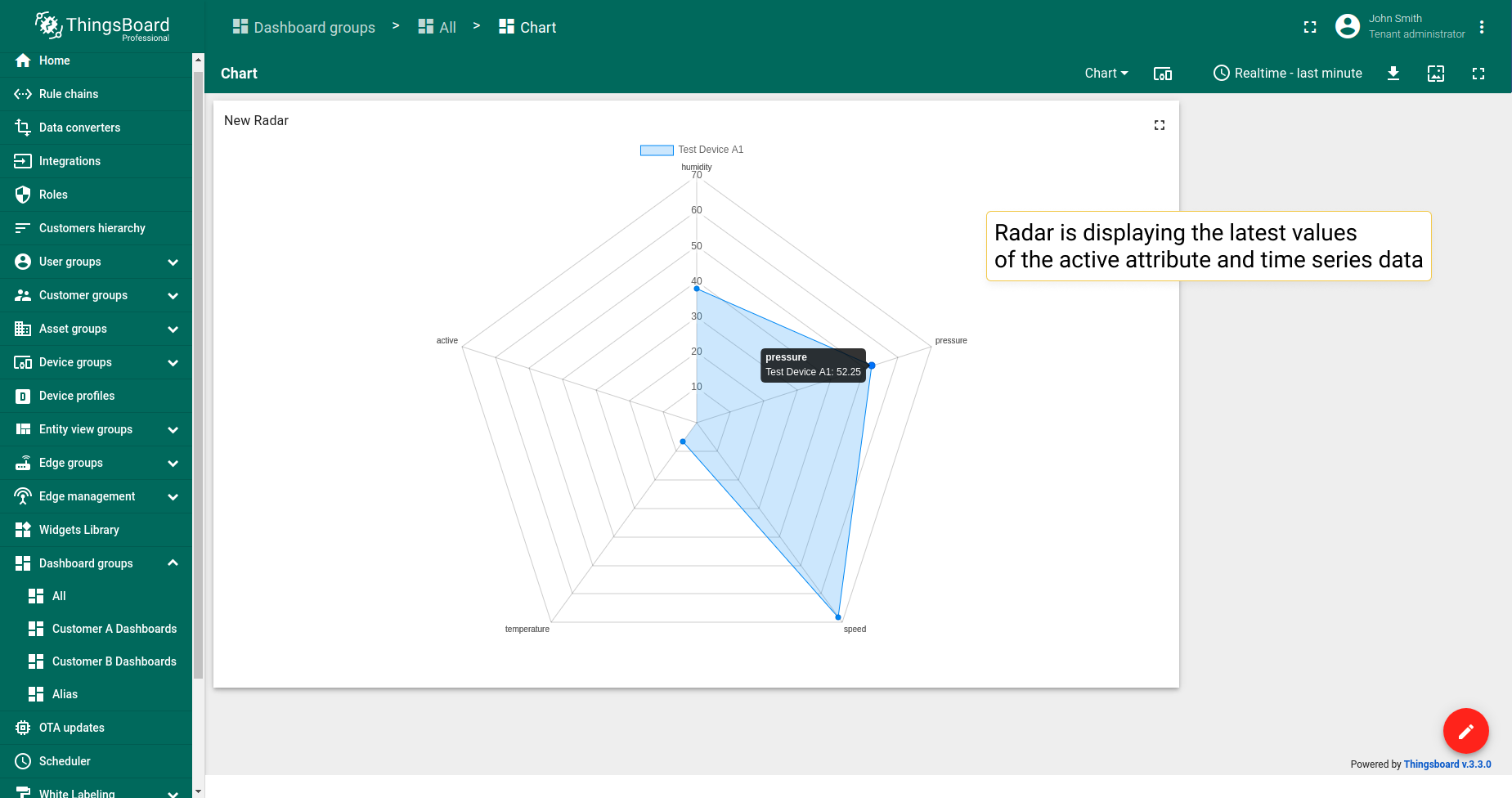
雷达图
雷达图部件在雷达图中显示多个实体的最新属性或时序数据值。仅支持数值。
示例中,部件显示三个设备的最新压力时序数据。
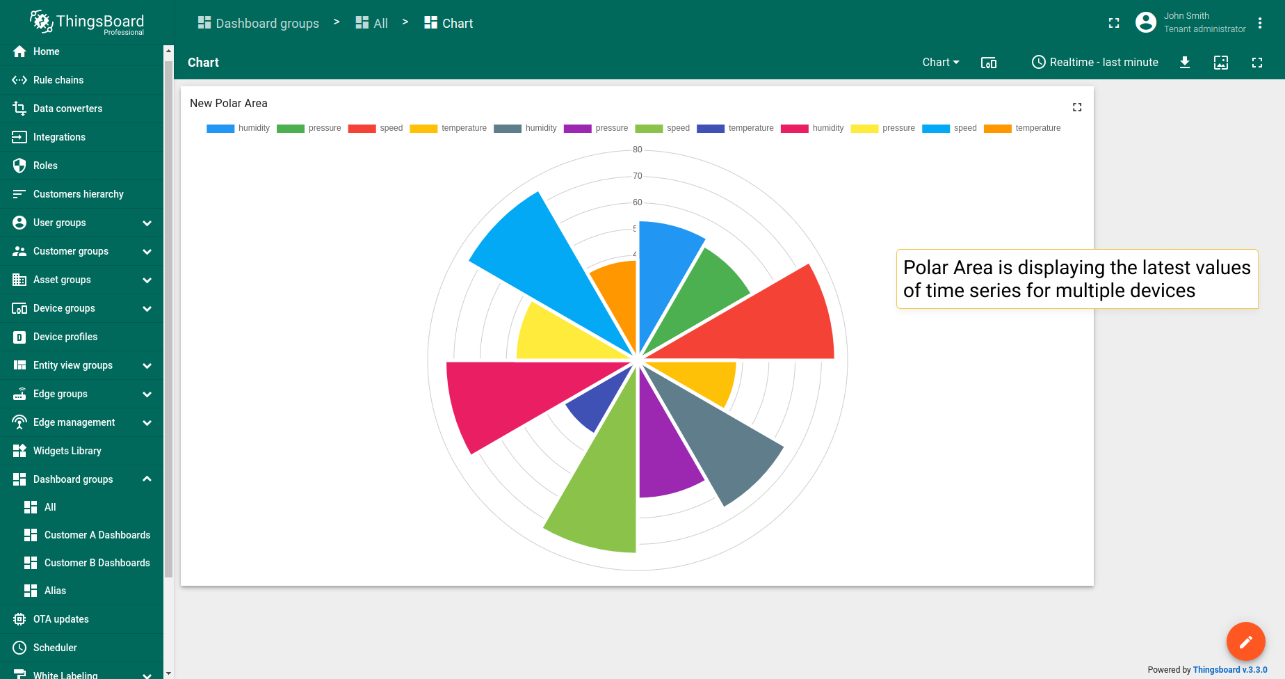
极区图
极区图部件在极区图中显示多个实体的最新属性或时序数据值。仅支持数值。
示例中,部件显示三个设备的最新压力时序数据。
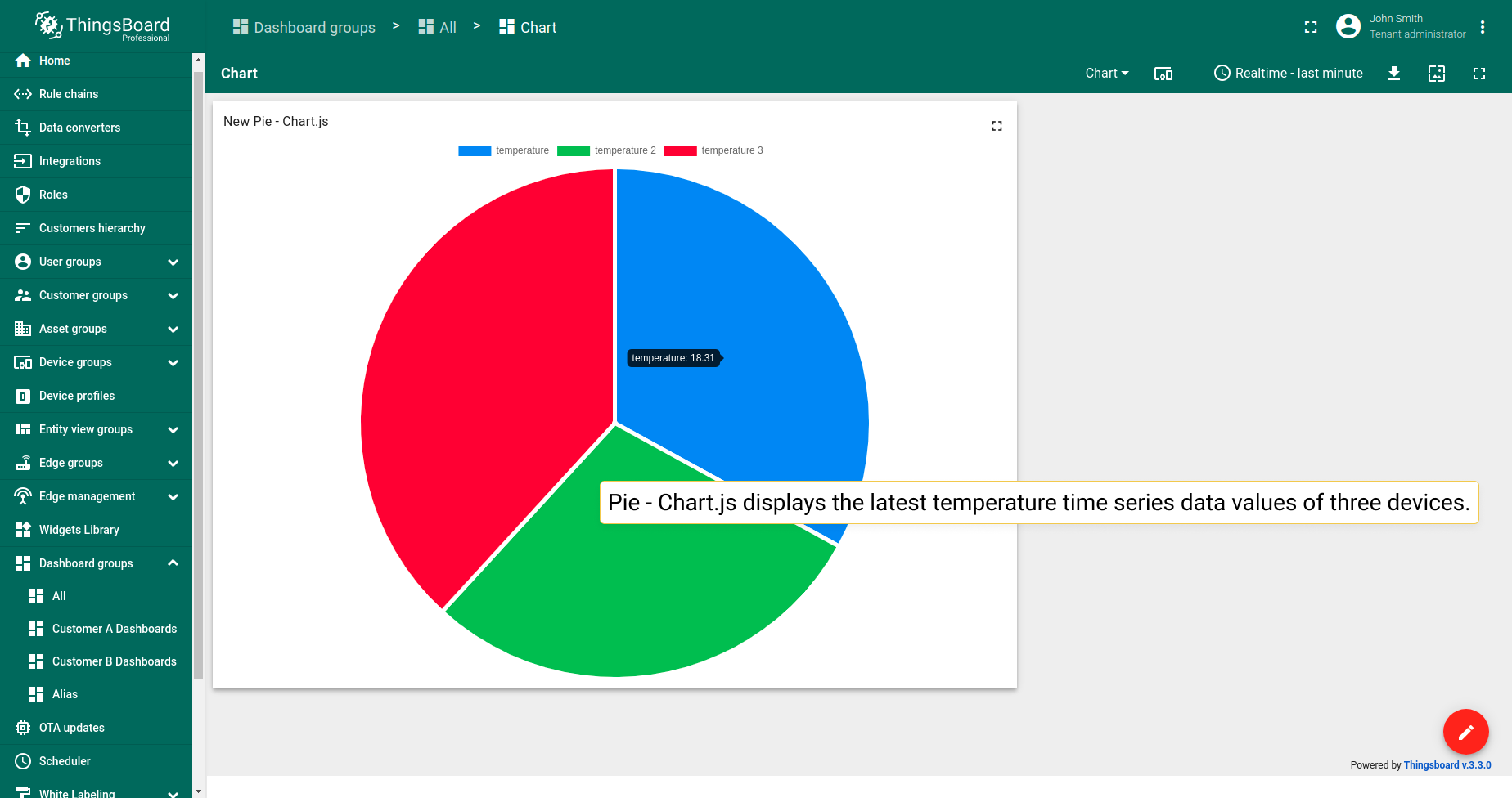
饼图 - Chart.js
饼图 - Chart.js部件在饼图中显示多个实体的最新属性或时序数据值。仅支持数值。
示例中,部件显示三个设备的最新温度时序数据值。
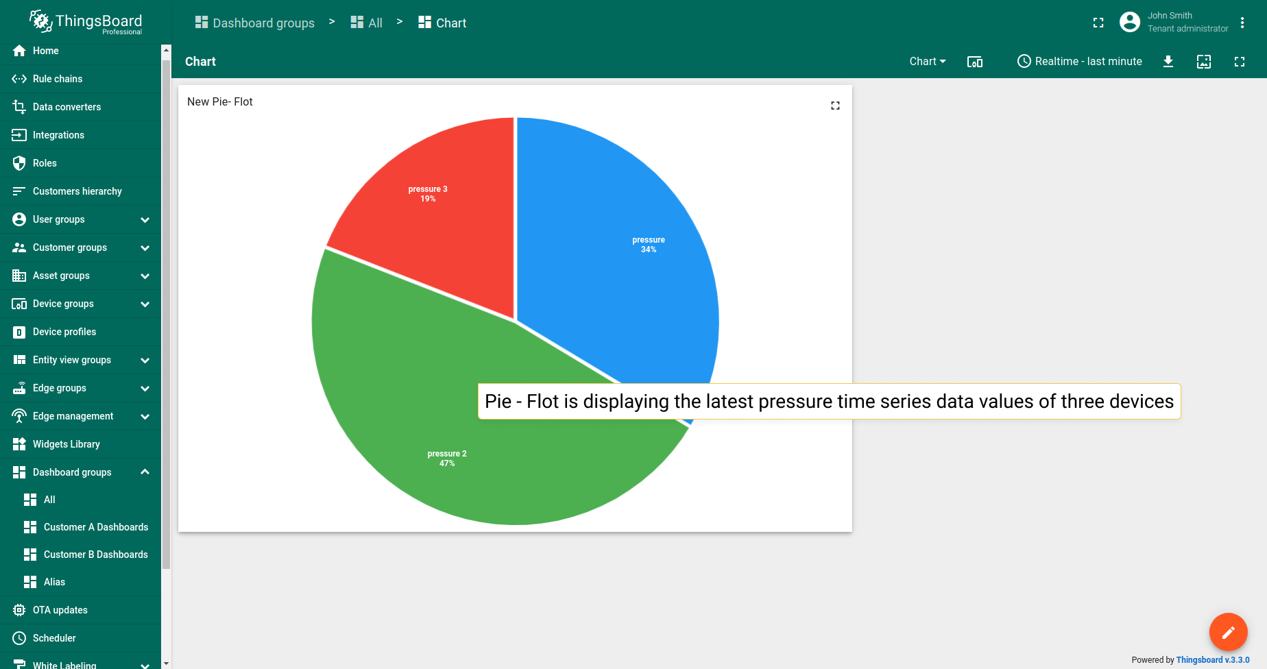
饼图 - Flot
饼图 - Flot部件在饼图中显示多个实体的最新属性或时序数据值。 仅支持数值。
示例中,部件显示三个设备的最新压力时序数据值。
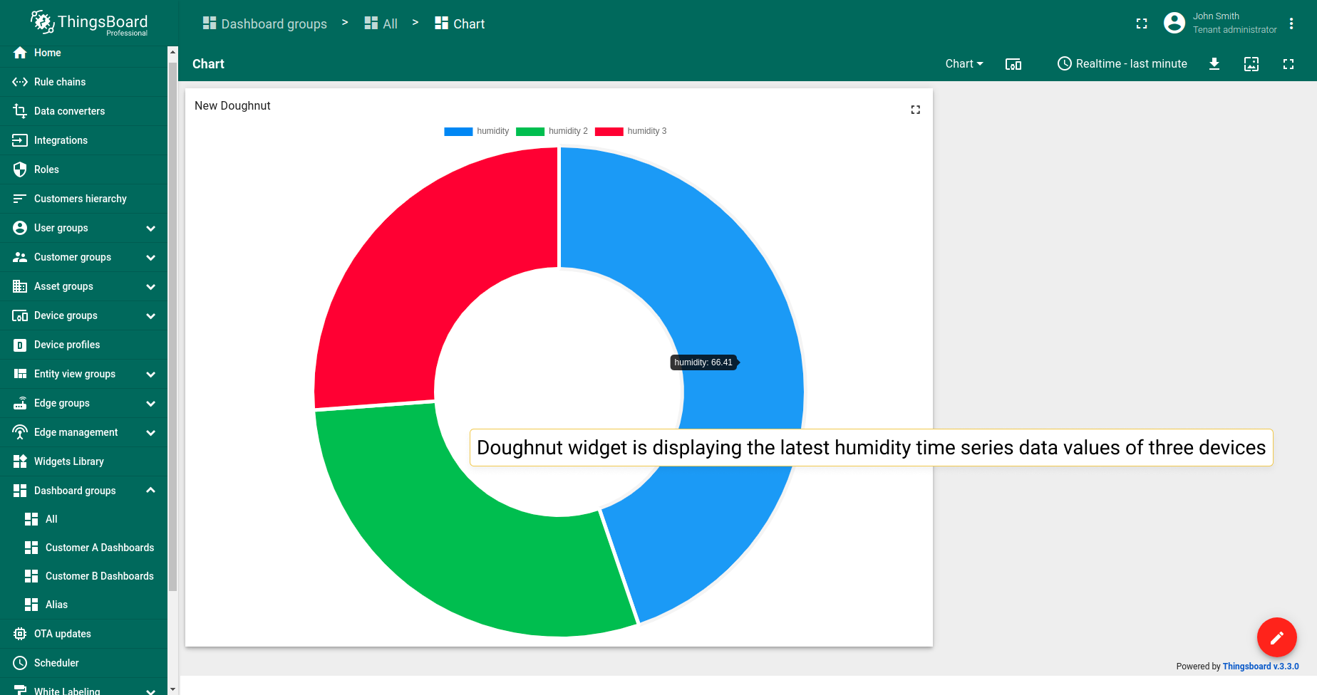
环形图
环形图部件在环形图中显示多个实体的最新属性或时序数据值。 仅支持数值。
示例中,部件显示三个设备的最新湿度时序数据值。
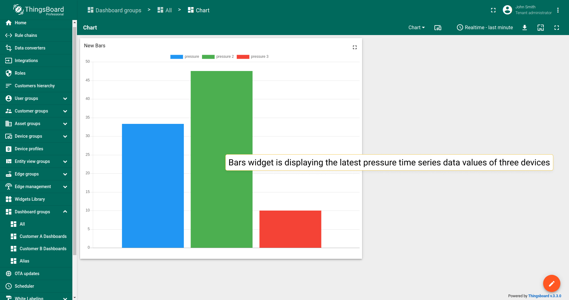
条形图
条形图部件以独立条形显示多个实体的属性或时序数据的最新值。 是唯一不仅支持数值的最新值图表部件。
示例中,部件显示三个设备的最新压力时序数据值。
图表部件设置
基本部件设置
基本部件设置负责部件的外观和样式:从标题样式和图例配置到移动设备设置。 ThingsBoard所有部件的基本设置相同,此处了解如何自定义。
高级部件设置
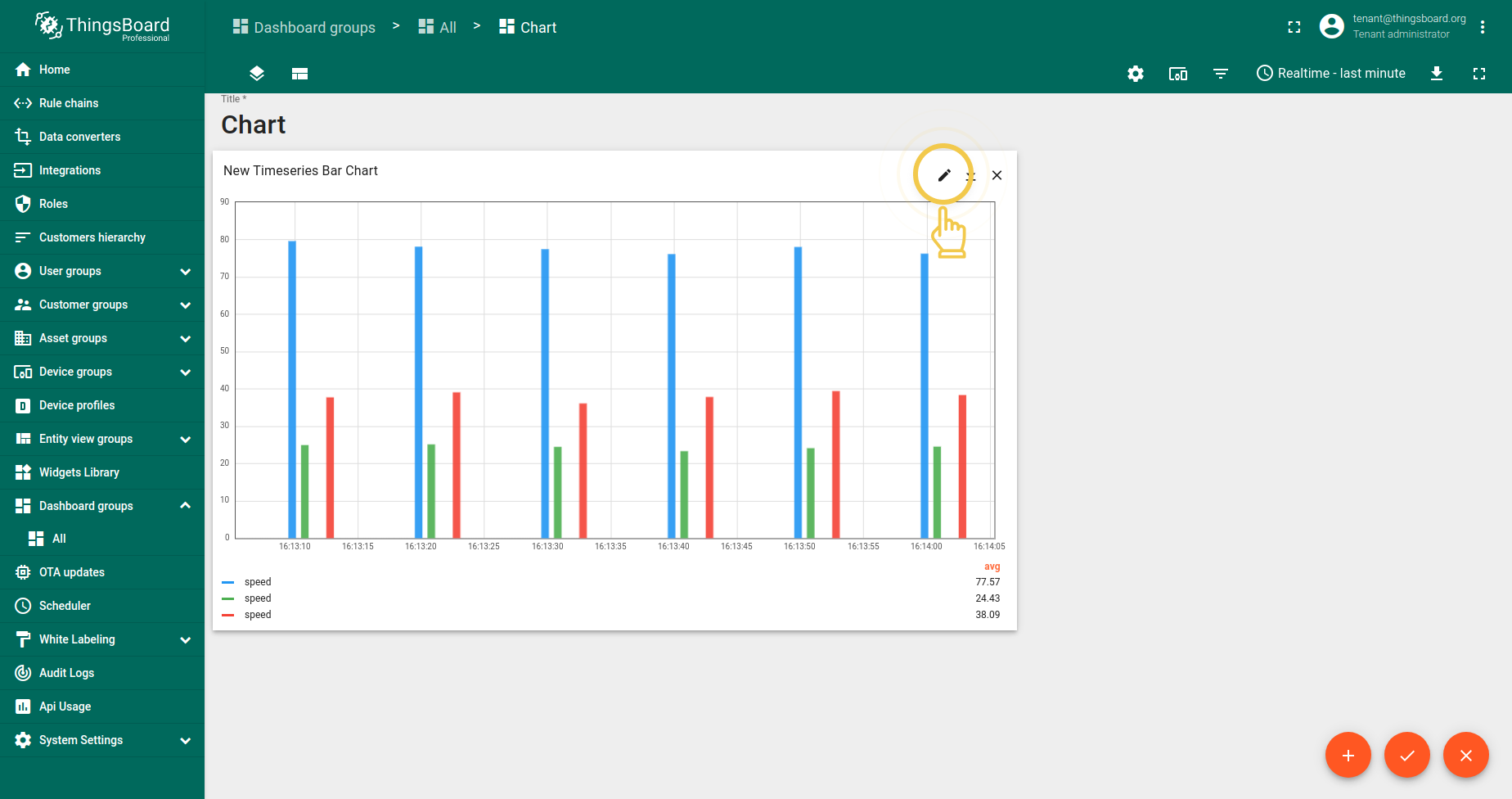
不同部件类型的高级设置各不相同。高级设置负责配置特定部件的独特功能。 要进入部件编辑模式并开始配置其高级设置,请先进入仪表板编辑模式。然后执行:
- Click the pencil icon in the right corner of the widget to enter the widget edit mode.
- Click the third tab "Advanced".
时序柱状图
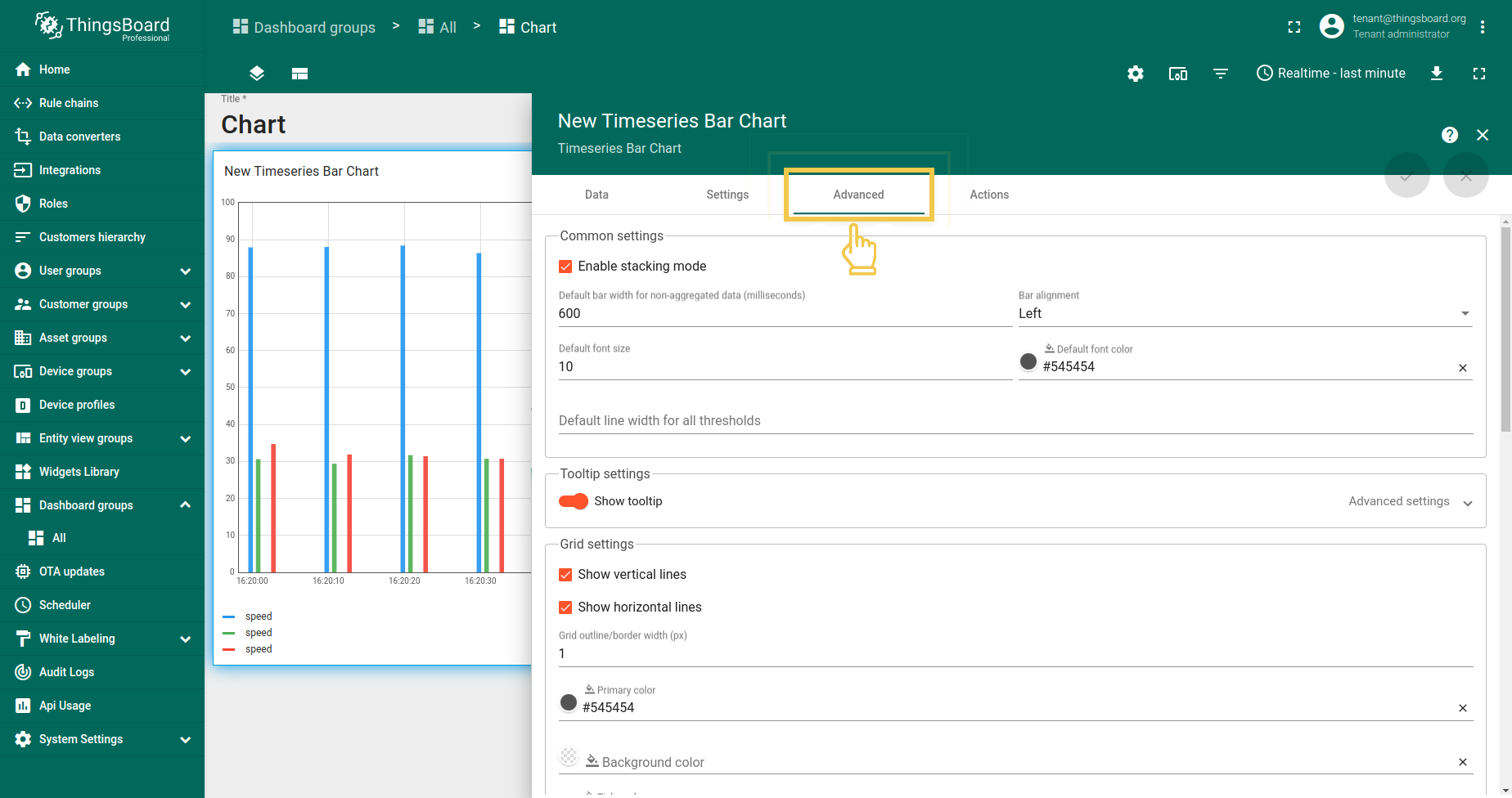
1. 常用设置
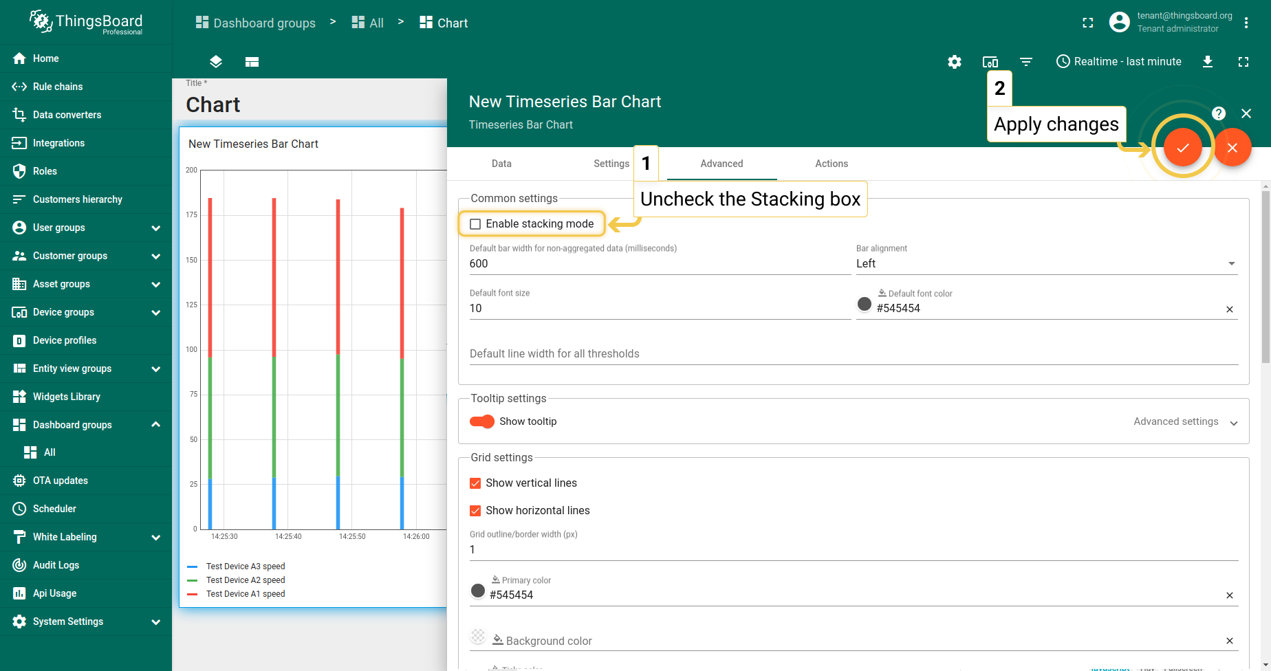
1.1. 堆叠
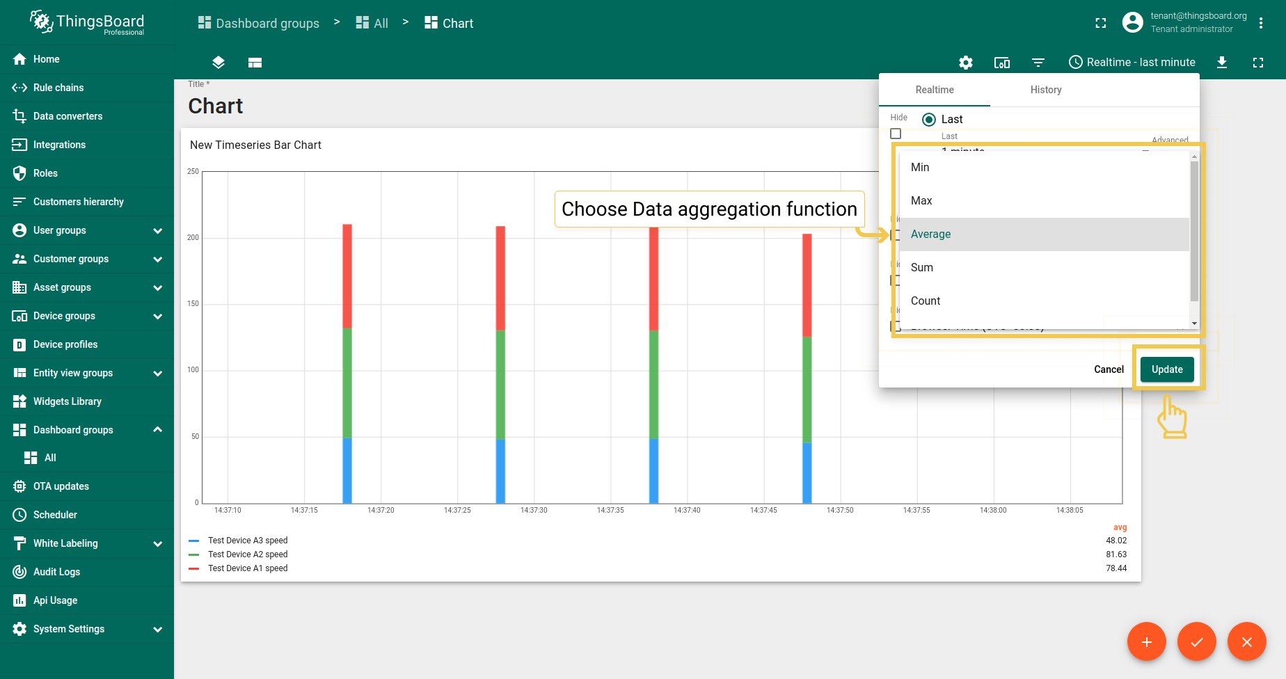
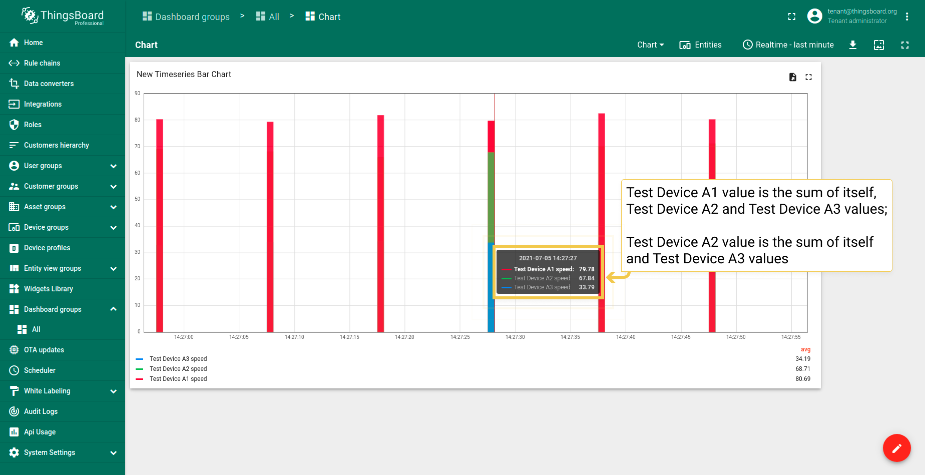
若数据聚合函数未设为None,可使用此功能。 若勾选“堆叠”框,柱形将根据所用实体的值进行拆分。 若不勾选,部件将显示所用实体值的总和。要查看所有实体的值,需将鼠标悬停在柱形上。
- In the upper right corner of the screen, click on the Time window configuration and choose any preferred Data aggregation function other than None. Click "Update" to apply changes.
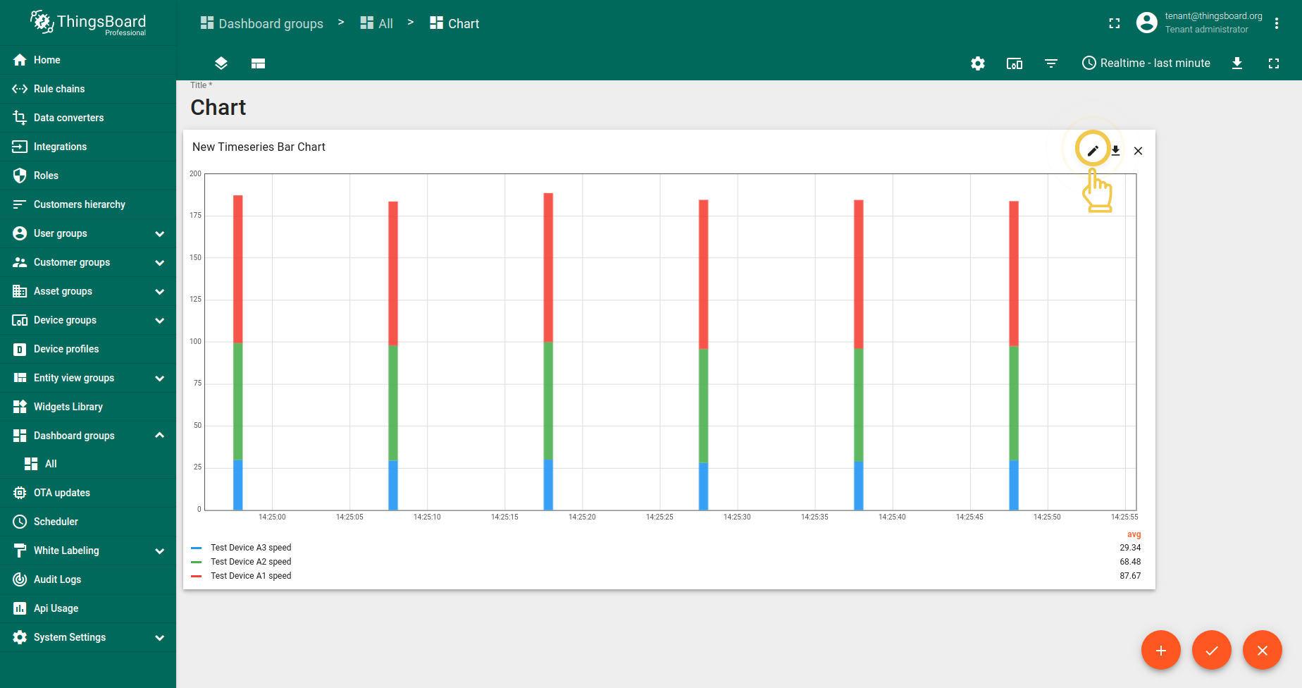
- Go to widgets Edit mode by clicking the pencil icon in the upper right corner of the screen.
- In the Advanced tab, disable the Stacking box and apply changes by clicking the orange checkmark in the upper right corner of the window.
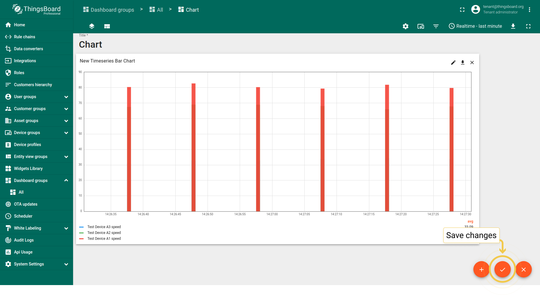
- After changes have been applied, click the orange checkmark in the lower corner of the screen to save them.
- Hover the mouse over a bar to see values of all entities.
若数据未聚合,可通过更改数值调整非聚合数据的默认柱宽(毫秒)。此操作使图表柱形更宽。
柱形对齐负责柱形在图表部件上相对于时间点的位置。
所有阈值的默认线宽、阴影大小、字体颜色和大小适用于时序折线图和状态图部件。
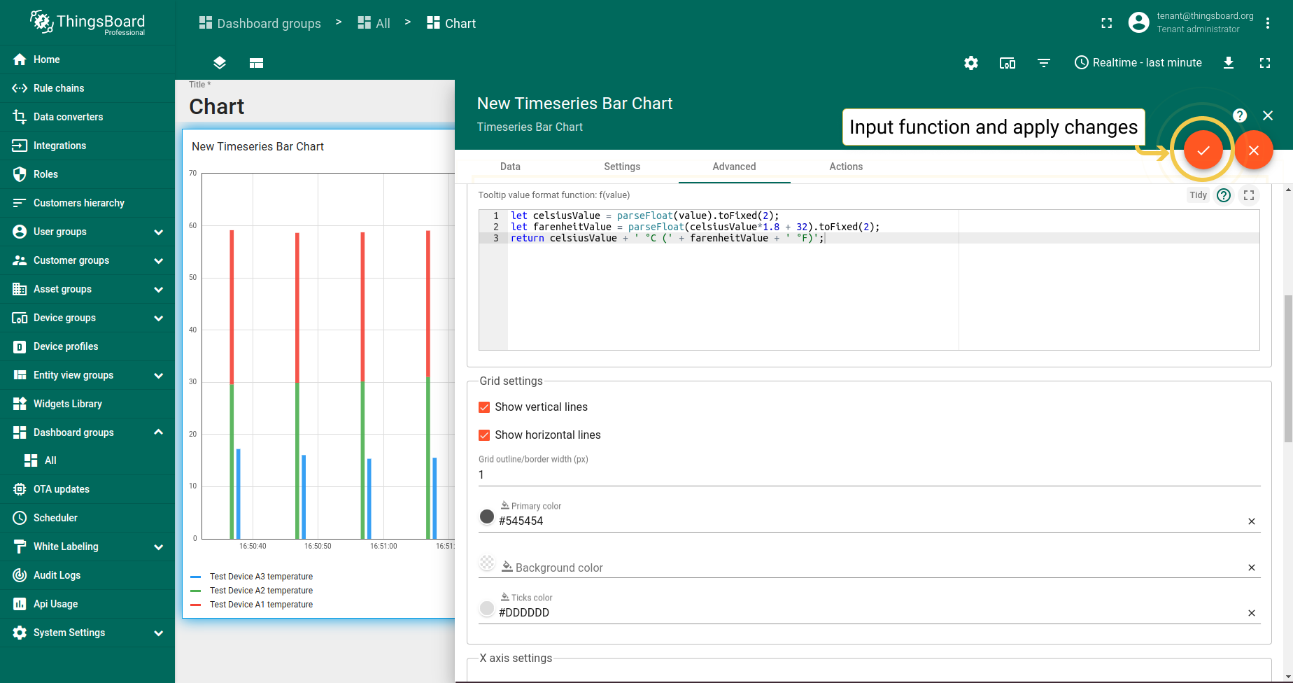
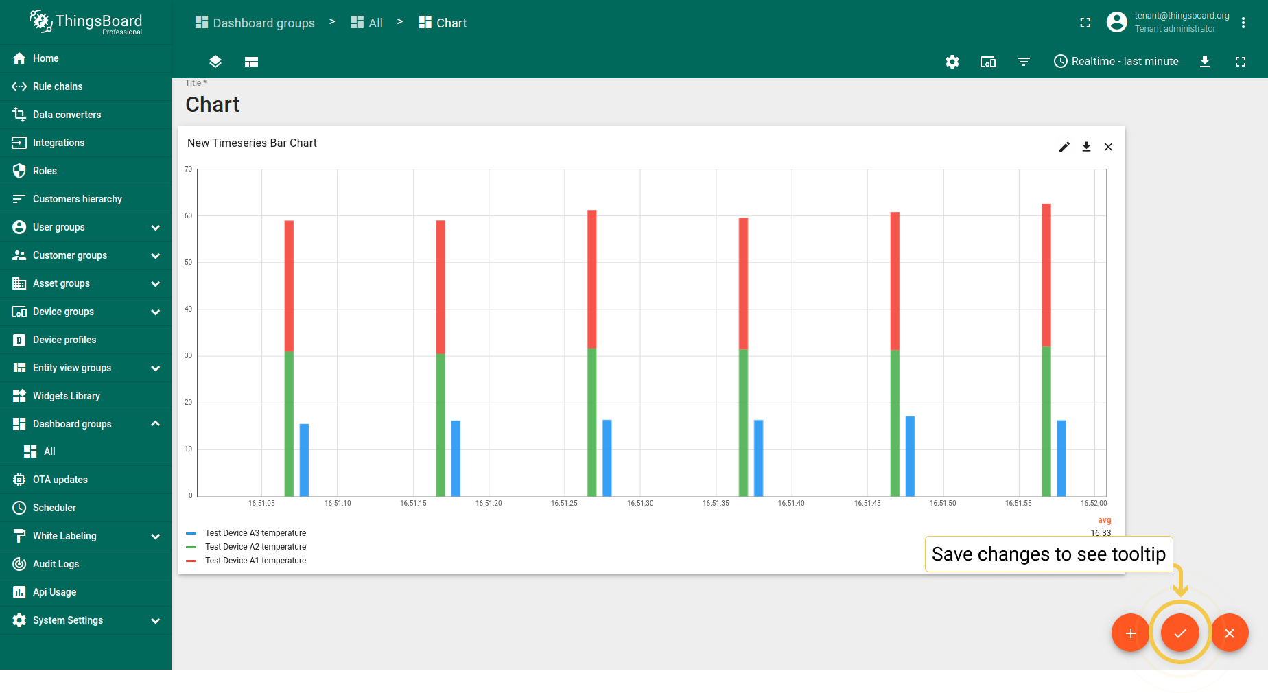
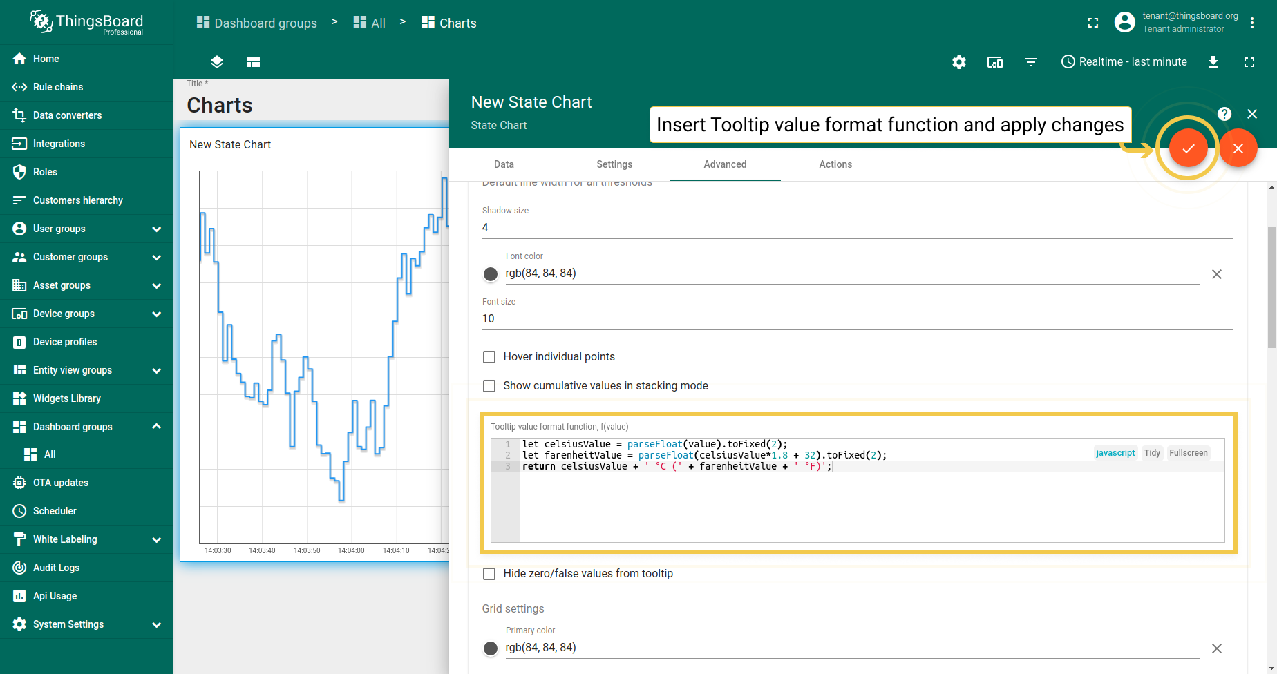
Tooltip值格式函数f(value) 用于手动自定义tooltip。可通过设置或 高级数据键配置自定义将在tooltip中显示的值。 通过设置配置tooltip为基础配置,同时应用于所有实体。在高级数据键配置中配置时, 仅应用于特定时序数据,基础tooltip函数将被子配置覆盖。
但若部件需要特殊效果,可使用Tooltip值格式函数。 假设有温度读数,希望在部件上看到摄氏和华氏值,并以两位小数显示。
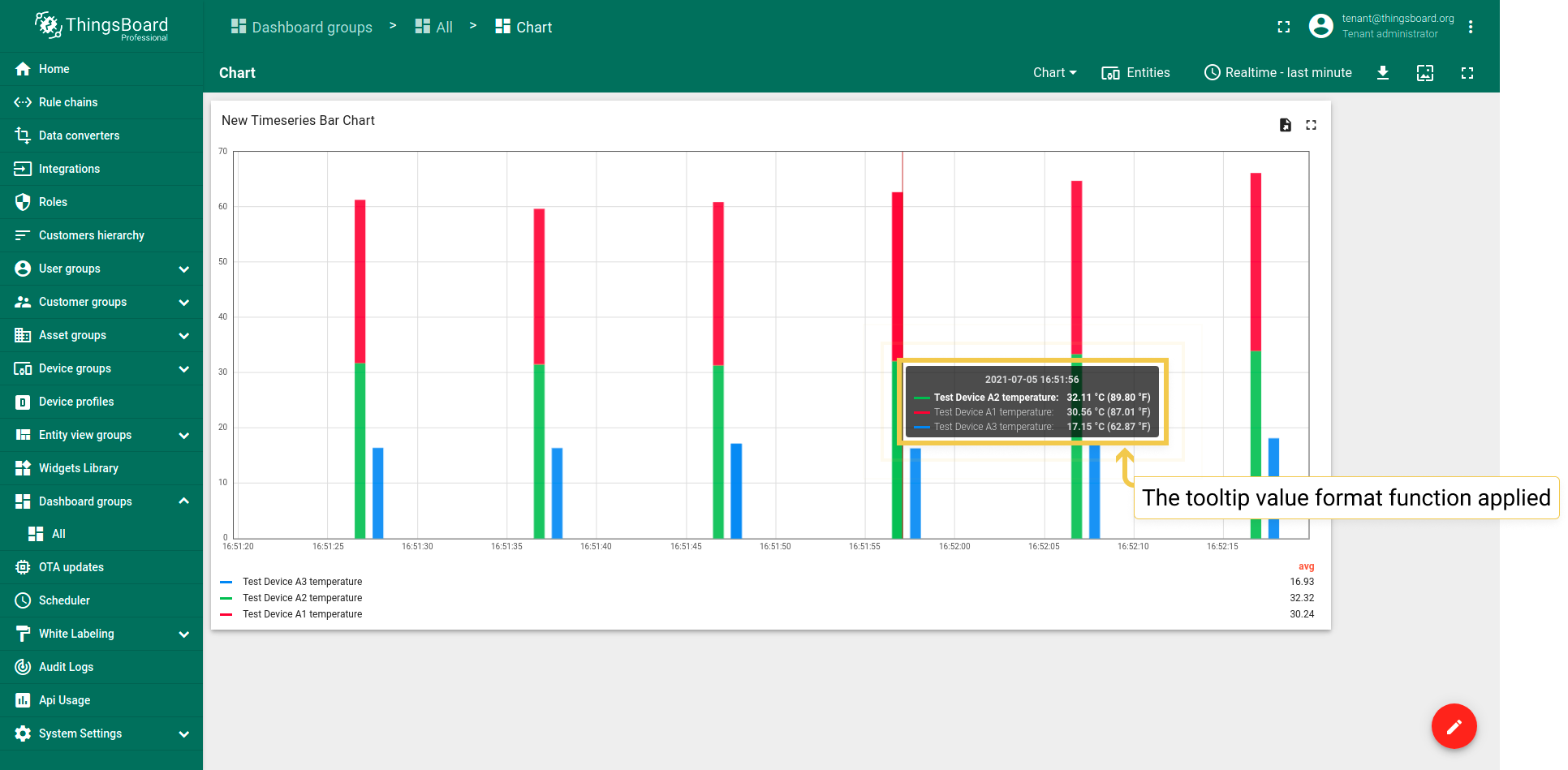
- Input your custom Tooltip value format function and apply changes by clicking orange checkmark in the upper right corner of the window.
- To see tooltip, you need to save applied changes by clicking the orange checkmark in the lower corner of the screen.
- Hover the mouse over the widget to see tooltip with applied Tooltip value format function.
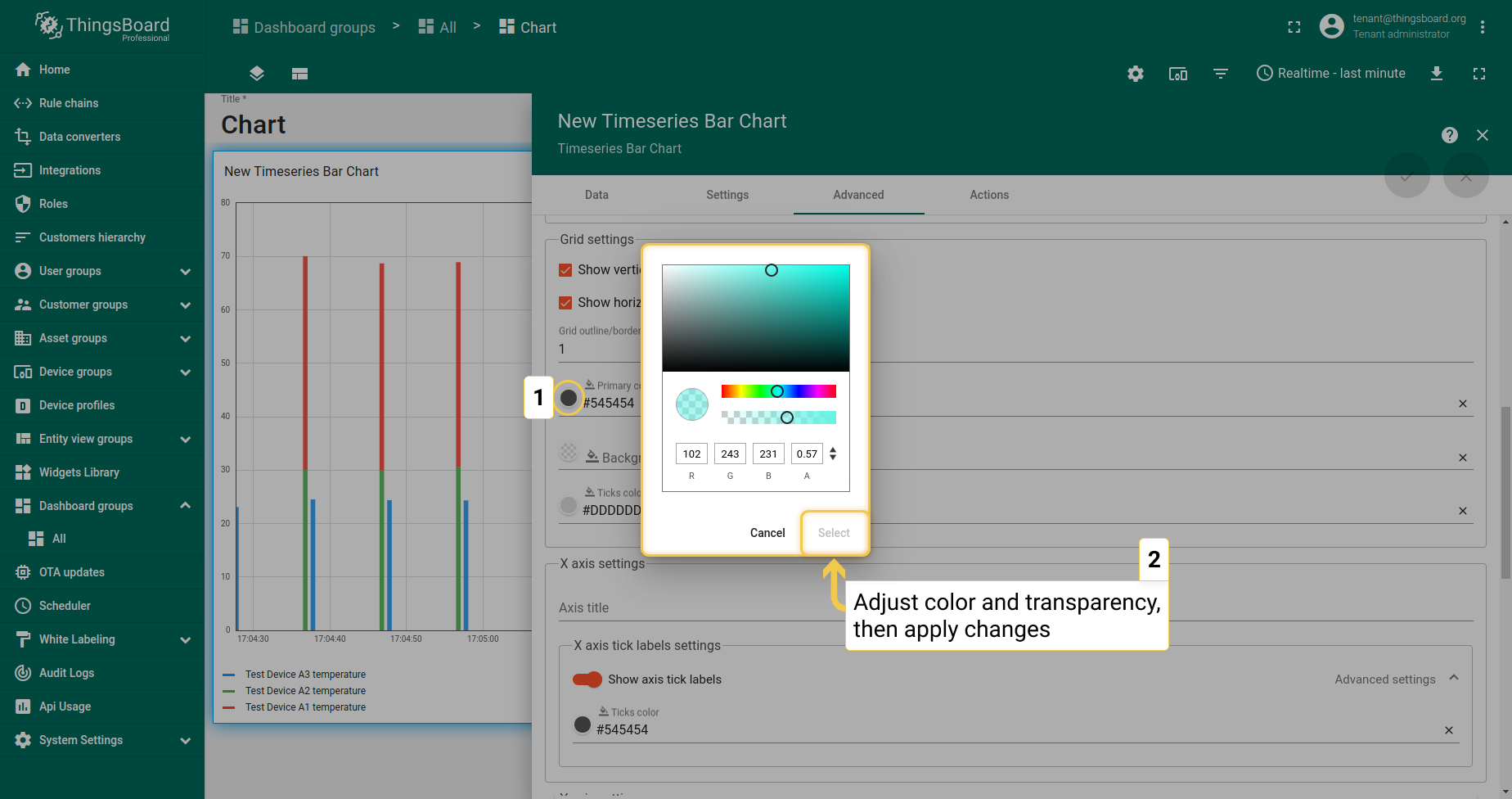
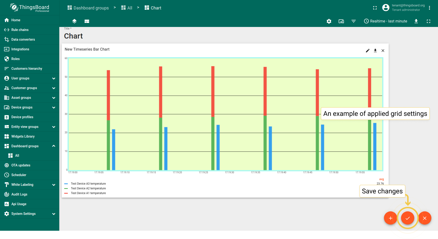
1.2. 网格设置
可更改图表网格的外观:自定义背景颜色、网格边框及其刻度;更改线条宽度及开启/关闭可见性。
- In Advanced tab, go to the Grid settings and click on the icon of Primary color circle. In the opened dialog box, move sliders to adjust color and transparency. Click "Select" when you finished, to apply changes.
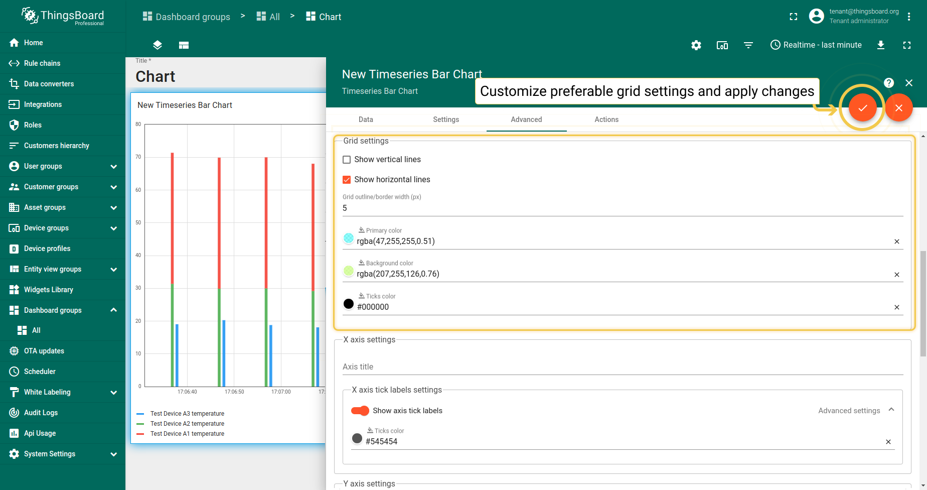
- Configure preferred Grid settings and apply changes by clicking orange checkmark in the upper right corner of the window.
- This set of applied colors is just an example. To save applied changes, click the orange checkmark in the lower corner of the screen.
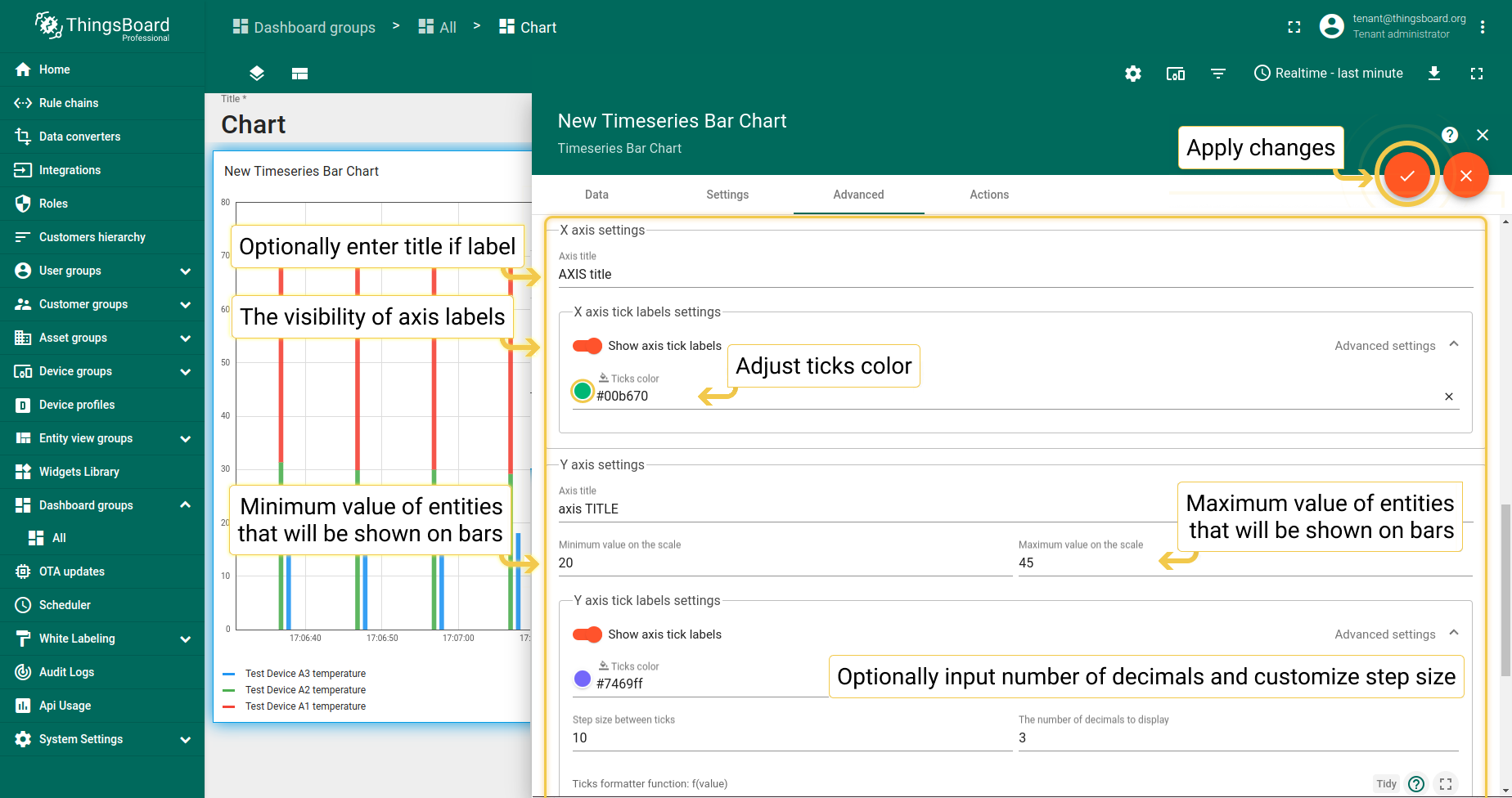
1.3. 坐标轴设置
- Configure preferred axis settings and click the orange checkmark in the upper right corner of the window to apply changes.
- As you see, titles have been added, colors of axis have been changed and values have been adjusted according to the applied changes. To save these changes, click the orange checkmark in the lower corner of the screen.

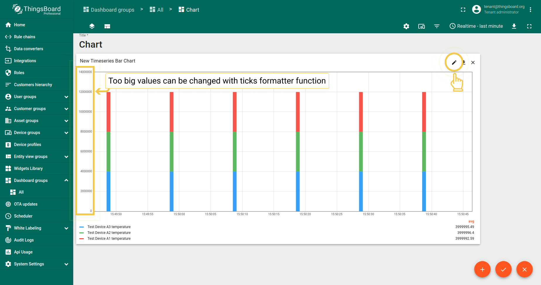
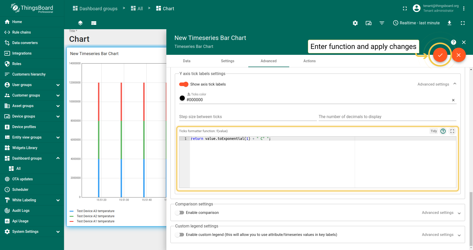
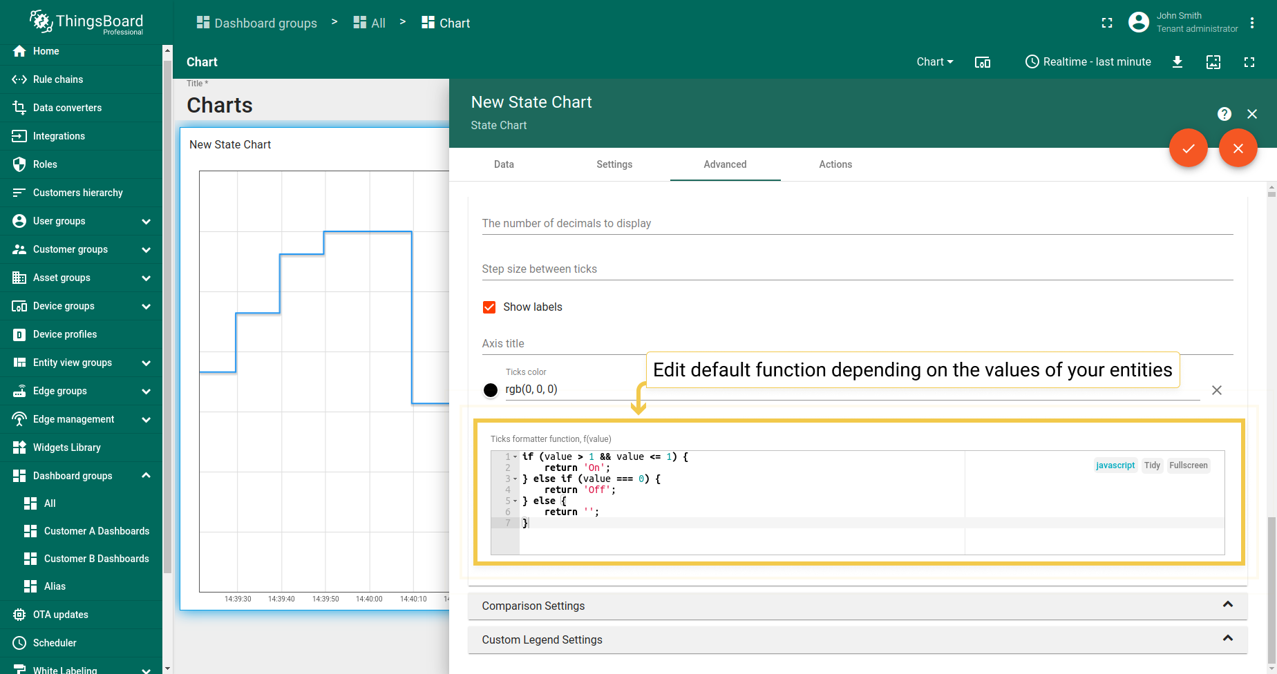
1.4. 刻度格式化函数f(value)
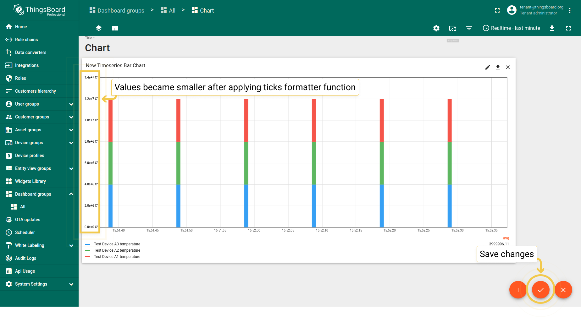
假设遥测值非常大,尤其数值旁有特殊符号时。然而需要绘制小图(仪表板上空间有限)。 因此,可使用刻度格式化函数将刻度值转换为更紧凑的形式。
- Enter widget edit mode by clicking the pencil icon in the right corner of the widget.
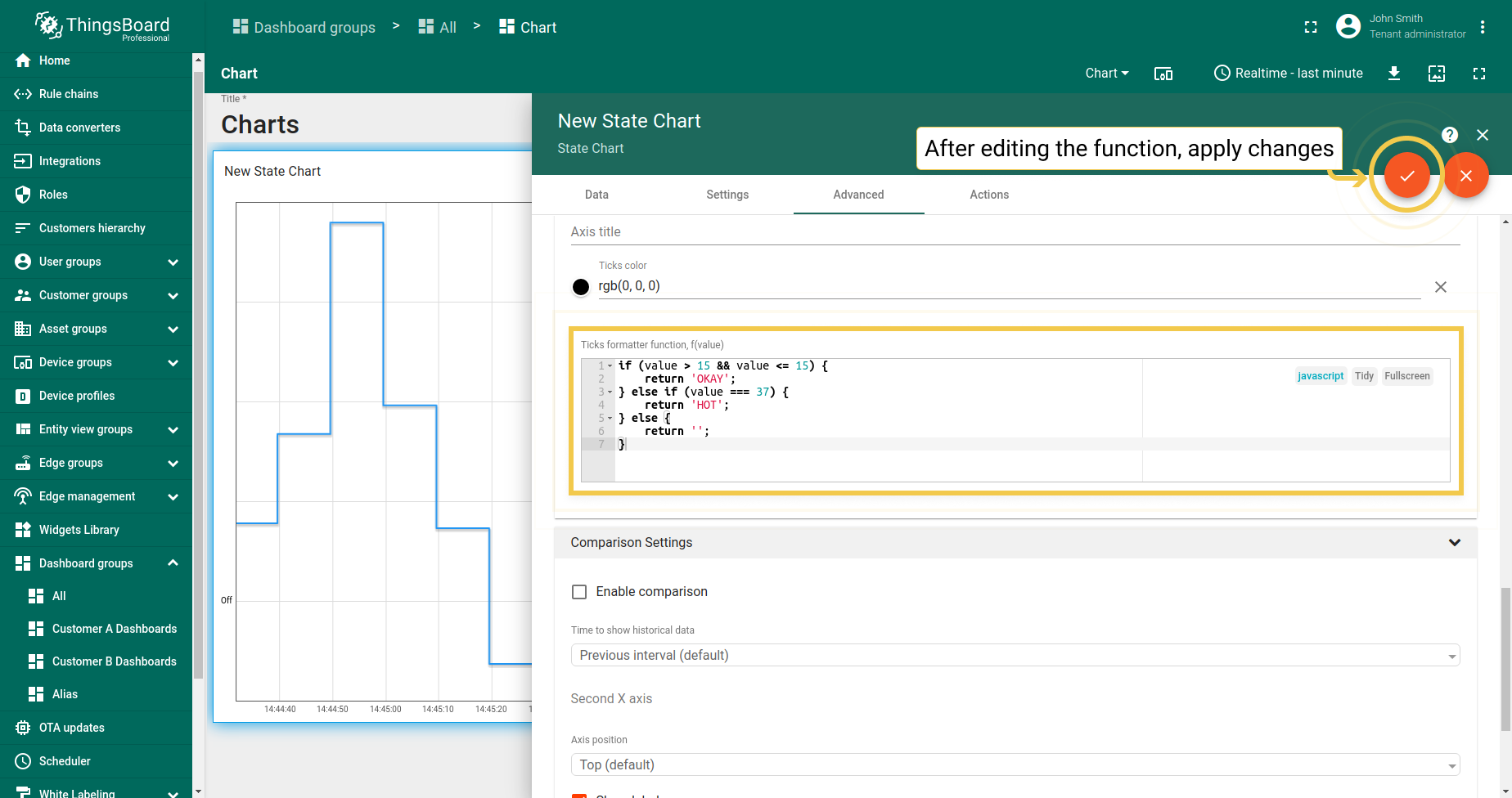
- In the Advanced tab, in the Ticks formatter function field, enter the custom function and apply changes by clicking the checkmark in the upper right corner of the window.
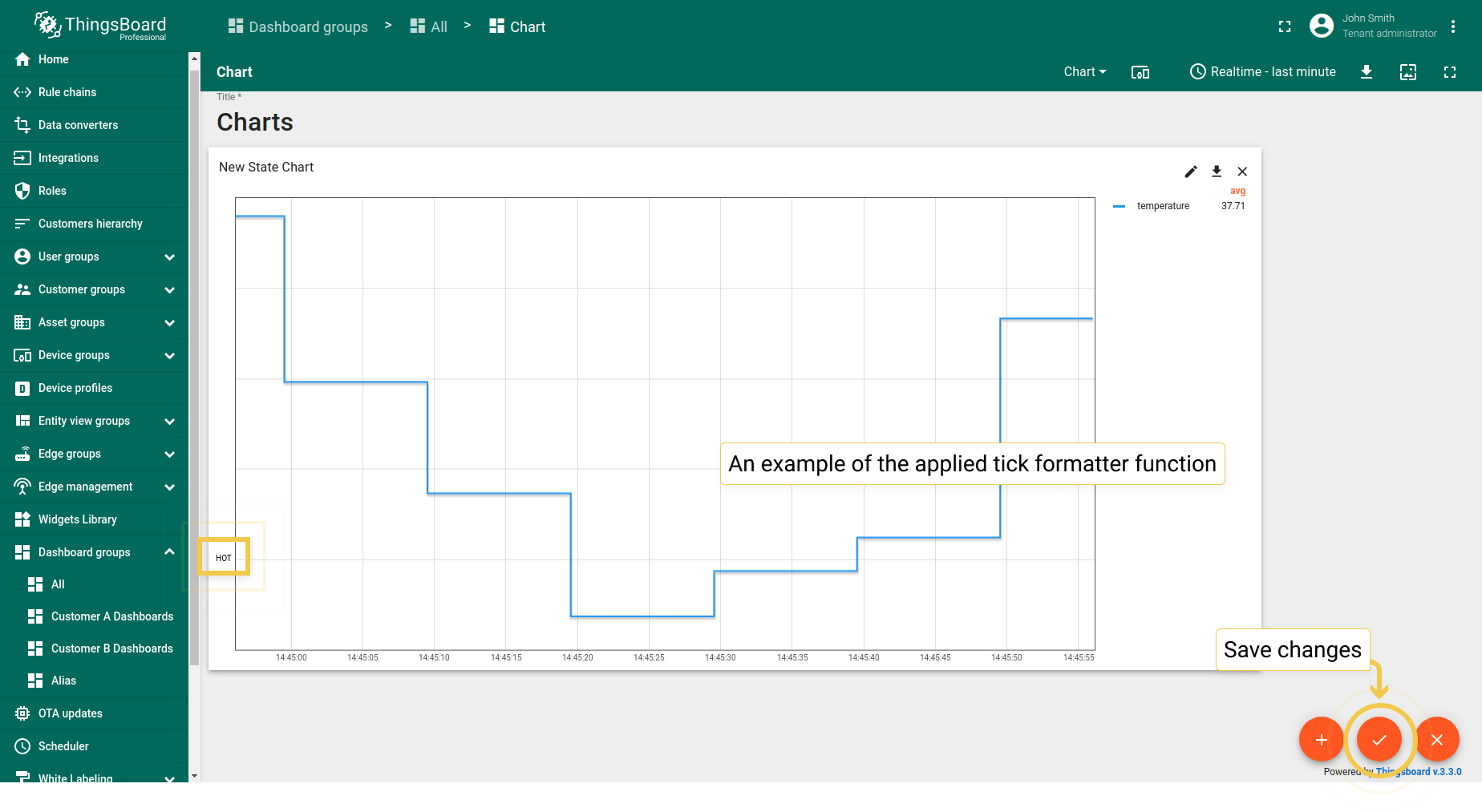
- Function has been applied and values became more compact. Save changes by clicking the checkmark in the lower right corner of the screen.
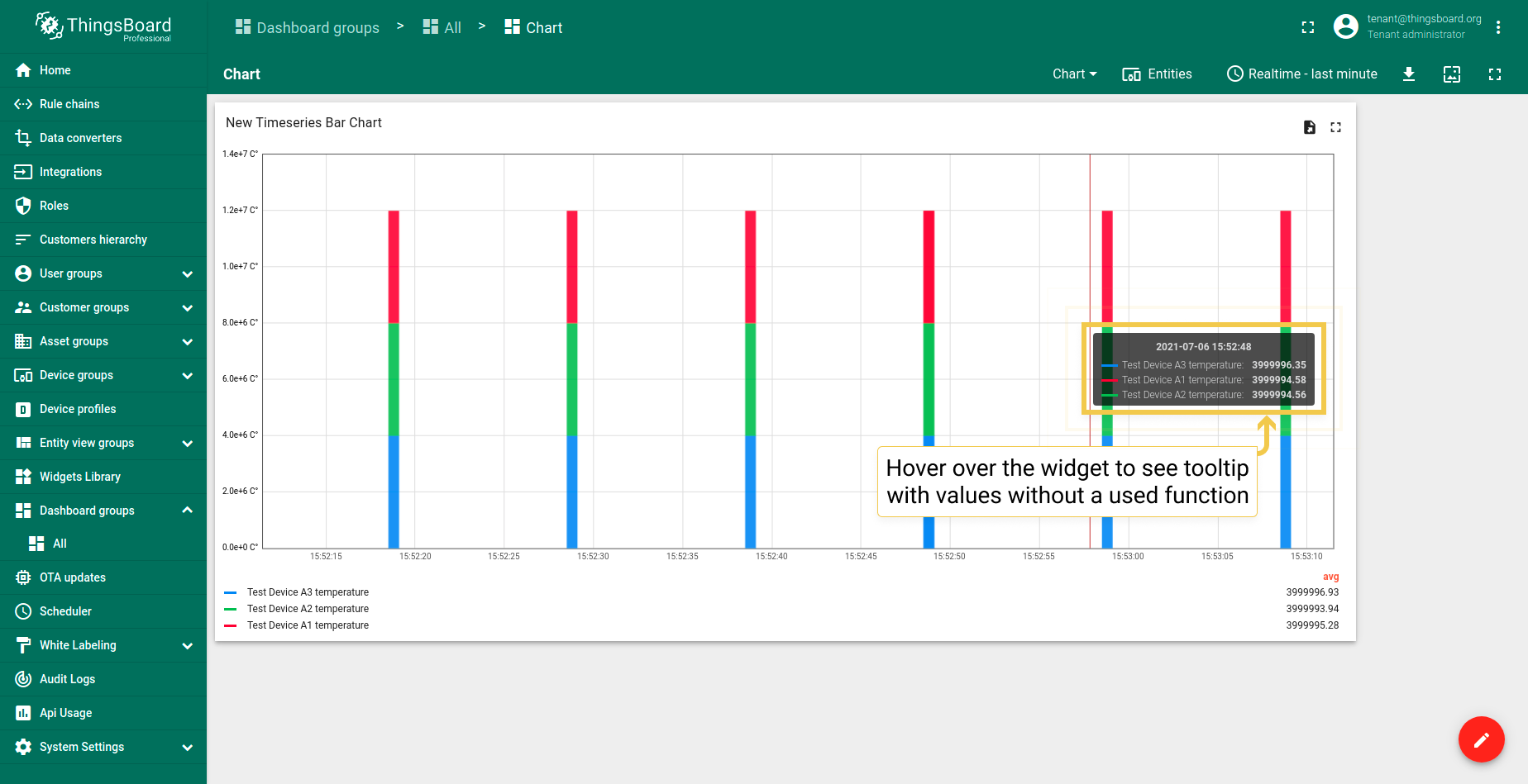
- By hovering the mouse over a widget you can see the tooltip with not reduced values.
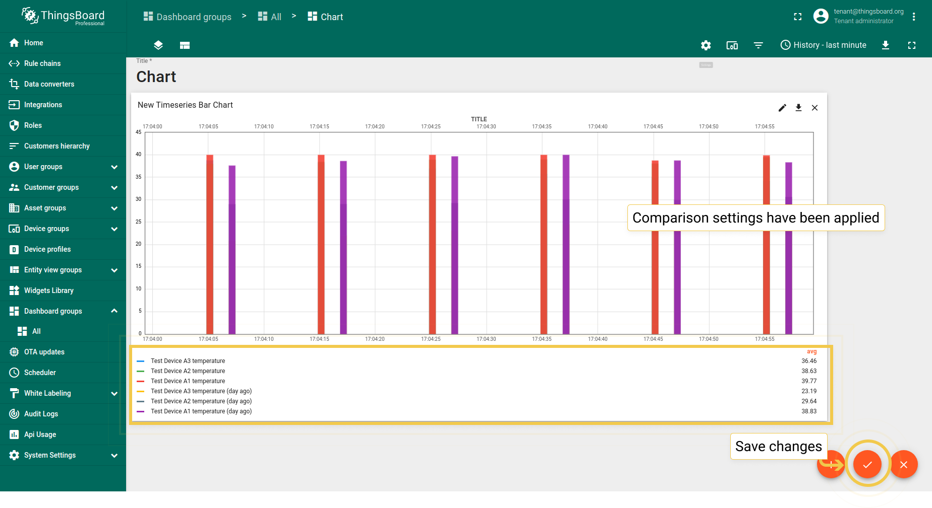
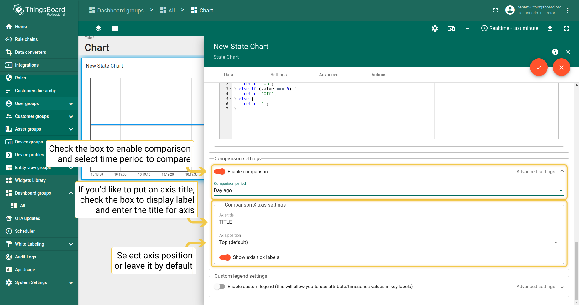
2. 对比设置
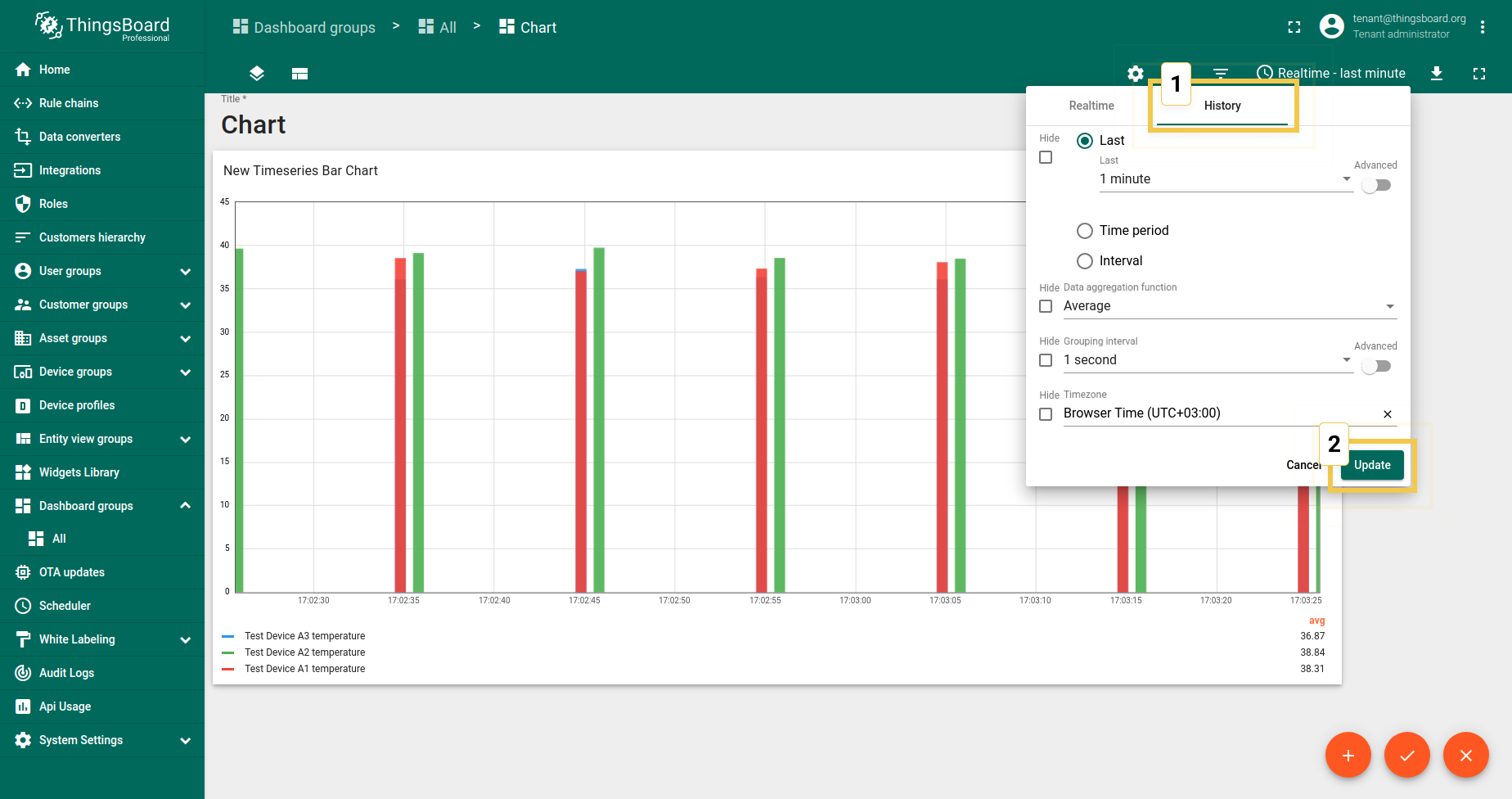
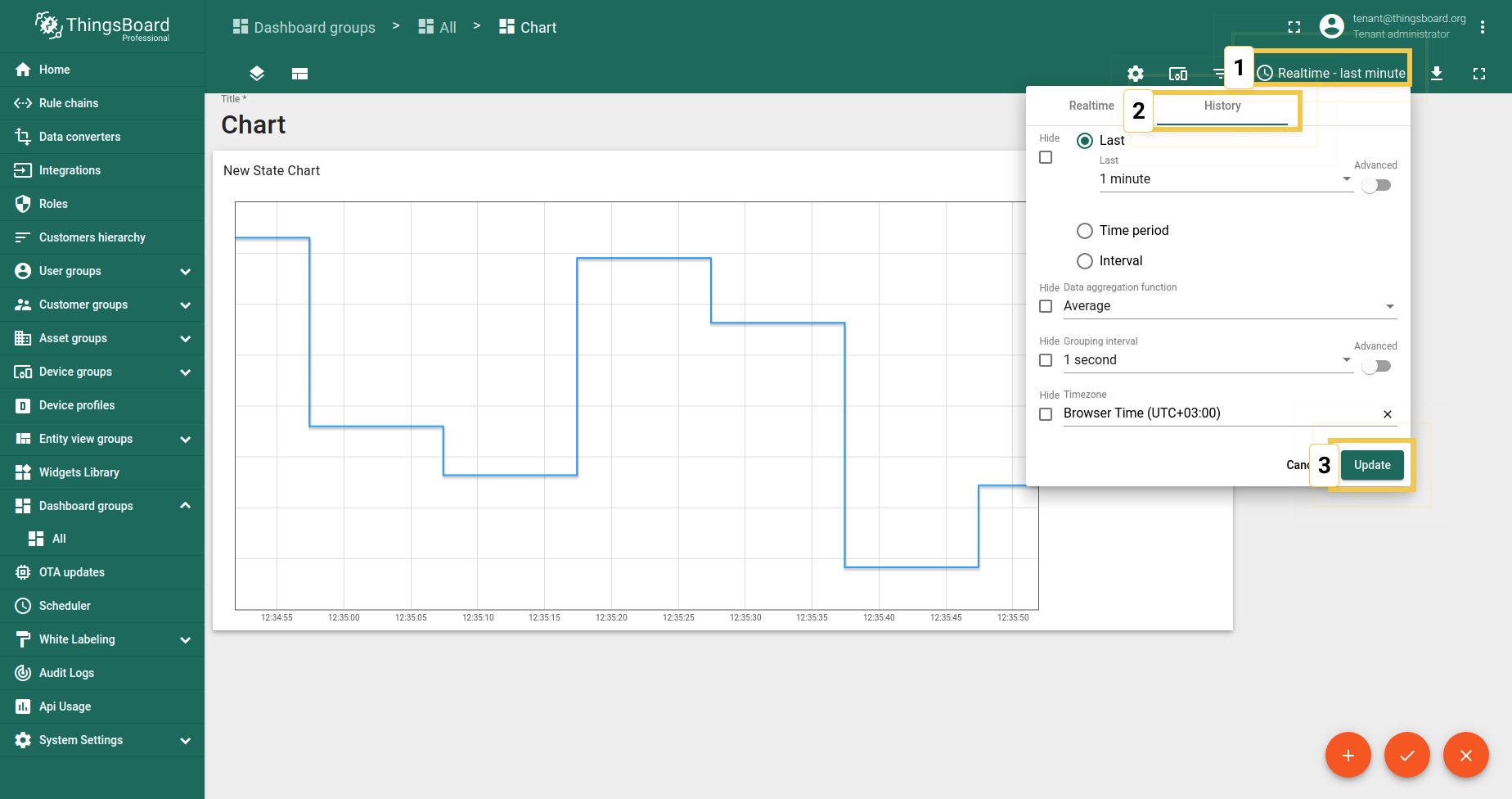
对比设置允许比较特定时间段内的值差异。仅在历史时间窗口中有效。
- Since comparison settings work only in History time window mode, click on the clock icon in the upper right corner and select the History time window there. Click "Update" to apply.
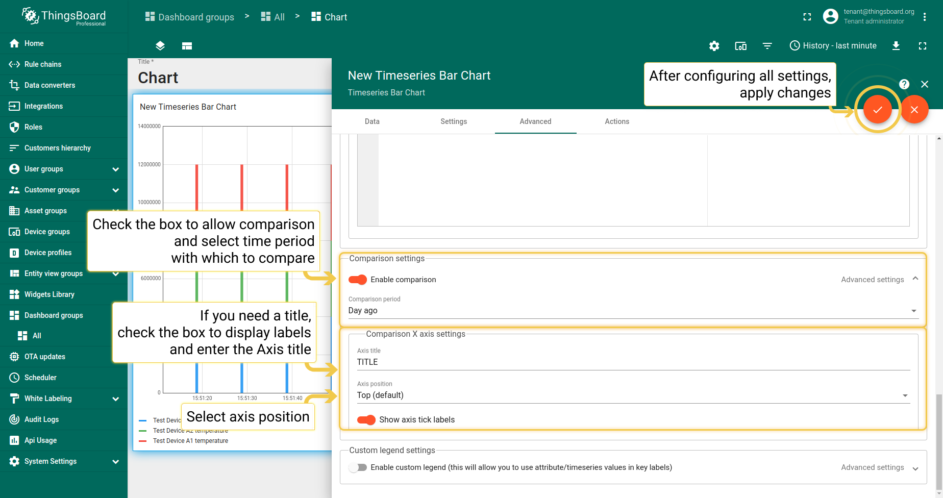
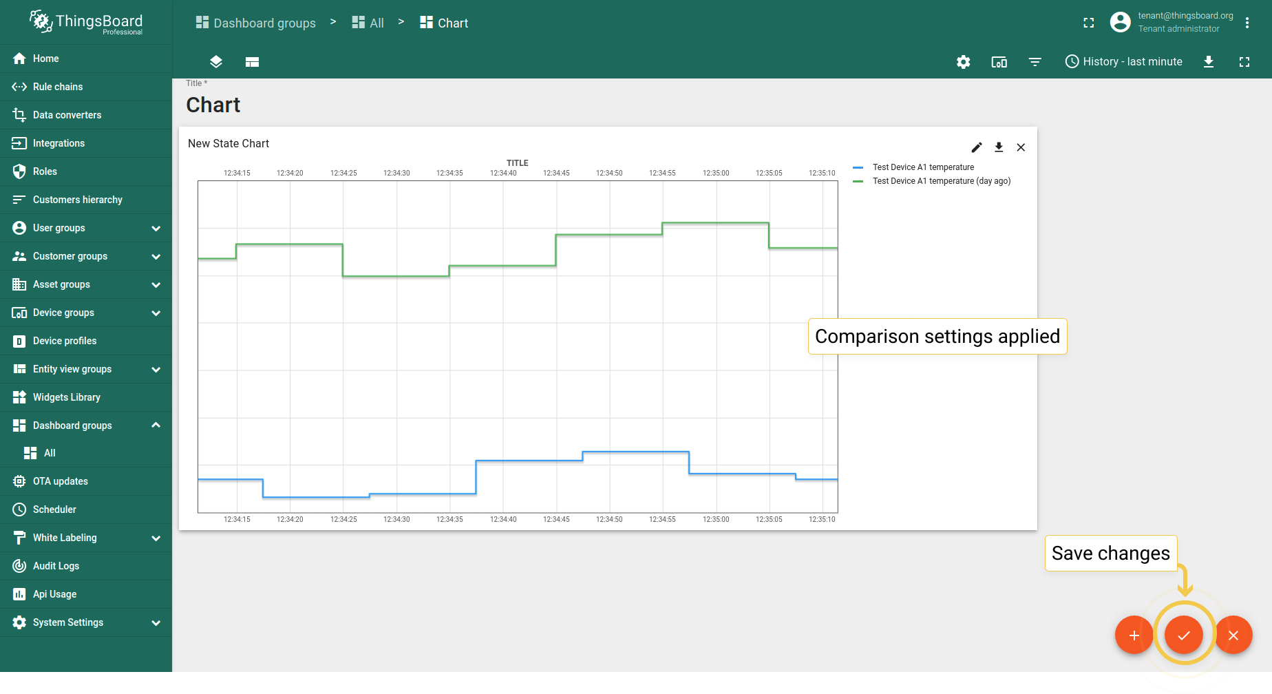
- In Advanced tab, enable comparison and from the drop-down menu select time to show historical data with which to compare. In the "Second X axis" section, select axis position, where the compared axis will be located on the widget. If you would like title for the second axis, enable "Show labels" and enter the Axis title. When you are done with Comparison Settings configuration, click the orange checkmark in the upper right corner of the window to apply changes.
- You can see in the widget legend that Comparison Settings have been applied. Save changes by clicking the orange checkmark in the lower right corner of the screen.
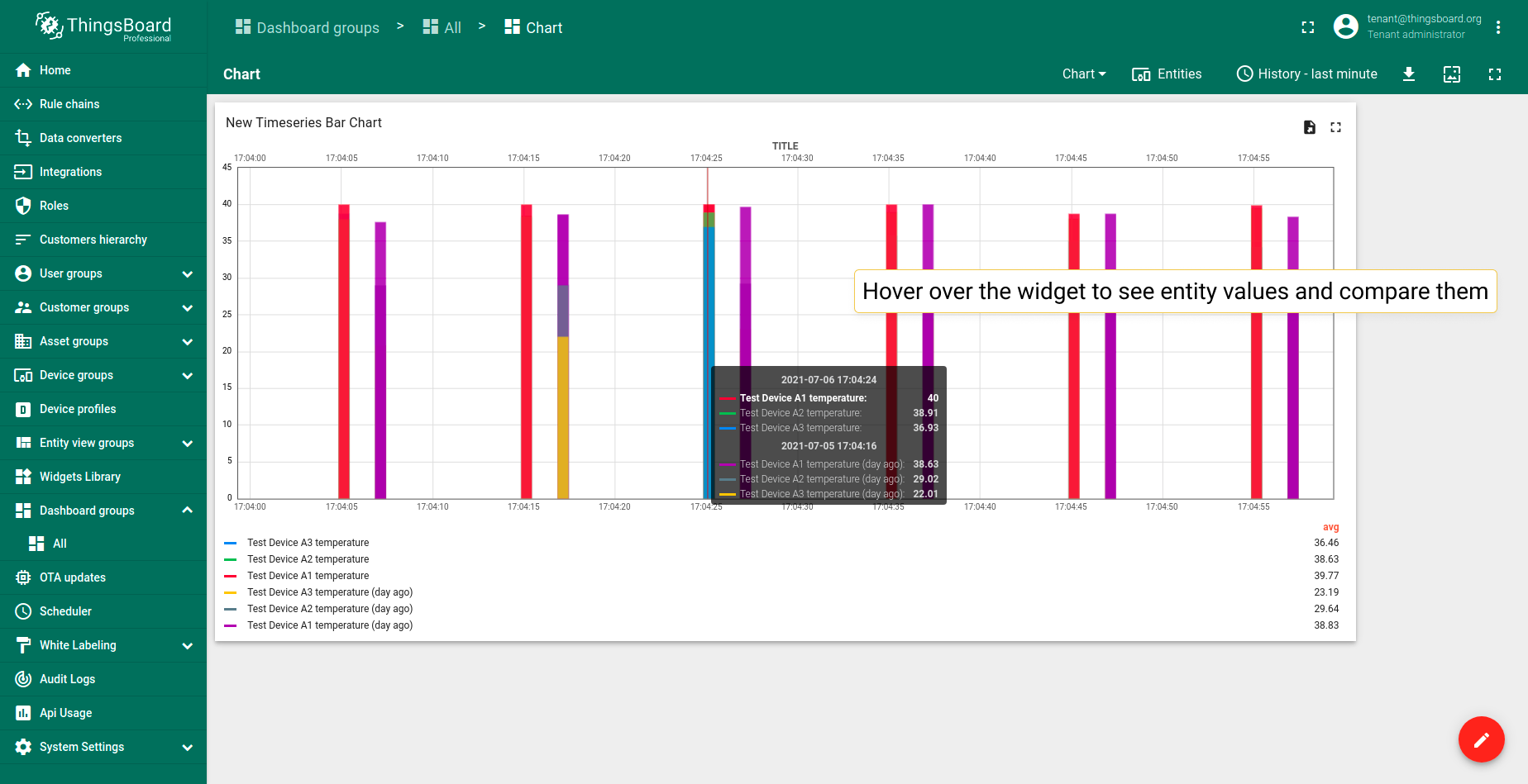
- You can see the tooltip with the comparison data when you hover the mouse over the widget.
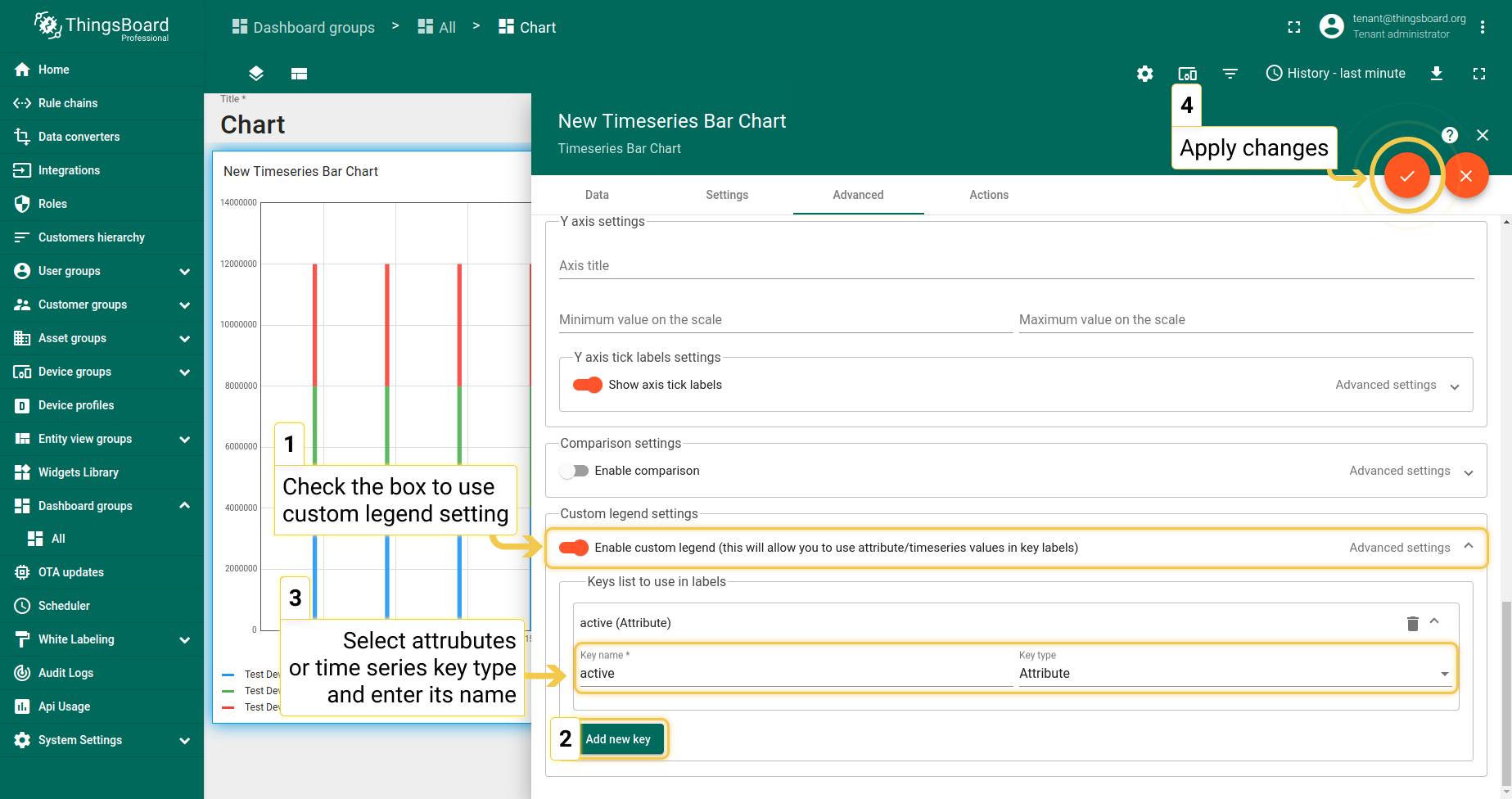
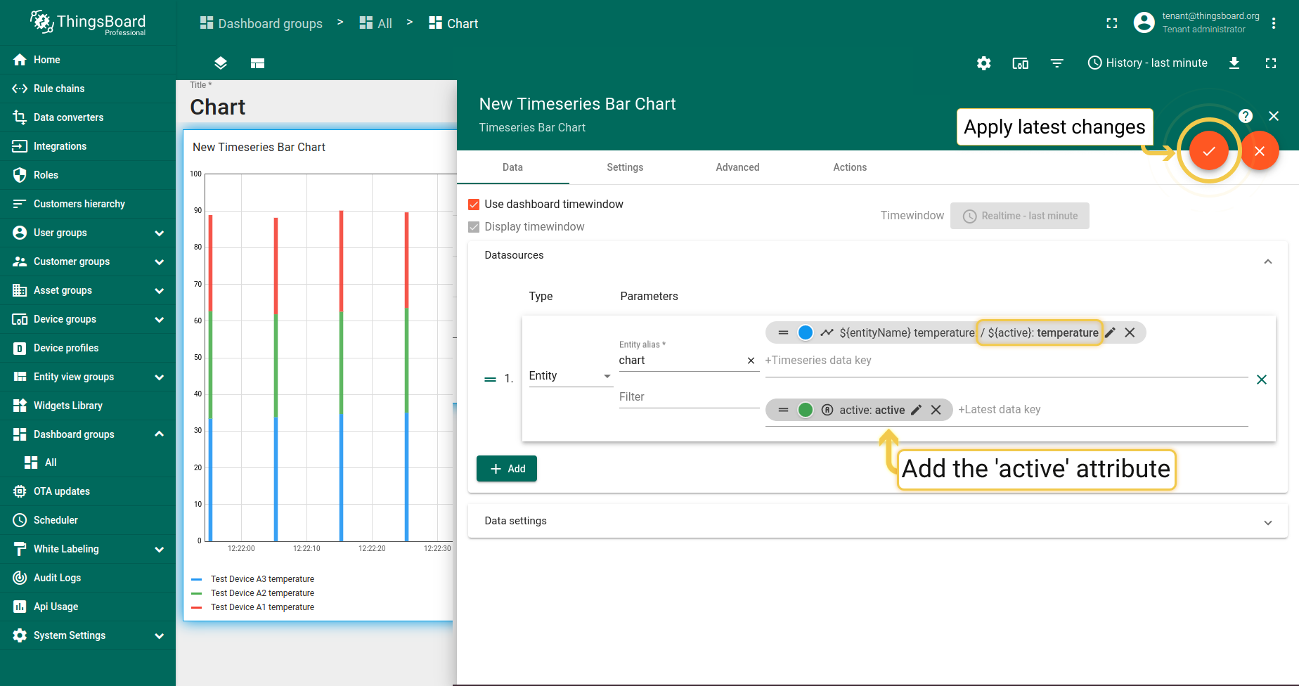
3. 自定义图例设置
自定义图例设置用于在图表图例中显示无法在图表中显示的数据(如属性)或仅显示特定时序。例如,active/inactive属性无法在图表中显示,只能在表格部件中显示。
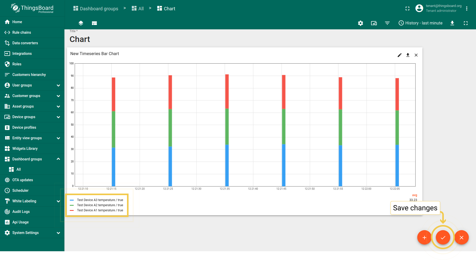
- In the Advanced tab, enable custom legend to use attribute or time series values in key labels. Click the "+ New" button. From the appeared drop-down menu, select key type. The Key name is entered in the line below. Apply all configured settings by click the orange checkmark in the upper right corner of the window.
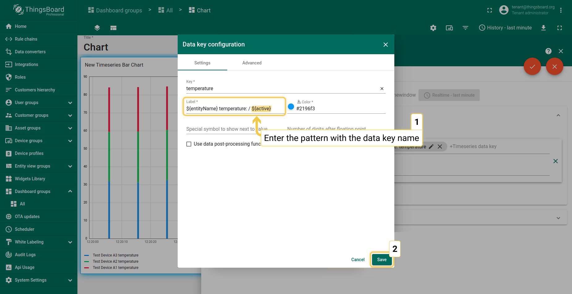
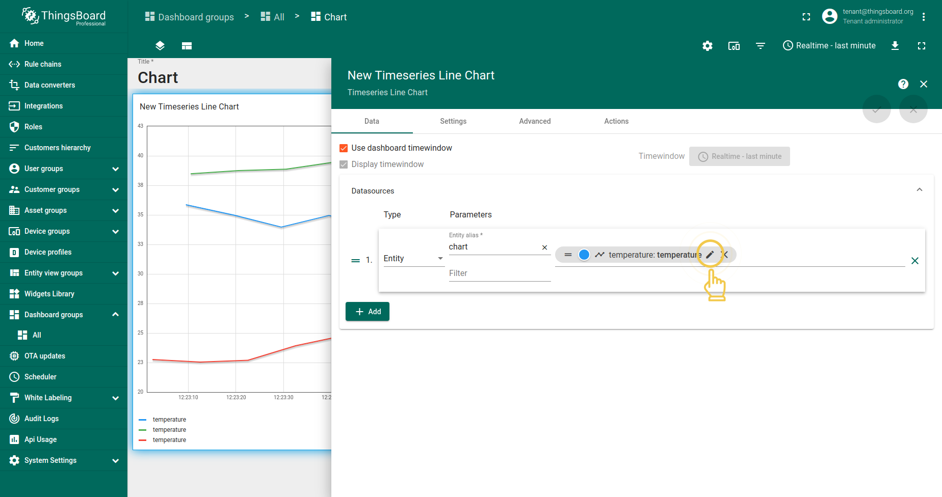
- Go to Data tab and click the pencil icon on the data key to enter Data key configuration.
- In the label line, enter the patter ${} with the data key name inside the brackets. Click "Save" to apply new label name.
- Click the orange checkmark in the upper right corner of the screen to apply data key changes.
- As you can see on the widget, custom legend settings have been applied. To save changes, click the orange checkmark in the lower right corner of the screen.

时序折线图
_时序折线图_部件的高级设置与时序柱状图相同。可在此上文了解这些设置。
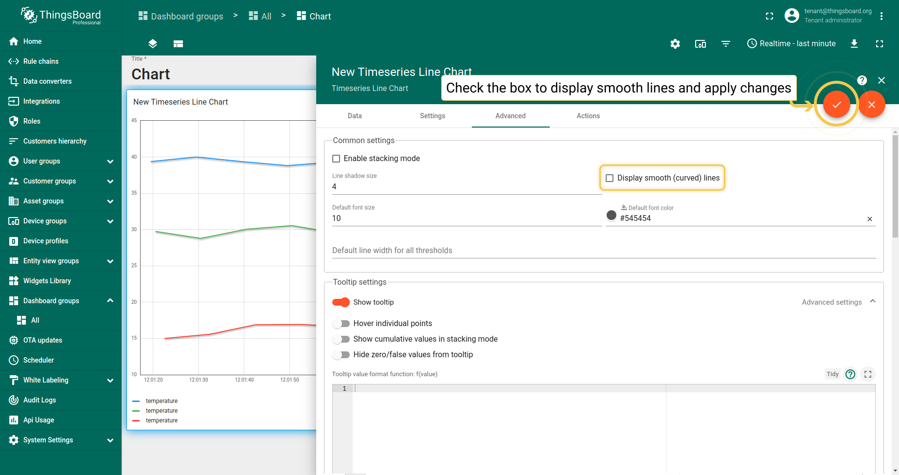
1. 显示平滑(曲线)线
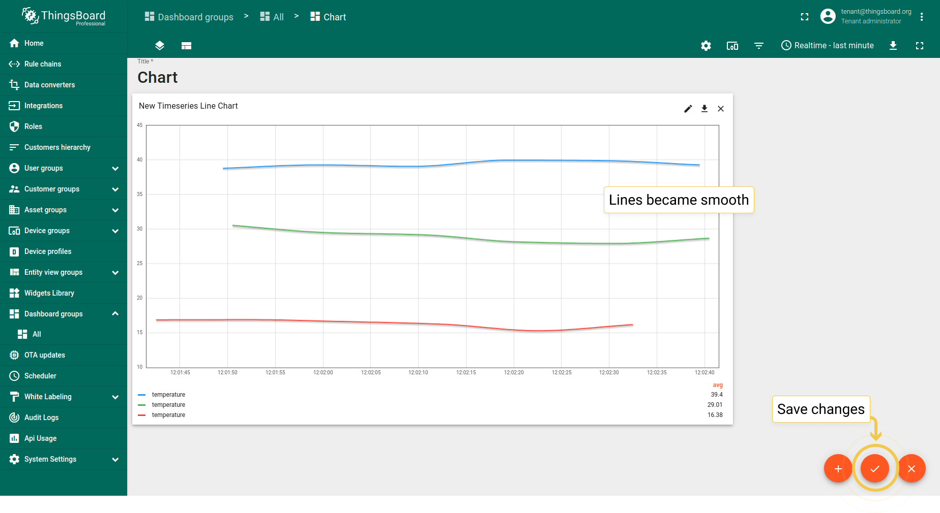
- In the Advanced tab, enable "Display smooth (curved) lines" and click the orange checkmark in the upper right corner of the window to apply changes.
- As you can see on the widget, lines became smooth. Click the orange checkmark in the lower right corner of the screen to save changes.
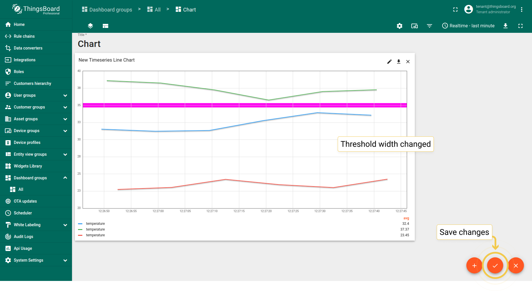
2. 所有阈值的默认线宽
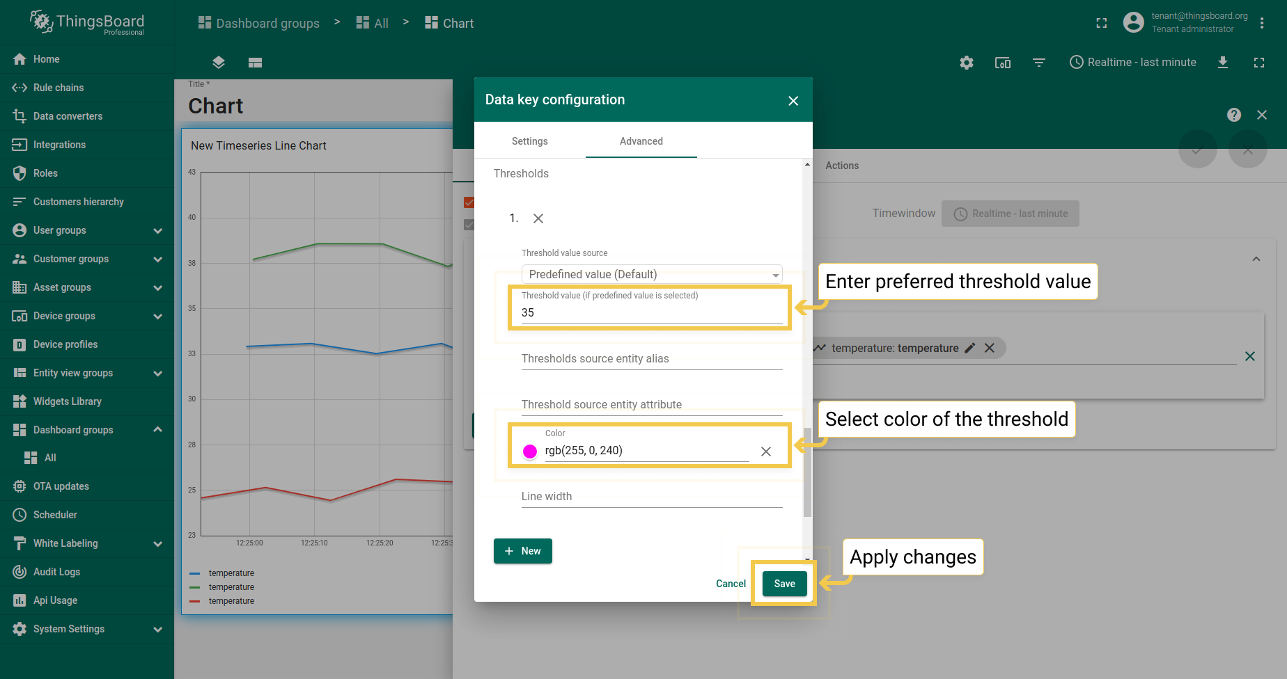
- In the Data tab, click the pencil icon on the data key to enter Data key configuration.
- In the Advanced tab of the opened dialog, enter preferred threshold value, pick the color of the threshold and click "Save".
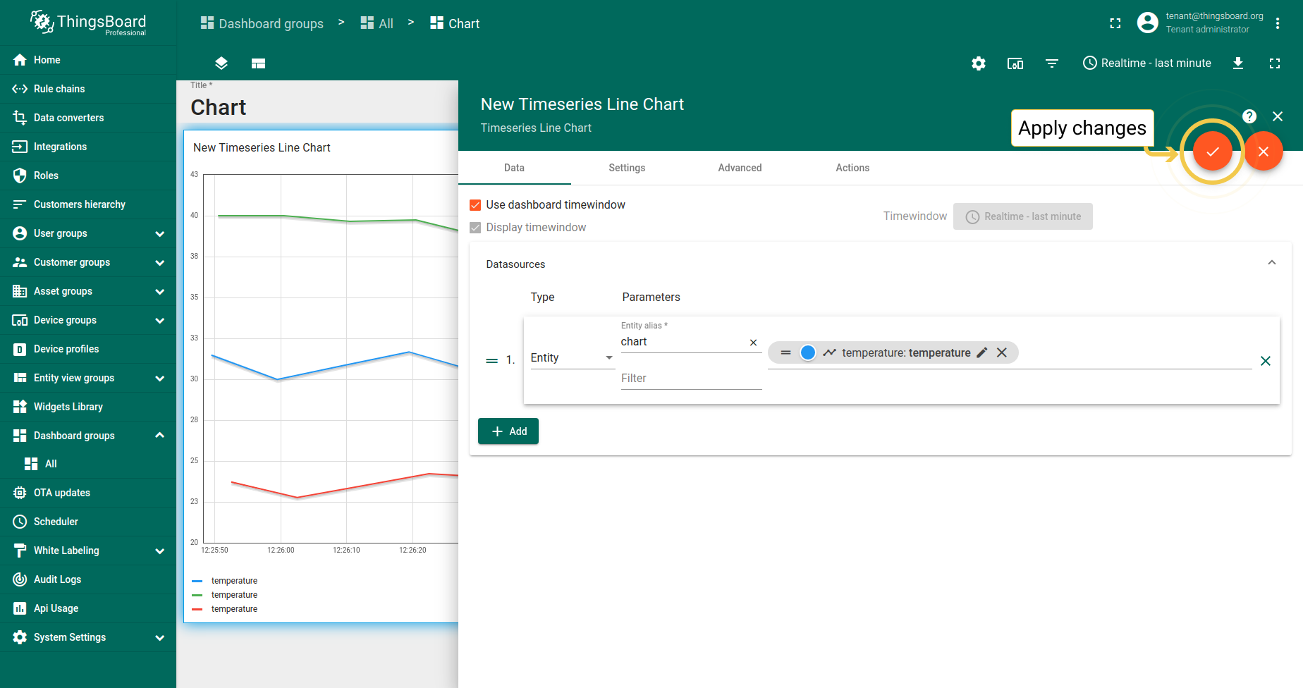
- To apply changes click the orange checkmark in the upper right corner of the window..
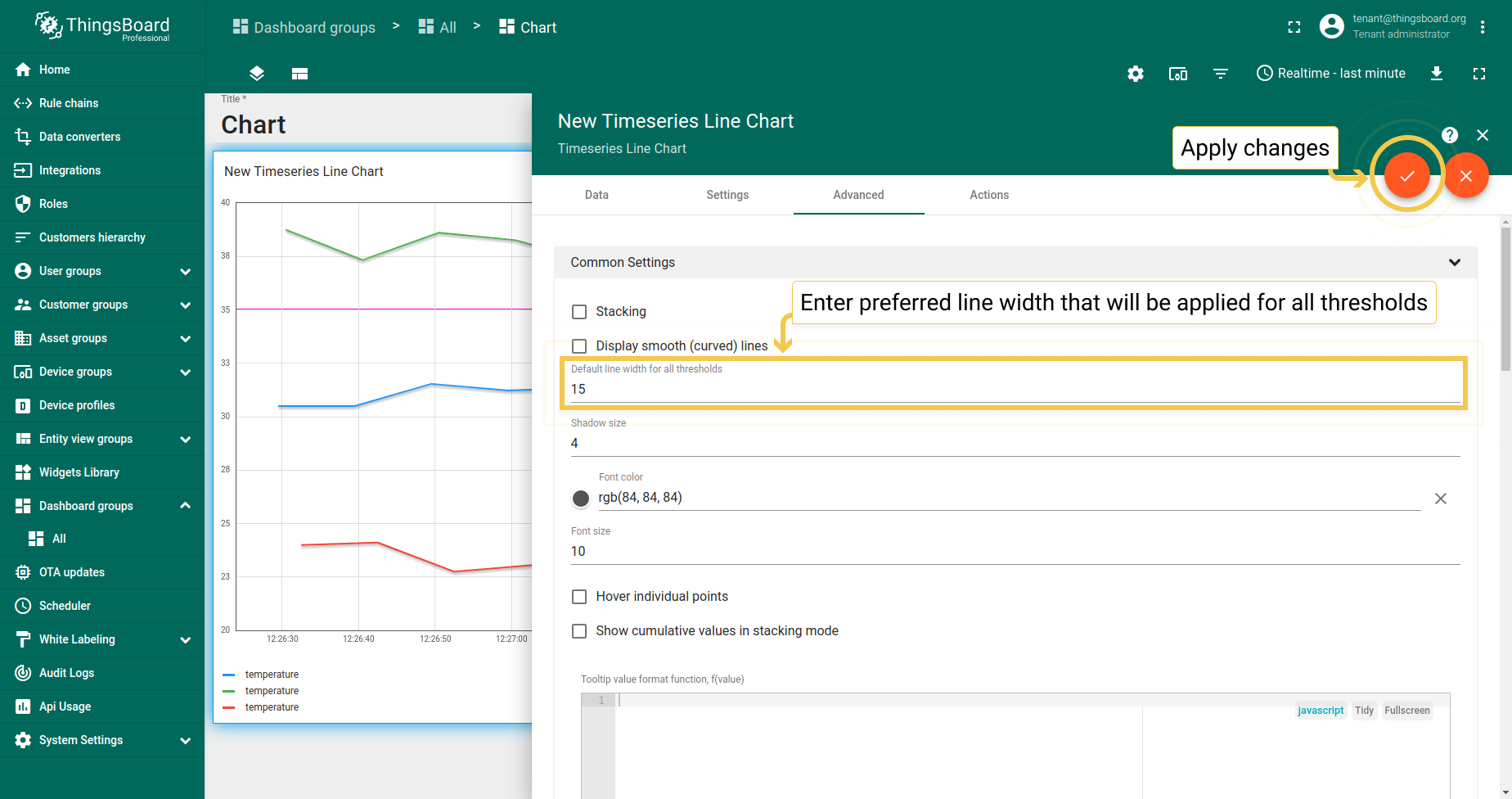
- In the Advanced tab, enter line width for all thresholds and apply changes by clicking the orange checkmark in the upper right corner of the window.
- Thresholds width has been changed. Save all applied changes by clicking the orange checkmark in the lower right corner of the screen.
状态图
1. 常用设置
1.1. 堆叠
堆叠模式适用于需要查看实体值的部件。
1.2. 显示平滑(曲线)线仅适用于折线图。
1.3. 悬停单个点
勾选悬停单个点框时,线条上不会显示数值点。
1.4. 堆叠模式中的累积值
堆叠模式开启时,可勾选“累积值”框使图表显示所有实体值的总和。
1.5. Tooltip值格式函数f(value) 用于手动自定义tooltip。可通过设置或 高级数据键配置自定义将在tooltip中显示的值。 通过设置配置tooltip为基础配置,同时应用于所有实体。在高级数据键配置中配置时, 仅应用于特定时序数据,基础tooltip函数将被子配置覆盖。
在状态图中,可根据实体值配置在tooltip中显示的实体状态。
1
2
3
let celsiusValue = parseFloat(value).toFixed(2);
let farenheitValue = parseFloat(celsiusValue*1.8 + 32).toFixed(2);
return celsiusValue + ' °C (' + farenheitValue + ' °F)';
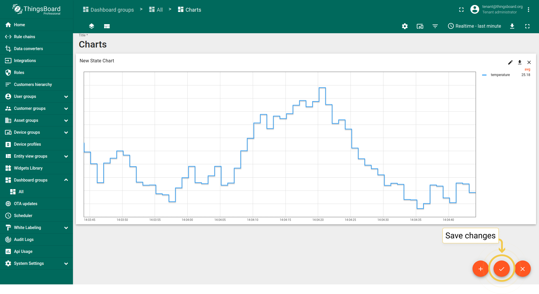
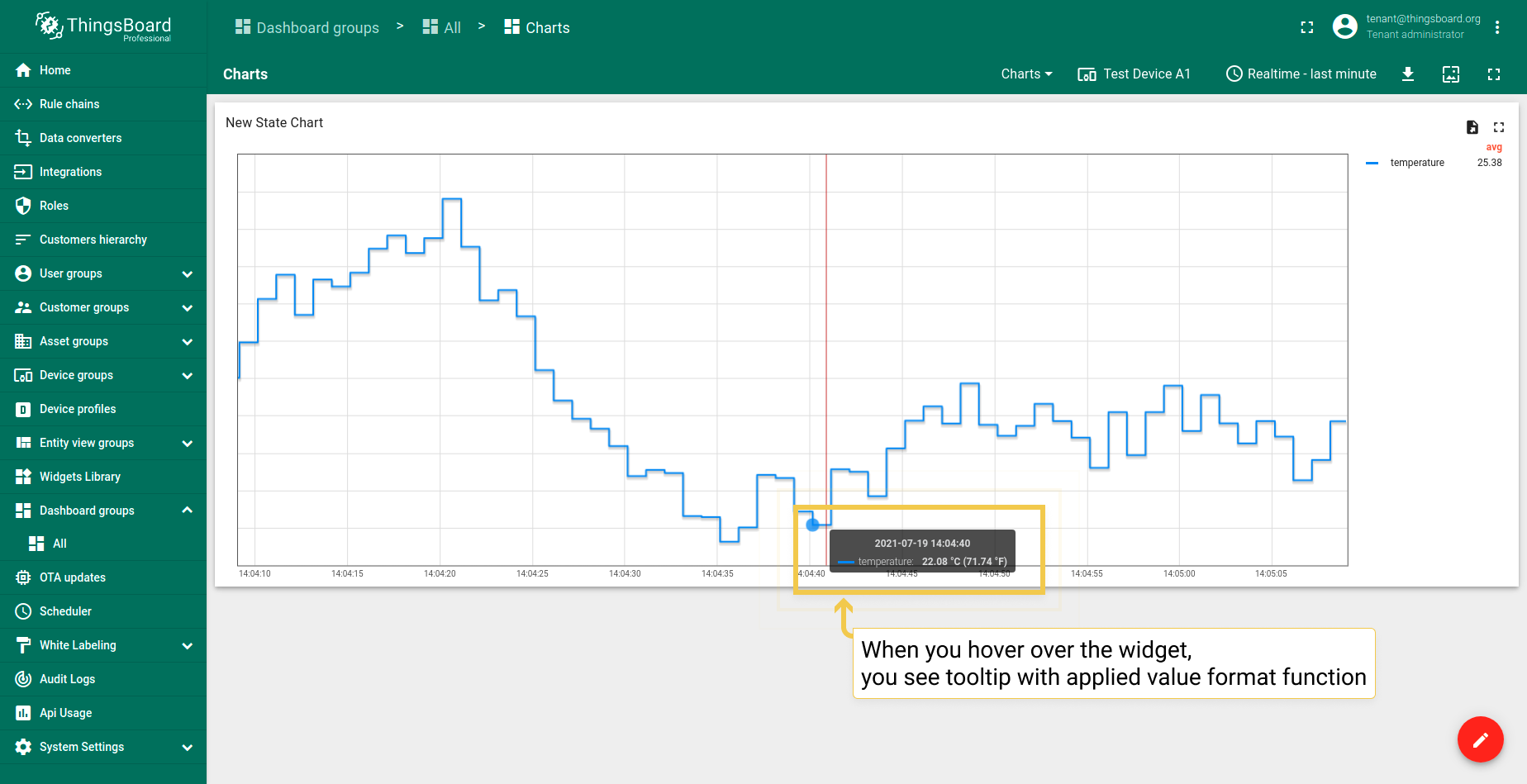
- In the Tooltip value format function field, enter your function (our example you can find under screenshots section). Apply changes by clicking the orange checkmark in the upper right corner of the window.
- You need to save changes to see tooltip. Do it by clicking the orange checkmark in the lower right corner of the screen.
- Hover with your mouse over the widget to see tooltip with applied value format function.
1.6. 网格设置
网格设置与时序柱状图相同。
1.7. 坐标轴设置
坐标轴设置与时序柱状图相同。
1.8. 刻度格式化函数
- In the Advanced tab, you can edit the default function according to your entity values.
- After you edited values and text to be returned, apply changes by clicking the orange checkmark in the upper right corner of the window.
- Ticks formatter function has been applied. To save it, click the orange checkmark in the lower right corner of the page.
2. 对比设置
- In Advanced tab, enable comparison and from the drop-down menu select time to show historical data with which to compare. In the "Second X axis" section, select axis position, where the compared axis will be located on the widget. If you would like title for the second axis, enable "Show labels" and enter the Axis title. When you are done with Comparison Settings configuration, click the orange checkmark in the upper right corner of the window to apply changes.
- Since comparison settings work only in History time window mode, click on the clock icon in the upper right corner and select the History time window there. Click "Update" to apply.
- As you can see on the widget, now you can compare value for last minute and the one from day ago. Click the big orange checkmark in the lower right corner to apply changes.
3. 自定义图例设置
自定义图例设置与时序柱状图相同。
最新值饼图 - Flot
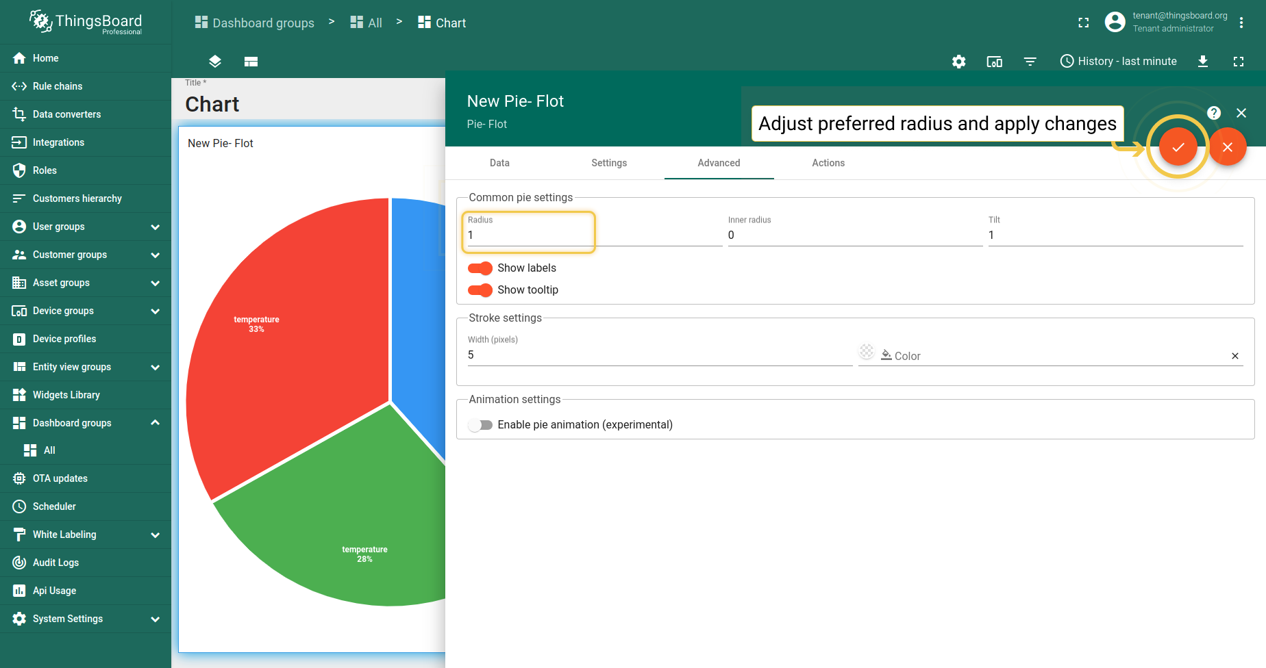
1. 半径
设置饼图的半径。若值在0到1(含)之间,则按可用空间(容器大小)的百分比使用。否则将直接以像素长度使用该值。
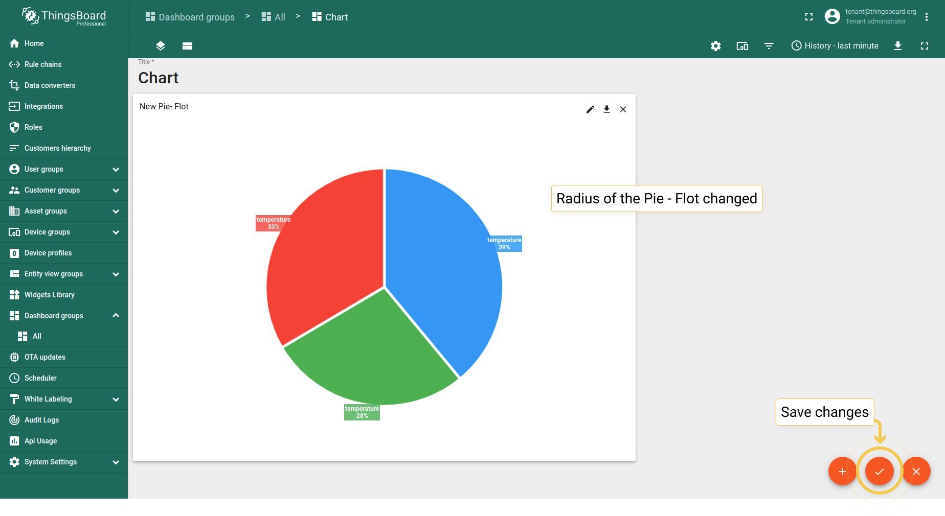
- In the Advanced tab, enter preferred radius (0 to 1) and click the orange checkmark in the upper right corner of the window to apply changes.
- Radius became smaller. Click the big orange checkmark in the lower right corner to apply changes.
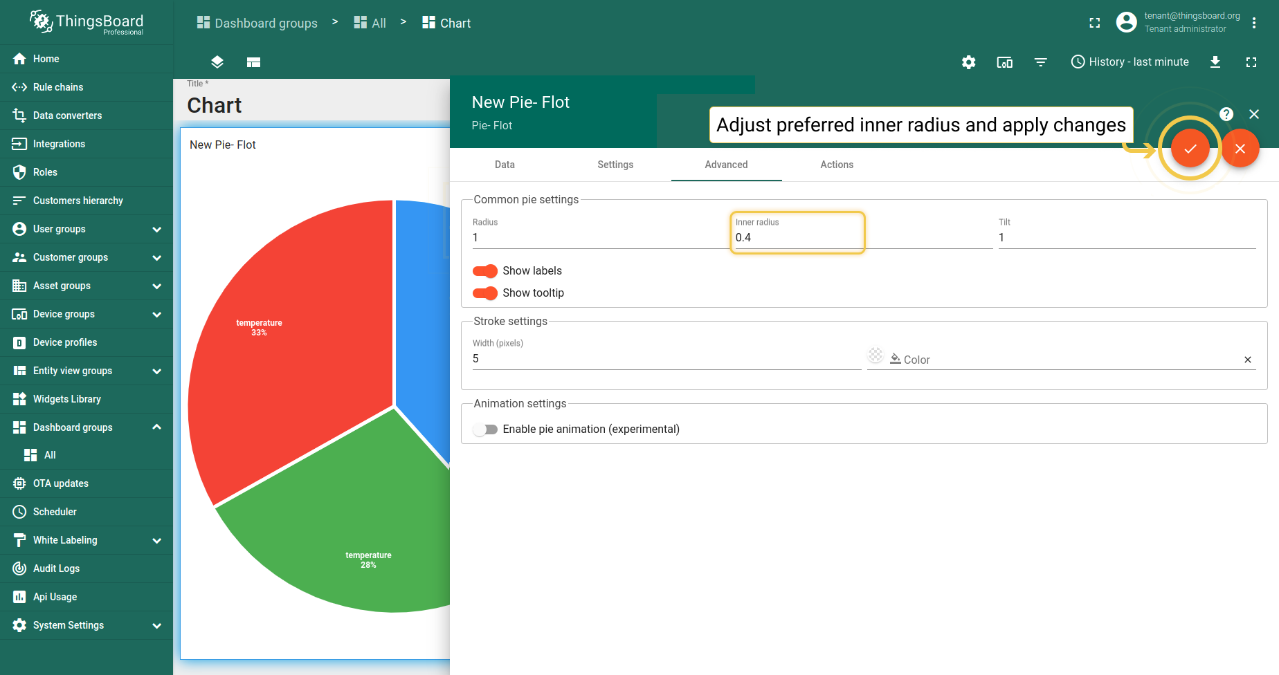
2. 内半径
设置环形孔半径。若值在0到1(含)之间,则按半径的百分比使用。否则将直接以像素长度使用该值。
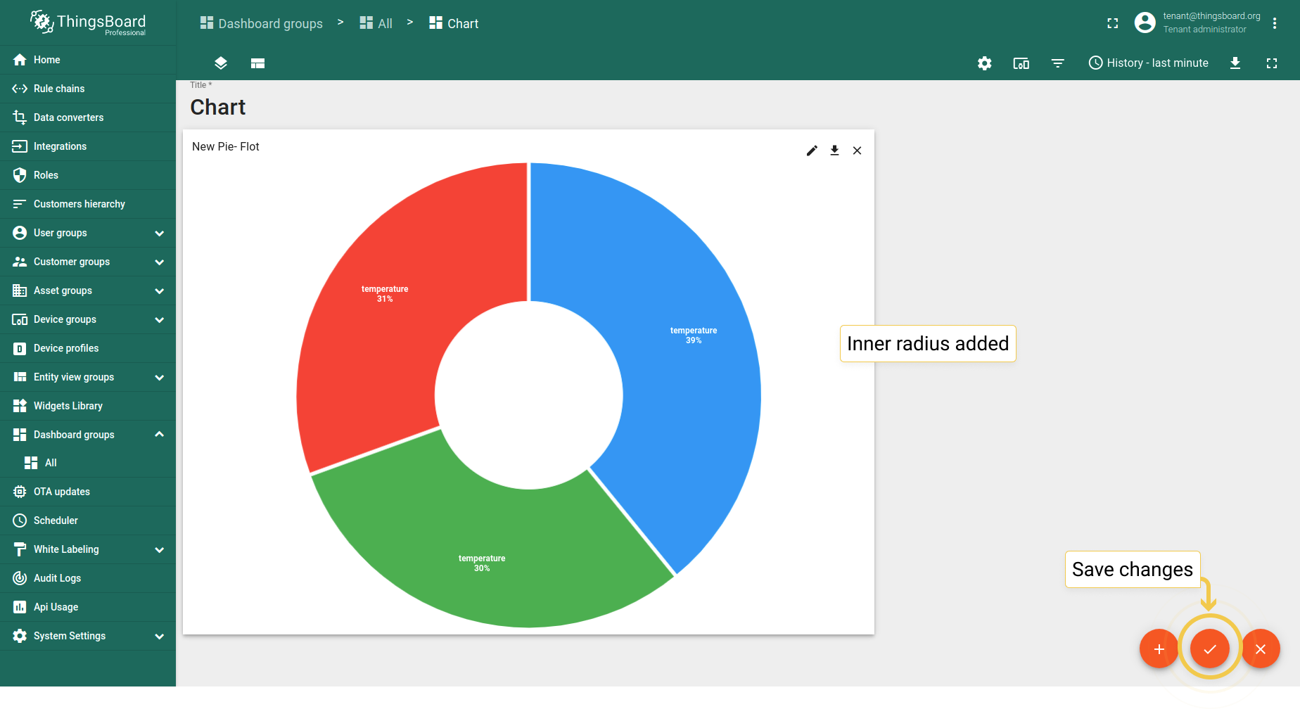
- In the Advanced tab, enter preferred inner radius (0 to 1) and click the orange checkmark in the upper right corner of the window to apply changes.
- Inner radius has been added. Click the big orange checkmark in the lower right corner to apply changes.
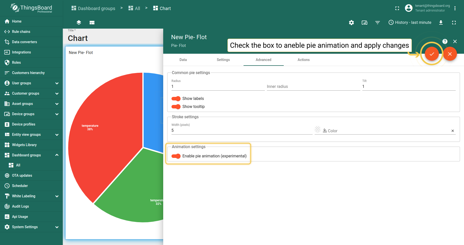
3. 启用饼图动画
实体值变化时饼图 - Flot会移动,但移动较生硬。饼图动画可使移动更平滑柔和。
- In the Advanced tab, enable the experimental pie animation function and click the big orange checkmark in the upper right corner of the window to apply changes.
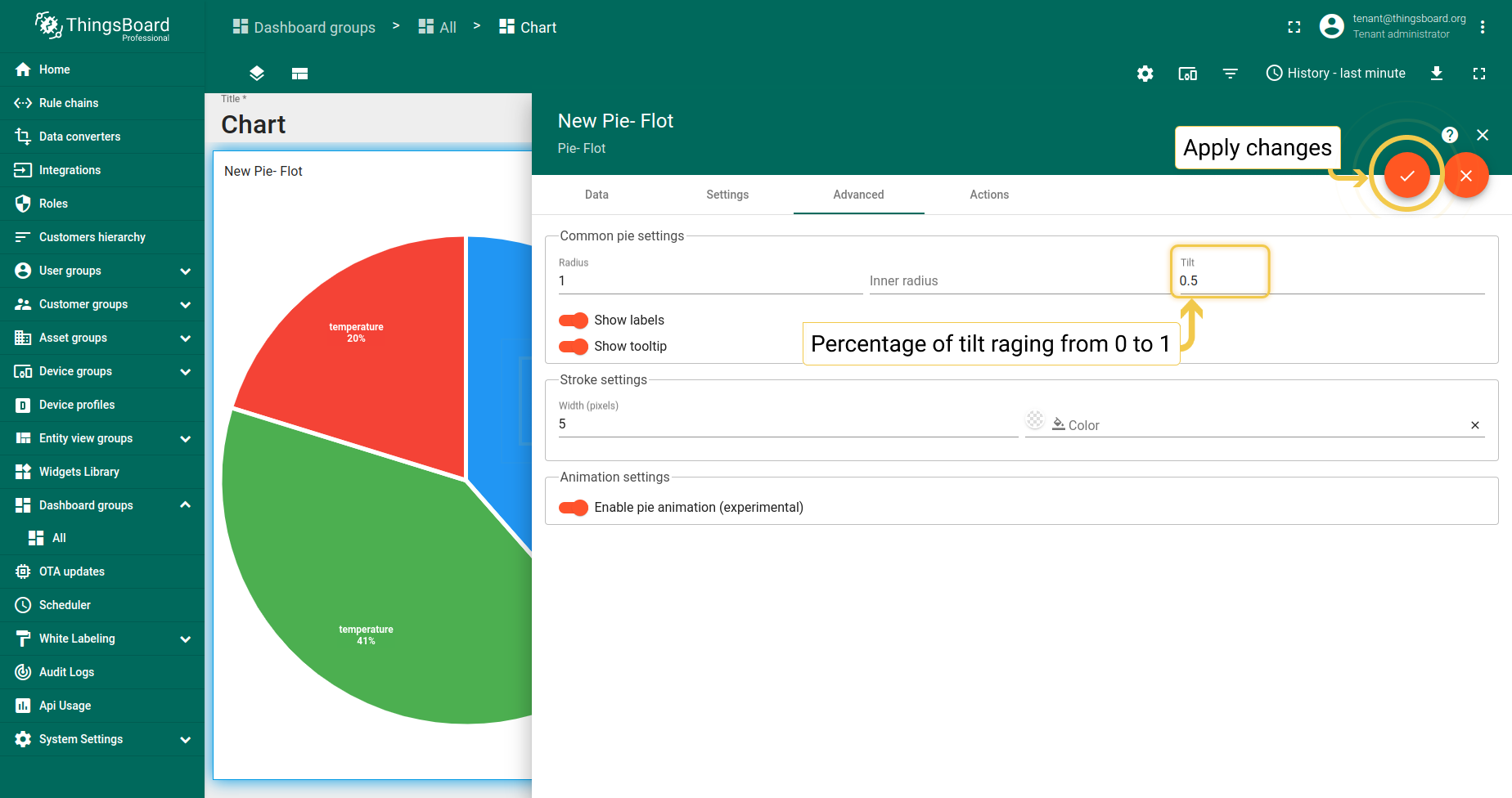
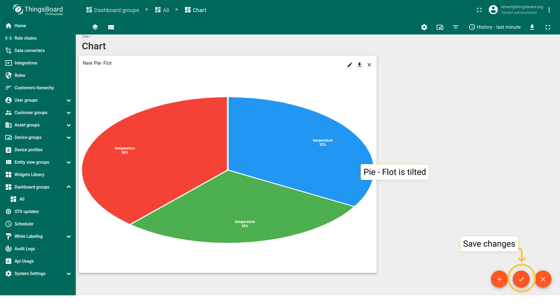
4. 倾斜
倾斜百分比范围0到1,1表示无变化(完全垂直),0表示完全平坦(完全水平,此时不绘制任何内容)。 倾斜值现用于计算饼图相对于容器高度的最大半径。 可防止饼图在某些情况下过小,并减少饼图上下方产生的额外空白。
- In the Advanced tab, enter preferred tilt (0 to 1) and click the orange checkmark in the upper right corner of the window to apply changes.
- As you can see, the Pie - Flot has been tilted. Save changes by clicking the big orange checkmark in the lower right of the page.
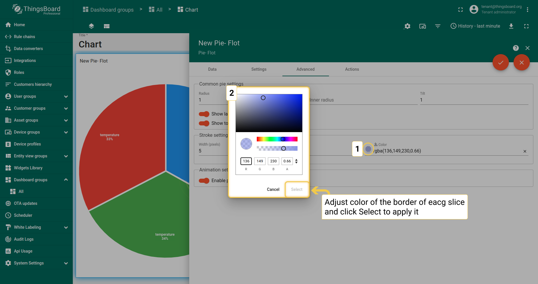
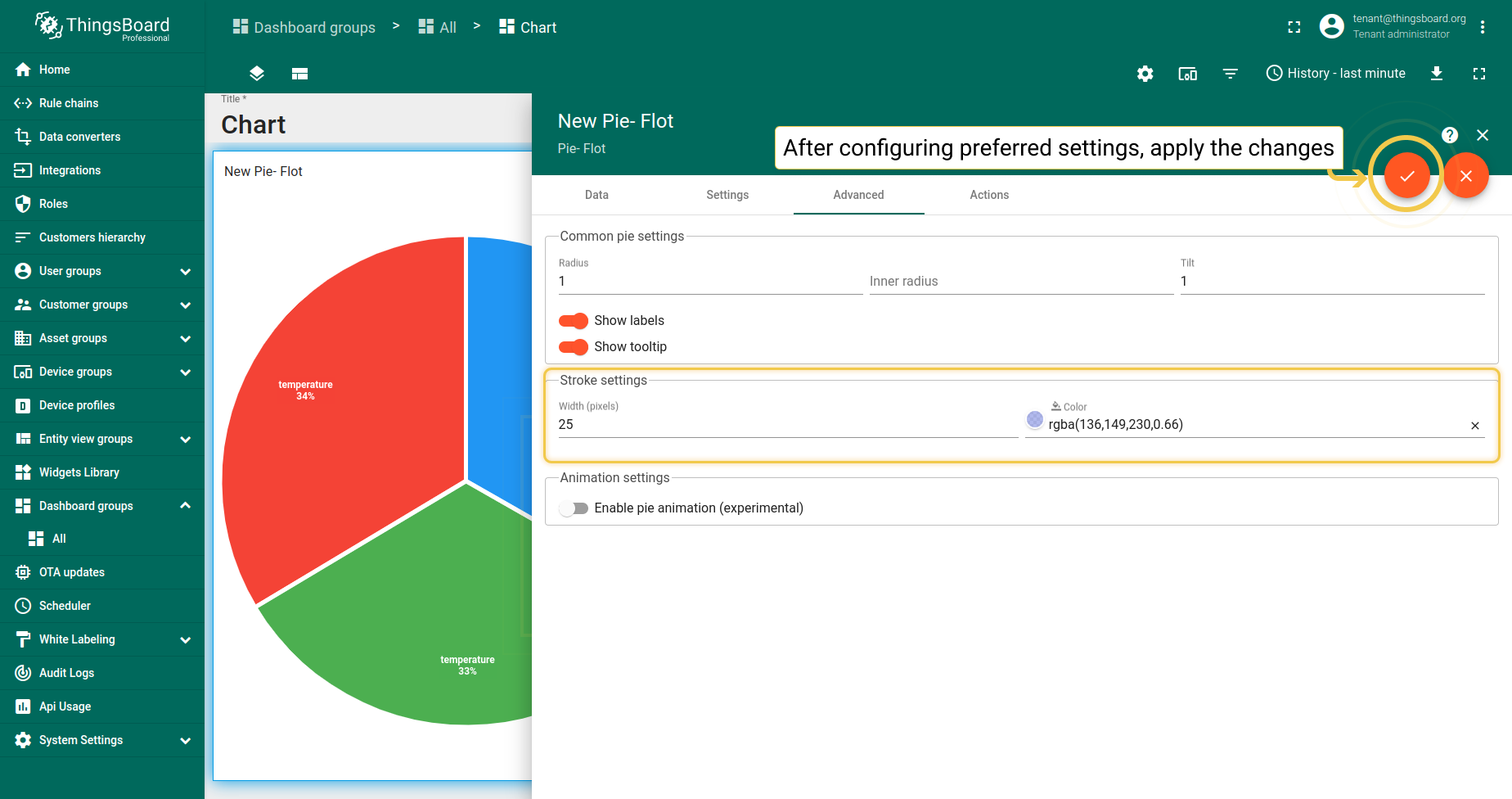
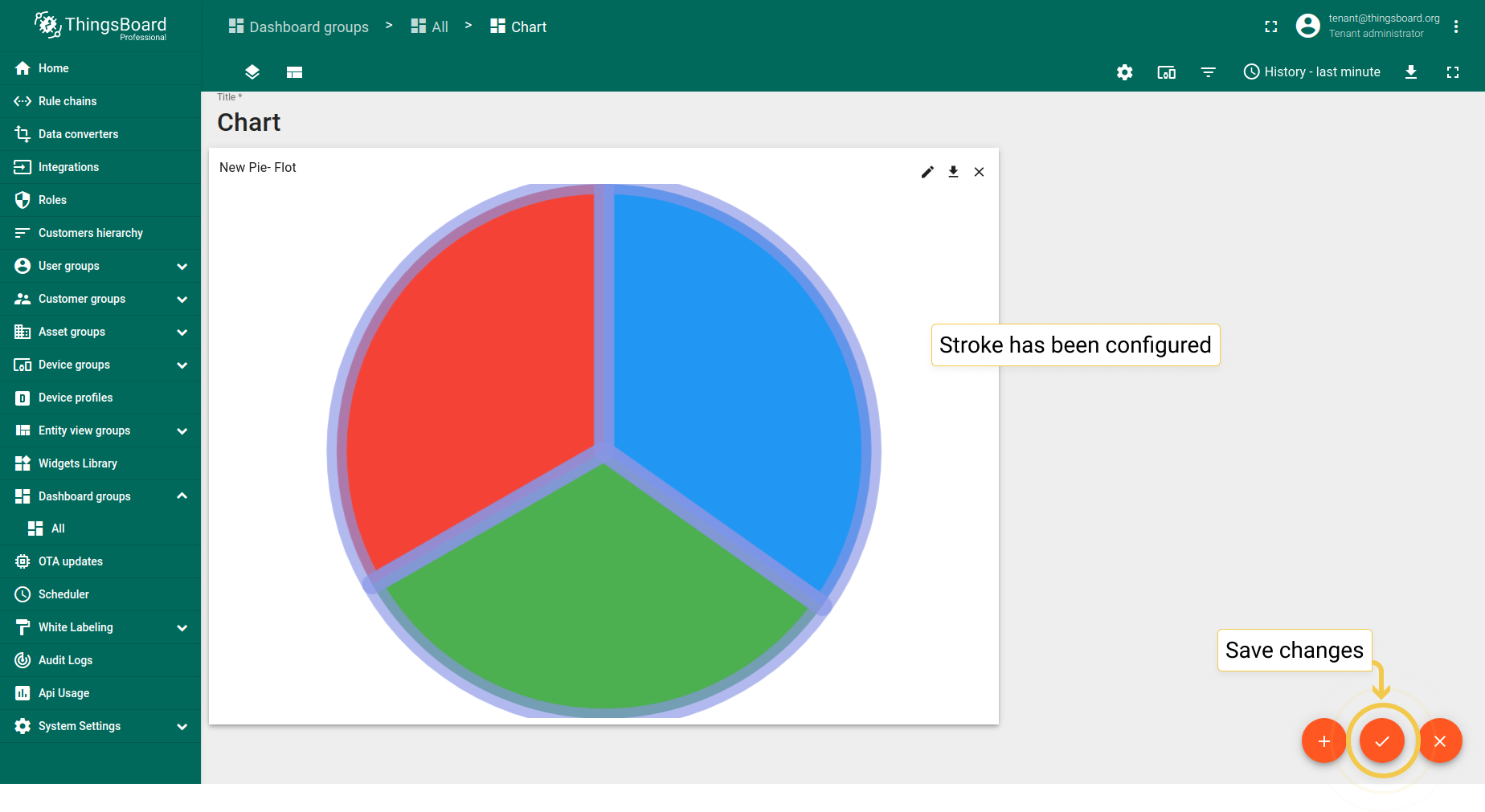
5. 描边
- In the Advanced tab, click on the stroke color circle. In the opened dialog window, move sliders to adjust color and transparency of the stroke. Click "Select" when you are done.
- Also, you can change stroke width and disable labels visibility. Apply changes by clicking the orange checkmark in the upper right corner of the page.
- As you can see, stroke has been added to the Pie - Flot.
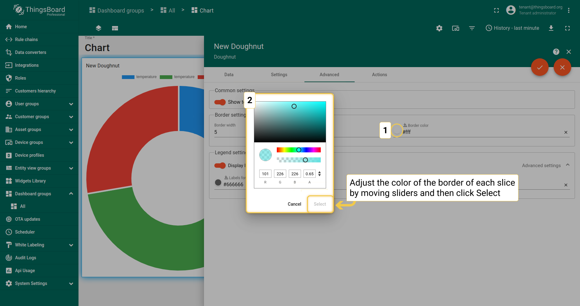
最新值环形图
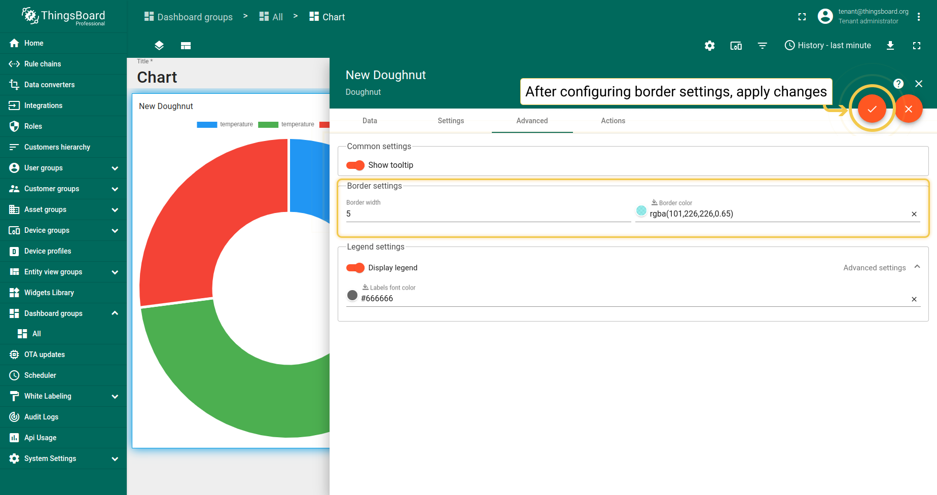
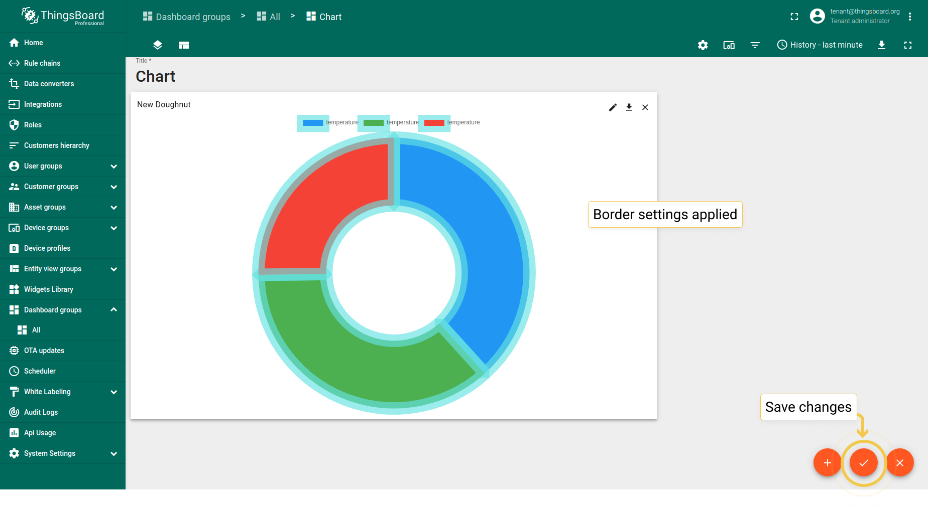
1. 边框
- In the Advanced tab, click the border color circle. In the opened dialog, move sliders to adjust color and click "Select".
- Also, you can change border width. After configuring all preferred border settings, click the orange checkmark in the upper right corner of the window.
- As you can see on the widget, custom borders have been added to the Doughnut widget.
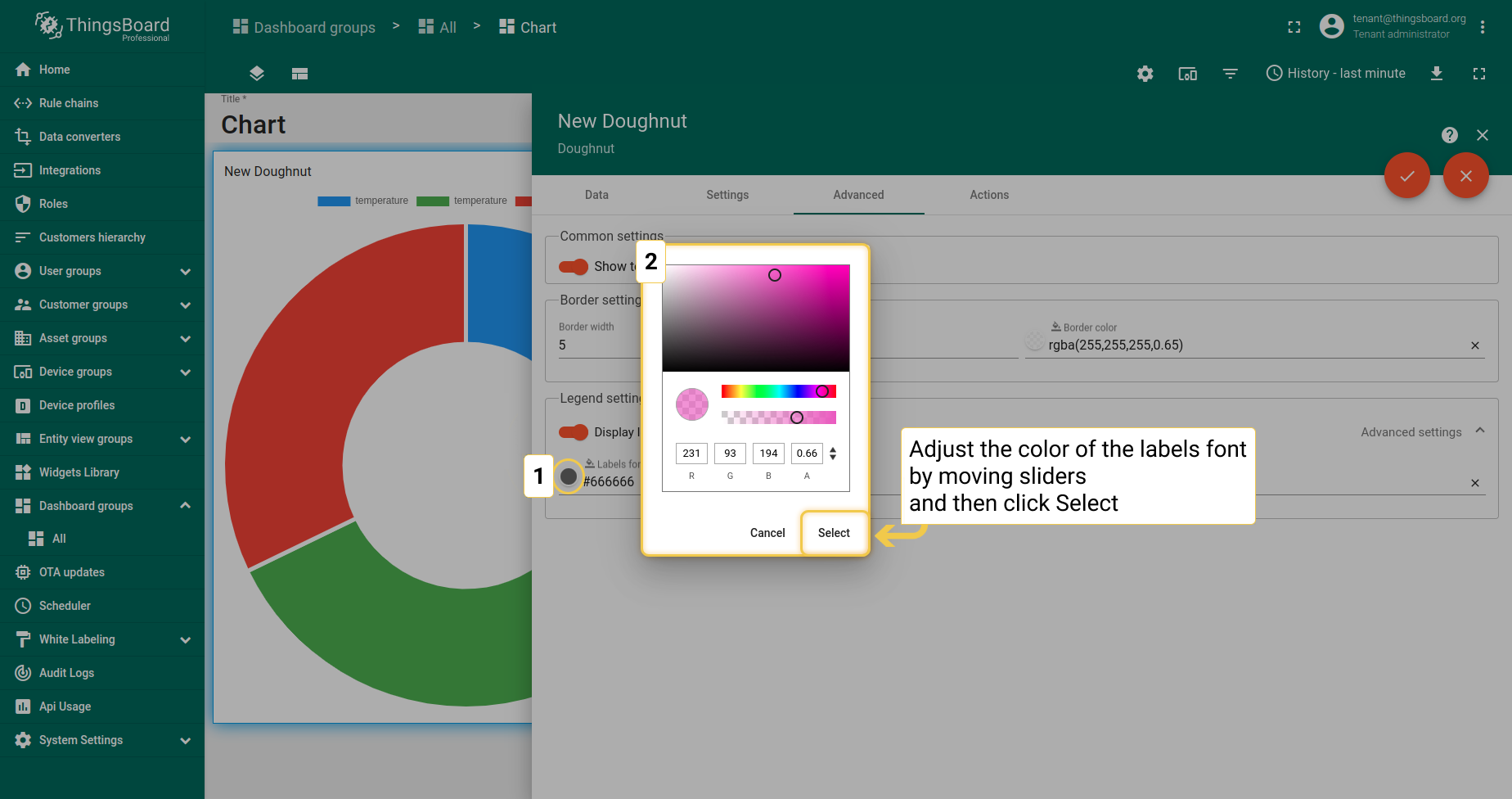
2. 图例设置
- In the Advanced tab, click the Labels font color circle. In the opened dialog, move sliders to adjust color and click "Select".
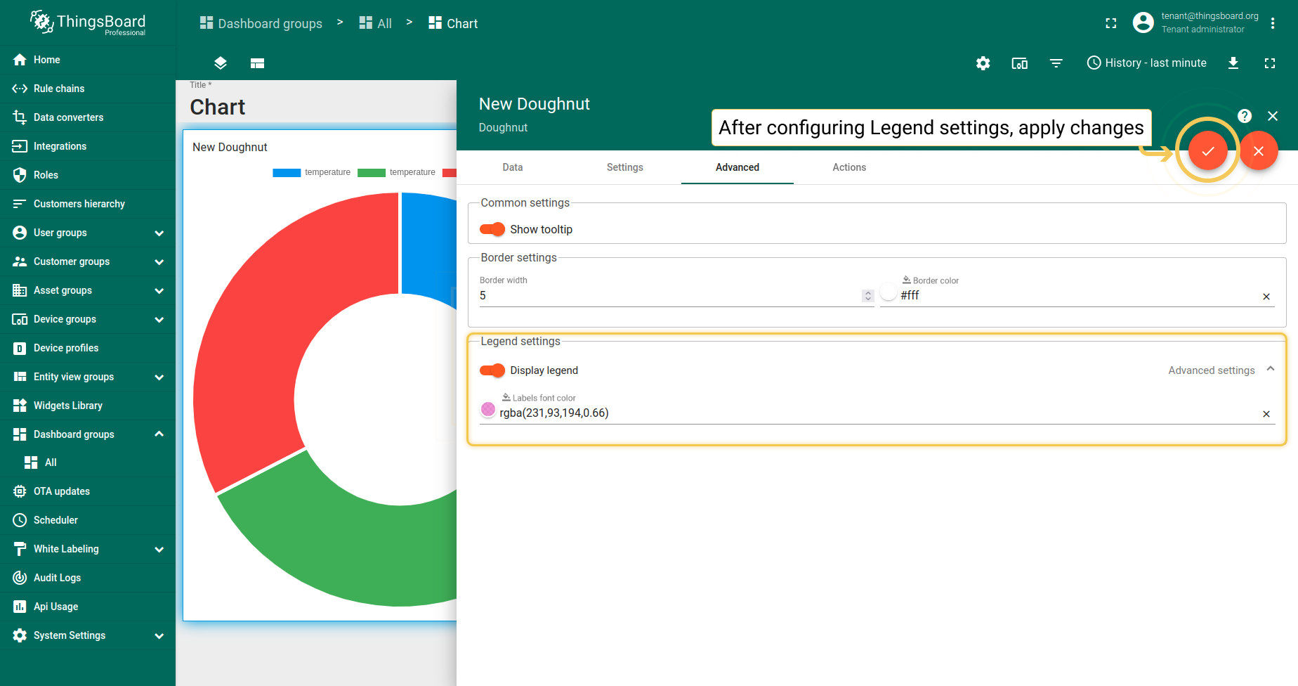
- Also, you can disable legend visibility. After you are done configuring legend settings, click the orange checkmark in the upper right corner of the window to apply changes.
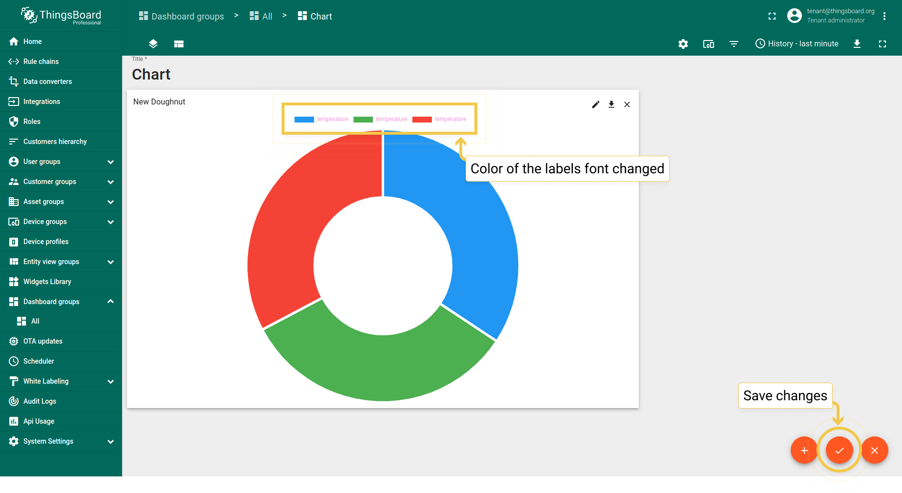
- As you can see on the widget, color of the labels font has been changed.