Details about basic Bar chart you can find in Line Chart Configuration Main concept for line and bar charts are the same. In this tutorial we will focus on differences.
Video Tutorial
Horizontal Bars
By default bar chart is vertical. In some cases it is required to show data using vertical bars. For making it:
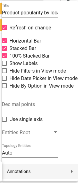
- Open View Settings
- Enable Horizontal Bar mode
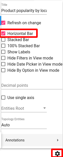
Note horizontal mode available only when Y-axis contains one field. When multiple fields added to Y-axis and there are fields in Series section - horizontal bar would not display.
Stacked Bars
When bar chart contains multiple timeseries or series fields - each seria showed independently. And it is possible to enable stacked mode for bar charts. Here are few examples: stacking disabled, stacking enabled and 100% stacked bars.
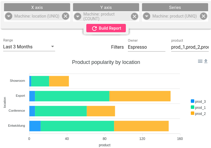
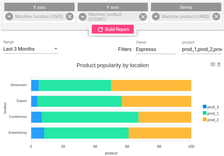
You can control stack options in View Settings
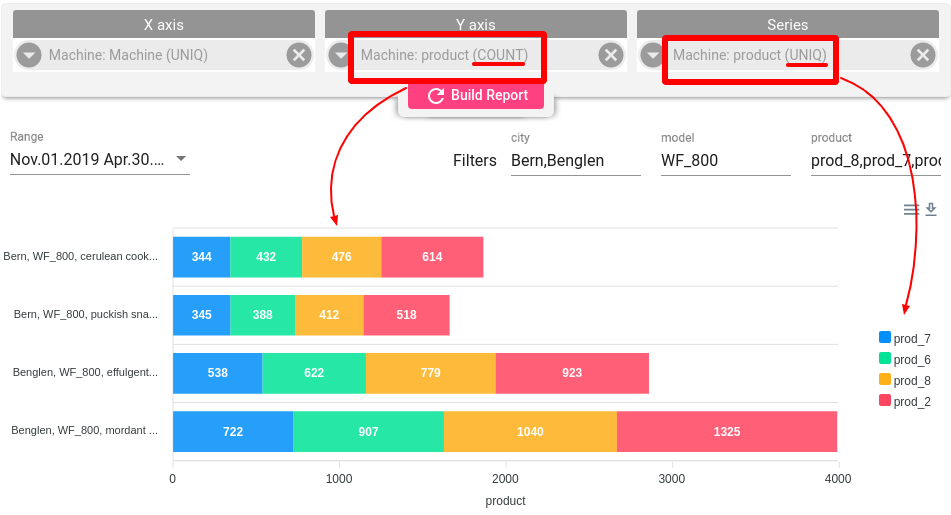
Group By telemetry value
This option used when you need to group and aggregate data based on telemetry field value. For example we have machine that produce different cups. Machine submit telemetry that contains info:
- How many products were produced (amount)
- What type of product was produced (product category)
- How many resources were utilised (energy)
Raw payload format is the following:
1
2
3
4
5
6
  {
    "ts": 1540892498884,
    "amount": 12,
    "product": "glass",
    "energy": 218,
  }
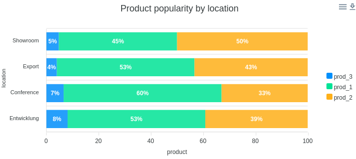
What we want to find - how many products with different types were produced. Or how much energy was consumed for producing products of certain type.
In both cases we need to group telemetry by product value and then apply required aggregation (in our case - SUM):
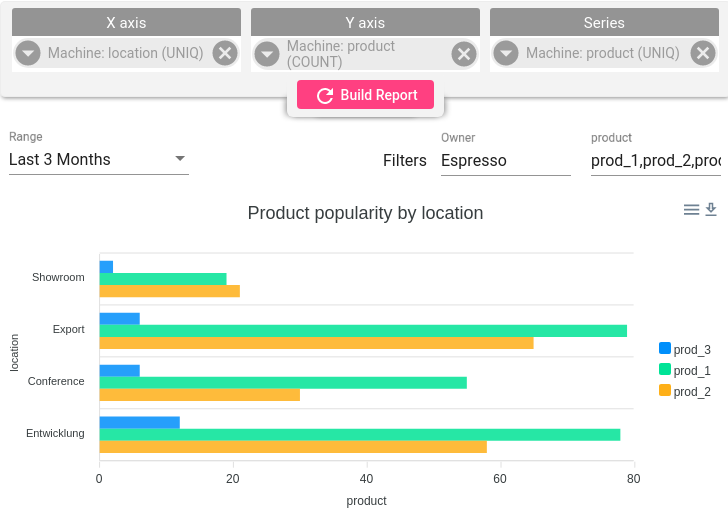
- Add product field into Series section and select UNIQ aggregation - in this step we will group telemetry.
- Add product field into Y-axis section and select SUM aggregation - in this step we apply aggregation for each group.
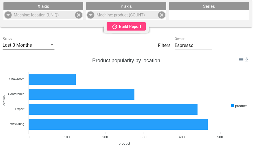
- Add Machine field into X-axis section - we will see a breakdown for each machine
Now we now how much products in different categories were produced by different machines.
Labels
You can add/hide labels from the bar chart using checkbex in View Settings.