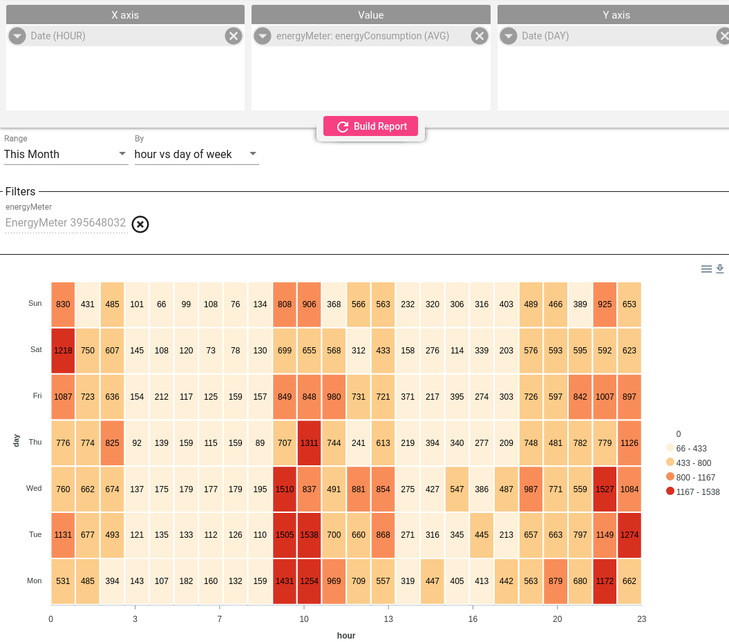
热力图是描述可重复模式、发现离群点的简便方式之一,与表格类似,但单元格根据数值以不同颜色高亮。
- X 轴 —— 定义表格列(横轴);
- Y 轴 —— 定义表格行(纵轴);
- Value —— 定义单元格值。
视频教程
日、周、月热力图
时间范围旁的 By 字段为热力图提供若干预定义模板:
- 小时 vs 星期几
- 分钟 vs 小时
- 日 vs 月
- 小时 vs 月份中的日
示例展示每周能耗模式,可知哪天何时能耗最高。
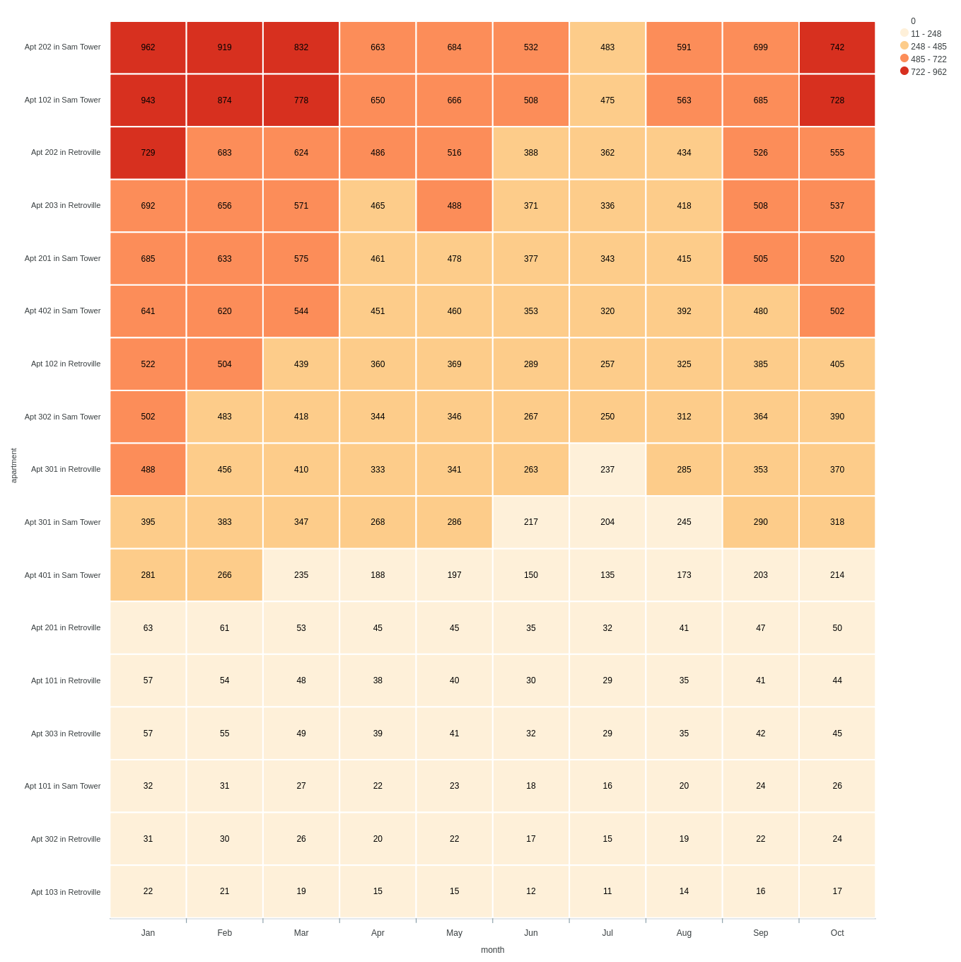
自定义坐标轴
可按场景自由配置,将所需字段作为热力图的维度。
示例展示:
- 每栋公寓作为独立行;
- 每列代表一年中的月份;
- 总能耗作为单元格值。
便于识别离群点及其变化趋势。