近年来,深色模式已经从一种趋势发展成为应用程序、网站和操作系统的基本功能。凭借其时尚、现代的美感和减轻眼睛疲劳的能力,黑暗模式为用户提供了时尚感和舒适感,尤其是在弱光环境下。
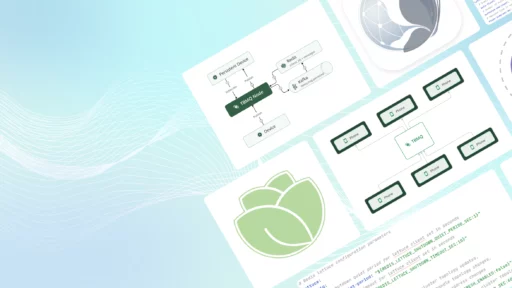
在本文中,我们将使用我们的用例解决方案之一探索 ThingsBoard 中的暗模式实现。了解关键概念后,您可以自行跟进以增强用户体验。
探索演示
目前,TB 平台默认不提供内置深色模式(尽管将来可能会改变!)。但是,您可以通过使用深色模式主题自定义仪表板来增强仪表板的外观。
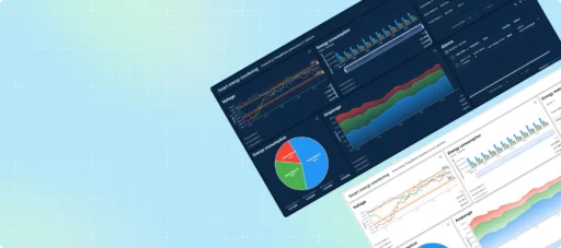
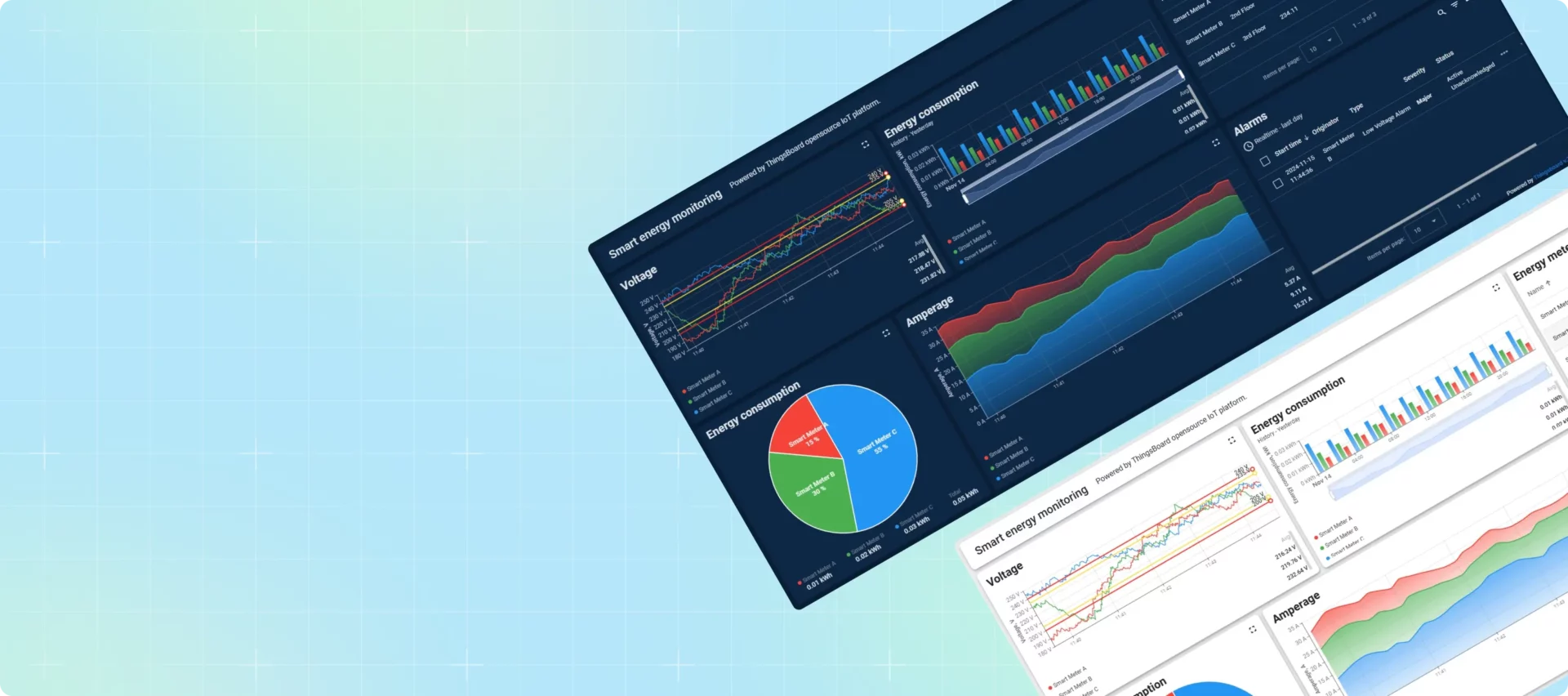
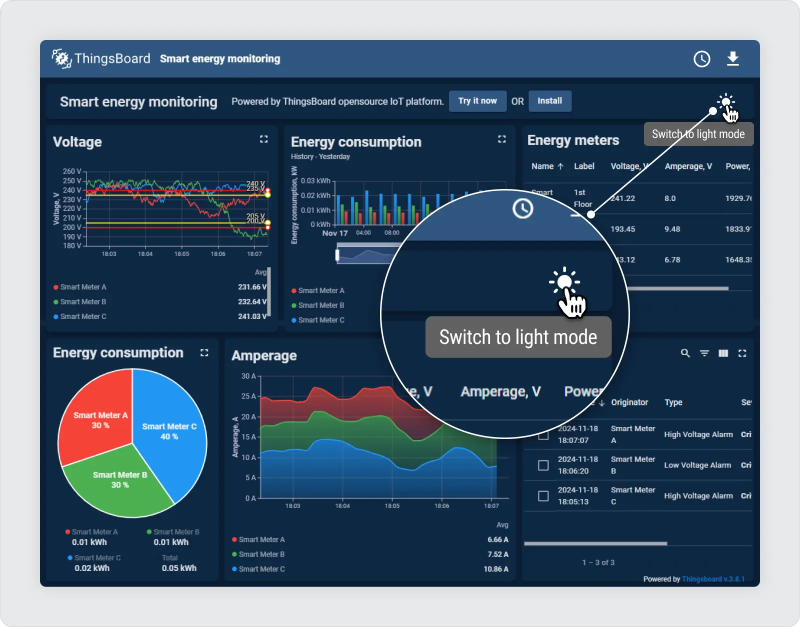
要查看实际示例,请查看我们的“智慧能源” 网站上的用例。只需单击“尝试演示”按钮即可探索 仪表板。在右上角,可以找到“太阳”图标,可以轻松地在明暗模式之间切换。

自定义操作:深色模式的切换按钮
仪表板暗模式实现的一个关键要素是 开关按钮 在浅色和深色模式之间切换。要在仪表板中启用动态暗模式功能,请切换开关 .dark 仪表板元素上的类使用自定义操作 卡片 小部件。
该开关通过自定义操作中的一行简单代码来切换 CSS 类:
$('.tb-dashboard-page').toggleClass('dark');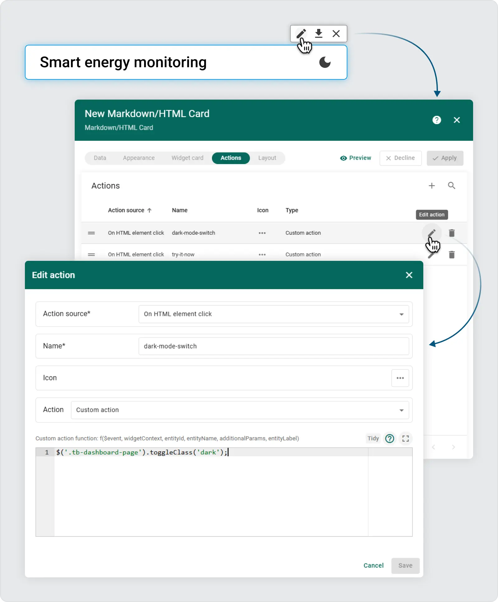
添加此类后,仪表板会自动应用您为暗模式配置的预定义 CSS 规则。这种方法可以灵活地编写高级 CSS 规则,这些规则仅在以下情况下适用: .dark 类存在。
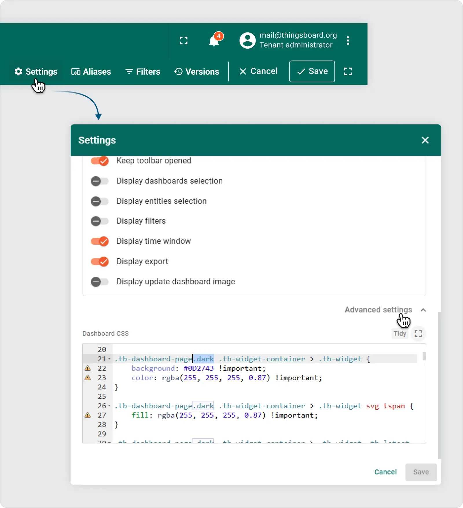
在仪表板设置中使用高级 CSS
要完全自定义深色模式下仪表板的外观,无需为各个小部件定义样式,所有配置都可以通过 仪表板 高级设置 部分。这使得该过程更加高效并且更易于维护。此外,浏览器开发人员工具允许检查组件类,帮助确定哪些元素应该为暗模式反转设置样式。
步骤:
- 打开高级设置:展开高级设置面板以访问 CSS 编辑器。
-
应用深色模式样式:在本节中,自定义样式是在仪表板具有以下内容时编写的:
.dark应用类。例子:
.tb-widget-container > .tb-widget {
    border-radius: 8px;
}

gridster-item:not(.tb-noselect) > .tb-widget-container > .tb-widget {
    cursor: default !important;
}

.tb-widget-container > .tb-widget .tb-table-widget .mat-mdc-row {
    cursor: pointer;
}

.tb-widget-container > .tb-widget .tb-legend-keys {
    cursor: pointer;
}

.tb-dashboard-page.dark tb-dashboard > div {
    background-color: #0A1F36 !important; /* rgb(238, 238, 238)*/
}

.tb-dashboard-page.dark .tb-widget-container > .tb-widget {
    background: #0D2743 !important;
    color: rgba(255, 255, 255, 0.87) !important;
}

.tb-dashboard-page.dark .tb-widget-container > .tb-widget svg tspan {
    fill: rgba(255, 255, 255, 0.87) !important;
}

.tb-dashboard-page.dark .tb-widget-container > .tb-widget .tb-latest-chart-legend-item-label div {
    color: rgba(255, 255, 255, 0.38) !important;
}

.tb-dashboard-page.dark .tb-widget-container > .tb-widget .tb-latest-chart-legend-item-value {
    color: rgba(255, 255, 255, 0.87) !important;
}

.tb-dashboard-page.dark .tb-widget-container > .tb-widget .tb-latest-chart-shape svg text {
    fill: rgba(255, 255, 255, 0.87) !important;
}

.tb-dashboard-page.dark .tb-widget-container > .tb-widget .tb-time-series-chart-legend-type-label {
    color: rgba(255, 255, 255, 0.57) !important;
}

.tb-dashboard-page.dark .tb-widget-container > .tb-widget .tb-time-series-chart-legend-item-label div {
    color: rgba(255, 255, 255, 0.57) !important;
}

.tb-dashboard-page.dark .tb-widget-container > .tb-widget .tb-time-series-chart-legend-value {
    color: rgba(255, 255, 255, 0.87) !important;
}

.tb-dashboard-page.dark .tb-widget-container > .tb-widget .flot-text {
    color: rgba(255, 255, 255, 0.87) !important;
}

.tb-dashboard-page.dark .tb-widget-container > .tb-widget .flot-text > div > div {
    color: rgba(255, 255, 255, 0.87) !important;
}

.tb-dashboard-page.dark .tb-widget-container > .tb-widget .tb-table-widget .mat-mdc-table .mat-mdc-header-row {
    background-color: #0D2743 !important;
}

.tb-dashboard-page.dark .tb-widget-container > .tb-widget .tb-table-widget .mat-mdc-table .mat-mdc-header-cell.mat-mdc-table-sticky {
    background-color: #0D2743 !important;
}

.tb-dashboard-page.dark .tb-widget-container > .tb-widget .tb-table-widget .mat-mdc-table .mat-mdc-row .mat-mdc-cell.mat-mdc-table-sticky {
    background-color: #0D2743 !important;
}

.tb-dashboard-page.dark .tb-widget-container > .tb-widget .tb-table-widget .mat-mdc-table .mat-mdc-header-cell {
    color: rgba(255, 255, 255, 0.87) !important;
    border-bottom-color: rgba(255, 255, 255, 0.2) !important;
}

.tb-dashboard-page.dark .tb-widget-container > .tb-widget .tb-table-widget .mat-mdc-table .mat-mdc-cell {
    color: rgba(255, 255, 255, 0.87) !important;
    border-bottom-color: rgba(255, 255, 255, 0.2) !important;
}

.tb-dashboard-page.dark .tb-widget-container > .tb-widget .tb-table-widget .mat-mdc-table .mat-mdc-header-cell .mat-sort-header-arrow {
    color: rgba(255, 255, 255, 0.57) !important;
}

.tb-dashboard-page.dark .tb-widget-container > .tb-widget .tb-table-widget .mat-divider {
    border-top-color: rgba(255, 255, 255, 0.2) !important;
}

.tb-dashboard-page.dark .tb-widget-container > .tb-widget .tb-table-widget .mat-mdc-input-element::placeholder {
    color: rgba(255, 255, 255, 0.57) !important;
}

.tb-dashboard-page.dark .tb-widget-container > .tb-widget .tb-table-widget .mat-mdc-input-element::-moz-placeholder {
    color: rgba(255, 255, 255, 0.57) !important;
}

.tb-dashboard-page.dark .tb-widget-container > .tb-widget .tb-table-widget .mat-mdc-input-element::-webkit-input-placeholder {
    color: rgba(255, 255, 255, 0.57) !important;
}

.tb-dashboard-page.dark .tb-widget-container > .tb-widget .tb-table-widget .mat-mdc-input-element:-ms-input-placeholder {
    color: rgba(255, 255, 255, 0.57) !important;
}


.tb-dashboard-page.dark .tb-widget-container > .tb-widget .tb-table-widget .mat-mdc-table .mat-mdc-cell .mdc-checkbox__background,.tb-dashboard-page.dark .tb-widget-container > .tb-widget .tb-table-widget .mat-mdc-table .mat-mdc-header-cell .mdc-checkbox__background {
    border-color : rgba(255, 255, 255, 0.57) !important;
}

.tb-dashboard-page.dark .tb-widget-container > .tb-widget .tb-table-widget .mat-mdc-table .mat-mdc-cell button.mat-mdc-icon-button mat-icon {
    color : rgba(255, 255, 255, 0.57) !important;
}

.tb-dashboard-page.dark .tb-widget-container > .tb-widget .tb-table-widget mat-toolbar.mat-mdc-table-toolbar:not([color="primary"]) button.mat-mdc-icon-button mat-icon {
    color : rgba(255, 255, 255, 0.57) !important;
}

.tb-dashboard-page.dark .tb-widget-container > .tb-widget .tb-table-widget .mat-mdc-table .mat-mdc-cell button.mat-mdc-icon-button[disabled][disabled] mat-icon {
    color : rgba(255, 255, 255, 0.2) !important;
}

.tb-dashboard-page.dark .tb-widget-container > .tb-widget .tb-table-widget .mat-mdc-paginator {
    color: rgba(255, 255, 255, 0.57) !important;
}


.tb-dashboard-page.dark .tb-widget-container > .tb-widget .tb-table-widget .mat-mdc-paginator button.mat-mdc-icon-button {
    color : rgba(255, 255, 255, 0.57) !important;
}

.tb-dashboard-page.dark .tb-widget-container > .tb-widget .tb-table-widget .mat-mdc-paginator button.mat-mdc-icon-button[disabled][disabled] {
    color : rgba(255, 255, 255, 0.2) !important;
}

.tb-dashboard-page.dark .tb-widget-container > .tb-widget .tb-table-widget .mat-mdc-paginator .mat-mdc-select-value {
    color : rgba(255, 255, 255, 0.57) !important;
}

.tb-dashboard-page.dark .tb-widget-container > .tb-widget .mat-mdc-select-arrow {
    color : rgba(255, 255, 255, 0.57);
}

.tb-dashboard-page.dark .tb-widget-container > .tb-widget .mdc-text-field--filled:not(.mdc-text-field--disabled) .mdc-line-ripple:before {
    border-bottom-color: rgba(255, 255, 255, 0.4);
}

.tb-dashboard-page.dark .tb-widget-container > .tb-widget .mdc-text-field--outlined:not(.mdc-text-field--disabled) .mdc-notched-outline__leading,
.tb-dashboard-page.dark .tb-widget-container > .tb-widget .mdc-text-field--outlined:not(.mdc-text-field--disabled) .mdc-notched-outline__notch,
.tb-dashboard-page.dark .tb-widget-container > .tb-widget .mdc-text-field--outlined:not(.mdc-text-field--disabled) .mdc-notched-outline__trailing {
    border-color: rgba(255, 255, 255, 0.4);
}

.tb-dashboard-page.dark .tb-markdown-view div,
.tb-dashboard-page.dark .tb-markdown-view div.param,
.tb-dashboard-page.dark .tb-markdown-view .header .title,
.tb-dashboard-page.dark .tb-markdown-view p {
    color : rgba(255, 255, 255, 0.87);
}

.tb-dashboard-page.dark .tb-markdown-view div.param-title,
.tb-dashboard-page.dark .tb-markdown-view .header .subtitle {
    color : rgba(255, 255, 255, 0.6);
}


.tb-dashboard-page.dark .tb-powered-by-footer {
    color : rgba(255, 255, 255, 0.87) !important;
}
之后 .dark 类应用于 .tb-dashboard-page ,小部件的背景变暗,文本变亮,为暗模式提供更好的对比度。
定制深色模式以适合您的品牌
这种方法的强大之处在于它的灵活性。您可以自定义配色方案以适应您的品牌形象。在 CSS 面板中,修改颜色和背景以创建符合您的品牌准则的有凝聚力的深色主题。
在您的实例上尝试一下:
- 下载 JSON:从以下位置下载 JSON 文件 演示仪表板.
- 导入仪表板:将此 JSON 文件作为仪表板导入到您的 ThingsBoard 实例中。
- 编辑模式:进入编辑模式以自定义和检查设置。
- 检查开关按钮的自定义操作:观察切换功能以启用暗模式。
- 仪表板设置 -> 高级 CSS:在这里,您可以查看 CSS 设置以增强深色模式体验。
使用深色模式改善用户体验
实施深色模式不仅是一种设计趋势,也是提高用户舒适度和可访问性的一种方法。通过遵循此功能,您不仅在仪表板中添加了暗模式,而且还为您的用户提供了更灵活和舒适的界面。请务必尝试 CSS 设置,找到适合您的深色主题的完美外观!